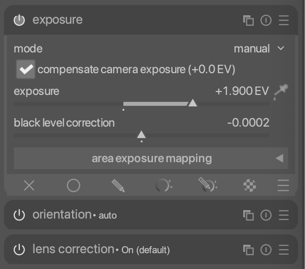
hi @rudantu , re. your example above where an Exposure instance is named Shadows.
Suppose this had a mask which is to be re-used later in the Rgb Curve module, say, as a raster mask. What do you suggest as the name for this module, and how might it be related to the source of the mask, the Exposure instance?
I’ve been following this thread with interest. It’s good to see people paying attention to UI/UX design, because for sure many operating system developers (particularly Windows/Linux) seem to have a “throw it at the wall and see what sticks” approach. IMHO UI design is a vital part of any application and sadly neglected with many (even commercial) apps today.
That said, I sure hope that things like colors/shades and element appearance continue to be defined by CSS elements. I know this is likely to be contentious, but while I am fine with a medium grey backdrop for the image (and understand the reasoning), I really need high contrast and legibility in the module and other UI controls. I use the high contrast theme with some personal modifications to make the button states and module labels/controls highly visible. As long as these can still be tweaked with CSS changes, I’m fine with revamping the UI in darktable.
4 Likes
I love this (and your example image). I personally find with the way modules are currently designed that I have to take a second for my eyes and brain to get in sync when I go from looking at an image to looking at the module list. This look really helps me more quickly discern what’s what.
3 Likes
For me I understand why the modules in the active module tab are in order to match the pipeline but if you could make a custom tab with modules in the order that you like to do your workflow you would barely have to concern yourself… You can make custom groups I guess that is the idea that you group your workflow that way but I don’t hardly use enough modules these days so having a single group that I could walk down through would be great…
1 Like
I like your idea of enclosing a module in a rounded pill. This is obviously not perfect, but I still kind of like it.
Here's the CSS to make this happen
#basics-box-labels widget
{
  border-top: None;
}
#iop-expander,
#basics-header-box {
    background-color: #444;
    border-top-left-radius: 10px;
    border-bottom-left-radius: 10px;
    border-top-right-radius: 10px;
    border-bottom-right-radius: 10px;
    margin-left: 4px;
    margin-right: 4px;
}
#iop-expander {
    margin-top: 2px;
    margin-bottom: 2px;
}
#right #plugins_vbox_left {
    background-color: @plugin_bg_color;
}
#blending-wrapper {
    border-left: 3px solid @field_active_bg;
    border-right: 3px solid @field_active_bg;
    border-bottom-left-radius: 10px;
    border-bottom-right-radius: 10px;
}
14 Likes
This is a big improvement, thanks for the css. Also changed to my font of choice which is Atkinson Hyperlegible (I recommend everyone to give it a try, it has a mono too) and the improvement is dramatic.
Rudantu’s design keeps getting better and better. It’ll be a colossal effort to actually implement it into dt, but I think it’s a great step forward for the longevity of the program.
3 Likes
Great stuff again. I appreciate the effort to talk through your thinking as well, it helps understanding the decisions!
Since we are throwing things around and people often tweak in css or complain about the active module indicator could we replace it with something like
Google has this whole set of icons … we might need some custom ones for DT but also being a bit more conventional where it makes sense might also help with new users…
3 Likes
I liked the idea of that, but the CSS tweak did not work properly with my Win 10 installation. Lots of elements were not displaying, and it changed the whole background/theme.
I haven’t had time to find out what was causing the issue, but I copied and pasted the code directly from your post. There may be some conflict with the CSS tweak I already have in there, which changes the colour of the module ON/OFF icon.
I didn’t test it with other themes than elegant dark. I bet that’s the culprit.
1 Like
Just FYI, the active module on/off is actually a three-way indicator, since it also indicates module focus (in-focus being indicated by the lighter background). Focus still needs visual indication, since some things like masks and overlays only show when a module has focus. Focus can also be controlled with Ctrl+click or a shortcut.
2 Likes
Yep, that will probably be it. I use elegant grey. I might see if I can tweak it at some point.
Could you not still use that logic with this or a similar more visual control …even a simple open circle then a filled circle and dull that when necessary…I think there are ways maybe also making the whole module header darker when it has the focus so it stands out…for a light theme and maybe lighter ie grey for a dark theme…
3 Likes
Thank you very much for this .css code snippet I am going to try to apply it to my custom theme and see what comes out.
1 Like
The mockups I saw here are really good ! 
I hope they’ll see daylight one day!!
I just saw your post and your CSS.
Applied.
Fantastic for my tired eyes.
Thank you.
1 Like
Sorry new user just reading through this thread - how do I change the font within darktable please? LUA script?
I’m on a mac if that makes any difference!
Thanks, Shelton.
Hello @rudantu,
I saw you were looking for an front-end developer with UX experience.
Can help you if needed, to transform your App design into code.
PS : did some comments on your penpot (and asked access to your App UI).
In the settings panel, under general you can set the font using a CSS Tweak.
For Mac you could you (Note, -apple-system is already used - this is just an example)
* {
    font-family: -apple-system, BlinkMacSystemFont, "Helvetica Neue", Helvetica, Arial, sans-serif;
}
What font do you want your interface to be?
1 Like
I really like the Atkinson Hyperlegible