Incorporating tonemapping in my workflow

I have been participating in another thread about my difficulties with darktable tone mappers like the new AGX.

My problem is I simply don’t understand what the tone mapper is, what it is used for, when I need to use it, and how to use it effectively.

Lots of people tried to help, but without much success, probably down to my concrete skull.

A couple of people suggested an alternative strategy, that I should post an example of an image I have edited using my non-tone mapped workflow in this playview section and ask people to demonstrate how the use of AGX or filmic could improve upon my standard processing method.

Just to be clear, I’m not looking for alternative artistic takes on my processing, just something that demonstrates clearly by example that there are weaknesses in my editing workflow that could be solved by switching on one of the tone mappers.

Before I do so, I should explain what my current workflow is:

  1. I use the settings panel to switch the default workflow to “none”. I believe this disables base curve, filmic, sigmoid and AGX, leaving a very murky, dark starting point. That’s my assumption anyway.
  2. When I start editing, I start by switching on the lens correction tool to remove any lens distortions.
  3. Then I crop the image to taste using the crop tool (normally a square crop, but not always, depends on the composition).
  4. Then I put a frame around the image (partly because I like it this way, and partly because it acts as a signal that this image in my library has been edited).
  5. At this point I now usually have a square cropped, white framed, lens corrected but still dark and murky image.
  6. Next, I address the tonality. I start by switching on the Local Contrast module, using the “Clarity” preset. I do this because it improves the midtones and often reduces any highlight clipping (I don’t know why, it just appears to do so).
  7. Then I switch on the Colour balance RGB module and go to the perceptual brilliance grading panel in the master tab. I use the sliders there similarly to how I would use the exposure/contrast/highlights/shadows sliders in the main panel of Lightroom or most other editors i.e. as a tool to apply basic global adjustments.
  8. Often, this is all I need to do. But if I feel that image is still a bit dark looking, I switch on the RGB curves module, add a grab point to the centre of the diagonal line and push it upwards to the left to raise the midtones a little to brighten the image.
  9. Usually this is enough for basic editing. However, sometimes even though everything is brightened and there is no clipping indicated, the tones don’t look balanced. In which case I might use the vignette tool or the graduated ND filter tool to darken/lighten the corners and/or one or more sides to improve the overall balance.
  10. In the occasional image where this is insufficient, I will create additional instances of the RGB curves tool and create individual local drawn masks to darken or lighten selective bits of the image - film era style dodging and burning.
  11. Finally, I use the Sharpen tool set to a very low amount, the contrast equalizer set to lens deblur strength 1 and the Diffuse and sharpen tool set to preset Sharpen demosaic for no AA filter and the denoise profile tool to sharpen and denoise.

I occasionally use other modules for specific things, but those are edge cases that can be ignored for this purpose.

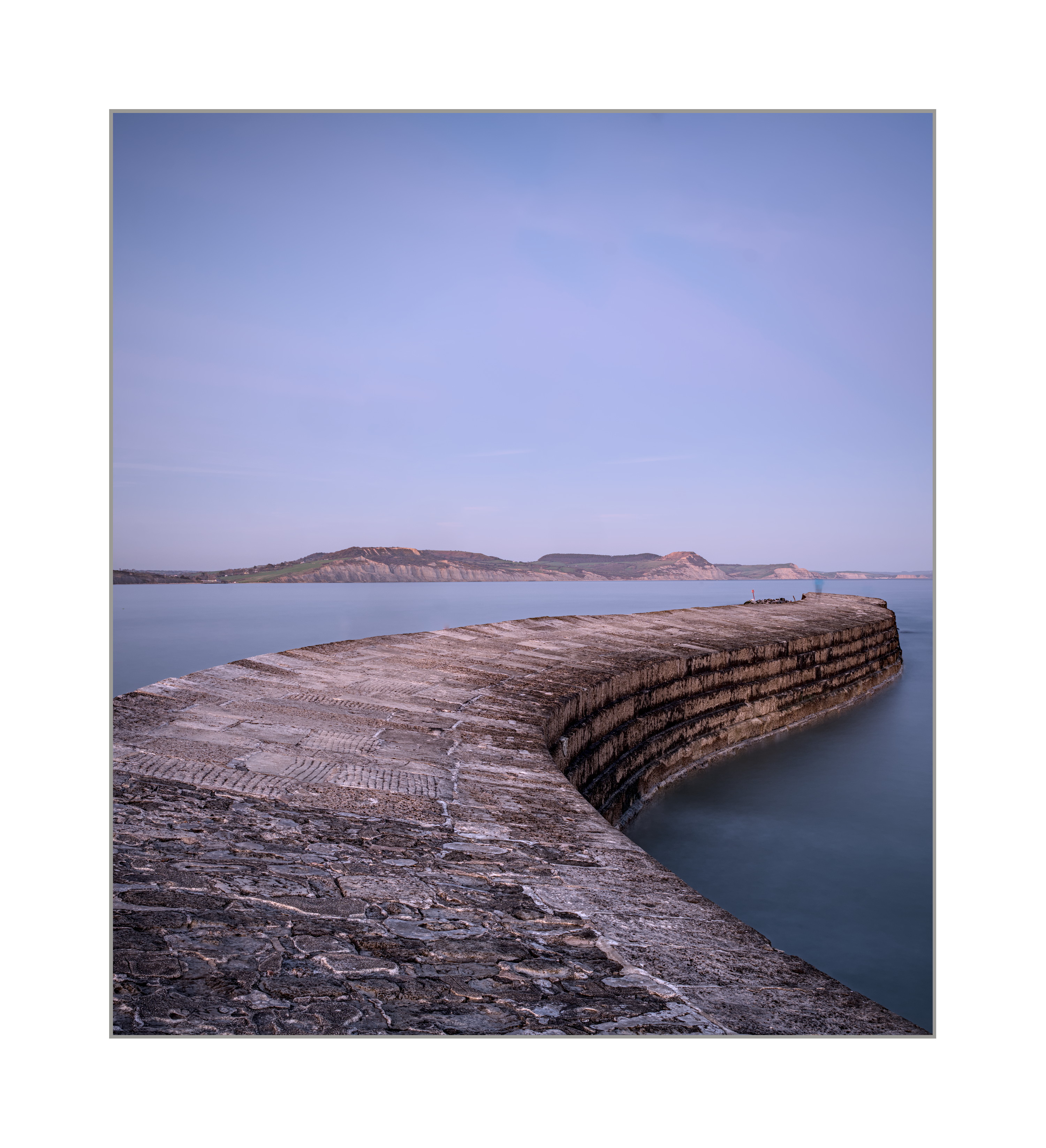
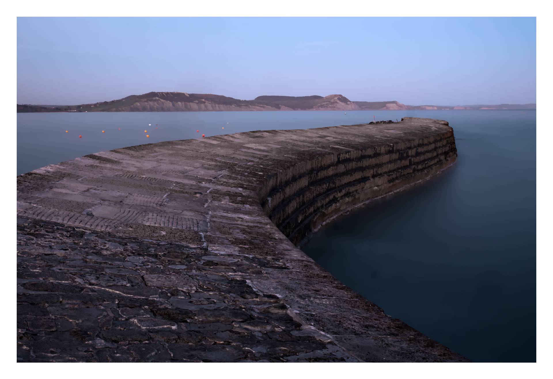
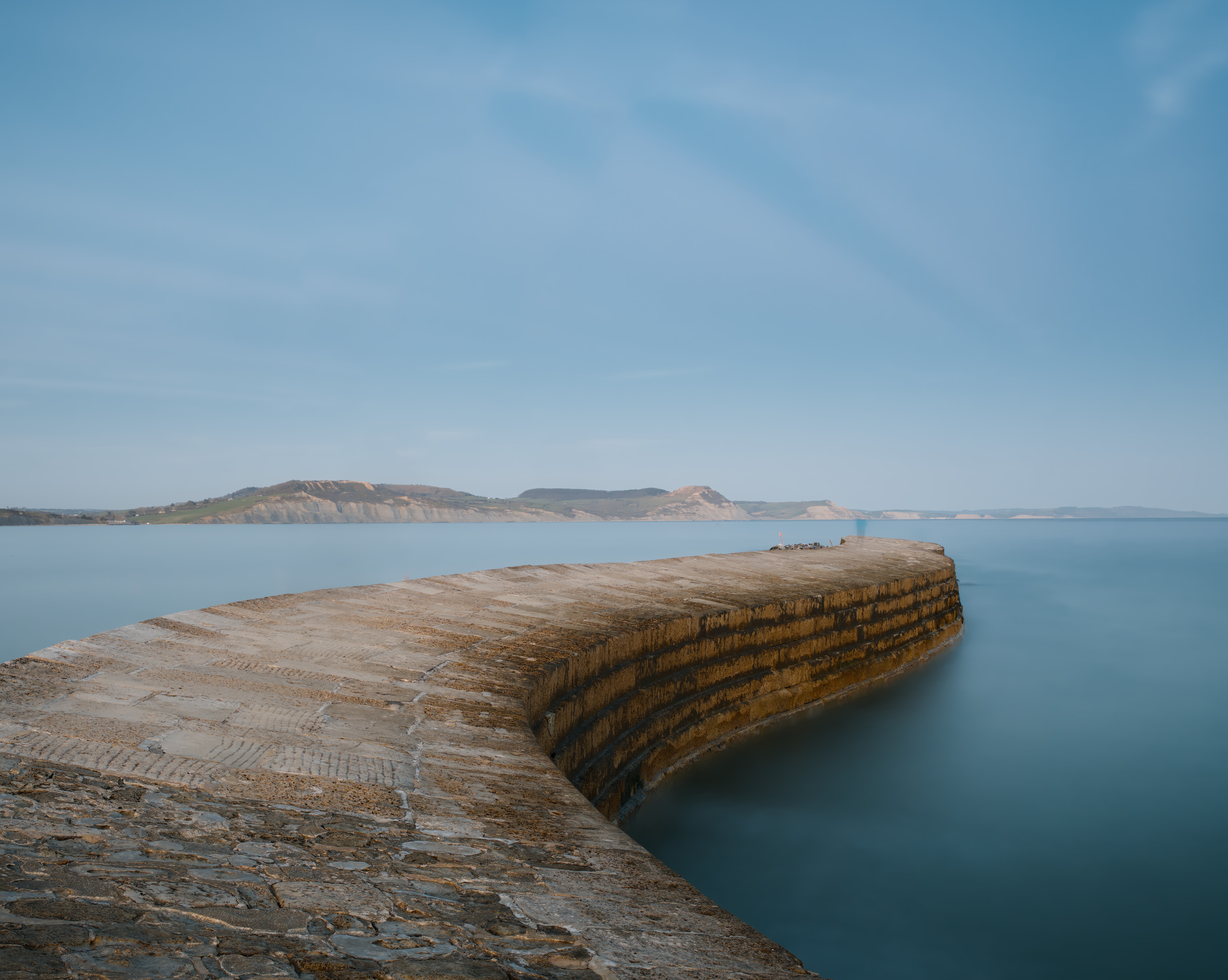
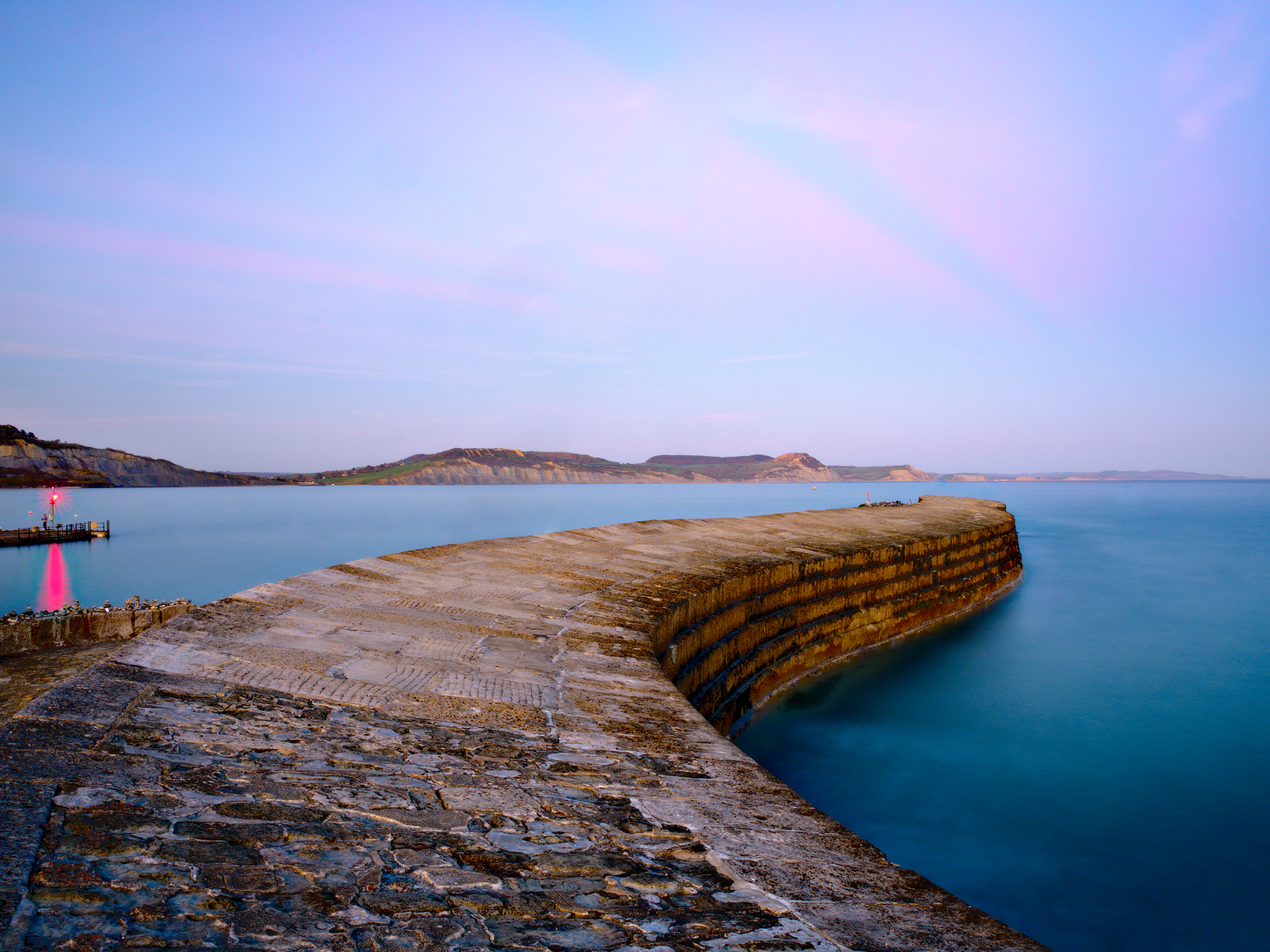
I’ll reply to my own post and attempt to attach a raw file, a jpg of my edit and the xmp sidecar file.

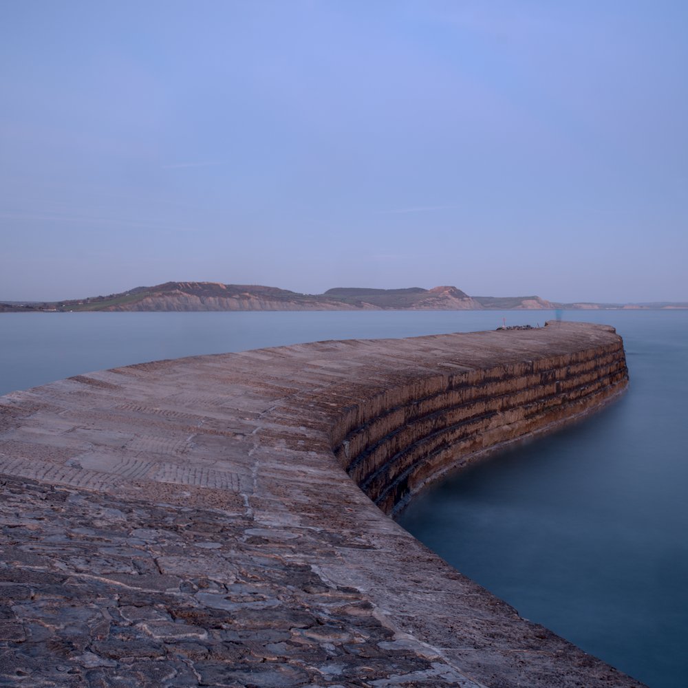
For the record the image will be a long exposure shot from my GFX50s. It was shot using my Tamron full frame superzoom which doesn’t cover medium format so needs cropping to remove the hard vignette. Other than that, I didn’t find it particularly challenging to edit without using tone mapping modules. I’m interested to find out whether not using tone mapping modules was nonetheless a mistake.

Please have a go and if you can make improvements using AGX or filmic, please explain what and why you did it. Hopefully this might lead to improved understanding and appreciation on my part as to what benefits tone mappers bring.

Thanks ever so much in advance

Dave

Attempt 2:


GFX17780.RAF.xmp (76.8 KB)
GFX17780.RAF (110.9 MB)

Files offered under creative commons or whatever the correct term is to grant you all edit rights

This replacement image was not shot with my adapted Tamron but with the native Fuji 35-70mm.

1 Like

What version of darktable did you edit this photo with? That will help people to know what modules are available to you. Thanks!

That is a very nice image. I have done a quick edit and made some adjustments that suit my eye. As far as workflow - I have a few modules with presets that are automatically applied - framing, denoise, highlight reconstruction, lens correction and demosaic. I almost always make my first adjustments to exposure and then AGX. After that it is simply whatever I think the picture needs. I have tried to use a bit of a variety in this case so you can see exactly what some modules do.

GFX17780.RAF.xmp (52.6 KB)

I should add that I use AGX initially to set black and white points and get to a contrast that I like. More and more I am using the Primaries to adjust the colours. As I add different modules I often readjust AGX to ensure nothing is crushed or blown out.

I’m using 5.5. It was meant to be the xmas 5.4 but for some reason when I ran the upgrade I got 5.5. I assume they are very similar.

Thanks for having a go. it’s not how I would want it, too dark, but my interest here is understanding tone mapping, not quibbling over aesthetic choices. how do I make use of your xmp to test this in darktable? I don’t want to overwrite my own edits by just copying your xmp…

1 Like

p.s.

Not only do I not use a tone mapper at the moment, I never use the exposure module either. As far as I can ascertain by eye, it does exactly the same thing as brightening midtones with RGB curves, so I do it that way instead.

Download the xmp file. In darktable make a duplicate of your image in the Duplicate Manager. In Lighttable with the duplicate image selected go to History Stack and select “load sidecar file” and select the downloaded xmp file.

Thanks, that worked!

@D_M I changed the title, category and tags to increase the visibility of this thread. I also cleaned up your first few posts for readability.

Note that Play Raw can invite many interpretations, even if that is not what you want. But you should still benefit from examining people’s XMP. Hope you learn something.

1 Like

if you just use RGB curves - and keep your 255/255 point at its position then you don’t need a tonemapper
That’s the old way working in display referred mode - assuming all values can just be modified between 0 and 100% (or 0 and 255 for 8bit steps)
If that meets your requirements, then go for it.

comparison rgb curve to exposure:
set the color picker to rgb% mode and select a white area for a measurement.
if you keep the rgbcurves endpoint at 255/255 and drag an arbitrary point in the curve to the top line, you cant get this measurement >100%
if you drag the endpoint toward left side, then your curve no longer ends at 255/255 but continues outside of the graph area where it intersects the top line and you’re able to generate >100% rgb values which can be brougt back with a tone mapper - this is a difference to the display referred tonecurve module which clips to 100%.

now increase exposure and you’ll see that it’s quite easy to go beyond 100% rgb% value.
same with other scene referred tools as tone equalizer or colorbalancergb.

1 Like

Very nice image! I used AgX on DT 4.5 dev.


GFX17780.RAF.xmp (34.3 KB)


GFX17780_01.RAF.xmp (19.8 KB)

That’s my attempt.
Some explanations and motivations regarding my workflow:

It is mostly centered around Exposure, Tone Equalizer, Color Balance RGB and AGX.

The primary motivation for the scene-referred workflow for this image is robustness: You can achieve mostly anything with any tools in darktable :wink:
However, a structured pipeline with reasonable separation of concerns regarding color management really helps for reproducibility and adaptability during the editing process.
In particular, changing some setting in a module to tweak a particular aspect of the look is less likely to break other things and the result is more predictable.

Take the simple example of only using a per-cannel tone curve instead of a tone mapper and some color balance before that to adjust colors to your likes.
Taken e.g. a sunset or blue sky with strong and bright colors, you’ll be fiddle the colors as you like somehow. Due to channel clipping and the non-linearity tone curve, things colors will break from a mathematical point of view.
But you won’t even notice as you fiddle around the issue by choosing just the right curves and color balance parameters.
For example, the red channel on a sunset will clip, leading to color shifts and posterization effects in the sky.
By desaturating the highlights and careful handling with color balance and the curves, you are able to mitigate this and the image looks good.
But this only holds for exactly this exposure and gradation and is hence fragile.
Now, if you decide to change the exposure at beginning of the pipeline, the colors in the sky will most likely break again.
For example, the red channel clips earlier, changing the color cast (by broken the colors) in the sky, so that you need to re-adjust.

In the end, this is a consequence of the fact that your whole pipeline must care for not breaking / unbreaking the colors in the transforms you do at the end to get an image within the output color space - which introduces complex interdependency throughout the pipeline.

What you do in a scene-referred pipeline is entangling this mess:
First, you work in an unconstrained, scene-referred space, where color representation is linear, easy to handle and hard to mess up :wink:
In particular, channel clipping is not an issue.
Then, your tone mapper (e.g. AGX) takes care of handling the mapping into a space with constrained range.
It basically does what was done by curves and color balance in the previous example. However, the tone mapper does this in a more robust controllable way at one defined place.
As a consequence, you can alter the image relatively freely (with appropriate modules for scene-referred editing) before tone mapping with less headache and more control.

The workflow for this image was my basic workflow I use most often:

  1. Adjust white balance for neutral colors
  2. Adjust exposure to get reasonable middle grey
  3. Adjust AGX black- and white relative exposure to capture the dynamic range (but very often, default settings work perfectly fine)

→ Now we have a sane, neutral base image. Next, handle dynamic range

  1. Use Tone Equalizer to adjust tone / make image more or less punchy / handle large dynamic range
  2. Maybe use diffuse / sharpen for local contrast
  3. adjust AGX contrast / shoulder / toe for the basic grading / tonality

→ Now we can adjust the colors

  1. Use Color Balance RGB to adjust chroma and saturation as desired
  2. use color equalizer for selective color manipulation
  3. Probably use color balance rgb to introduce color casts / change general color mood. It is important to note that white balance was made neutral at the beginning and we add desired color shifts here, later in the pipeline. This allows to work on well-separated and neutral colors for selective editing until this point.
3 Likes

With AgX in 21:9 format and few modules:


DT 5.4: 20251229_GFX17780.RAF_1.xmp (8,5 KB)
Greetings!
(You have spots on the sensor)

2 Likes

Thanks for this explanation.

One thing I’m gleaning from it is that is puts a lot of emphasis on controlling/preserving colour and not doing an edit that breaks the colour.

This is very different from the way I routinely edit.

Aside from white balance and saturation I never attempt to do anything to colour. I’ve watched videos by the likes of Nigel Danson where he is tweaking colour selectively all over the image. I’m impressed by this because I dare not do it.

I’m happy in a black and white environment playing with tones and I’m happy doing a watered down equivalent in colour images. But I lack the skill do mess with colours; if I attempt to do so it turns into a mess very quickly so I just don’t.

The only colour skill I’ve added to my armoury is using the colour equalizer to alter the saturation and brightness of a single colour in the image (eg a red pillar box). I don’t have the confidence to make hue shifts and other such tricks locally (like some people do to warm up the light in one specific part of the image for example). Too tricky for me.

ps

For what it’s worth, it’s always interesting to look at other people’s takes on your own image and try and see different preferences, but so far I haven’t seen an alternative edit that doesn’t IMO make my image worse. I guess we all have our own view of what an image should look like! And quite right, too. Pleasing other people, though, is no easy matter…

Carry on editing please, and the explanations. It all helps a little.

1 Like

How did you manage to restore those dust spots, they are not in my finished image. Did you disable the retouch module where I cloned them out?

The reason the spots are visible is because that image was shot at f/16. At wider apertures you rarely see dust spots with the GFX because the cover glass is quite far from the sensor surface and they don’t show up.

At f/16 and f/22, if you go that far, they become visible.

I edited the raw file you gave us from 0, in my own way.

I didn’t load your xmp at any time.

But the important thing here is not the sensor spots, but whether you are convinced to include a tone mapper in your workflow.

Indeed.


GFX17780.RAF.xmp (24.2 KB)

This is a very simple edit, not necessarily how I’d handle it, but to illustrate a simple workflow with a tone mapper, in this case AgX.

Workflow is as follows:

  1. Exposure module: adjust midtones until they look good
  2. AgX to stretch the histogram over all
  3. Color Balance RGB: increase color intensity.
  4. Local contrast: clarity preset
  5. Retouch because I couldn’t resist.

Good visual in the link below