I am just wondering if the checkerboard pattern is the best option to visualize the masks in the color balance rgb module. I personally find it hard to work out what is what with most images when I see the checkerboard pattern. I would be interested in the opinion of other users and the developers.
I think a greyscale version of the image to show areas effected by that mask and a flat color (user selectable?) that hides out-of-scope areas would be the easiest way to visualize. I agree, the checkerboard is really hard to look at and doesn’t make it obvious what each mask is covering.
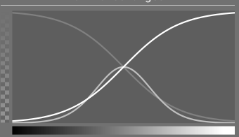
What about a view of the image converted into three colors: blue shadows, green midtones, red highlights. That way all three masks can be seen at the same time?
I could have been more clear with what I’m picturing in my head. These colors can overlap each other as well. Where blue overlaps with green, you get hues in cyan. Yellow appears where the reds and greens overlap.
I could be totally wrong. It’s one of those things I’d have to actually try out to see if it’s a good idea or not.
The three masks could be operated individually, but if someone wanted they should be able to activate more than one at a time. Colour seems like a good choice to me and to have the ability to select the color and opacity would be a bonus.
I could see something like this photoshop plug-in being built with one of the new scripts in ART ( added recently by @agriggio ) and ART’s tone eq has a nice color (heat) mask for tonal ranges already… I wonder if you could simply modify that to three tonal ranges in DT…
In the end all three colours would overlap at varying intensities, and remembering that a particular shade of light brownish yellow means values x, y and z for the shadows, highlights and mid-tones might be hoping a bit much from the average user.
Hi @priort the heat map is probably not what I would want to see for the color balance module. I feel something like how we already visualise a parametric mask would be suitable. Like the screen shot here using a parametric mask to select the dark pixels. This is more what I am proposing. Compare that to the checkerboard and I would be surprised if everyone doesn’t agree the colored mask is more informative.
Maybe but I love @agriggio 's mask in the tone eq of ART midtones are set to gray and stand out nicely and its dynamic so you can watch all the zones move an shift…
I feel the heat map has its place and would be an excellent addition to the right modules, but not in the color balance module since we only want to visual what is covered by each of the three sliders. I could certainly imagine the heat map in the tone equalizer module.
I used to use ART before I migrated to Darktable, and I always loved its false colour mask. Similarly, I really enjoyed the old Zone System module in Darktable, which is now sadly deprecated. I know Tone Equalizer replaced it, and it probably works better, but I liked the Zone System interface. It was really easy to visualize the tonal ranges. The mask histogram and mask in Tone Equalizer are not as easy to read in my opinion.
I’m fairly sure I don’t have any old edits using the module. Besides, I don’t want to use those hacky ways of using old modules. I’d prefer to work with the tools that are officially supported. I’d just like to see the tonal range visualization of that module return in some form.
The zone module in principle was nice to work with and interface was good if I remember correctly. I cut my teeth using curves in Photoshop so curves to me is a logic interface for my brain. BTW, my first version of PS was on a 3.5 inch floppy. That was a long time ago.
+1
Except that i can see what falls outside of the mask, I’m not able to interpret what I see.
The colors in the ART-version of TE is much, much easier to interpret.
And, yes, an alternative to the checkerboard in the color balance module, like what @Terry proposes, would clearly also be welcomed.