So, here are some thoughts. I tried to find something with a similar palette to the picture in the video above; however, as I don’t have anything as beautiful, we’ll have to use the attached picture:
PXL_20210816_084702642.dng (11.0 MB)
I’ll try to go step by step to illustrate some processing options.
As a start, we can take the “Standard Film Curve” profile that is bundled with ART, lowering the exposure a little bit to avoid a pure white sky; also, since this is a phone picture, we also want to use the embedded flat-field correction to get a reasonable starting point:

Then, we use the tone equalizer to brighten the shadows a little bit, like this:

Now we can do our grading. In this case, I want to give the picture a warmer feeling, emphasizing the yellow in the light rays and with overall “richer” greens in the foliage. I also want to show a bit more detail in the deep shadows in the foreground.
So, I go to the color/tone correction tool, and select HSL factors mode, to get something vaguely similar to the Lightroom panel shown in the video.
Now, before tweaking the parameters, though, here’s a “trick” I’m going to use. As we can read in the ART wiki, the color/tone correction tool works in linear RGB. This is not necessarily the best choice for creative color grading, especially if you want to have fine control over the darker regions of the image, as small changes to the “shadows” controls will already show a big impact. Since our picture is predominantly dark, this is exactly the case here. So, I’m going to change the “working gamma” of the HSL wheels from 1.0 (i.e. linear) to something bigger, say 2. The trick to do this in ART is quite simple: before our HSL layer, we insert a “Separate RGB channels” layer with a gamma of 2.0, and then add another “Separate RGB channels” layer with a gamma of 0.5 (i.e. 1/2.0) after the HSL layer:


Now we can tweak our HSL sliders and wheels to our liking, and get something like this:

(If you want to see the effect of working with a different gamma, try disabling the two gamma layers and see what happens)
Now the basic color grading is done, but our shadows are a bit flat.
We can fix this with another grading layer, this time in Perceptual mode (standard would also work), to add a bit more “depth” to the darkest parts:

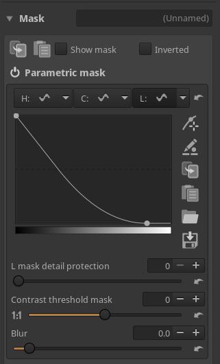
In order to not affect the brighter tones, I’m using a simple luminosity mask:
The picture is already good (for my taste), but if we want a bit extra “bite” we can add some local contrast (again using a luminosity mask excluding the darkest tones to avoid crushing the blacks, which is an unfortunate side effect of ART’s local contrast):

Our final result:

And here’s the full ARP with snapshots corresponding to the different steps above:
PXL_20210816_084702642.dng.arp (97.5 KB)
