Orton Effect in ART (quasi-tutorial)

Mark Denney released a YouTube video today on creating the Orton Effect entirely in Lightroom. Obviously Lightroom isn’t on-topic here and while both tools have similarities, they also have many details not found in the other. However, I was curious if I could create the Orton Effect in ART instead using his basic procedure as a starting point.

I kinda got there, but it’s difficult to tell since the image I used doesn’t really lend itself to “Ortonizing”. For some reason I have very few images even slightly suitable for demonstrating the Orton Effect.

In the end, it’s very subtle. Very subtle. And honestly, I don’t use Orton Effect all that much, but if a procedure in ART can be better defined, who knows. Used appropriately it can be effective in the right context.

It would be great if others could try this, correct any errors / “worst practices” I’ve committed, improve it, document it. etc. In particular it needs more “glow”, so maybe there’s a better way to do (parts of) it…?

Anyway…

The Orton Effect in ART

The starting image

Activate the Color/Tone Correction tool

Per Alberto’s recommendation, temporarily raise gamma in by surrounding your editing layers with two “Separate RGB channels” layers first raising, then lowering gamma:

image

The first layer raises the Gamma to 2.0 and the bottom layer lowers it again by half (Gamma set to 0.5), returning it to normal. All edits will occur on layers between these two.

Rename the second layer to Highlights and add a new Parametric Mask. Adjust the Luminance equalizer to target highlights only.

Raise the Highlights/Gain level to add more brightness to the highlights. This will vary by image, experience and desired intensity / effect. This example is raised by 1.500. Depending on the prominence of the image’s highlights, how “inclusive” your mask is and other factors, you may need to adjust elsewhere if they get too bright. But since they’re masked, most of the image won’t be affected.

Copy the Color/Tone Parametric mask you just created.

Activate the Smoothing (Local editing) tool

Name the existing layer Glow.

Activate the Smoothing Parametric mask and paste the Color/Tone mask you just copied.

Change the layer mode to Gaussian and raise the Radius value to create a diffuse glow. This amount is very subjective and even providing a suggested starting point could benefit from further experimentation but a radius value of roughly 0.10x of the image’s size in megapixels seems to work reasonably well.* For example, this is a 24mp image, so I chose a radius of 2.5.

image

Again, experiment to see what value gives a good softening without killing too much detail.

* This is based entirely on what I’ve seen recommended in other Orton tutorials. Experiment!!

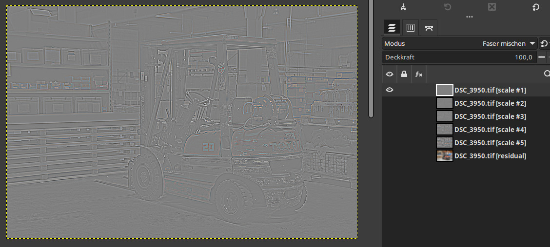
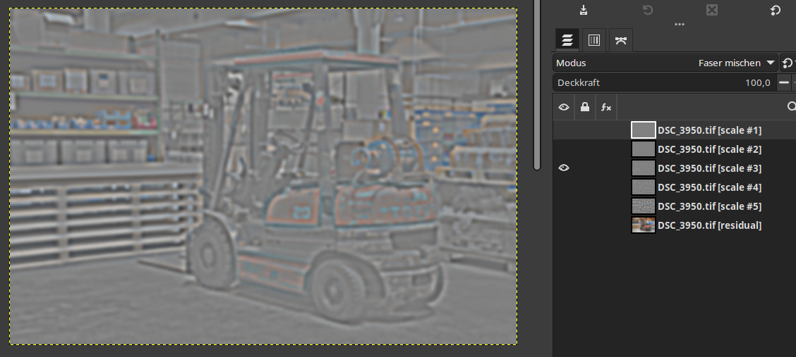
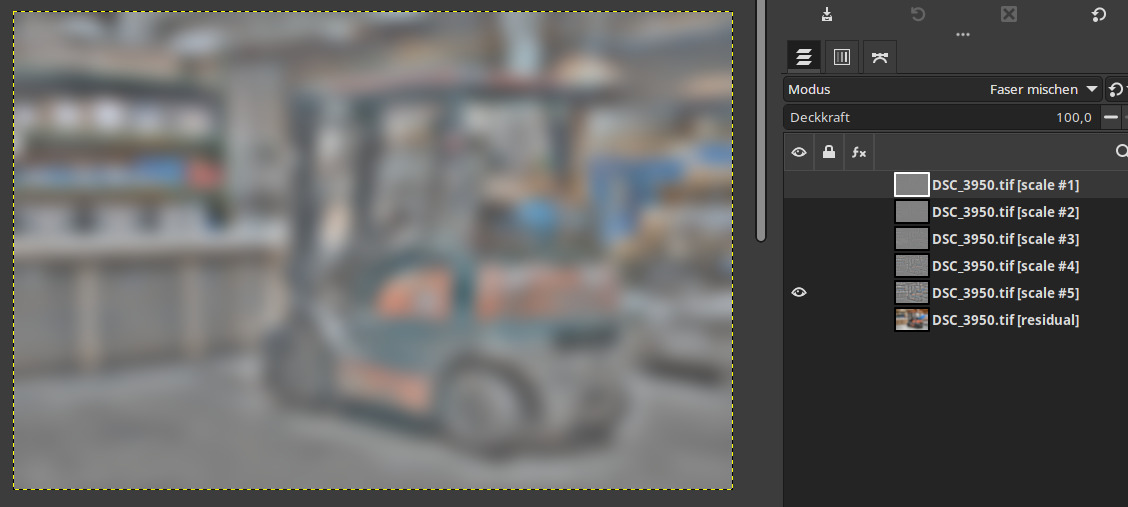
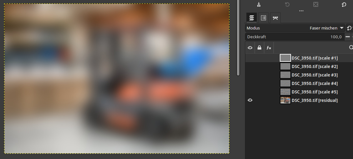
Activate the Texture Boost/Sharpening tool

Name the existing layer Details.

As with Smoothing (indeed, with almost any parameter of this process), the optimal settings will need to be found. For this image, I settled on Strength of 1.00, Detail scale of 15.00 and 3 Iterations.

image

Ideally it would be nice to be able to control the overall opacity of the effect, but by varying the Local editing tools’ parameters it can be controlled well enough. In particular, changes to Smoothing and Texture Boost/Sharpening can control the strength of the effect.

On this particular image, it’s pretty subtle but it would be nice to see what others can do with their images. Hopefully this process can be refined and better documented (e.g., good default values).

The final image

A/B comparison

Left is off, right is on.

So what can be done to improve this process?

5 Likes

Hi,
thanks for the tutorial!

I don’t know about improving, but here’s another way to do something like this:

Screenshot from 2024-02-01 08-43-15

HTH

Just looking at the curve (here on my phone) that makes sense. Just for the record, what does the Residual Contrast slider officially do?

Thanks.

what does the Residual Contrast slider officially do?

Yes, I also wonder what this slider does: “Residual contrast”? But I would have liked to know what it’s for and why in “Local contrast”?

I have the impression that Residual contrast does something like an amplification of the lighting effect.
It is more of a global contrast that can be raised here, not a local one.

I think that Local contrast does some wavelet decomposition, and that the Residual contrast slider affects the contrast of the residual image. Basically, imagine you remove all the fine/medium detail of the image, and you get the residual, then you add or remove contrast to it and blend the result with the original image. At least this is how I interpret this module.

1 Like

Same for me.

For example wavelet decomposing in gimp/gmic:

Fine details:

Mid details:

Coarse details:

About these three levels are affected by local contrast.

Then there is the very coarse leftover (the residual), which is outside of the local contrast affected area:

This is what you can adjust with the residual contrast slider.

3 Likes

I really like this effect, it makes the image more dramatic without the details looking overly sharpened. Perfect for dramatic portraits. This filter increases the contrast, but without visibly enhancing unnecessary details such as blemished skin.

Since I have no experience with this ‘residual contrast’ effect and I have a question for you: When is it useful to use this filter?

And where are its limits? It could quickly look tacky. What do you think?

I’m afraid I have no valuable tips for this. I’m not a photographer and don’t do ambitious photo work. Just some shappy snapshots here and there with very basic raw development. I have some discreet local contrast activated by default, but haven’t messed with the residual contrast yet.

We need to separate the term"contrast" from “residual” in wavelet processing because “residual” refers to the amount of 1/frequency content of the residual layer or ‘scale’ (GIMP). That layer can be edited with any GIMP function, not just Contrast.

If you only select two scales, say 2px and 4 px, Residual becomes 8 px detail so more like a sharpish local adjustment. But you can select up to seven scales in which case the residual becomes really, really blurred … almost global for adjustments which will only apply to very large “details”.

In a landscape shot, adjusting the residual is useful for messing with the clouds. In a portrait, for messing with the skin tone independently of the wrinkles or hair.

And where are its limits? It could quickly look tacky.

Most wavelet software ‘detail’ sizes (scales) run from 2 pixels to to 128 pixels so ‘residual’ represents anything bigger than that that. How it looks to anybody is purely subjective …

1 Like

Hallo @cedric
thank you for your descriptions, even if I am a little overwhelmed to understand them.

In the end, I have no choice but to look at the results carefully and question how much of the “residual contrast” is really good for the image, and when it is too much.

Can you explain in more detail how this is done?

Pat David explains it far better than I:

https://patdavid.net/2011/12/getting-around-in-gimp-skin-retouching/

and this one is perhaps even better:

https://patdavid.net/2014/07/wavelet-decompose-again/

hope it helps.

Hi @cedric thanks for the links. Very interesting, but it is a completely new topic and does not really have anything to do with the function in ART, the residual contrast slider.

OK. I don’t use ART so I won’t be helping you with that.

Maybe this will help see the effect of Residual Contrast. I created an image with 2 rectangles, one dark grey (9.8%) and one light grey (63.5%):

Here’s the result of -100 Residual contrast:

Here’s the result with +100 Residual contrast:

I would say that residual contrast applies positive or negative contrast in a roughly 100 pixels wide region near the edge, with stronger effect in the center of the band and a rolloff at the edges of the band.