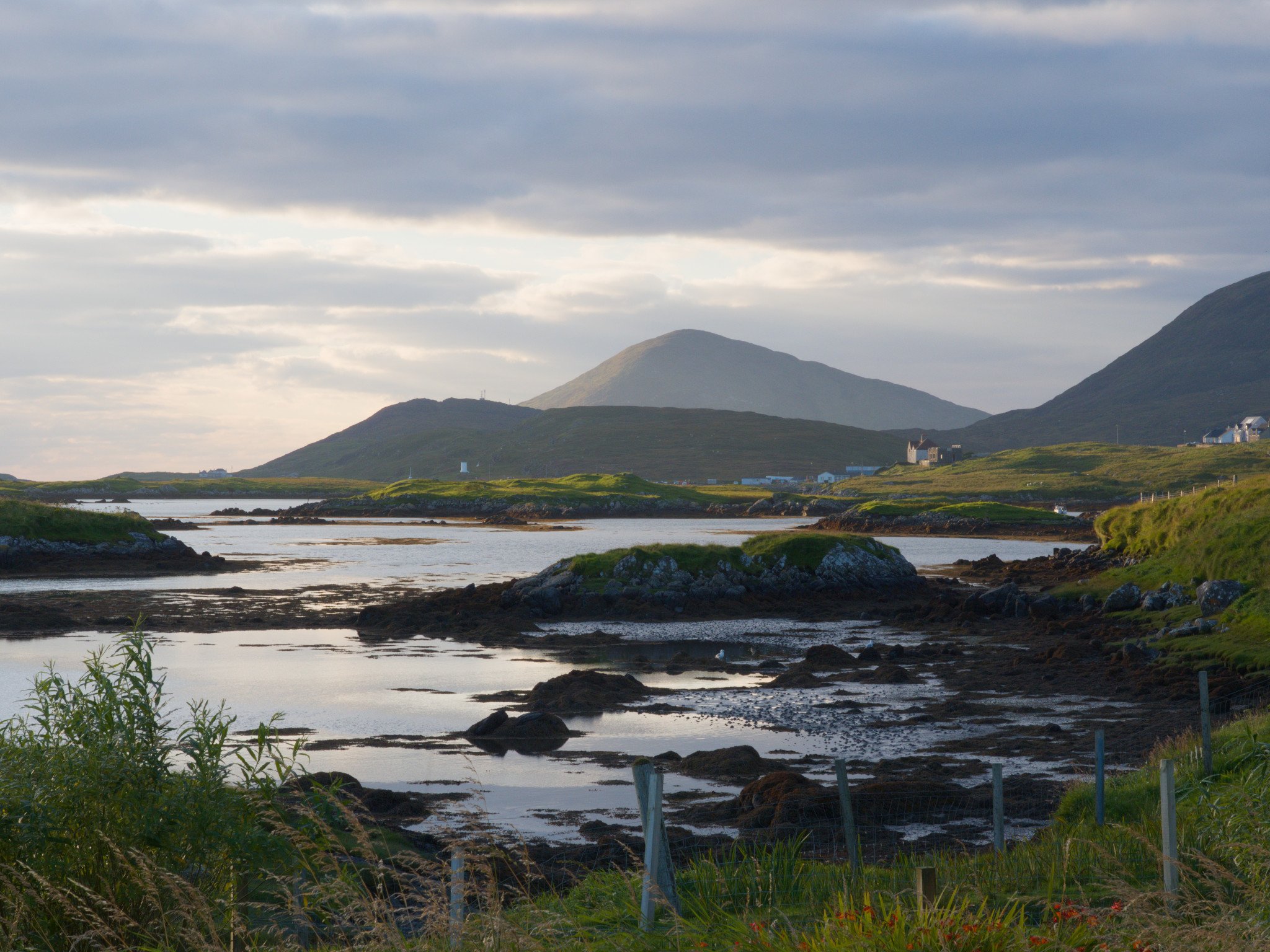
Just back from trip to Harris, Lewis and Uist in the Outer Hebrides
My first effort from the trip
I added some blue to the highlights as it seemed a bit too orange in the sky but now I’m not sure… find it hard to figure out whether stuff looks weird after staring at the image for ages. Also, maybe the highlights need a boost, at least on the ground.
I did a quick edit. Very different to yours because I never saw the original scene. Looks a nice location.
I also looked at your camera settings. In my opinion I would advice turning the ISO up to 400 ISO and using a quicker shutter speed to reduce the risk of subject blur with the grass in the foreground. 400 ISO image quality I would imagine to be as good as lower ISO on your camera.
I have added the xmp file for anyone interested P1082742.RW2.xmp (9.3 KB)
Thanks the suggestions. Yes, I normally just slap it on aperture priority and forget about the shutter speed…. I did a more contrasty version, though not as much as this. I struggle with knowing which way to go. Need to think more before I start fiddling with sliders.
Photography is not about capturing reality but rather interpreting reality. As a photographer you need to close your eyes and remember the emotions you felt seeing the scene. Then move those sliders to share your interpretation of the scene. For me looking at your scene, I thought it was late afternoon with low light and that is why I hit the contrast harder than you. I also set white balance to daylight so that I captured the colours the same way colour slide film would have. If i want to draw attention to the white buildings I would have masked that area and brightened it a little to draw the eye into that part of the picture. But for me the foreground water was the draw card.
It’s notable that both your version and @josemar127 ‘s are bluer, which I think was closer to the scene as I remember it. So I think my white balance was off.
I created a drawn (path) mask in a second color balance rgb instance, so when I added some mid-tones (and just a tad of shadow) perceptual brilliance grading, it also brightened it up a bit. Originally I had a second mask on the foreground greenery, but it made it a little too bright so I deleted it.
I thought I might need to put an additional exposure instance after color balance rgb (and use a raster mask) to raise it, but it was bright enough without it. I did mask out the sky and add just a (very) little low-frequency contrast equalizer to slightly emphasize the clouds.
Thank you for sharing.
My first try in GIMP. My aims: I wished to keep the grass and flowers in the foreground to give depth to the image, but the fence posts were a distraction so they had to go! To create a more panoramic aspect I cropped the less interesting part of the sky.
I feel that it needs more detail in the darker parts of the photograph.
Thanks. I didn’t mind the fence posts to add a bit of human mess but thought about cropping out the grey clouded sky. I used a mask to increase the exposure of the mid ground shore front. The building in the distance seemed the obvious focal point for me, but it’s a bit small and disappears into the landscape.