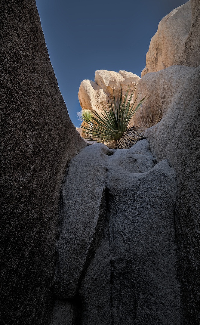
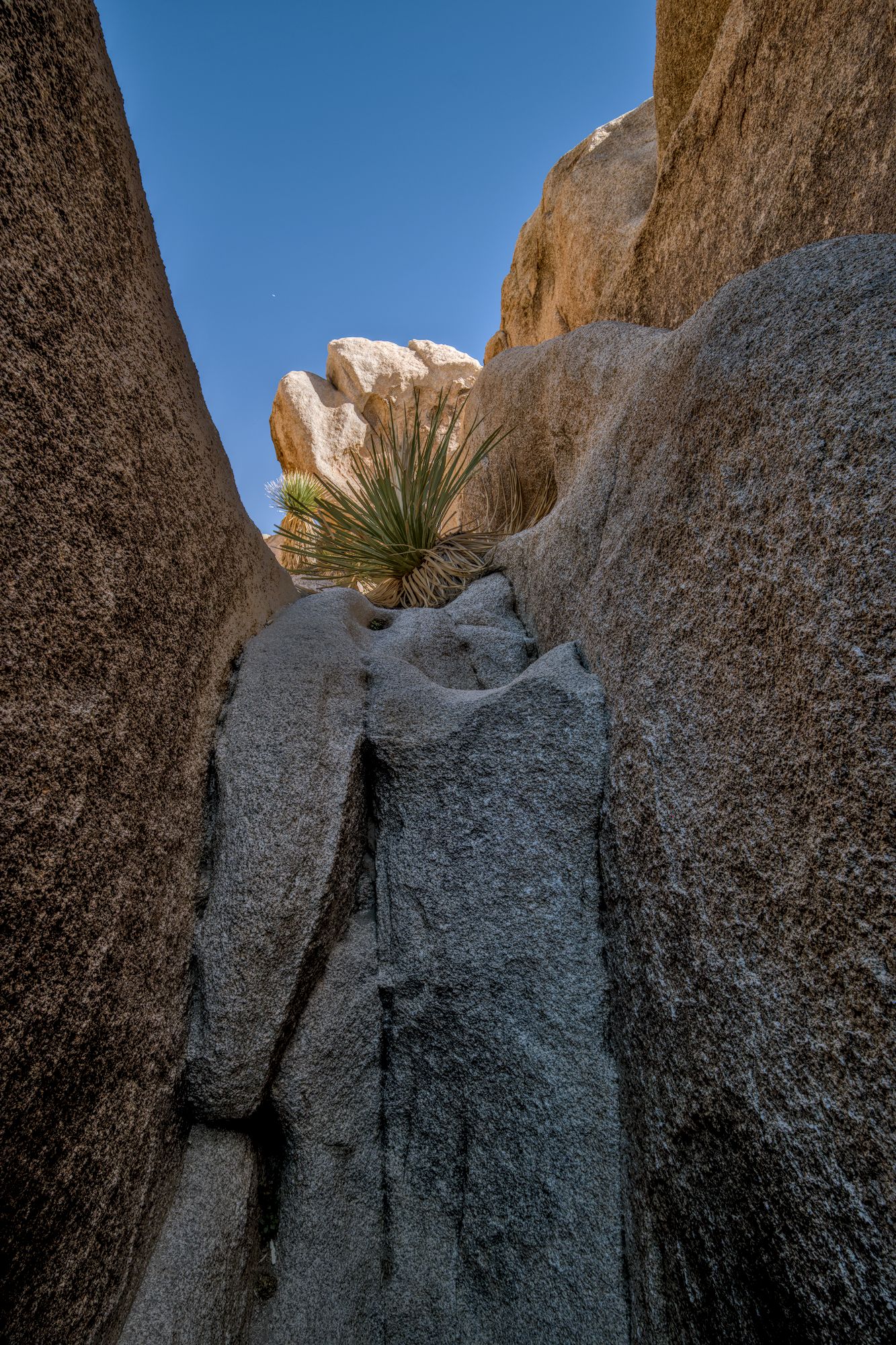
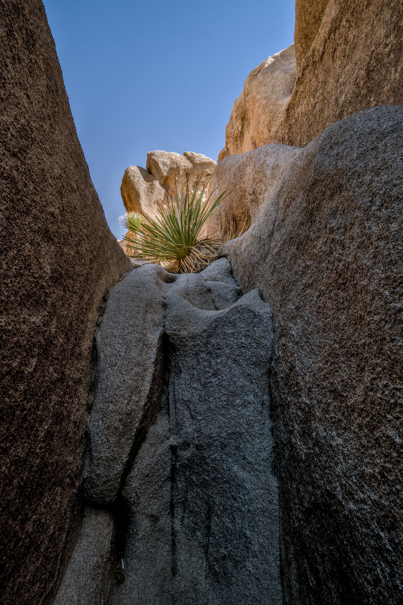
To follow up on my first thread below, I’d like to offer my first entry into the play raw category. Would be curious to see what others come up with. I threw a kitchen sink worth of modules at it and made ample use of masks, but I have a feeling this could be somewhat simplified.
On a related note, output sharpening for the jpg required some detours. Apparently, the style that can be applied in the export module (and that could accomplish the sharpening) gets applied before the downsizing. Then I was happy to find a Lua script to this end, but then G’mic can’t handle spaces in file names/paths, so that was out as well. Ended up making a bash script that I can run over a folder of exported jpgs that does the G’mic RL sharpening.
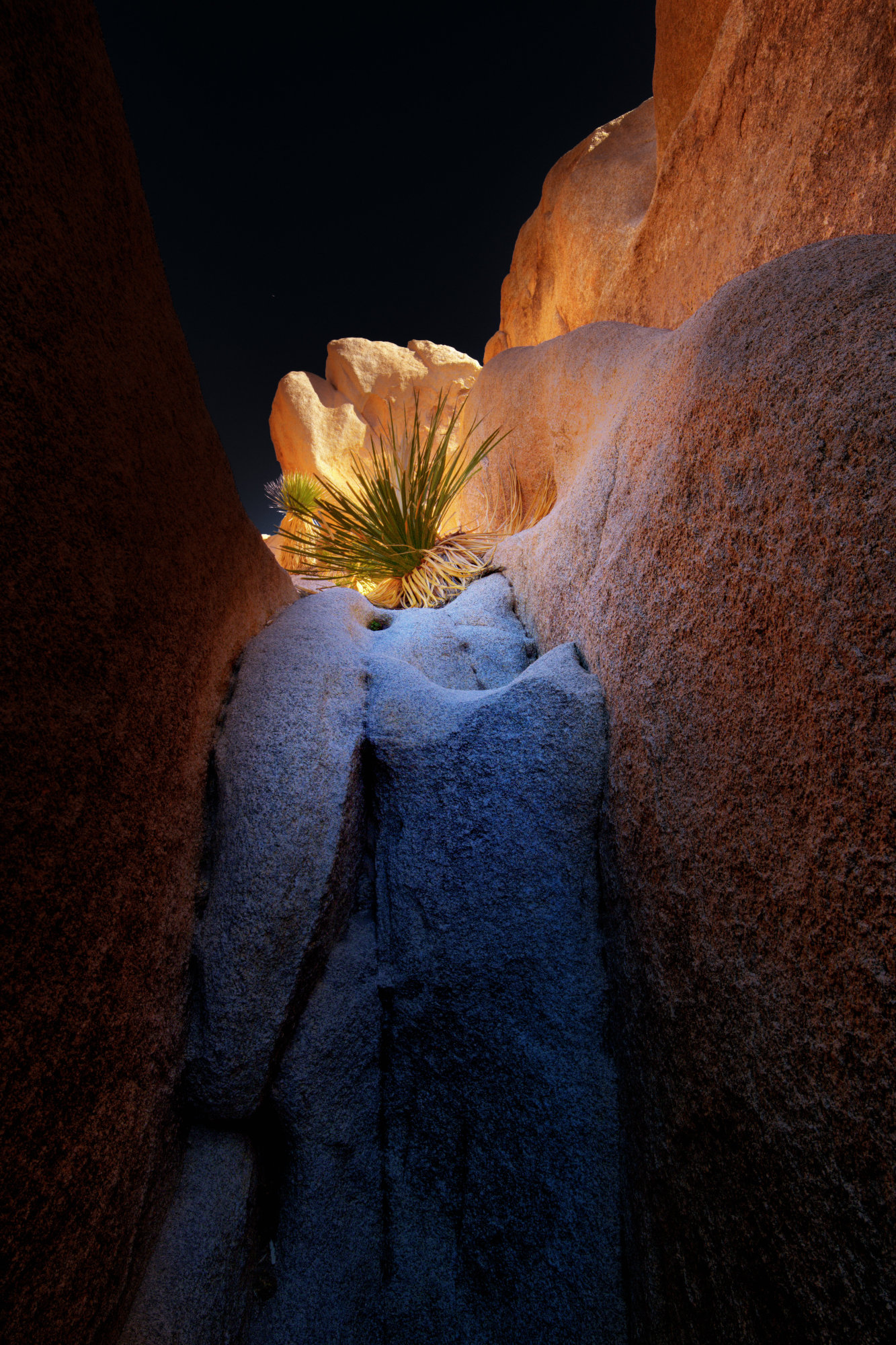
What I threw at it: denoise / lens correction / exposure / tone equalizer / crop / 2x color calibration (overall bit warmer tone + shadows more reddish) / 3x diff.o.sharp. (sharpening+loc.contr.) / color lookup table (enhance green) / col.bal.rgb (overall improvement) / framing
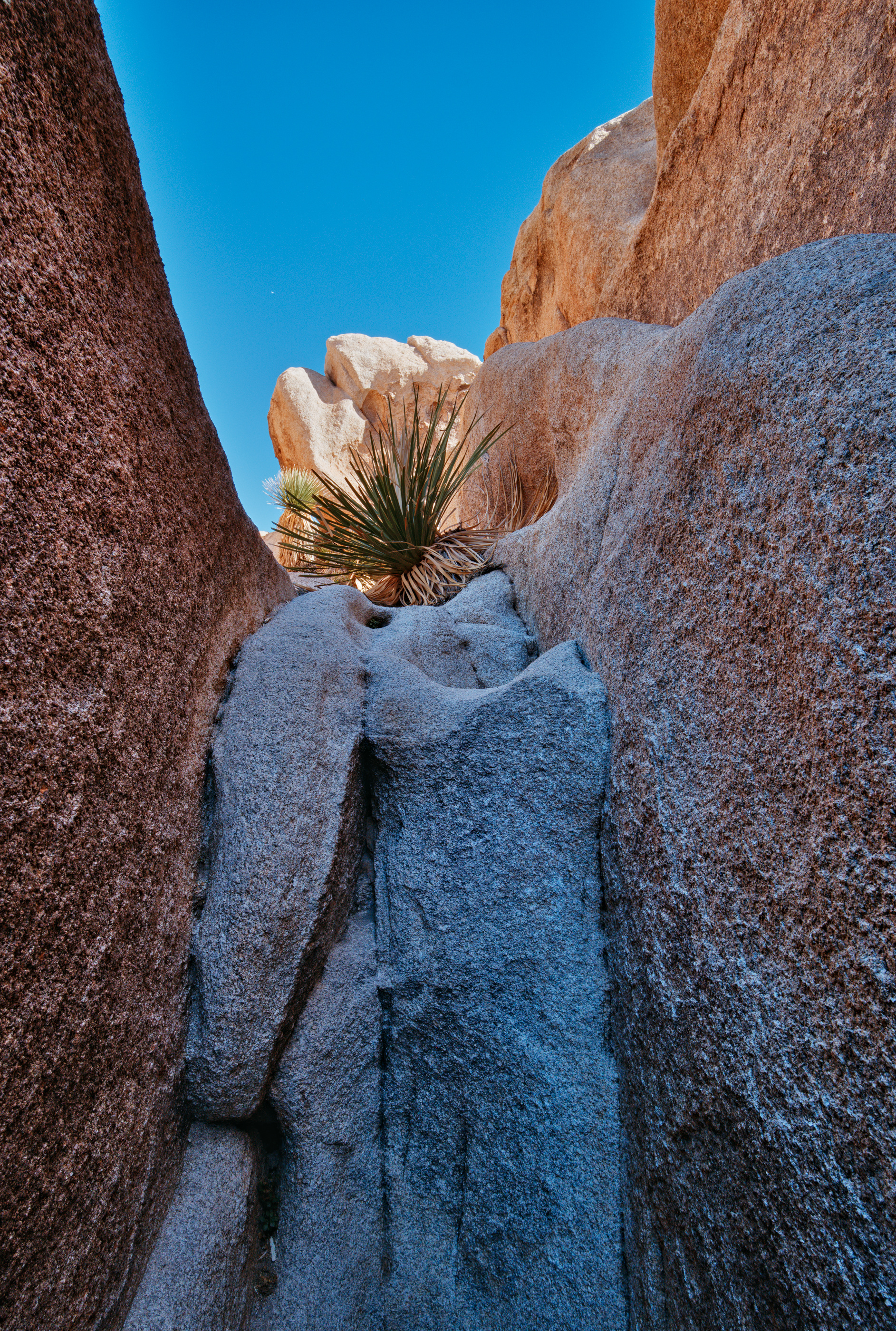
What a wide dynamic range for the light. I did a few tricks and one last one was using a preset in local contrast for HDR tone mapping. I liked what it did to the image. I would recommend others look at this preset which is included in the DT install. _T5A7025.RAF.xmp (12.1 KB)
There are some nice edits here. What I’m wondering, though, is “what is the subject” of the photo? I’m thinking it might be the desert spoon, but maybe you have a different idea - ?
My simple-minded sense as a beginner is to draw attention to the main subject and let the secondary subjects stand out without distracting from the main subject. Other stuff is a distraction.
Most of my own photos fail to establish main and secondary subjects, and no amount of editing can fix that. But now and then I think maybe I get a good image. Then it’s time to edit and make the vision clear.
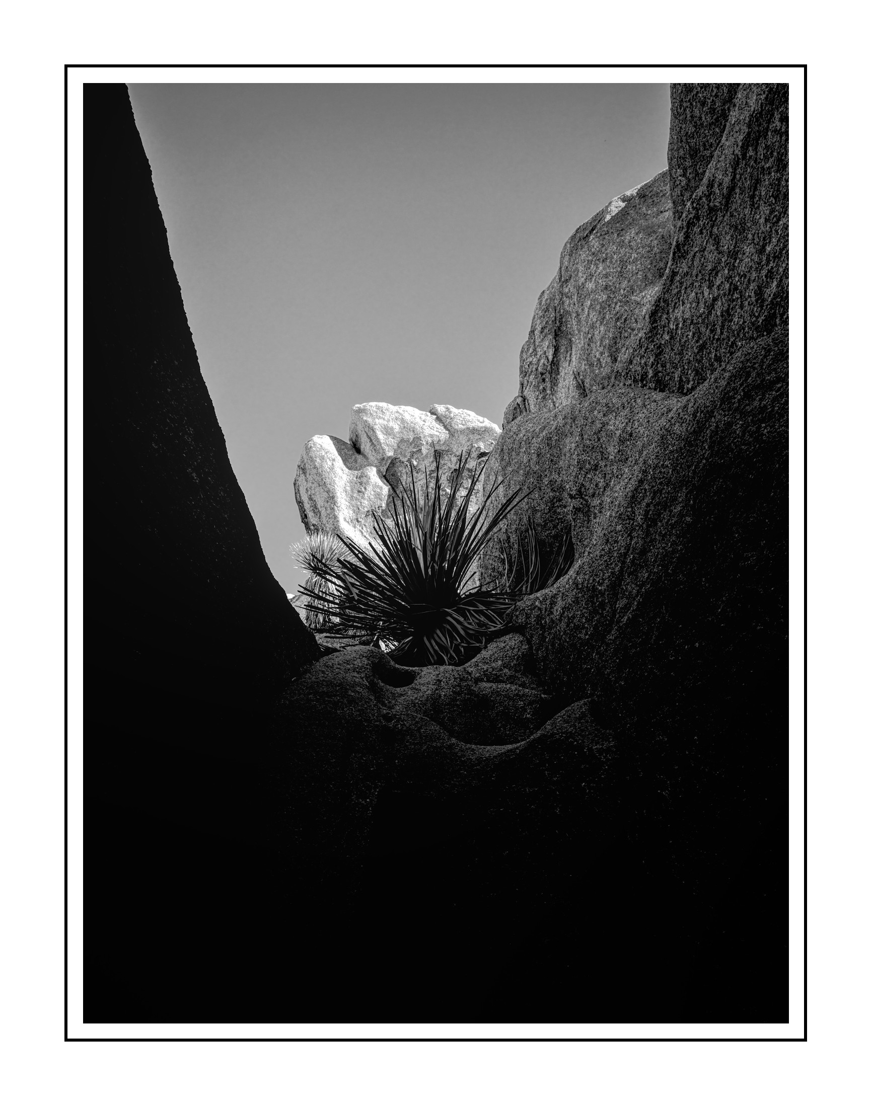
Some great edits and there’s much to be learned from the xmp’s!
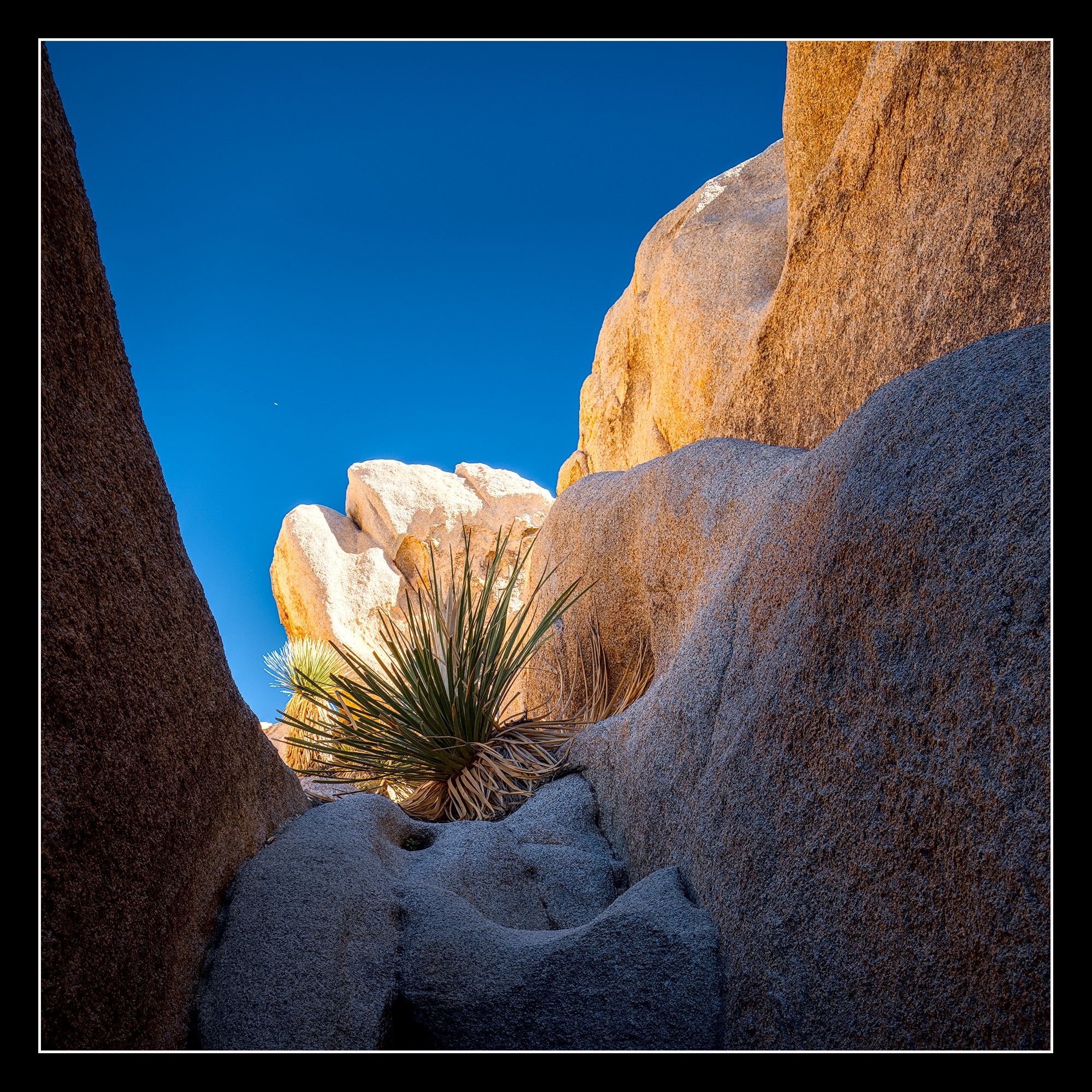
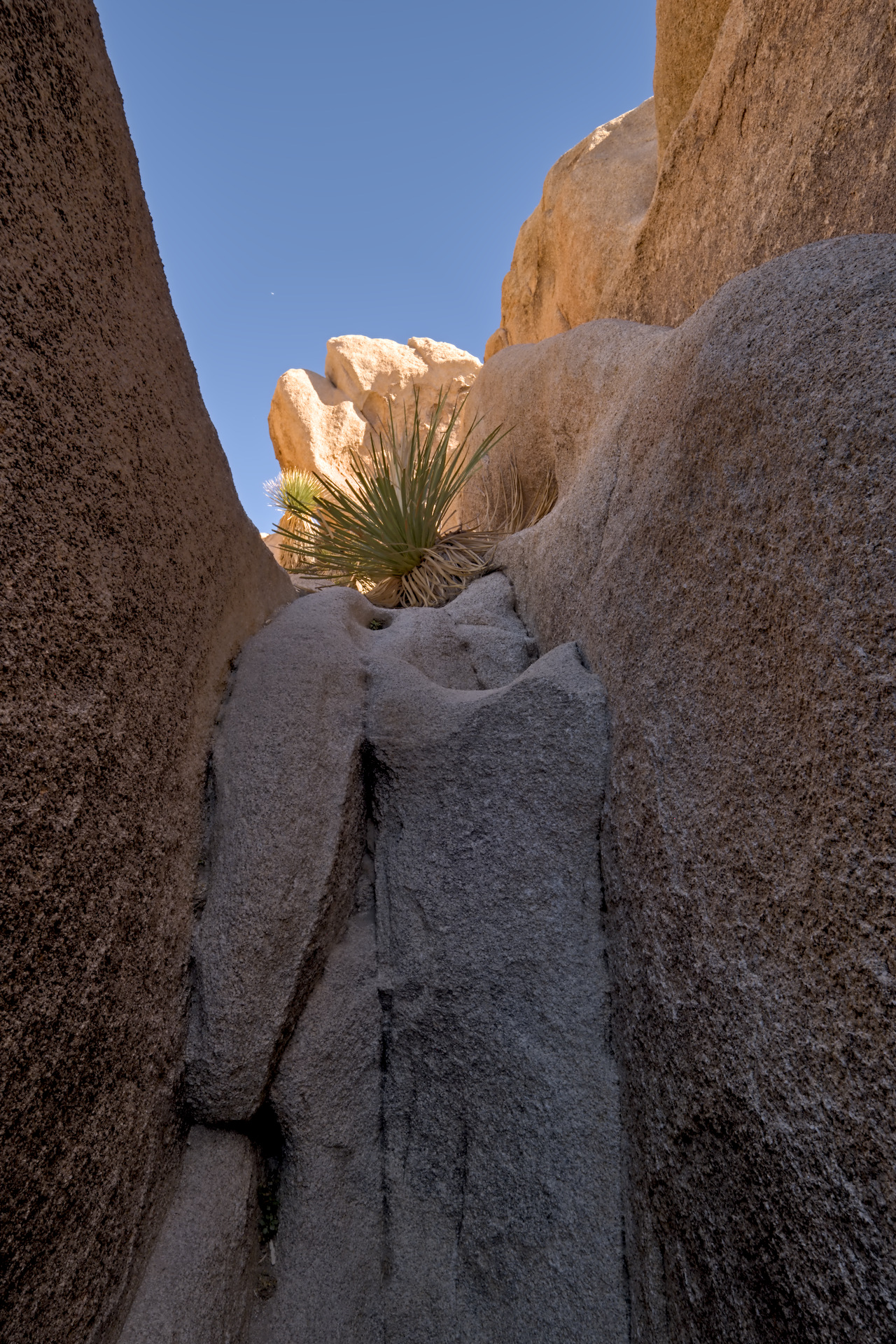
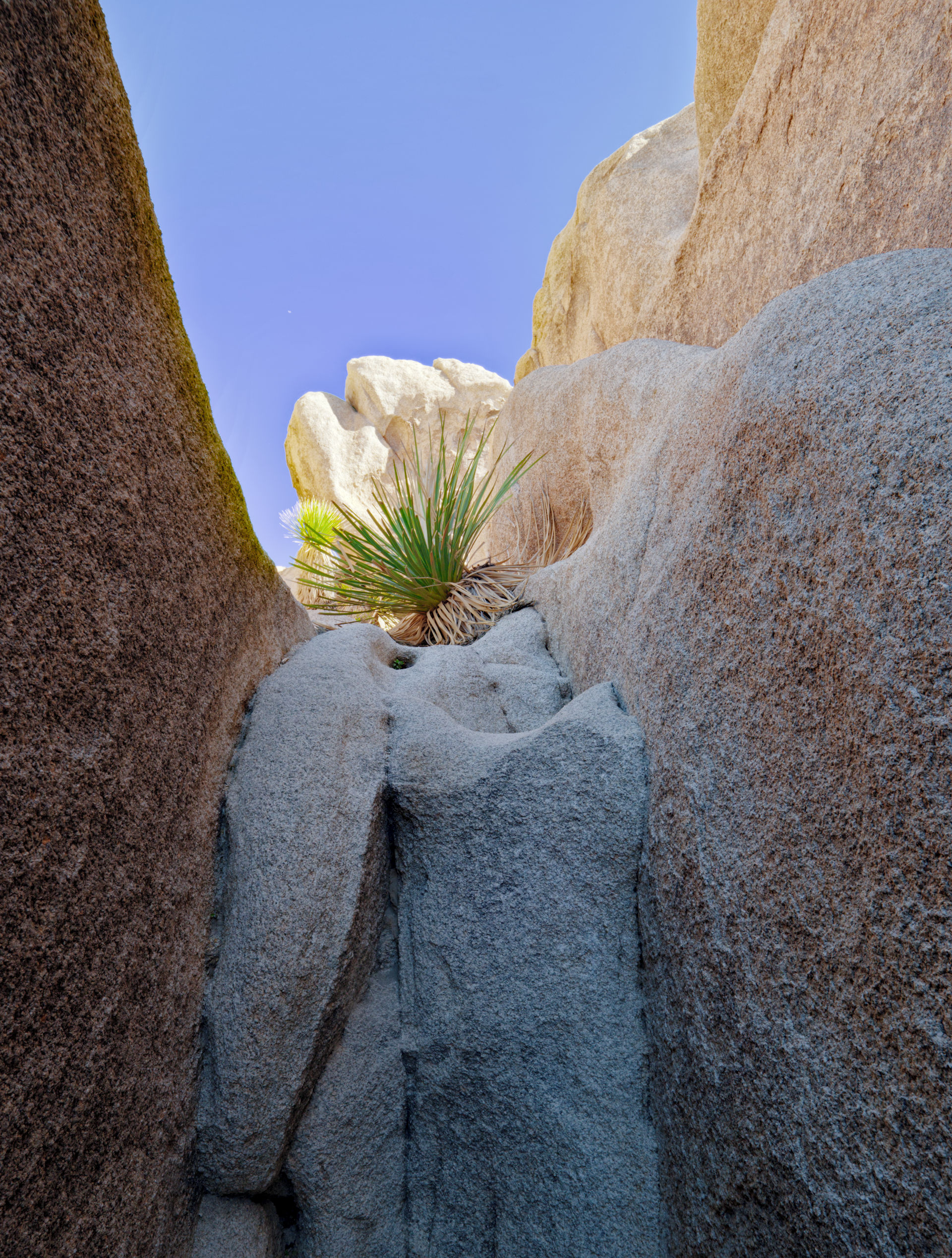
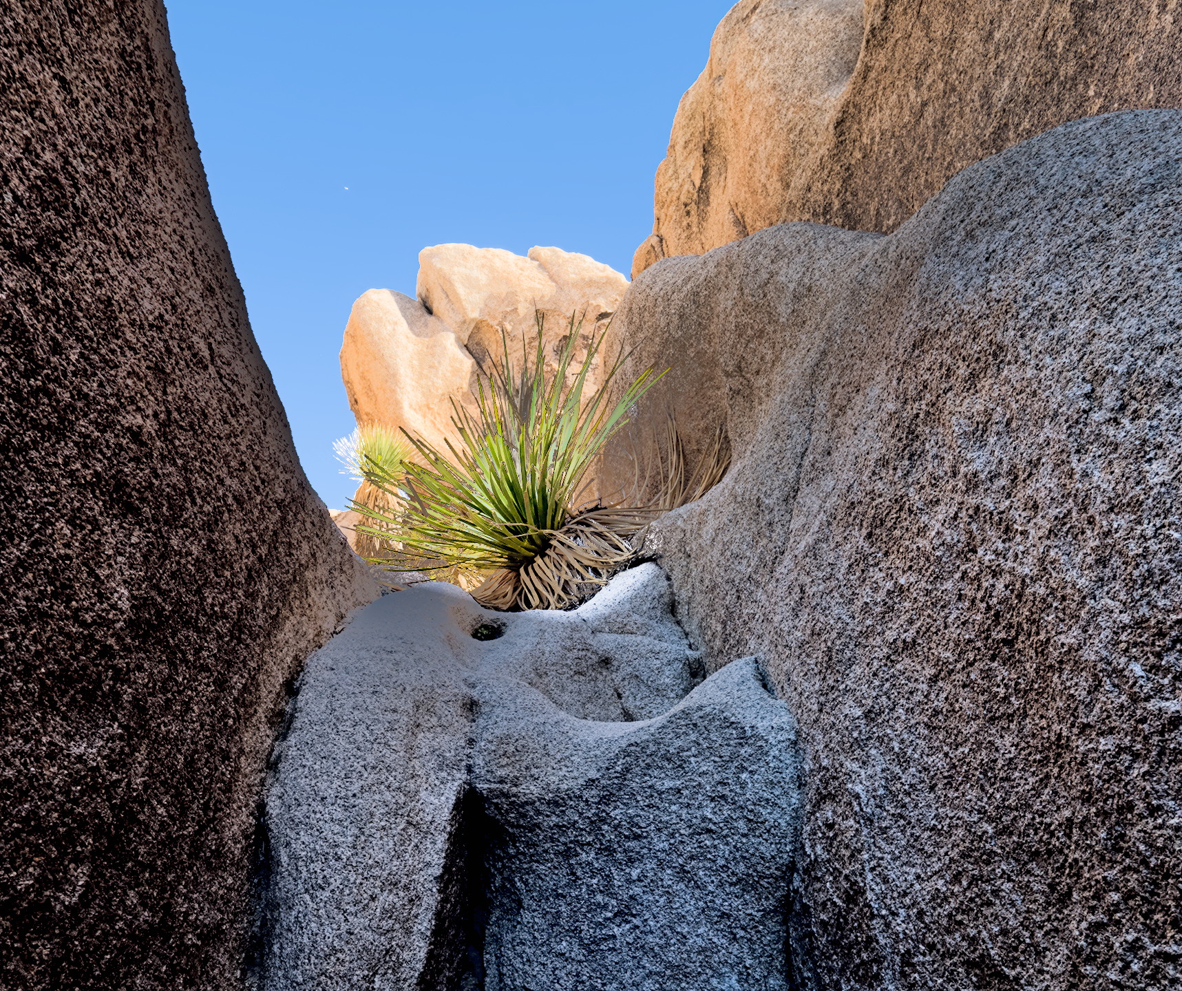
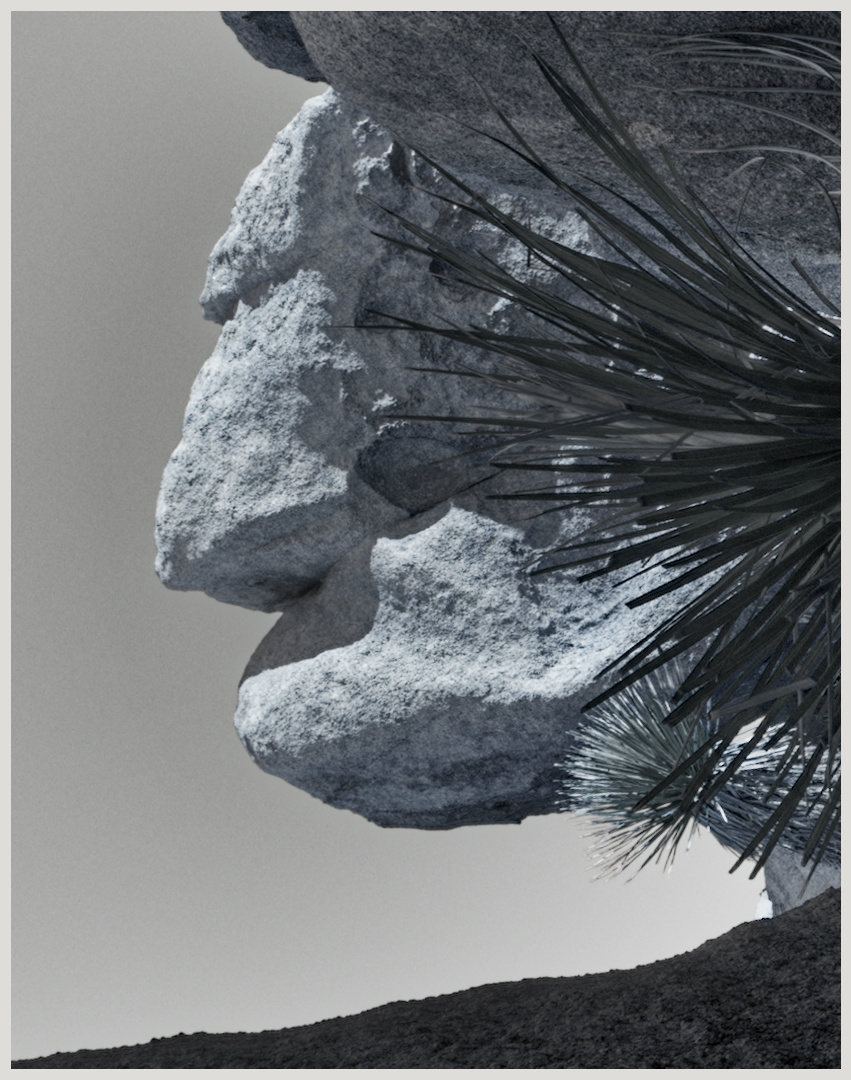
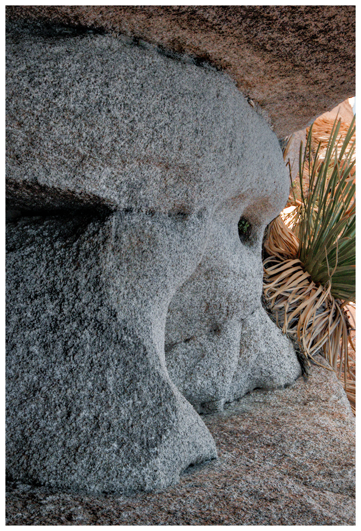
@ Doug-Phoenix: a very good point and pretty much what I was struggling with. All the lines are nicely leading towards the succulent, but then the very bright rocks in the mid-ground are stealing some of the attention. I was hoping to drastically brighten the plant, but that doesn’t seem to be in the cards without creating some ugly artifacts. In think, the B&W sidesteps that issue by placing the focus on the bright rocks (and silhouetting the plant) and in Uli’s version the square crop is also very effective in guiding attention equally to the plant and the rock.
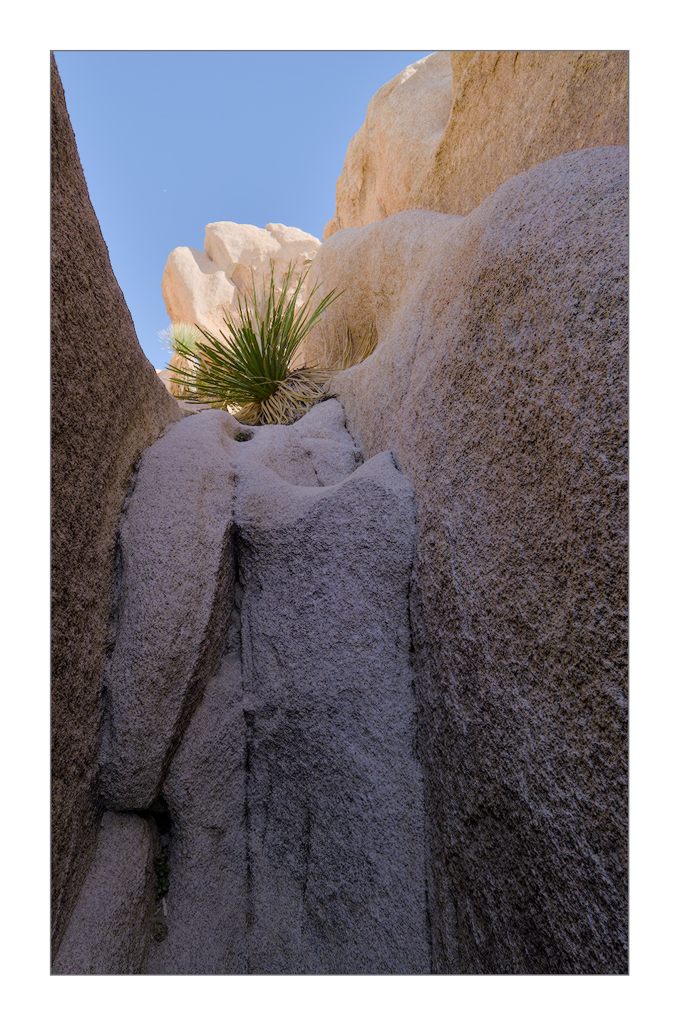
With the latter edit, I noticed that on my screen the inline jpg looks fine, but when I load the xmp, the bright rocks are quite blown out. Did something get lost in translation?
Also, I just realized, that in my exported jpg the output sharpening produced some halos…
I considered several things to be the subject/part of composition here.
Surely the plant living under such harsh circumstances. But I think the color opposition blue <> red to be the subject as well. As the light accentuating the beautiful shapes and texture of the rocks can be considered important to the subject. And one may also consider the X-shape lines to be part of the composition.
In this very nice picture these do not bite but enhance each other.