film scanning software silverfast scans negatives as so called HDR(i) RAW TIF files and i’m curious how you would process those files in darktable - what’s your input color profile setting?
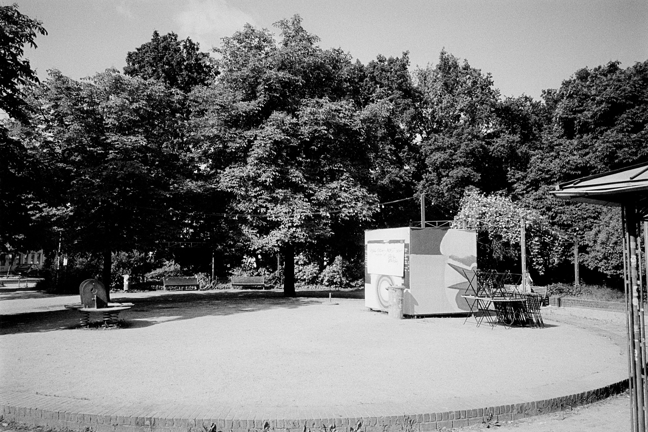
so, i have uploaded a 35mm negative scan which should be used for processing. this tif file even contains an embedded icc profile, which i have uploaded in addition. it’s a kodak tri-x black and white negative but scanned in colour. the scanner is color calibrated and by this i hope to have very good/accurate starting point for the post processing ~ ok, … actually later for color negatives … one process for all film scans!
Anyway: Thanks for sharing, working with negatives is always a joy. I’m sure there will be darktable users that will upload their edit (maybe I’ll have a go in darktable as well).
I did not use the provided profile, it did not work well (just about everything got blown out), but that might have to do with the approach I’ve taken doing this edit.
As far as I can tell RawTherapee doesn’t really have an out-of-the-box negative tool for B&W’s, it is colour negative based, so you need to be a bit creative.
I did started to apply noise reduction but decided to negate that. The grainy look might even be truer to a tri-x 400 film print.
a waste of some K-bits for black and white. but, i don’t need to think anymore about the scan process and settings. same settings for black and white as for color. … and scanning takes quite a while
@Thomas_Do you made me curious about your use of the color calibration module
your edit nearly equalized throughout the histogram the colors (except a bit in the shadows). couldn’t figure out what you have done here
in my edit i’ve set the color of the film base with the negdoctor module and not nearly got the same result. i’d thought, with an embedded icc profile i would get the same effect, … it’s a bw image …
some dt screenshots
at the end i have set the input color profile to linear rec 2020. with this i was closest to equalized colors. i also tried to set it to the extracted profile but the result wasn’t that good
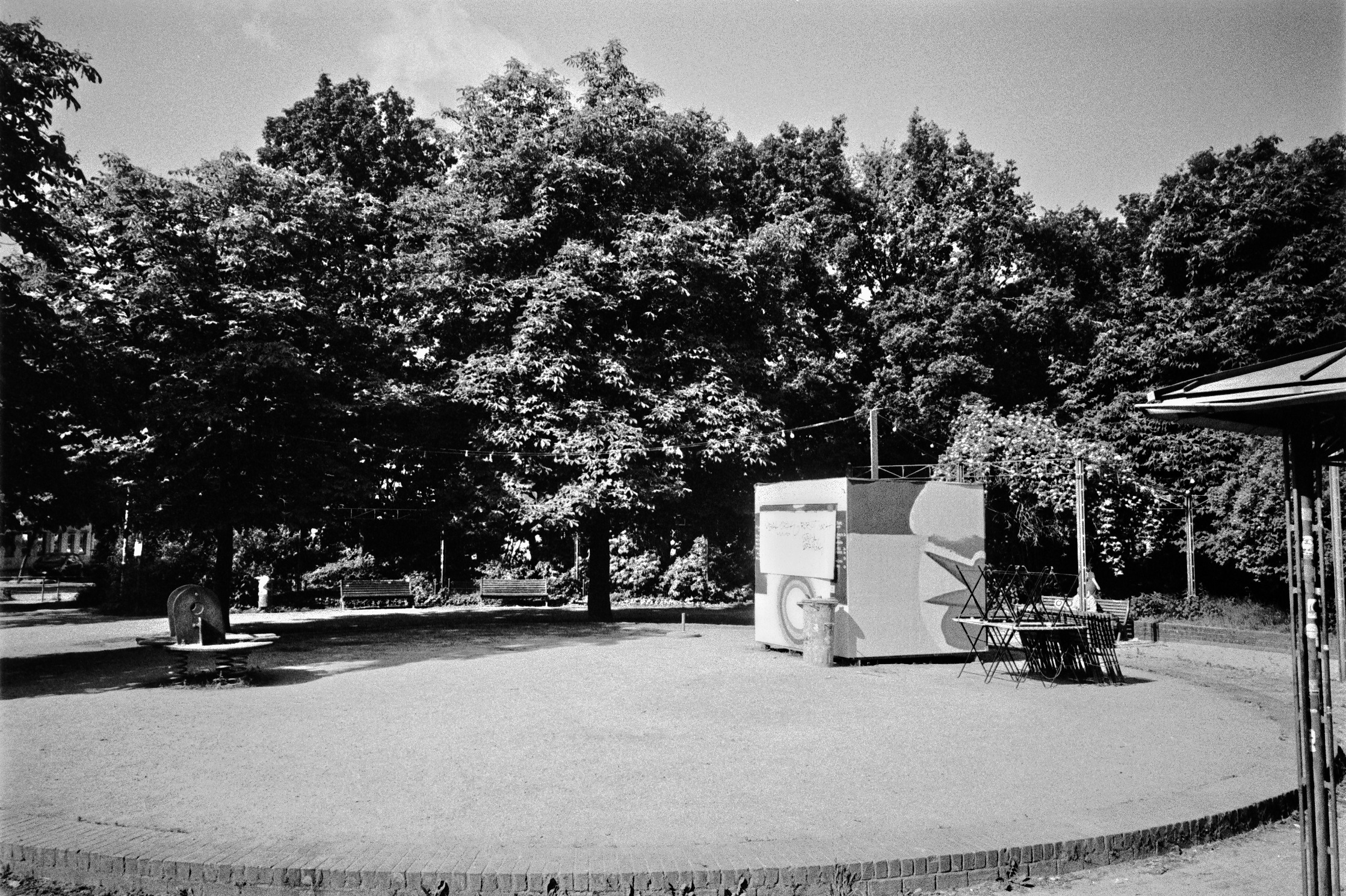
I initially had a go at using negadoctor, but that did not go as planned. So I improvised (well, used an old technique: flipping the curve and went from there). It is nice to be able to move modules in the pipeline…
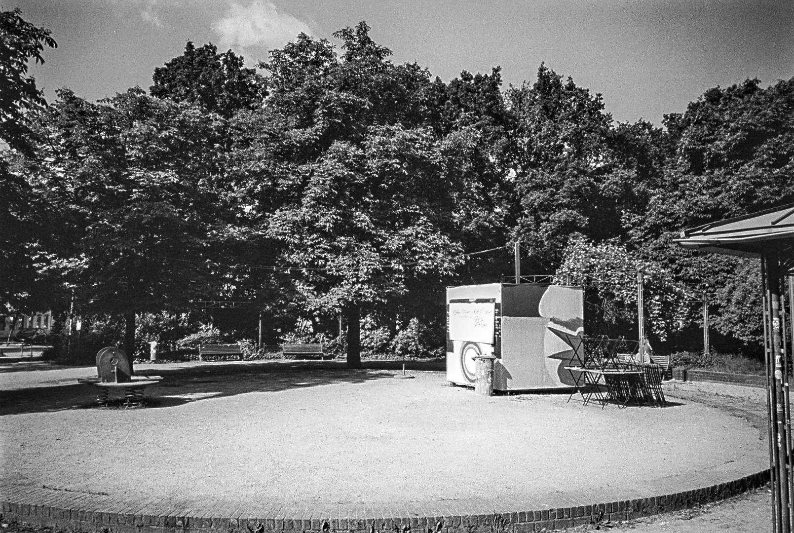
This one is grittier and a bit darker then my previous one. Not sure which one I like better, both have there good/bad points.
EDIT: Noticed that I slightly rotated the first one. Fixed that.
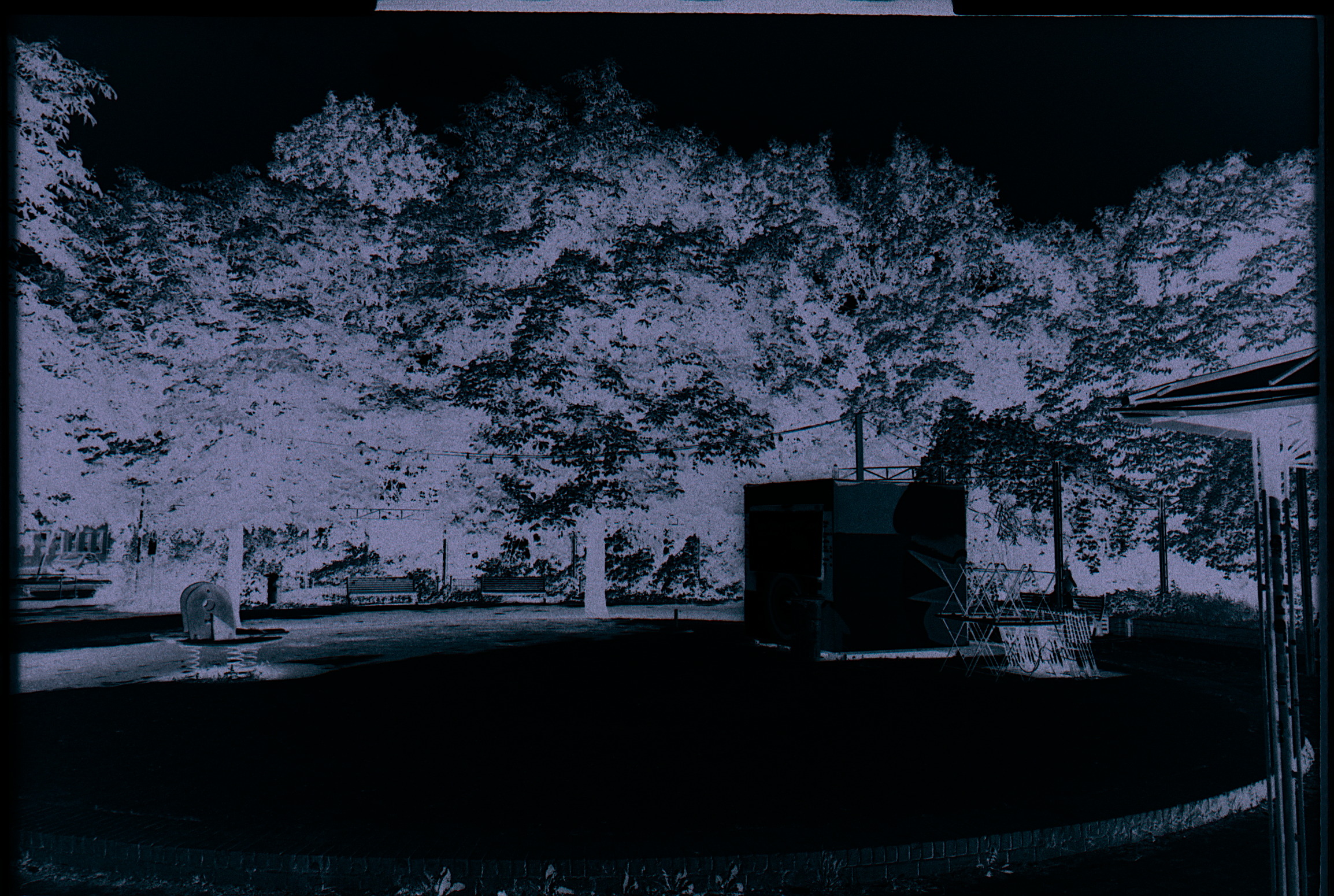
we can almost read the graffiti in this edit! impressive how much details are in. i like this one better, might be because of higher contrast. i also like the shadows more here. they are darker but have more details then in mine edits
i would bring together your kiosk and tree background together with the foreground from tomas_do
Getting the balance correct in this one is a challenge. Just about all my initial versions (RT and DT alike) ended up with a too dark a background and a almost blown out foreground without any details. This was also one of the problems I couldn’t fix when using negadoctor: Too much contrast that I could not correct later on.
I tried to get the detail back in the foreground and the graffiti in this latest version. Trying to make that lighter negated most of the details, hence this slightly darker version. I think I agree with you with this one being the better one.
Anyway: Thanks for uploading this one, had fun with it!

 … one process for all film scans!
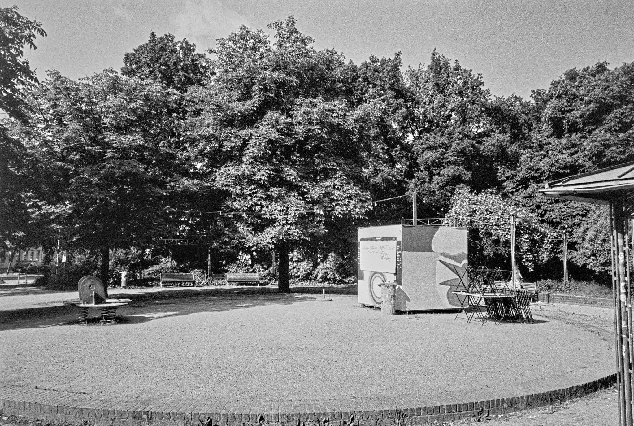


