LAB in RawTherapee--workflow, toning, combining with RGB edits...

EDIT: Sorry, maybe should have put this in the Processing forum! :crazy_face:

I have been curious to know how people are using LAB in RawTherapee for making contrast/ tonal, color adjustments, and how these are combined with other adjustments outside the LAB space. I must thank Andy Astbury for his excellent video on this, which finally pushed me toward expanded use of LAB several years ago.

Do you have a particular order in which you do LAB adjustments? Do you adjust color balance outside LAB–i.e, using an eyedropper tool? (I rarely use this, but adjust A and B channels until they look right. )

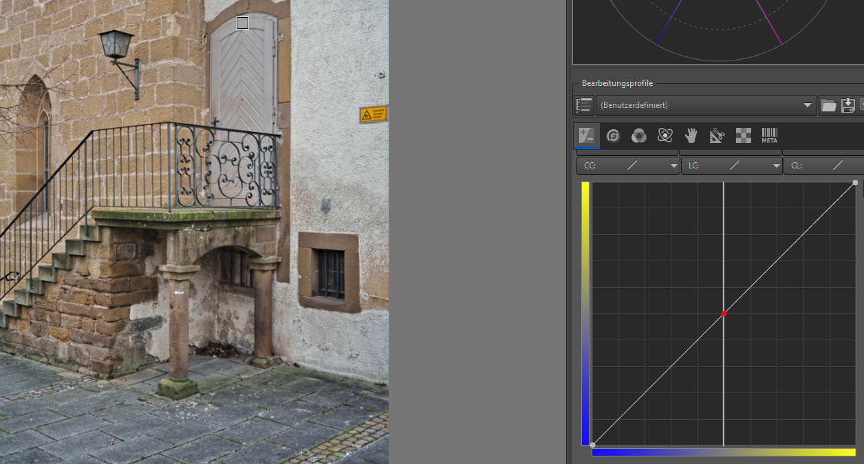
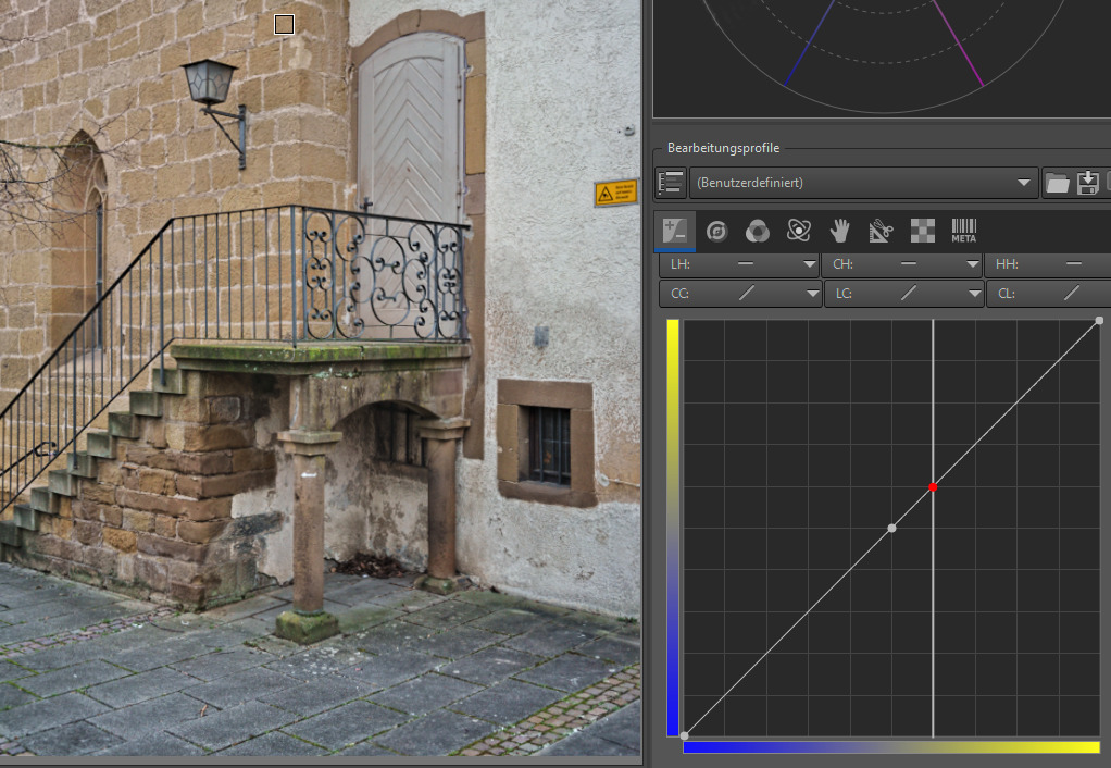
To start, I always load a pre-set processing profile (incl, dual demosaicing, global chrominance noise reduction, etc) as recommended by Andy.

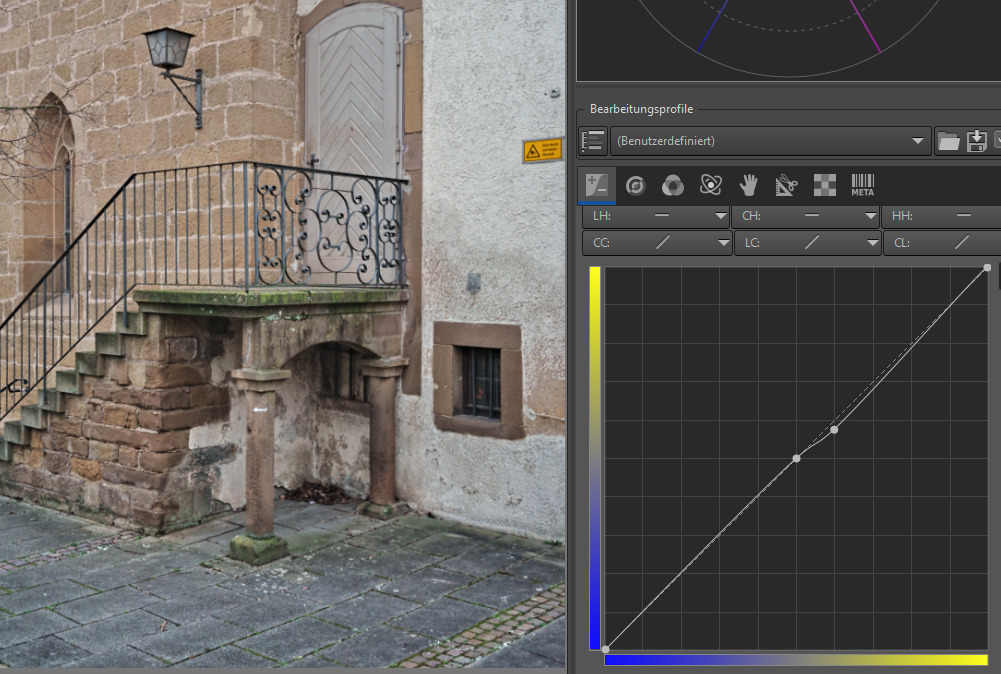
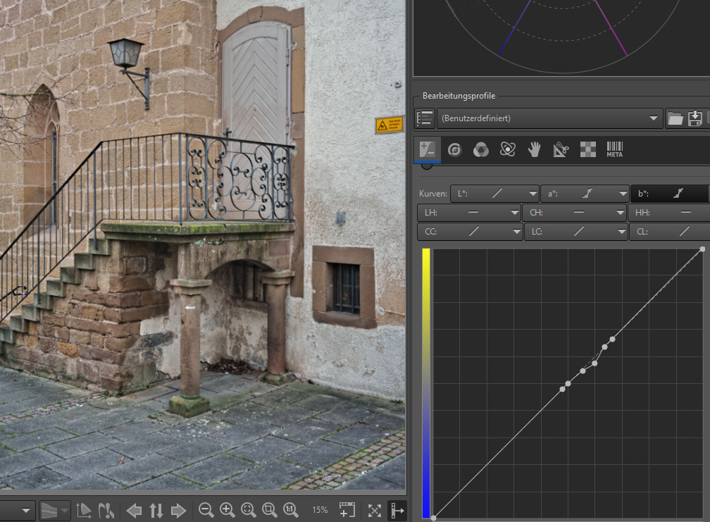
I often make some rough adjustments to contrast/tone in the L channel, and then sometimes go over to Local Contrast, then come back to L channel, sometimes followed by A, B, and often, CC or CH, and/or HH. I assume mixing RGB edits with LAB does not make any difference as long as there are no noticeable color shifts (?)

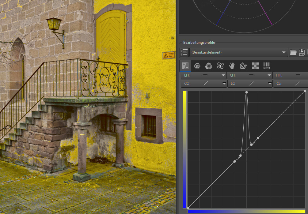
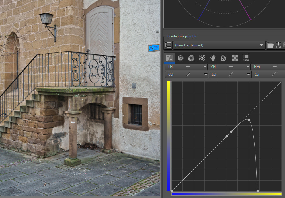
I have been playing around with split toning using the B channel–warm highlights and cold shadows. Do you do split toning in LAB? If so, how?

Any other LAB tricks and tips, I would be interested to hear! Thanks.

Ciao!

2 Likes

I don’t really treat LAB adjustments different from anything else. I often start with ‘auto exposure correction’ to get started, tweaking the result if it’s close, or undoing it and starting from scratch if not. The RGB lightness slider is my next stop, to get the general exposure dialed in a bit.

From there I often use LAB for contrast adjustments, and to tweak individual colors via the CH and LH equalizers. Usually I do curves in LAB too.

I do like the highlights and shadows sliders in RGB though, and will mix those in along with my LAB adjustments, particularly when the image has interest in those extremes (e.g., dappled sunlight in the woods).

For saturation I use the vibrance tool in the colour tab. For colour toning/split toning, I use either the tools on the colour tab, or in the local adjustments/selective editing tab.

Generally though, I have a rough schedule of things I do, but I will often bounce back and forth to get the right combination of effects from multiple tools. e.g., after setting LAB adjustments, moving on to colour toning, then readjusting the LAB to account for colours.

2 Likes

I am a DT user and I notice that some modules are LAB and some are RGB and their order seems insignificant. I can only presume the same is in RT.

I just came accross this post so I guess I’ll just resurrect it. Hope you’re still interested. :slight_smile:

While I love Andy’s tutorials and I’ve learned a lot from them, I found the L*ab one misleading. He’s talking about highlights and shadows in the a and b curves and it seems you misunderstood that, too. There are no hilghlights or shadows mapped in those. It’s all about green/magenta and blue/yellow chromaticity. So here’s how the a and b curves work and how I use them. I will use the b curve as an example.

First, you set a point at exactly 50/50. This is where chromaticity is 0 for both, blue and yellow. In this image I’ve set the white balance so that the door is neutral.

Now, just to show the effect, I’ve lifted only the middle spot. What happens is, that the most neutral parts turn yellow. Would I drop the point, the neutral parts of the image would turn blue.

Now, as the X and Y axis indidicate, the left and lower part of the graph area refer to increasing blue chromaticity while the right and upper part refer to yellow chromaticity. So if you set a point far to the right, you target saturated yellow parts of the image. To show this, I’ve just set a point and pulled it all the way down (remember: raise = introduce yellow; drop = introduce blue). What happens is, that only the sign turns blue.

So, in a nutshell:

  • If you want to avoid a total color shift, ALWAYS set a point at 50/50
  • left side of this point targets blue (green) color with increasing chromaticity
  • right side of this point targets yellow (magenta) color with increasing chromaticity
  • raising a point adds yellow (magenta)
  • lowering a point adds blue (green)

So, here’s how put this to use:
In difficult/mixed lighting situations you might get yellow or blue color casts in some areas. You can pick those areas of, say, yellow, and lower the point to add blue (–> cancelling out the yellow). I tend to do this on skin areas that went too yellow. Basically it works like a white balance on steroids, as Andy might call it. :smiley:

To show you on the example image, let’s say we find the brick wall too yellow and we want to fix this.

  1. Set a point at 50/50, so the neutral colors stay neutral.

  2. Pick a spot in the brickwork that seems too yellow to you.

  1. Lower your point to shift color towards blue

  1. Set some counter points to avoid color shifts in areas you don’t want it

That’s it. Sorry if I use wrong terminology at some points, I’m and ESL speaker and also not that deep into the color science technicalities. :slight_smile:

4 Likes