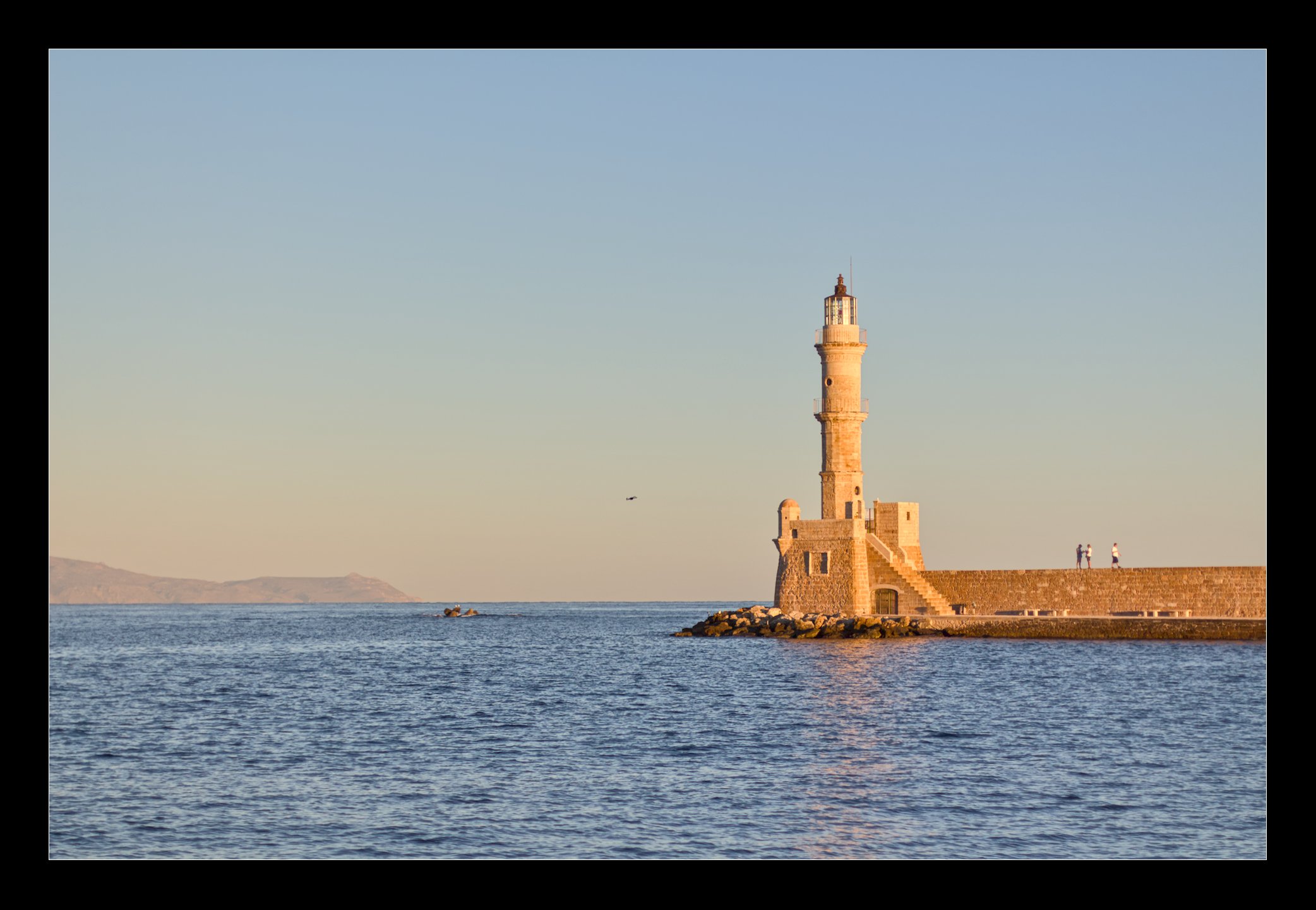
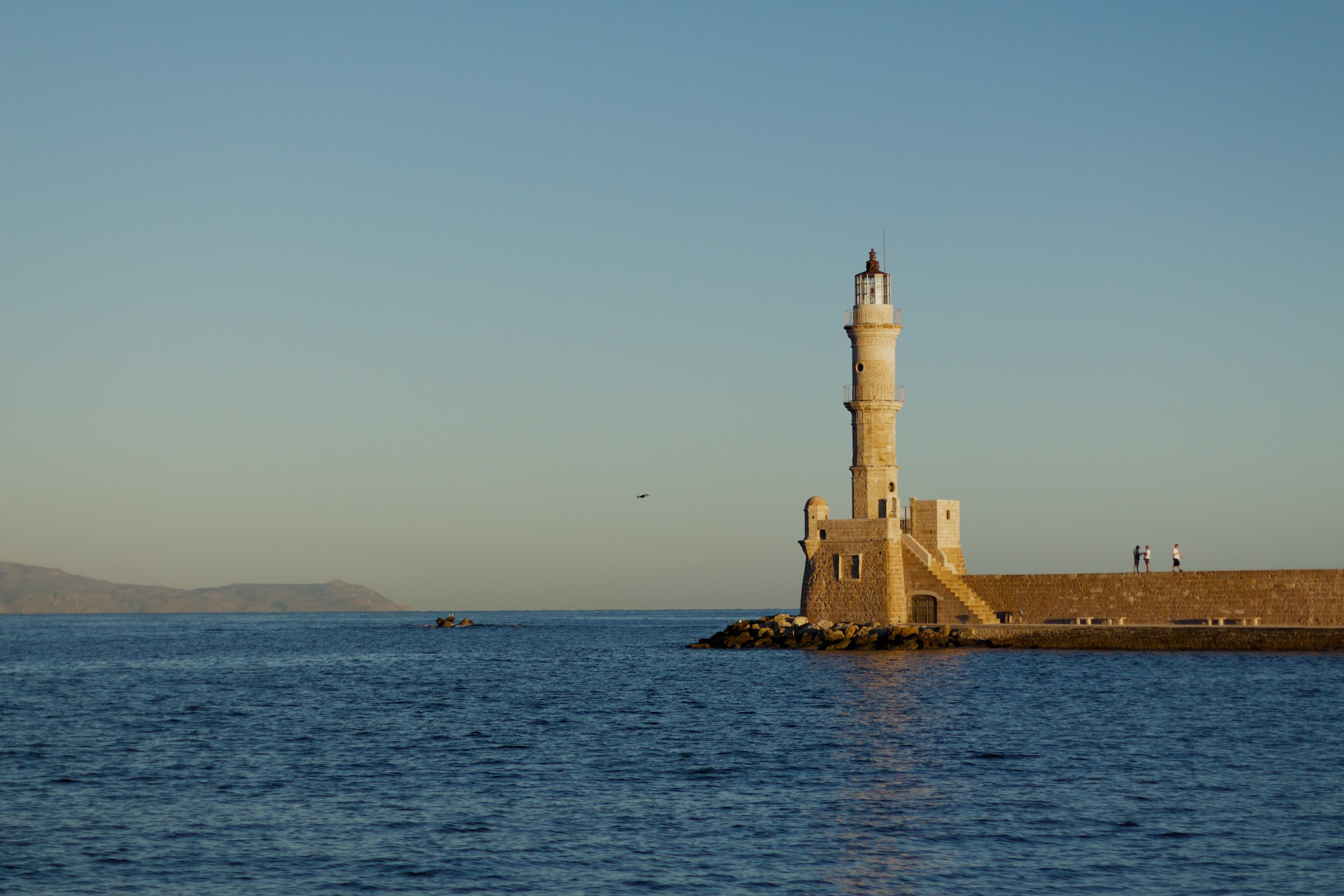
My second post on here, the first was a year and a half ago on how to get started. Well I did get started (after countless videos), but am nowhere near where I want to be. Looking for help from you amazing people here.
I manage to do the bare minimum edit, but would love to see you guys bring this to life and learn from you as well.
But I do like your edit! So maybe you describe to us what you think your edit lacks… and where you want to be… This is not an easy question but actually the thing a mind goes through - more or less conscious - when starting working on a picture.
Your edit has a soft filmy tone in it… a quality in itself!
Hey Jetze, thanks for the response and the compliment on the tone.
To be honest, that filmic look is actually what I’m struggling with as I find myself defaulting to it across almost all my edits, often without entirely intending to. My goal right now is to figure out how to consistently hit a true, neutral ‘base’ edit first.
I want to understand exactly which adjustments are introducing those specific tones, so I can choose to layer them on deliberately afterward, rather than having them just show up in the photograph.
Wow, I believe that to be nearly impossible… I never am sure weather my recollection of a scene is true. Thus I have nothing ‘true’ to compare my edits with.
I mostly do know what I want a picture to look like. And maybe that’s what you mean with ‘true’ or ‘neutral’. Which of the interpretations above do you think come closest to your goal? And why?
I will take a shot at your picture and let’s have fun!
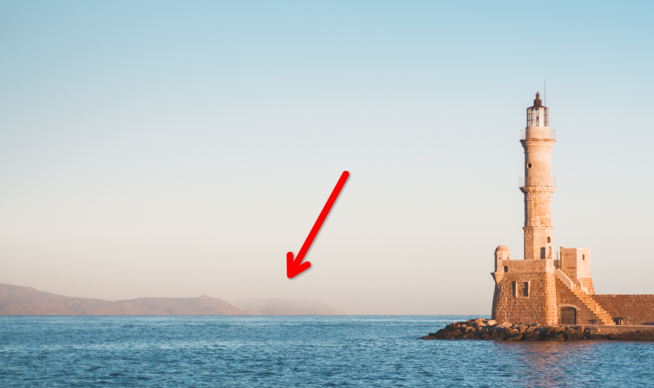
Was it by intend, that you cloned the rock in the background? If I look at your XMP I would guess, No. But if I were you, I would answer this question with yes. It simulates a nice upcoming fog in the background.
Switched on denoise (profiled) and lens correction
Leveled horizon (right click + drag over horizon, g for showing grid)
Switched of AgX (I usually do this, I’m a minority ‘case’ here )
Reduced highlights with tone equalizer as they mostly rise with contrast, local contrast or sharpening
Added local contrast for pop
Ditto contrast equalizer set to 50% not to overdo
Then tweak color balance rgb to my liking (in this case I raised both the shadows and the mid tones to get this ‘light’ holiday feeling that would make me happy being there)
Add a frame
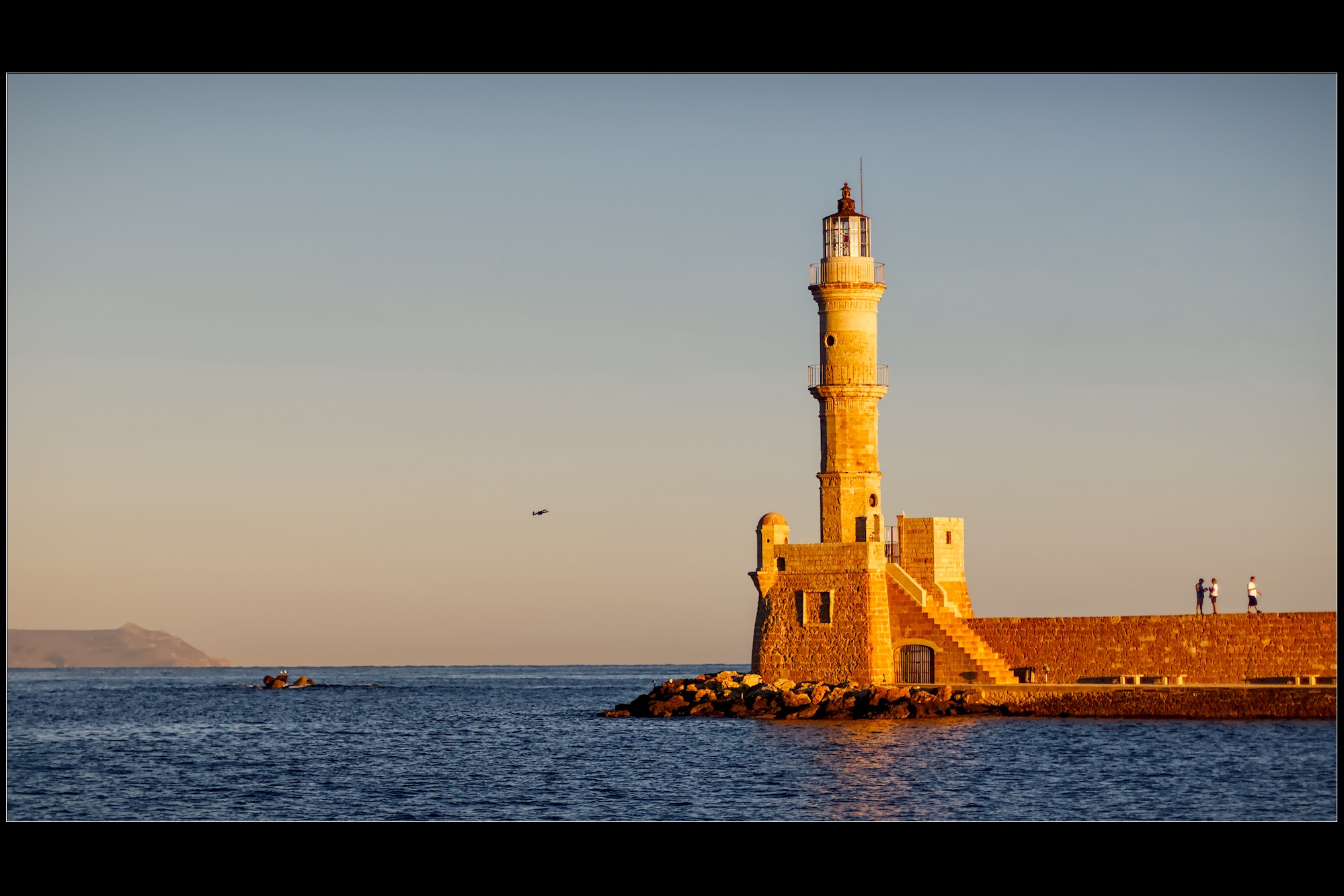
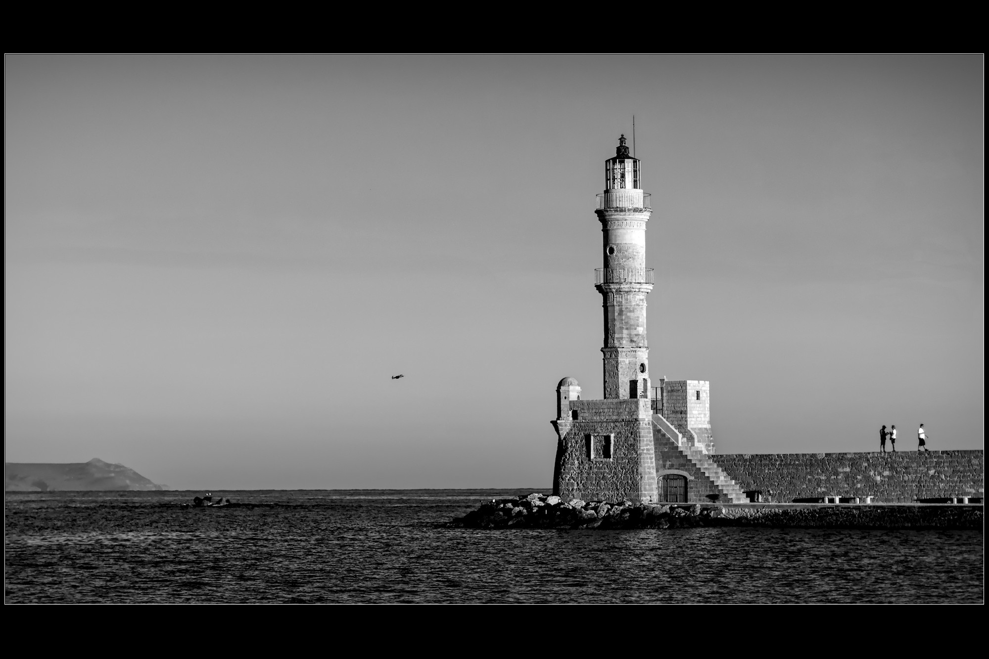
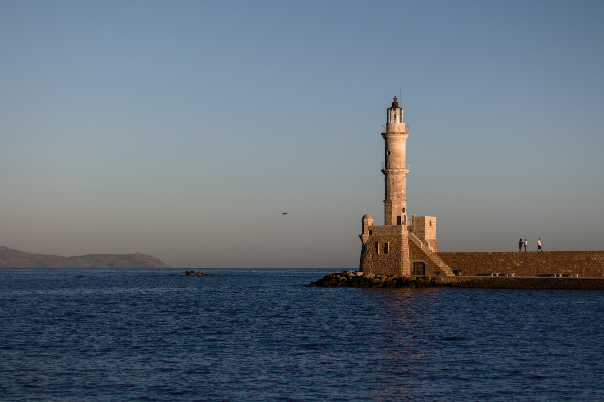
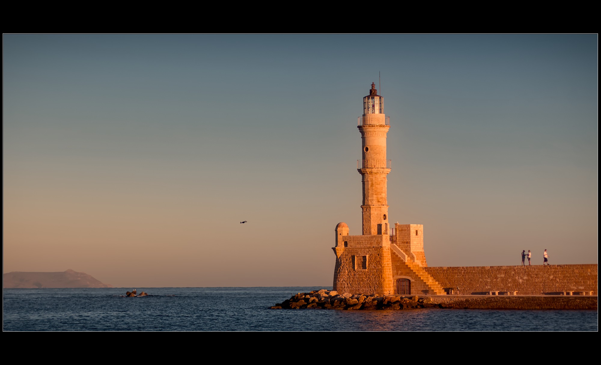
That’s my starting point, see picture below. There is no magic and it’s mostly close to what you did. Most steps have been pretty standard.
The sunlit highlights on the lighthouse are close to washing out but still having structure and ‘proper’ colors (in my eyes) so did not reacted on the overexposed colors using the letter ‘o’ key. The waveform too shows the reds there are a bit out of control.
That’s all I’d like to do here. Forgot to mention: using dt 5.6.0 maybe xmp is not compatible with previous versions.
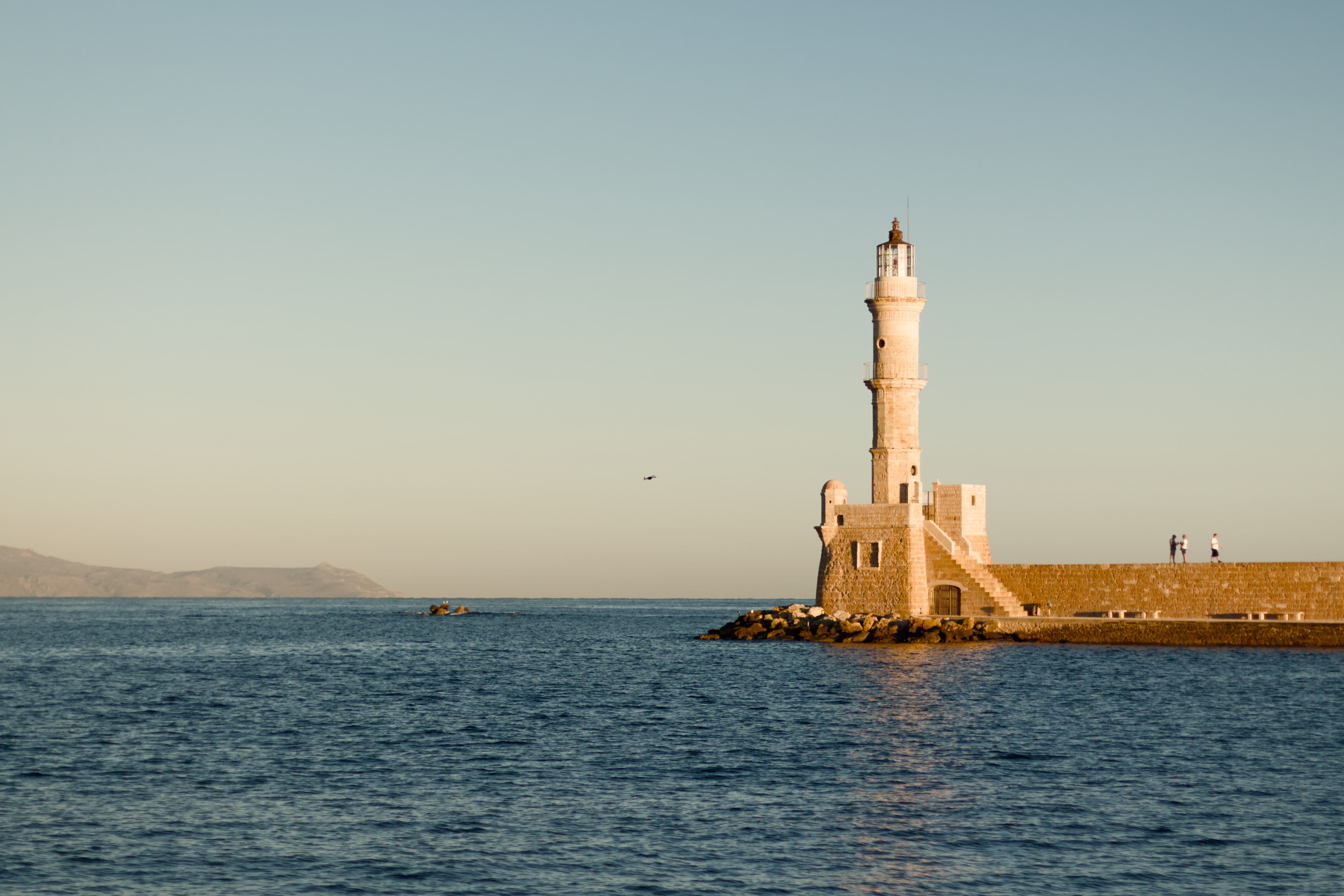
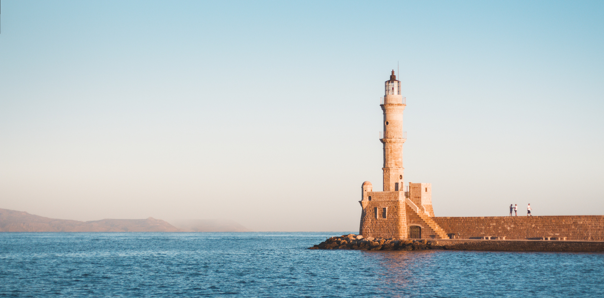

 )
)