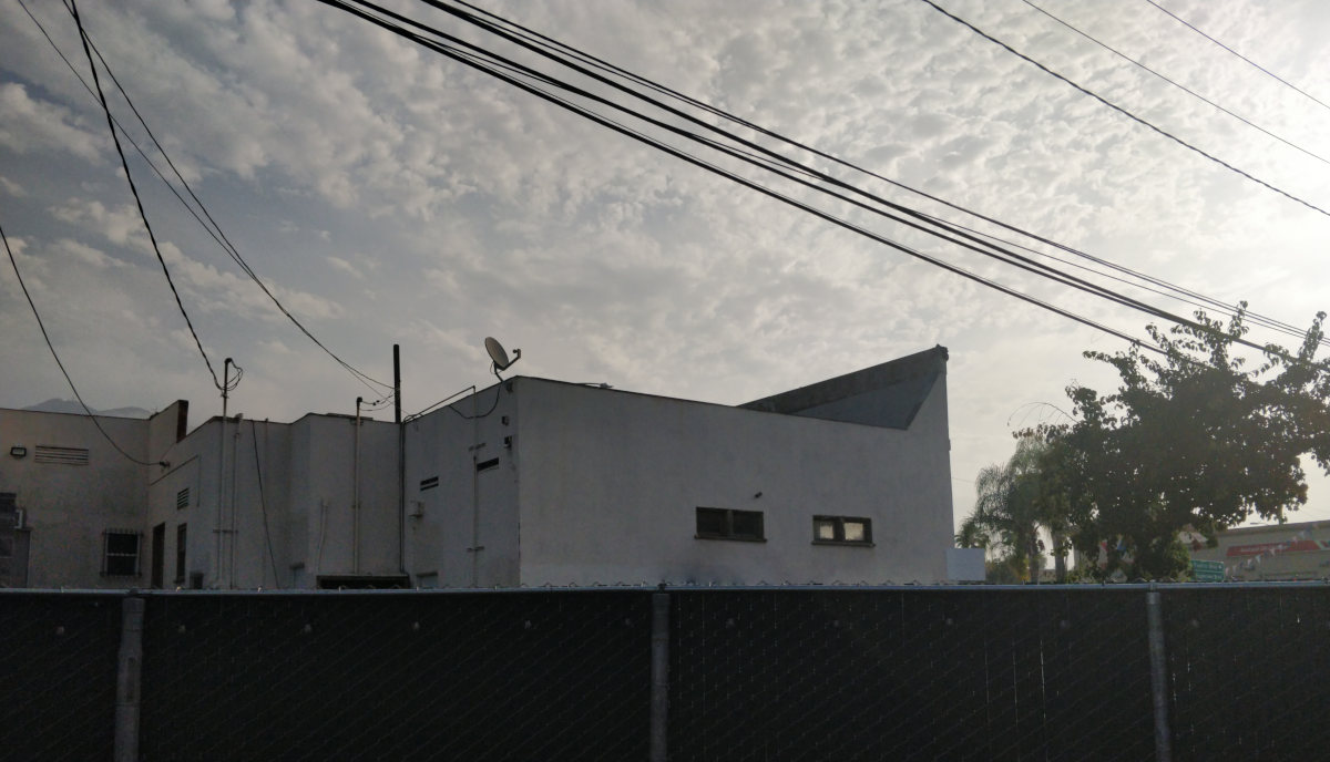
I’ve been looking at and admiring the very minimalist work of Sinziana Velicescu lately, as I have been trying to shoot some minimal architecture in and around Los Angeles. This has proven to be quite difficult, as Los Angeles is dense, many power lines, and a lot of cluttered visuals.
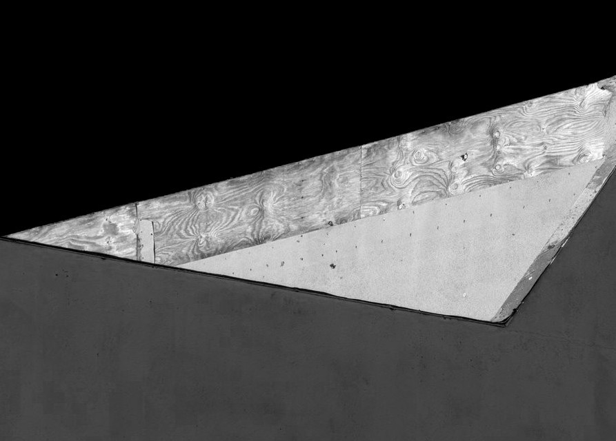
While sitting in my backyard I saw this, and grabbed the camera.
There’s one thing that kinda bothers me a little: The vertical blue stripe on the right. There’s not enough of it there to nicely balance the entirety and it seems to make that part of the image somewhat claustrophobic compared to the rest. Alternatively removing it altogether makes the shot way to “heavy”. Just my opinion.
Then again; Maybe you noticed the slight imbalance yourself but the scene did not allow this (cluttered visuals and all that).
BTW: Thanks for the Velicescu link. First impression is positive, but I do need to take my time and have a better look at those images.
This was the case. Just out of frame are the power lines (top) and a tree (right). I guess I could’ve gone wider and just cloned it out, but I’ve been trying to push harder to get it right in camera.
Feels like it maybe needs a little more sky to the right though. Or none. Personally I would crop out the sky to the right and the far edge and make it more about the shapes and textures, similar to @KristijanZic’s effort.
Apologies I know this isn’t a PlayRaw but a picture speaks a thousand words… something like this:
I didn’t want to say anything but that really bothered me a lot. Like infuriating if that’s the right word. But then I’ve realised that that’s precisely what makes this image good as it is. We ask ourselves: “Why the hell did he left that in?!”. It excites a strong emotion with that imbalance because something is not right. We’d like to take a knife and fix it. But then we’d loose that effect that excites uneasiness.
I’d be interested in seeing a series of images like this. That could be better balanced but if they were better balanced then the emotion would be lost. It might not be a good emotion but it’s still an incredible thing to achieve. It’s art. For example looking at my edit, I think I’ve lost that in favor of some “better” lines, form. I’ve ended up with a bland 2 dimensional image.
Because you still can’t dismiss this image as a shitty one even tho one might think “I could have taken this with my phone”. It has some form to it, some lines, perspective etc. But that small imbalance and that smashed thing at the top right corner of the building really creates something else. And since the subject is some devastated real estate in the first place maybe this is the right emotion and look to go for. Because it’s ugly as hell, but still when @mica looked at it he found a pleasing angle and focused our attention to something we’d be running away from in the real life.
It’s weird, it’s a photo of two walls and some wooden boards. But the more I look at it the more I find it interesting. If I saw this at the gallery I’d be thinking there must be a deeper meaning to it xD
I seem to be somewhat photography ignorant: All that discussion about geometries and sky is just secondary to me - my attention is fully on the patterns of the wood and can stay there for a long time. I also really like the color. Only gripe: It should have been one solid beam of wood. Oh right, this is about photography, sorry about the lack of relevant feedback. I like the picture
My intention was to give a bit of space to try and balance the side of the building, to the left of there the point of the triangle is formed.
What I don’t like about @elstoc’s edit is that you loose the sense of the diamond shape made by the illuminated part of the building.
This is interesting, I wasn’t trying for uneasiness, but I have been feeling that uneasiness personally lately.
If you take a look at the link from my first post, I think she does minimal architecture quite well. I find this type of photography to be very challenging. It’s easy to find forms that are too simple or boring. It’s easy to find things that would be awesome if it weren’t for the extremely messy and distracting background. I like the challenge of this kind of minimalism and returning to the basics of composition. You should give it a try!
Yeah, I took a look at it as soon as you wrote the original post. I like it quite a lot. It’s different to what I’m used to. I wonder how many cool shots I missed because I wasn’t looking at seemingly uninteresting subjects to check for any nuggets. I guess one should pay more attention to his surroundings while going trough life. Not just be in his thoughts or looking at the phone
In Chicago, Columbia College sponsors a museum of contemporary photography. Each year they have a 1 or 2 week exhibit put on by local high school students. One year a student submitted shots of construction debris in a lot.
I think that was the piece I spent the most time looking at. People live there and nobody cares enough to clean this mess up. Sometimes “simple” photojournalism is as powerful as fancy art.
I’ve recently been pondering why I photograph. I think a big reason is to share what / how I see with others. OP has shared their reality with us. Clearly, no one cares enough to provide OP with a nice view from their back yard.