Use the duplicates manager, then load the sidecar file to the duplicate.
3 Likes
Further to @paperdigits comments if you left click and hold on any duplicate thumbnail in the duplicate module it will update the display to that version until you let go so you can do some quick comparisons of several versions to a base image. Also you can make use of snapshots with the duplicates once you have them so that you can use a slider to split and scroll the preview…
2 Likes
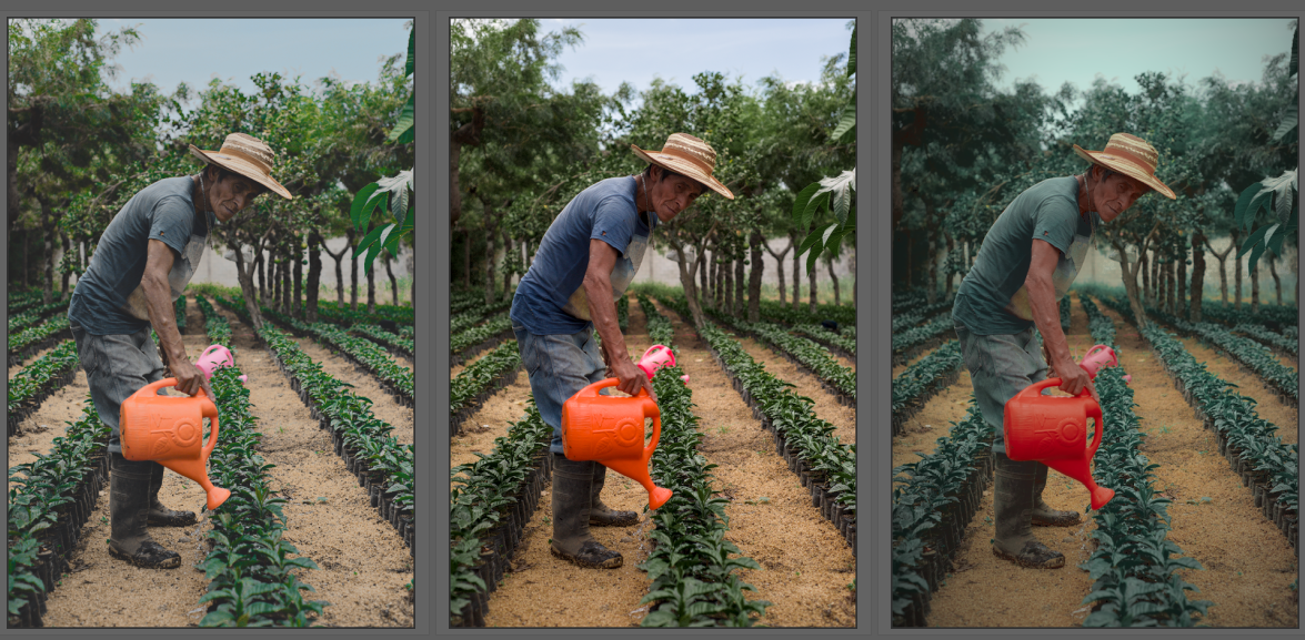
This is in darkroom view, while I was talking about lighttable view ![]()
2 Likes
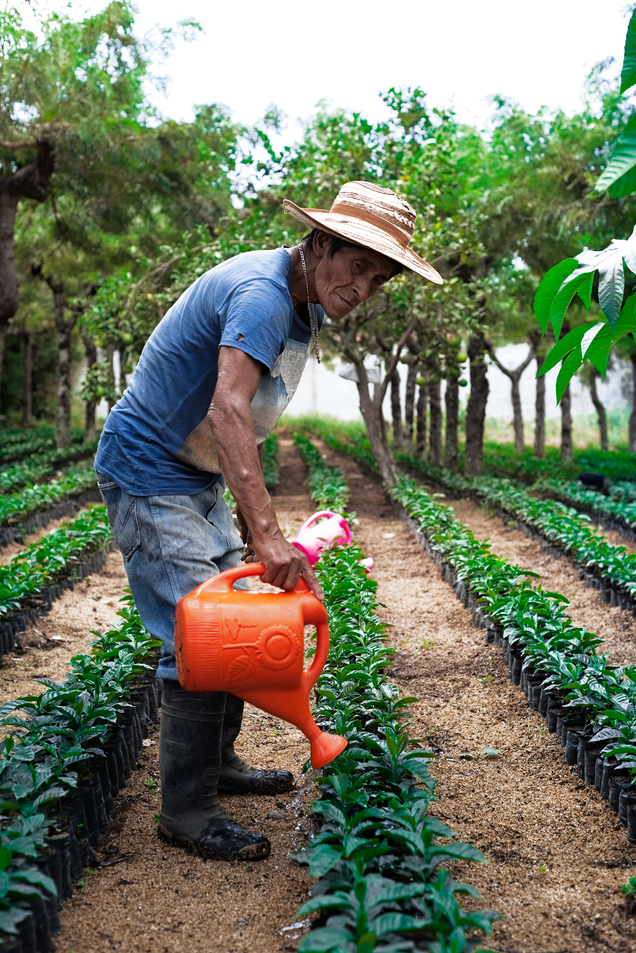
Here are my edits. The first one is a LR Mobile edit that was exported into a CLUT and then imported into DT with some further tweaks.
_UFP3580_02.NEF.xmp (9.2 KB)
The second one is a DT only edit.
_UFP3580.NEF.xmp (15.6 KB)
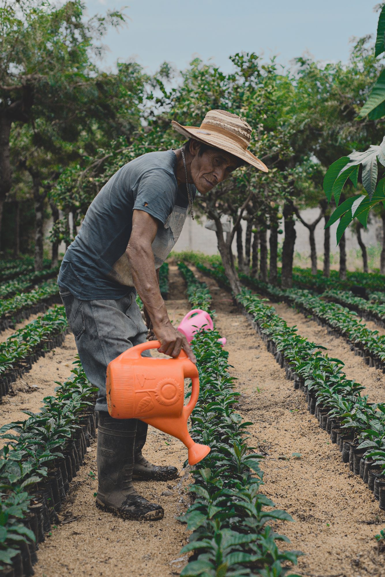
And these are the two next to Tim’s version (middle).
3 Likes
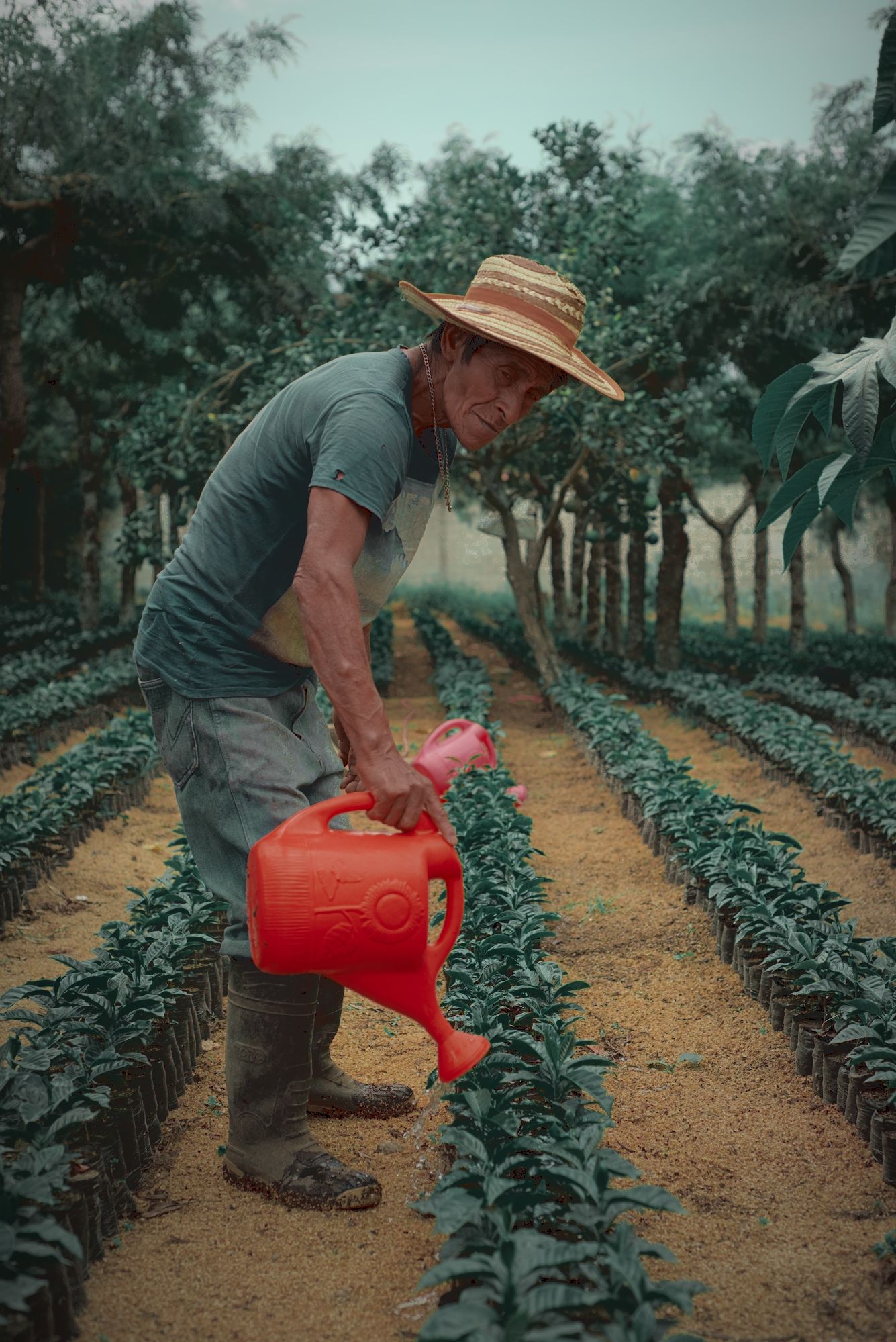
Generally, I prefer the edits that preserve the hue difference between the shirt and the trees in the background.
1 Like
True. I’m also heavily leaning towards @Tim’s edit. It looks great.
2 Likes
My fun with ART and GIMP Colors > Components > Decompose > L-a-b just a
I once long ago published a guide here but in Polish, which one of the participants translated into English.
( Microsoft OneDrive )
1 Like
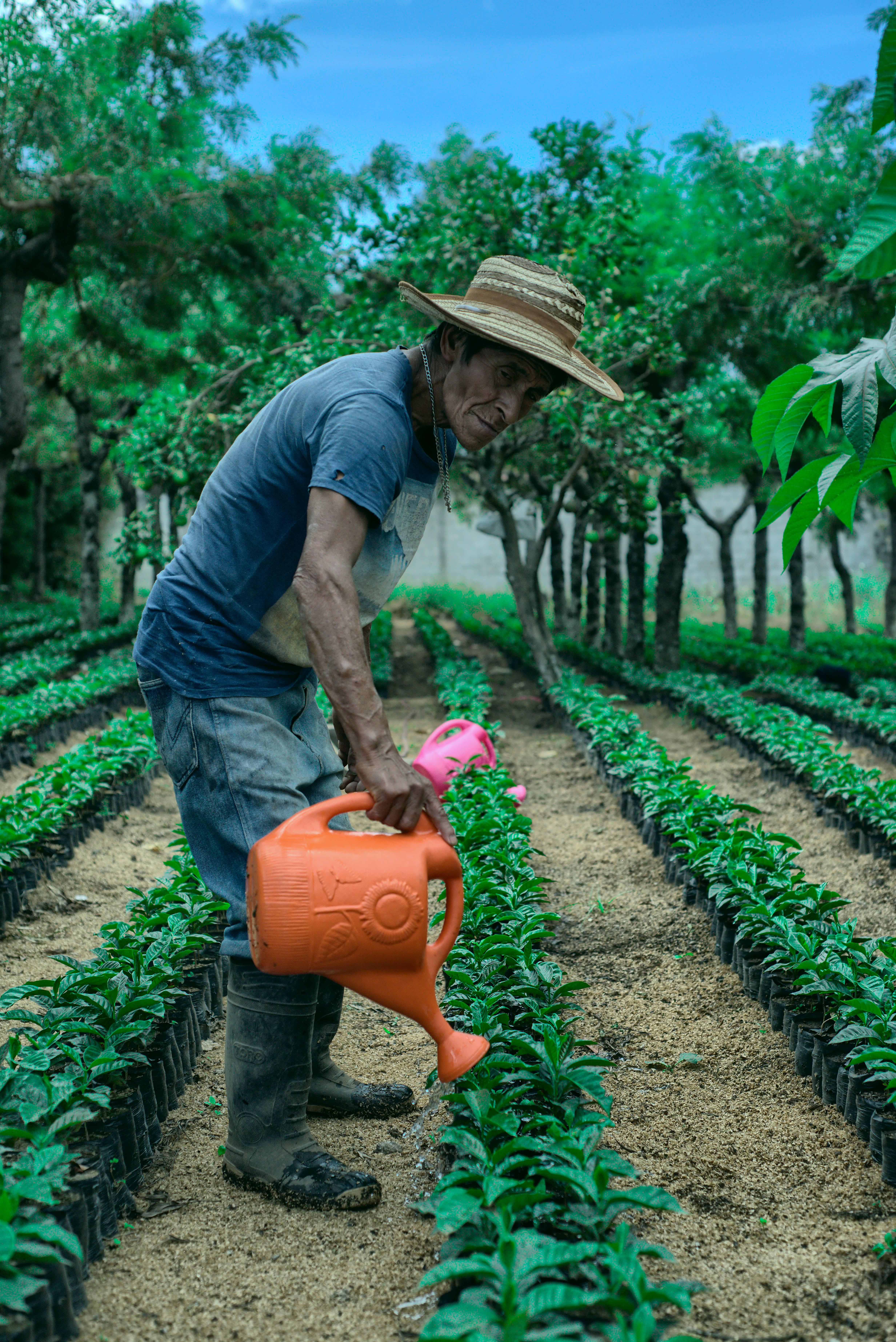
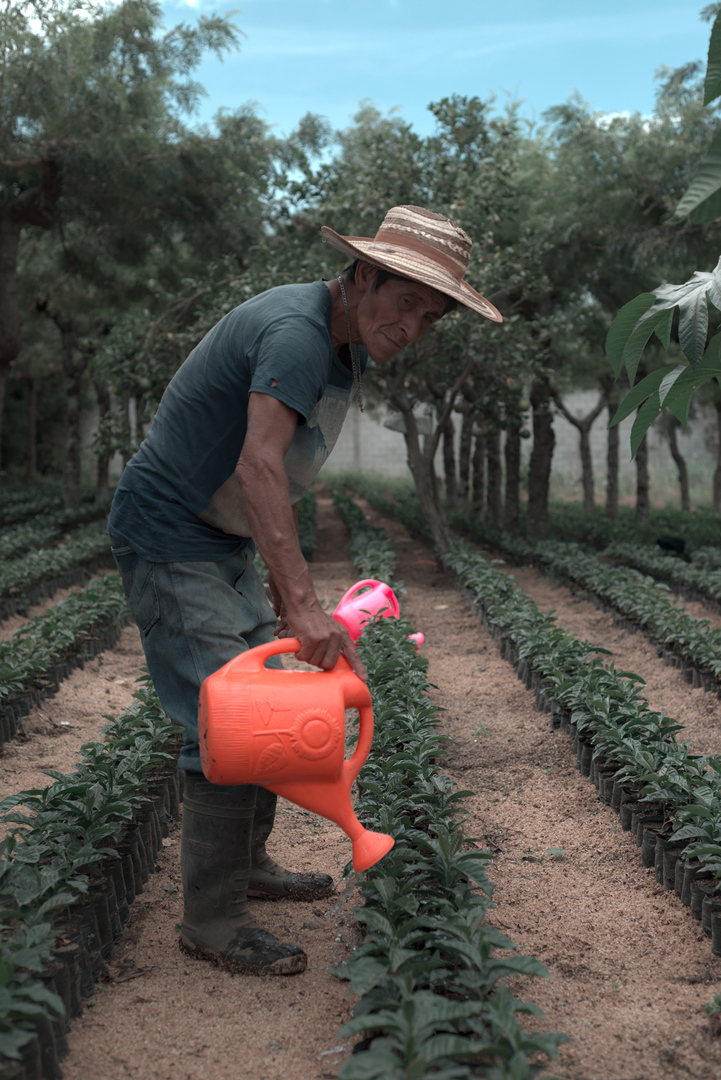
My atttempt:
_UFP3580.NEF.xmp (22.3 KB)
And one with a mask like they do in the LR style:
_UFP3580.NEF.xmp (26.5 KB)
2 Likes
Hello, I made a basic development in Art then exported Gimp or I applied the plugin “National Geographic”.
2 Likes
How do you get the raised blacks in the final shot? Would that be through filmic?
1 Like
Not sure who the question is directed to but I typically do it with tone curves. ![]() Just pull the left point up vertically.
Just pull the left point up vertically.
WIth the scene tools its the global luminance in the 4 way tab of RGB colorbalance or the black level in exposure that is a good tool to lift or drop the blacks… you can see it in the waveform and they have similar impact and on the other end global brilliance is good for the whites stretching the top part of the waveform up…
3 Likes
Still not sure if I truly understand what moody green style is supposed to look like, especially when it includes (more or less) direct sunlight.
1 Like
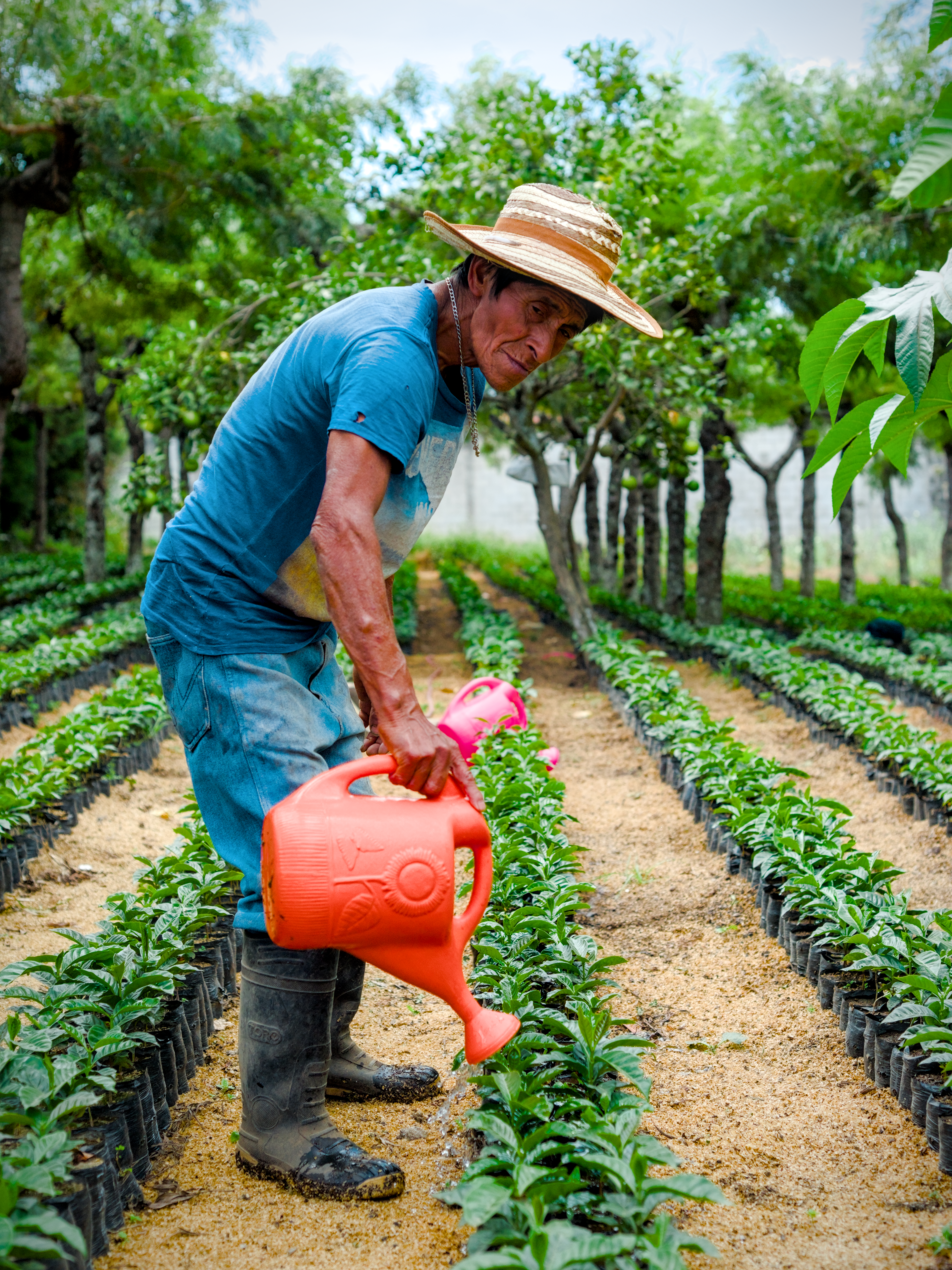
Here’s my try. I started with Boris’ adjustments and then added my own.
_UFP3580_03.NEF.xmp (13.2 KB)
1 Like
I believe this one is a difficult one because as you said it’s a pretty sunny picture. But to me, Tim’s version is what I would describe as a moody Green style. If I would have to describe it, it would be an image with loads of greens that have been moved towards cooler tones and desaturated, warm skin tones, a darker feel that’s a bit faded and not very vibrant or punchy. See the examples I posted in the beginning, maybe my file wasn’t the best to experiment with for this style.
3 Likes
_UFP3580.NEF.xmp (34.1 KB)
1 Like
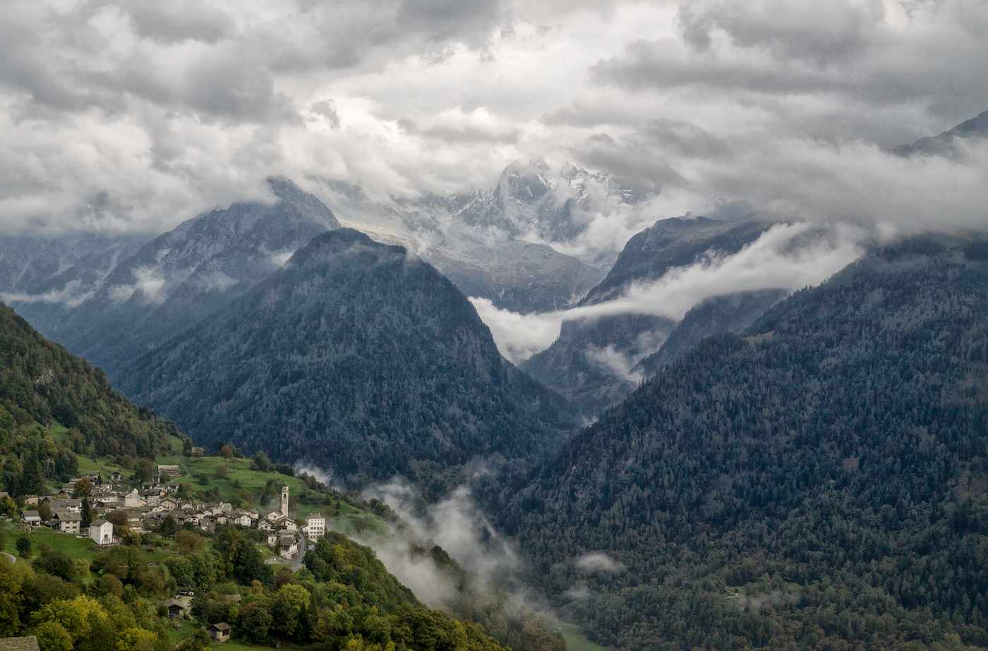
I used Boris’s settings as a base and applied them to one of my fairly standard landscapes. Overall I must say it is both interesting and an interesting direction.
Nothing is overwhelmed but quite a new feeling. I do like the red kick.
2 Likes
That to me looks like it would work great as a black and white ![]()
1 Like