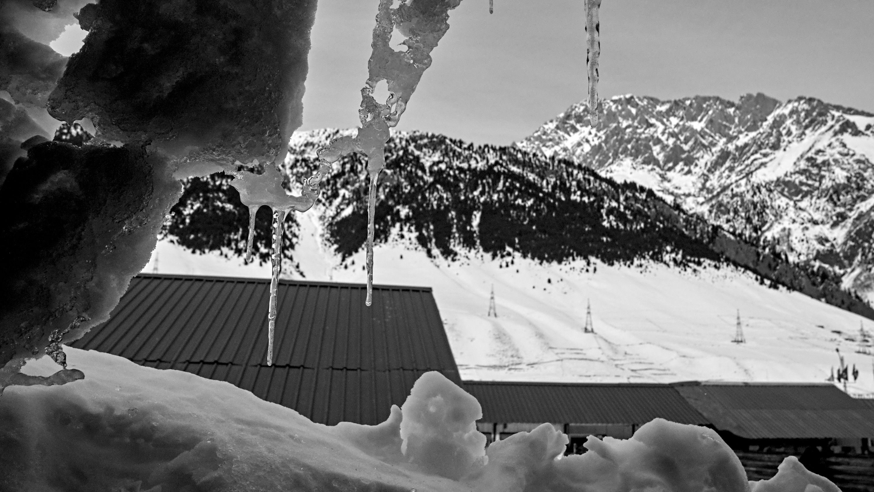
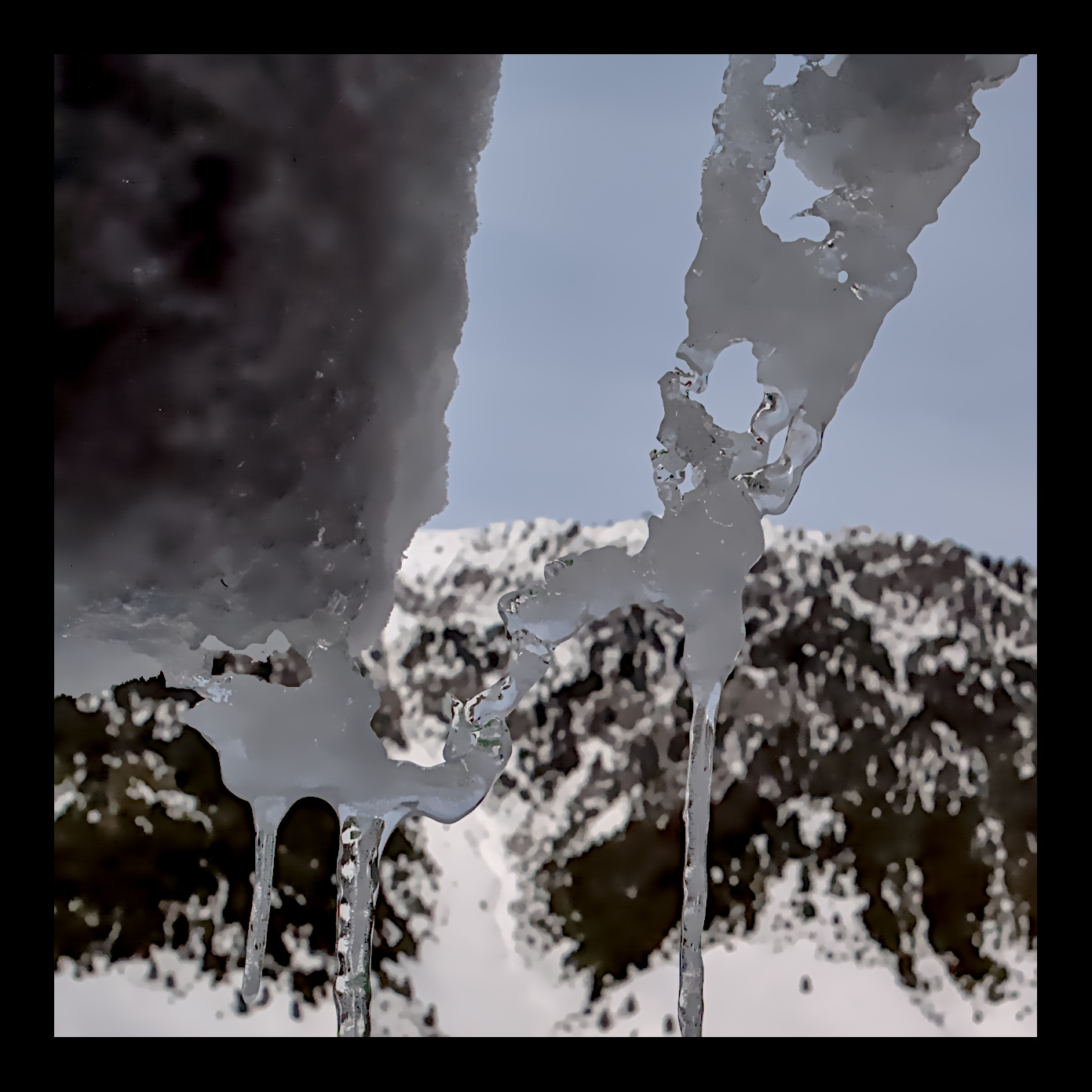
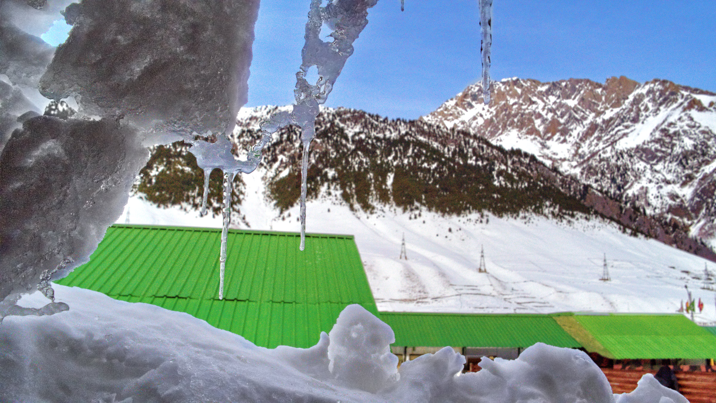
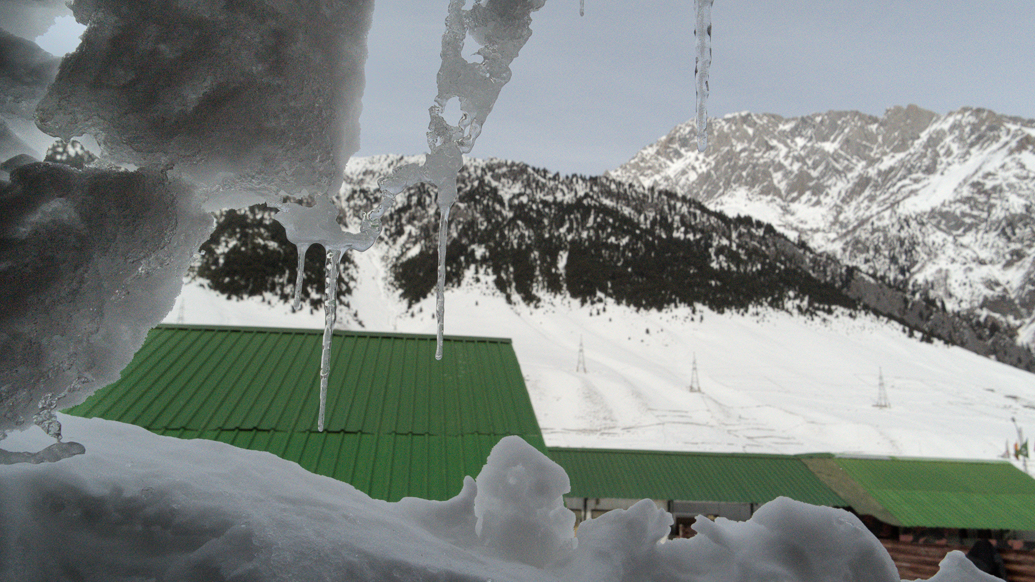
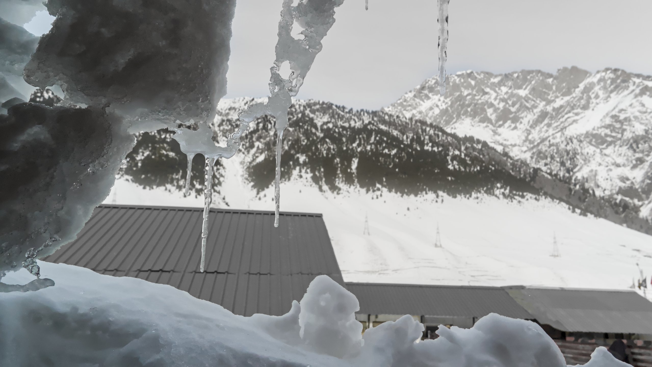
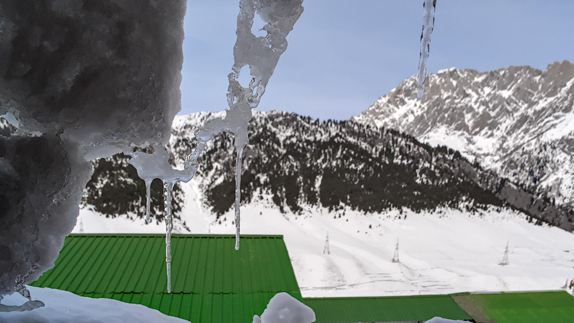
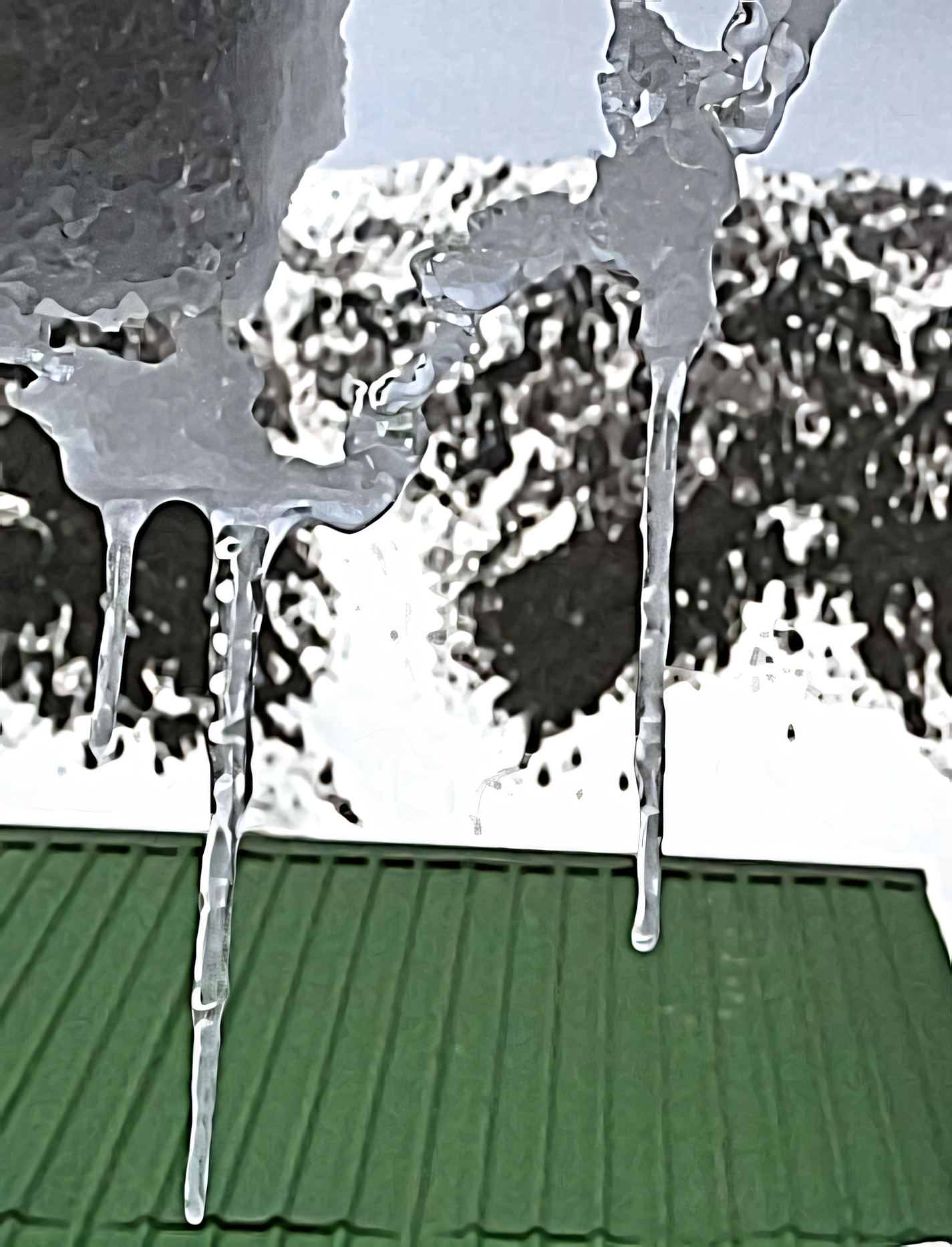
Unable to resolve that icicle in the middle of the frame. I am curious to see how y’all would process this image.
P1073216.rw2 (16.2 MB)
Although not satisfied, here’s what I did:
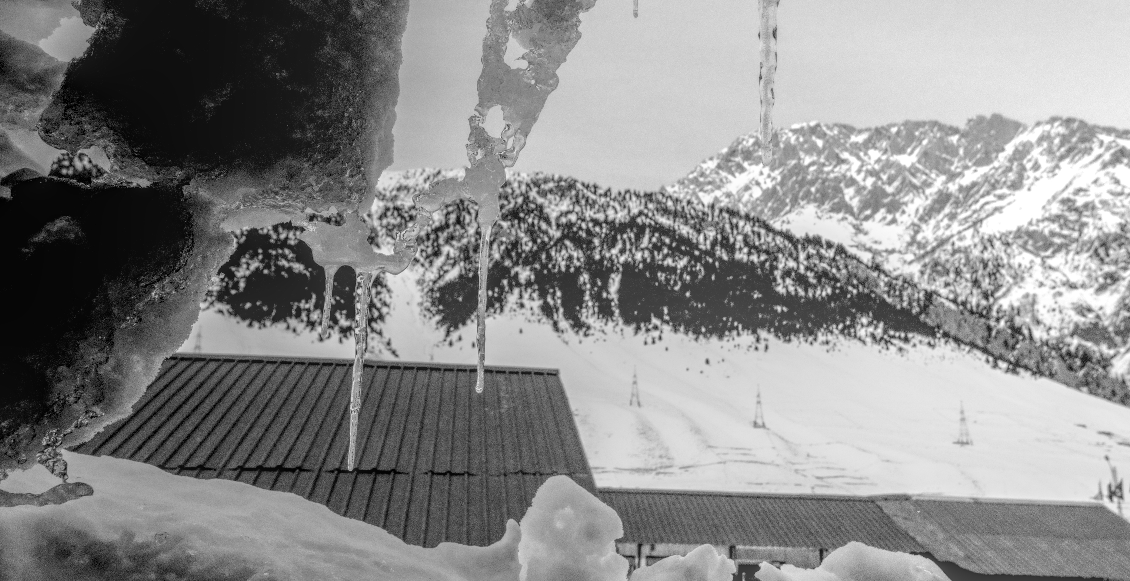
This file is licensed Creative Commons, By-Attribution, Share-Alike.
Unable to resolve that icicle in the middle of the frame. I am curious to see how y’all would process this image.
P1073216.rw2 (16.2 MB)
Although not satisfied, here’s what I did:
This file is licensed Creative Commons, By-Attribution, Share-Alike.
I think you did a good job already. Here is my try at it. IMHO the main issue with this photo isn’t the postprocessing but the capture itself. The roof has very strong lines which lead my eyes roughly in the direction of the icicles but I then get lost between the background between the icicles because there is not enough DOF.
I think I honestly agree, with the capture part. You can’t click a good photo on DT. Thanks for your interpretation and the feedback.
Just cropping out the roof.
P1073216.rw2.xmp (19.1 KB)
Interesting. Do you think the roof disrupts the harmony in the image? mino also raised an issue with the roof, so just curious. This was my first idea, but I really like the tip of the icicle and that they look like an equidistant pattern
Edited with Ansel. The contrasts could be exaggerated a bit more. I thought it was sufficient. I can’t attach the .xpm file (but it’s basically layer-based editing and contrast adjustments using RGB Color Balance and Tone Equalizer).
Playing a bit with masks (should be refined a bit…), color equalizer and DorS (blurr)…
P1073216.rw2.xmp (40.9 KB)
A different edit keeping the roof. Increased saturation and straightened the roofline.
P1073216.rw2.xmp (16.5 KB)
@Sai_Deepak
I am very curious which route(s) you’ll take from here …!
Please show us what you are going to do…
Regards Jetze
Hey Jetze, as of now, not far from what I have posted. One thing I realised is that, it might be a good idea, but it is a badly captured image, otherwise it shouldn’t be so long and tantalizing. I will have that pic with me for some time and try out any weird ideas once in a while.
Nice, you’ll have to go back… 
Maybe think a bit more about composition and background or/and have your background less sharp.
or not completely monochrome…
Would be nice for next years PlayRaw…