I really like the Quick Access Panel in DT’s darkroom.
The freedom to choose between the most common used sliders of all available modules is great and it reduces the complexity.
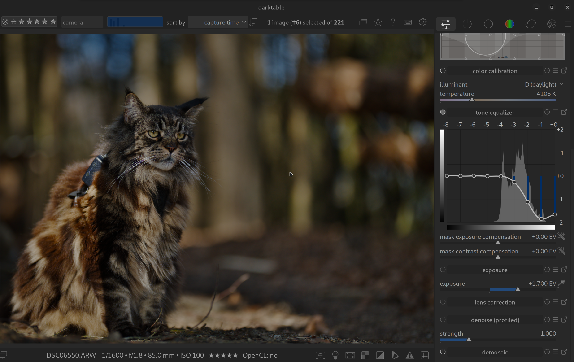
For me there’s a flaw though: available vertical space is rare, especially if the panel contains graphical elements of modules (like the color eq). And … scrolling is … meee tbh.
I’d love to have the ability to have mutliple Quick Access Panels. For instance I’d create one with sliders for basic corrections (that is: replace the base module group), another one that replaces the color correction group and so on.
I asked for this quite some time ago but I don’t think it got any traction… Basically a request to customize and streamline even more the module groups and functions that a user would use most…
I did take a look and I couldn’t yet find it on the github site but I am quite certain…I may have asked for it in the context of letting you make custom module layouts not just of a list of modules but to replicate the functionality in the QA panel… if I find it I will share…
A possible workaround to somehow achieve multiple QA panels would be to create multiple module layout presets and switch between them. It works, but I don’t find it very convenient
I was thinking that a custom module tab could be allowed the same properties as a QA panel so that you simply create effectively a 2nd one with options letting you cherry pick module features
I confess that I don’t currently use the QA panel and that might be my own bad. However, I can see that for those who have come to appreciate the advantages of the QA panel it would be good to have multiple QA panels to divide the relevant modules into groups of function. Put in a feature request but justify the benefits clearly.
I probable need to revisit QA panels for my own workflow. I have certainly customise the module setup for my personal workflow and maybe QA would be helpful.
I will probably sound a bit crass, but I feel like the QAP is for new people who need to see the sliders. Once you get a feel for what sliders and what modules you use, you should really map them to some hotkey + mouse wheel and you’ll be way faster than you’ll ever be with the QAP.
I do this, and then I have a lua-script that loads the correct preset based on what type (sports/portrait/etc) of image it is. I determine the type from the path name.
For me, if you need things like color equalizer or tone equaizer, it’s much more convenient to go to the module itself: such modules aren’t “quick” to use, and I want access to all the functions of such modules.
Then again, I have modified the module layout to suit my workflow, so modules are arranged so I can find them quickly. Rarely used modules are not in the layout at all, I can always get at them through a 2nd click on the group header. I also have set up darktable so only one module is open at a time, limiting scrolling to find a module.
As I now use a Midi box, I don’t actually need the quick access panel at all anymore, but the only functions I had configured on it were “exposure”, “color calibration” illuminant and temperature, and filmic relative exposures and contrast.
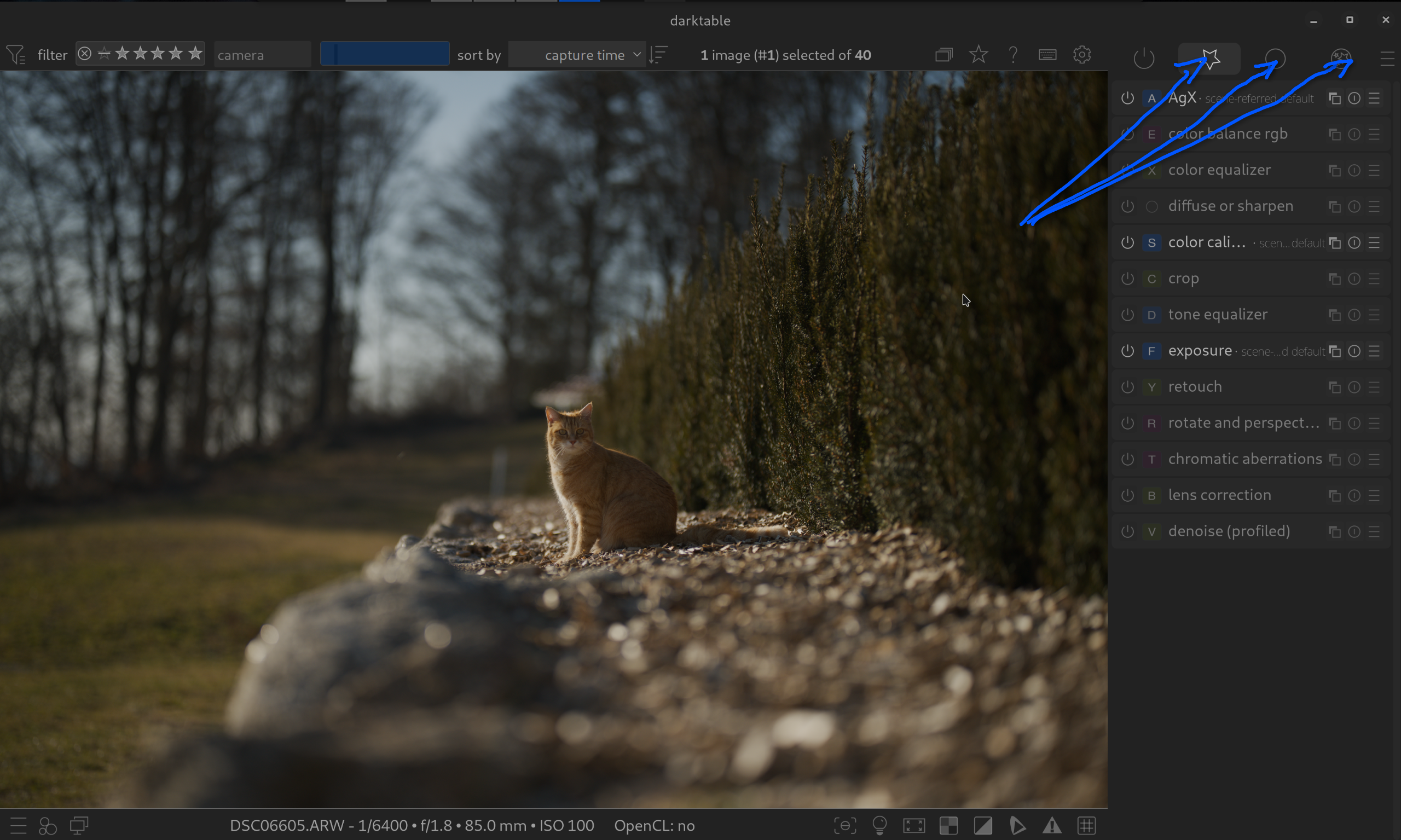
Also, the quick access panel is now implemented as a “module group”. Those are identified by an icon. So either you can set an icon for the quick access panels, or you’d end up with several groups with the same icon. Hard to remember which function is in which panel in that situation.
The basic idea behind QAP is really very good, it just needs a little “love” to make it usable for (very) many people.
At the same time, this defuses the discussion about an “excessive” number of modules, because it allows everyone to put together exactly the functions they like to use.
I only ever once used the QA panel to my advantage. I only put tone equalizer graph and the two masking sliders in the QA panel. Then I could adjust the mask while seeing the graph. That use/need now doesn’t exist because the sliders have been placed in the tone equalizer advanced tab.
But the ability to manage the module layouts and just display the modules I want to use defuses the discussion about too many modules in DT. I feel the only people who should be worried about too many modules would be the people who maintain DT.
I propose that a splash screen comes up for a first time user of DT asking if they want want simple or expert mode. Based on this choice DT could present a module layout to beginners that includes only the most important modules for their needs.
Styles let you do that with more control, though possibly less accessibility since they aren’t all open and displayable at the same time. Using the style to restrict the modules to the useful ones (for the type of image you want to process) and shortcuts to focus and control works well.
Thank you for your reply. I always try to see things from a beginner’s perspective.
By the way, the timing is perfect, as I was just thinking about you , I’m currently trying unsuccessfully to add shortcuts for the filter groups. I just can’t find anything in the shortcut settings.
You can’t shortcut those because they are “user defined” in the sense that you can create a modulegroup preset with the sections you want and the modules in each section that you want. darktable would have to read the module preset to create the shortcuts, but that would change if you changed module presets and then all the shortcuts would need to be remapped. The active modules tab is guaranteed to be there so it can have a shortcut, but nothing else is guaranteed.