Hi, I’m also a design student with a few years of comp experience! For my fourth year thesis project next year I plan on doing a redesign of Natron with the goal of creating the ultimate compositing program… UI wise anyway. Haven’t begun that project yet though because I’m saving it for the fall haha.
With that out of the way, I do have some critique.
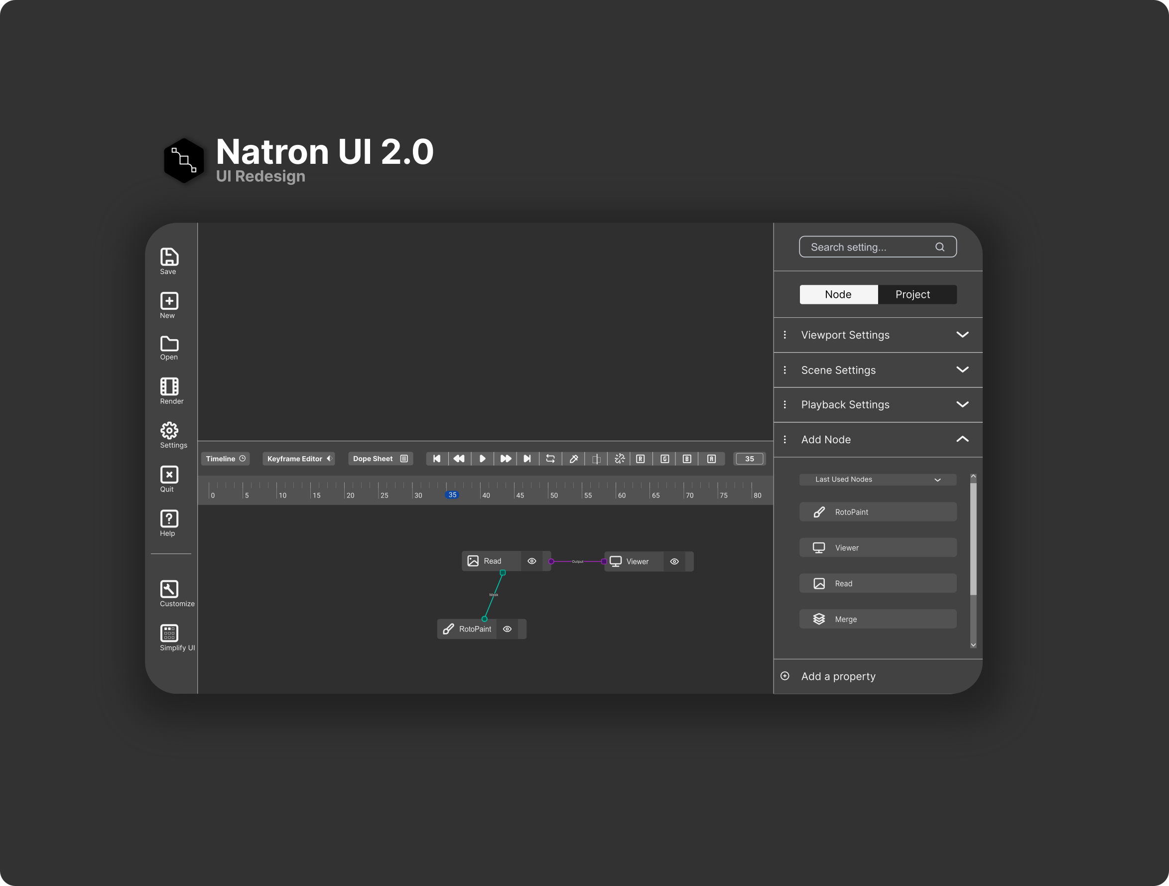
I believe the material design spec is the wrong choice for a professional desktop compositing application. It sacrifices information density for clarity and readability and the UI elements you have implemented here are all optimized for a mobile interface. Dark mode aside, what you have made (which is a well implemented material spec) would not allow professional compositors to operate with the same speed that they are currently able to with an interface that is much closer to Nuke’s or Natron’s current UI. While it is much friendlier looking at first glance (which is a bonus!) the amount of padding that material design encourages alone results in a much clunkier experience for a compositing suite. Have a look at Adobe’s tools, Blender 2.8+, and even Nuke (UX wise, and yes, there is room for a lot of improvement there too) and you’ll find a much denser interface. Using these tools for extended periods of time should afford you some insight as to why they are designed in this way.
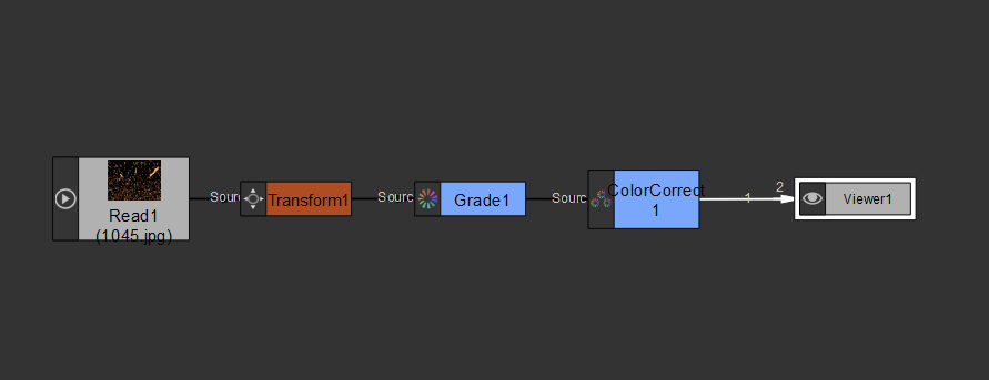
The node graph you have proposed here is also an issue. A bendy-pipe left-to-right node system is much more well suited to something like a 3D material editor than a 2D compositing application, spend a solid amount of time in Nuke or Natron and creating giant organized node-graphs and you’ll quickly see why the current system of elbow joints and pipes is probably be best one. I suspect you’ve taken inspiration from Blender’s compositor but lets just say there’s a reason that most actual compositors (not 3D artists) use a separate dedicated program.
Nuke-like operation is one of Natron’s strong suits, especially as it is an open-soruce alternative. Having a familiar interface (especially concerning the node graph and modular panel layout) allows compositors to get started in Natron much faster than they would otherwise be able to, something I have experienced first hand and am very grateful for, that said there is absolutely room for improvement.
While I believe that a Nuke-like layout and shared amounts of information-density should stick around in Natron I have compiled a list of all the things that could be improved across both pieces of software that I plan to tackle in my redesign proposal. I’ve done many tutorial sessions with friends and lots of what I want to improve upon is the result of watching people struggle with Nuke’s various quirks. I think Natron has some great potential to improve in these areas. There are plenty of small changes that would make the first time user experience easier overall however I also believe that some learning curve for both Nuke and Natron will always be a requirement, having low-level image transformations available to the user is both a blessing and a curse, if you want them done for you go use After Effects.
Some of the things I plan to iterate on in my report (from a design perspective, I likely won’t be doing much of the implementation on these) are as follows, would appreciate any insight you have on them as a user!
- There is no unified standard node colour scheme
- Clicking the roto-tools buttons twice to switch them sucks, why is this not a drop down
- Editing a roto-shape’s settings (life time, etc) is not a great user experience and is very difficult for first time users to learn
- Natron’s icons should probably be redesigned to offer more consistency
- Natron and Nuke both have poor trackpad experiences, much of which could be solved by multi-touch gestures
- Natron’s tab-to-add node functionality isn’t as good as Nuke’s (gotta find out exactly why that is)
- Natron doesn’t have dual monitor support for saved layouts (this one is just a known bug)
- Natron’s mask input and node graph is messier than Nuke’s in that it doesn’t hide mask inputs… maybe this is good because it makes things obvious that a mask input is available, maybe not it results in more inputs that mostly will be connected to nothing, gotta think on this one.
- Nuke has a better timeline for browsing through frames, why?
- Nuke has better sliders for adjusting values - they all start in the middle and have better incremental numbers, this makes sense more sense than a linear scale as it means compositors will be adjusting values logarithmically without even knowing it which is how our eyes see lightness values anyways, this one is actually huge and a really good piece of UX on Foundry’s part. See Nuke’s grade node for an example.
- Natron’s current Natron Community Plugins repo of downloading community-made nodes is a good thing to exist but not as good as it could be. Nuke has Nukipedia but even that would be MUCH cooler if it was built into Nuke itself. Having some sort of plugin browser that offered one click install of user created nodes would be giant… and also a giant amount of work so that’s definitely out of scope right now.
- Natron refers to “Channels” as “Planes” which is confusing because “Channels” is the industry standard name and I don’t know why that was changed here.
- The save dialogue seems to have a redundant text field which confuses people where to input their file name.
- When writing things out with a write node there are a lot of settings that should auto-populate but don’t, also the “Default” setting is very unclear because it’s literally just labelled “Default” and all description as to why that is just tells the user “It tries to pick the best settings” which is great but WHAT settings are those?! Also some image compression options should only appear when the acceptable file format is selected in the write node
That’s my current short-list of gripes, all of which I plan to document and introduce solutions for, if you’ve got more please let me know!
Aside from those, I would recommend you spend a solid amount of time if you haven’t already either using Nuke non-commerical (it’s free!) or Natron to get a real idea of the workflow and the process. Make a short about a guy that can teleport or something, that’s a fairly simple effect. What you’ve made here looks really nice at first glance from a visual perspective but unfortunately I think it is flawed in what it is trying to accomplish. I don’t want to be too harsh here because I recognize that you’re trying to contribute positively to a project that is in dire need of more contributors but unfortunately I think this mockup comes from a place lacking in user-empathy and a more focused understanding of the tasks that come with compositing will help you create a better end product.