This file is licensed [Creative Commons, By-Attribution, Share-Alike]
Sorry, I don’t know anything about CC, but looks OK.
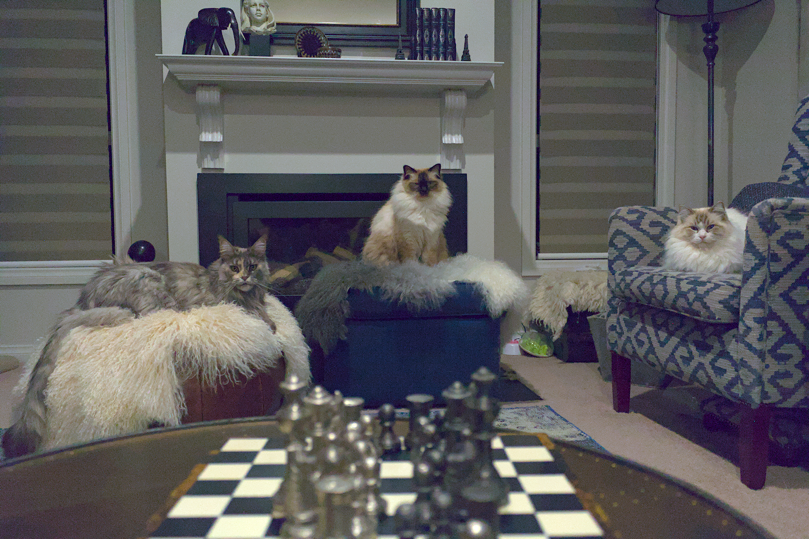
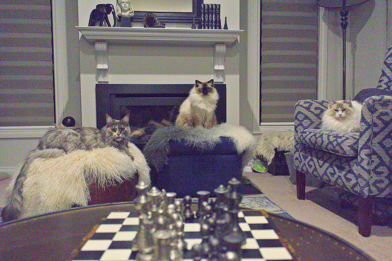
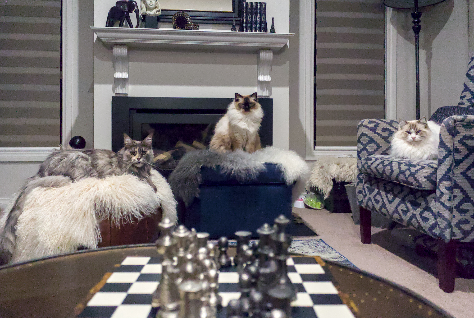
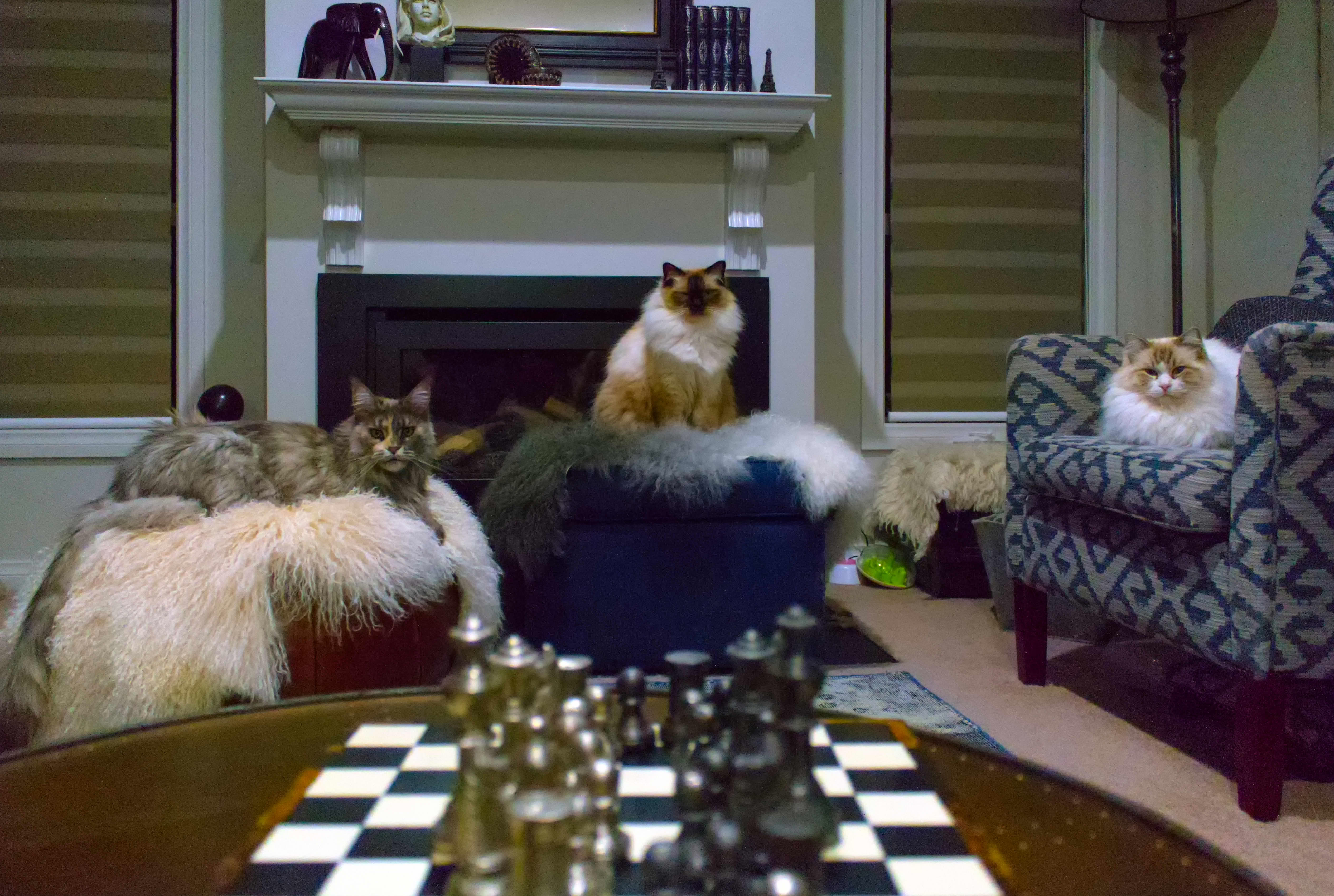
So I took this pic and I really can’t work out how to make it look ‘normal’. I really want to work on it, but after some fiddling with white balance, levels and curves in DT I only managed to make things worse.
Any help to bring the colours back to usable would be much appreciated. I used AWB in camera.
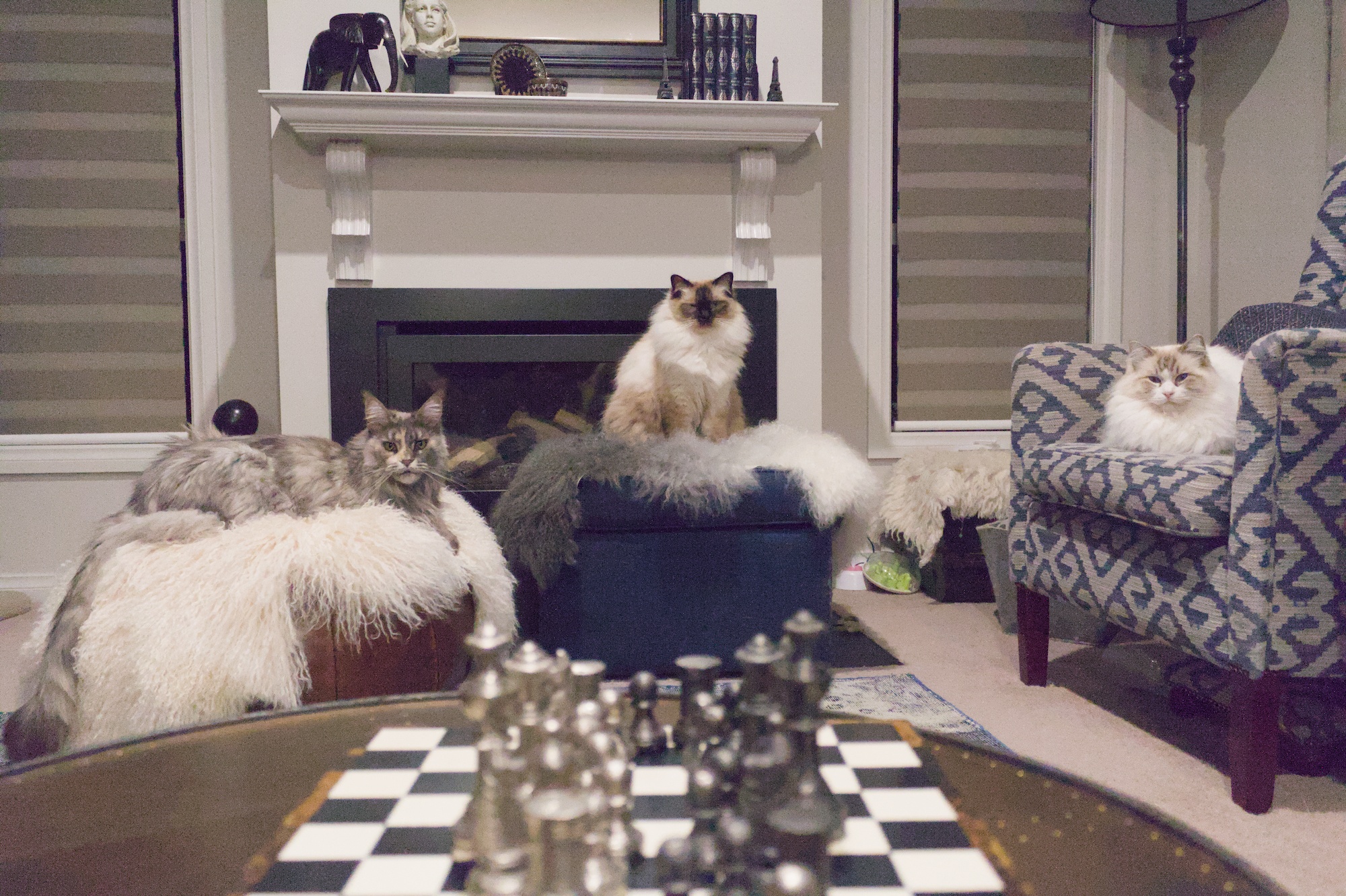
I think without treating the shadows differntly to the lights, it isn’t really possible to get a natural look. I’m still not really satisfied with my approach but I think the direction is not that bad.
Thanks everyone for your help. To clarify, the shot was taken at night under yellow LED lights with the camera white balance set to AWB.
The colours look washed out with a purple tinge. Probably serves me right for using AWB, but I’m not likely to get the shot again hence me wanting to save it.
I guess the look I’m after would be as if the shot was taken in daylight, if pos.
IMG_5598.CR2.xmp (14.7 KB)
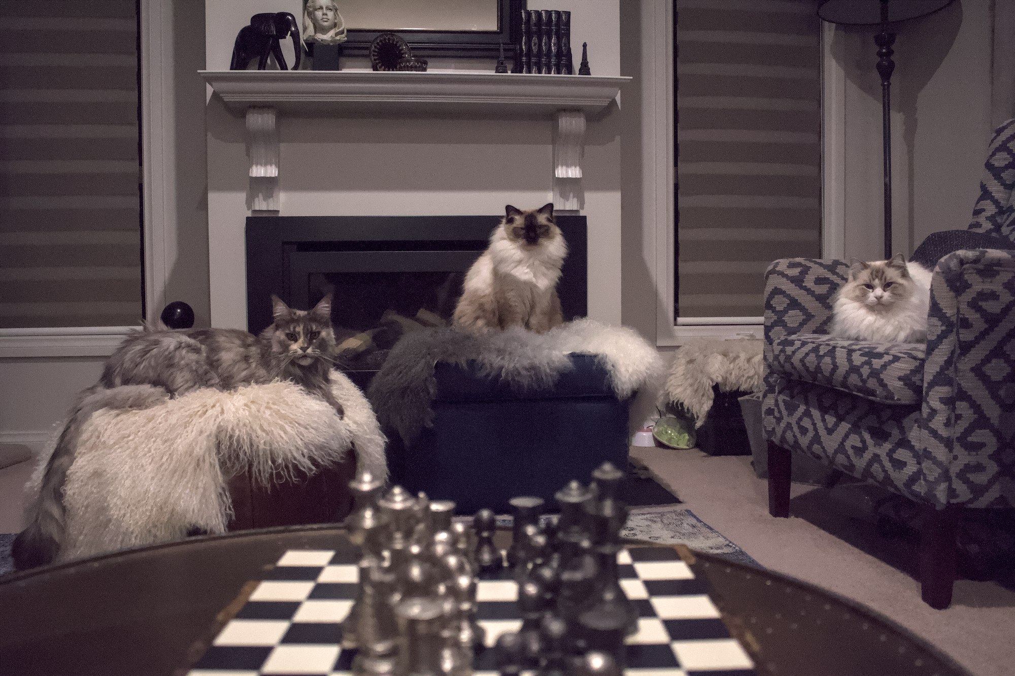
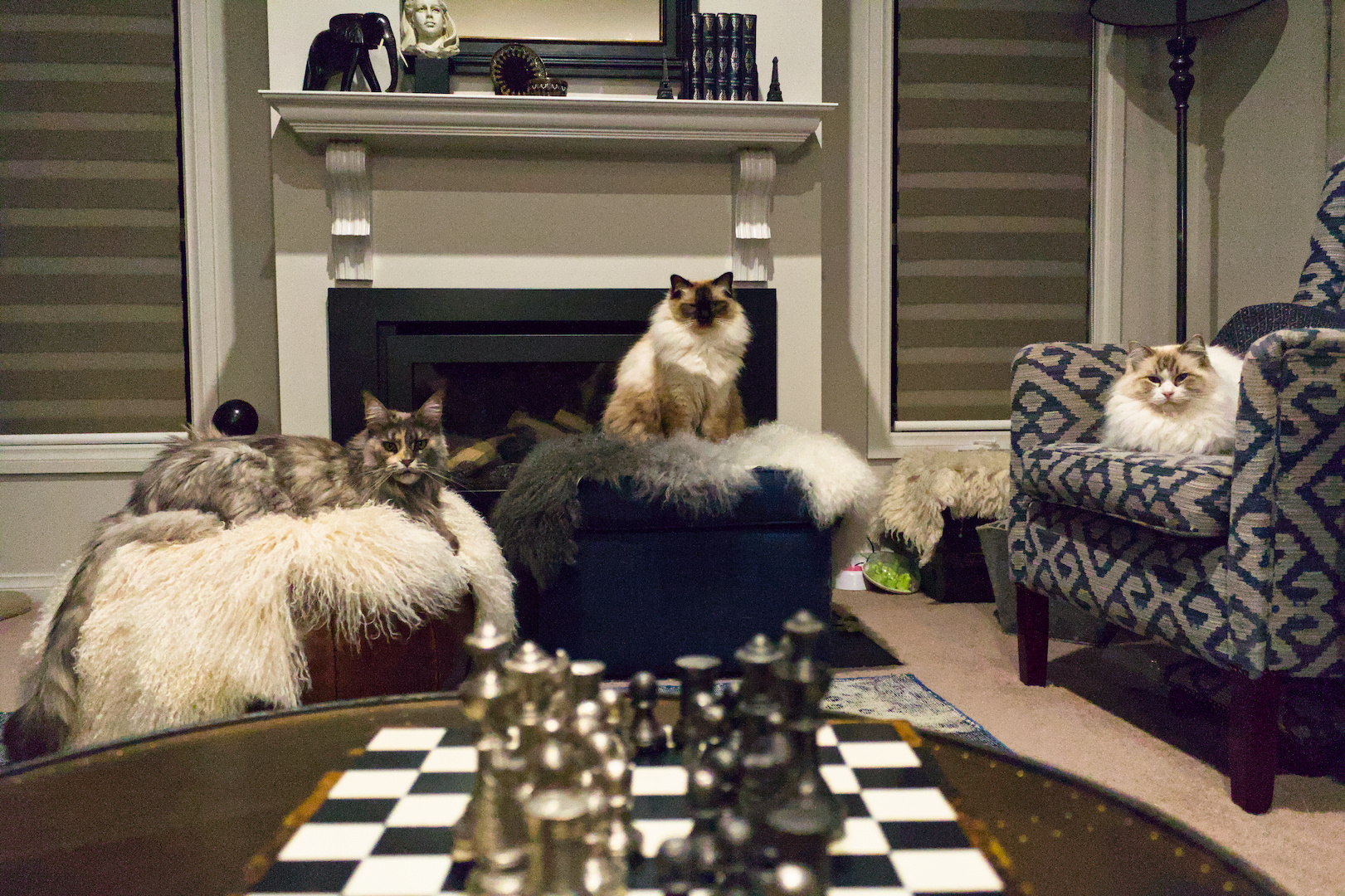
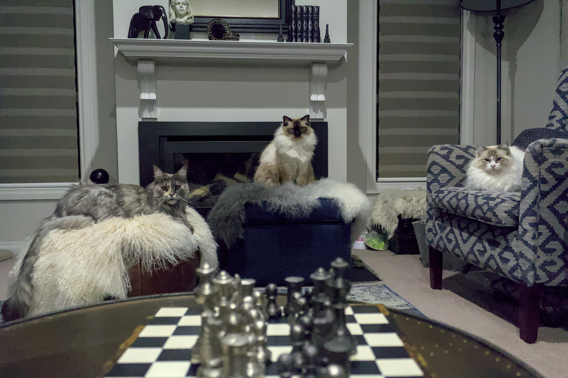
Here’s my take… This is as natural looking to me as it gets, assuming what an average artificial light in a household looks like. They tend to be rather warm, so I went for a warmer look
Also not me having power saver on, and wondering why my computer is so slow
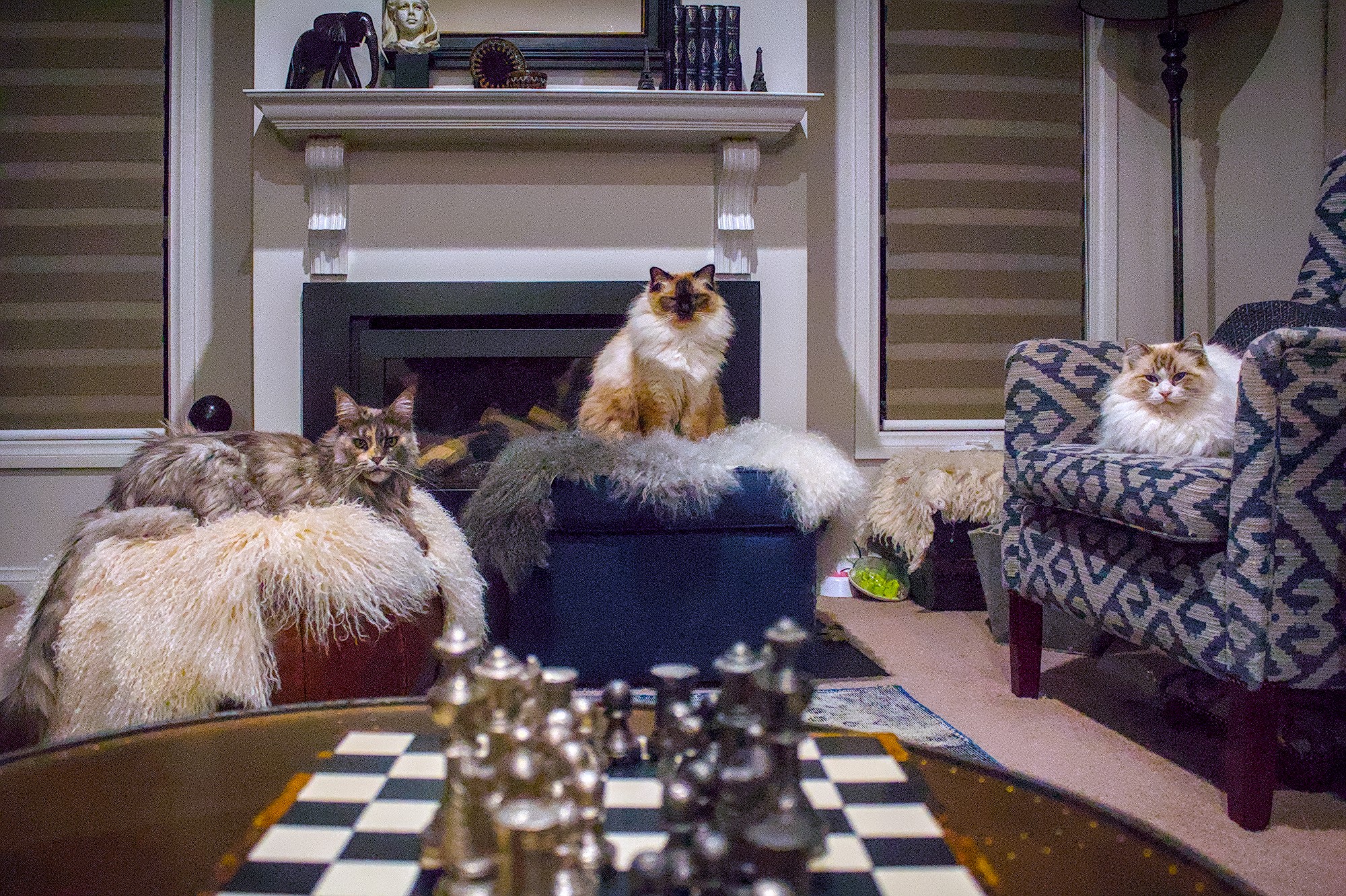
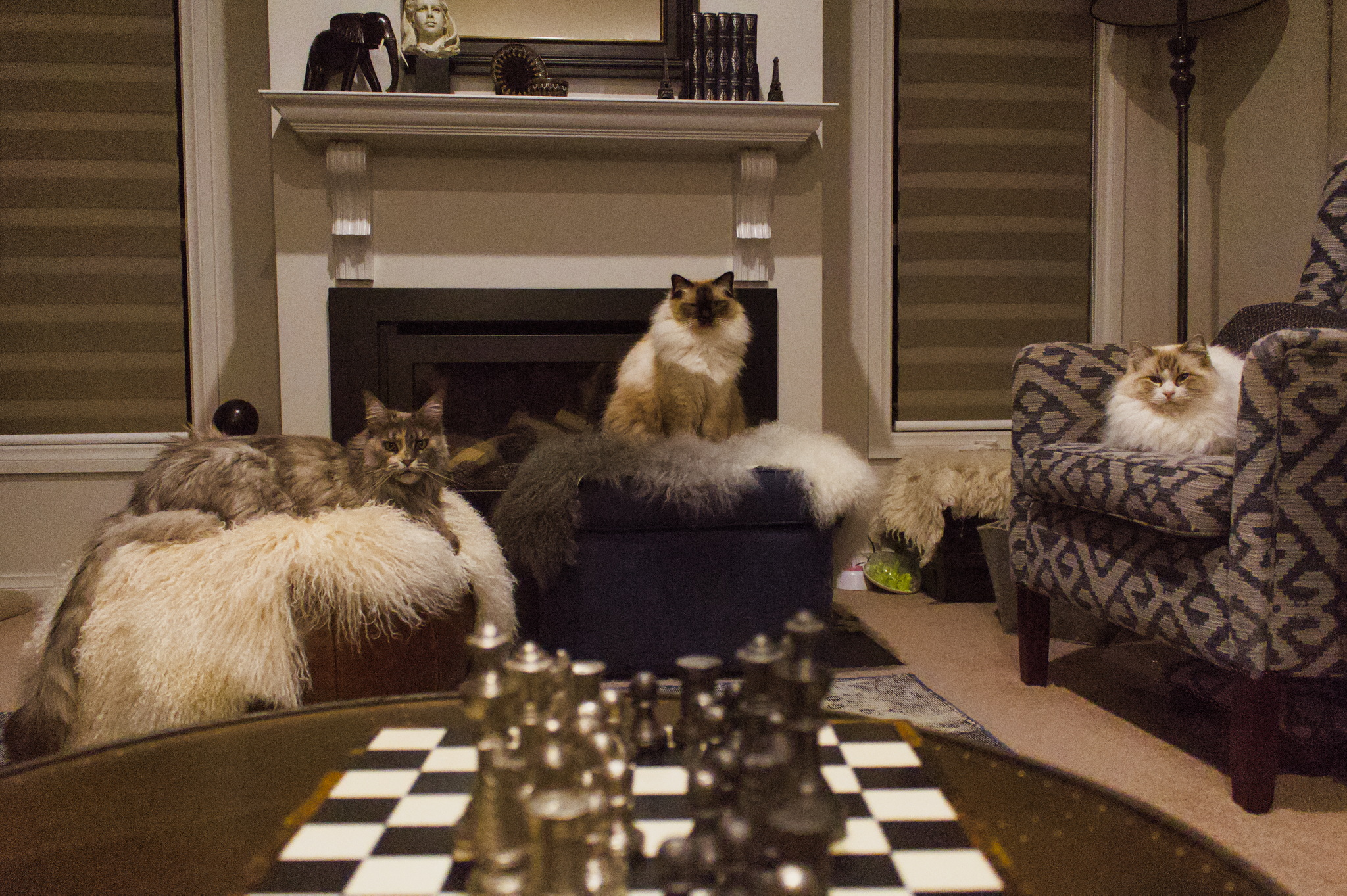
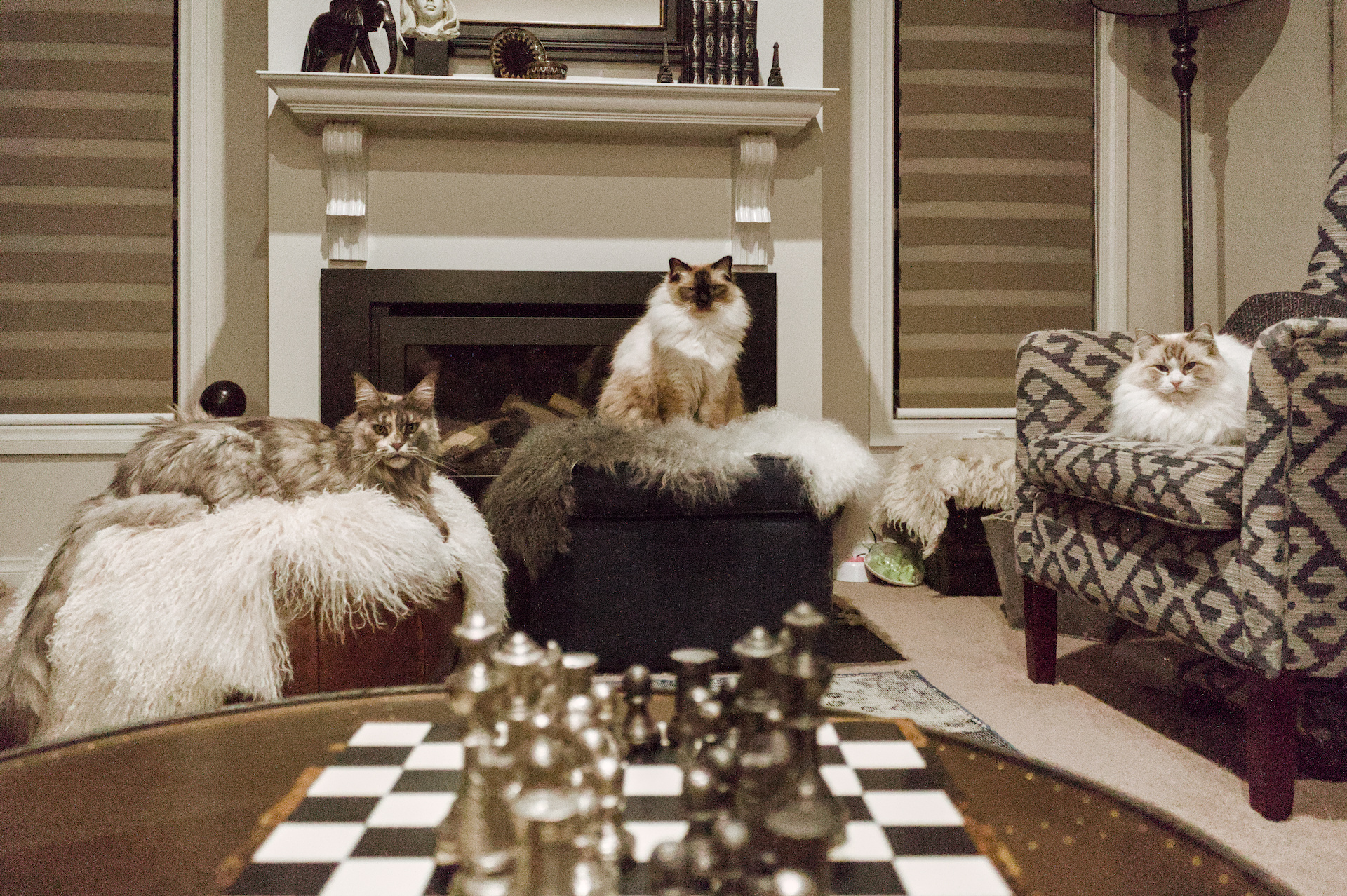
DT 5.3. I own Canons and they don’t like underexposing as it results in a lot of noise. That was a challenge in this image. The colors seem fine to me. IMG_5598.CR2.xmp (13.8 KB)
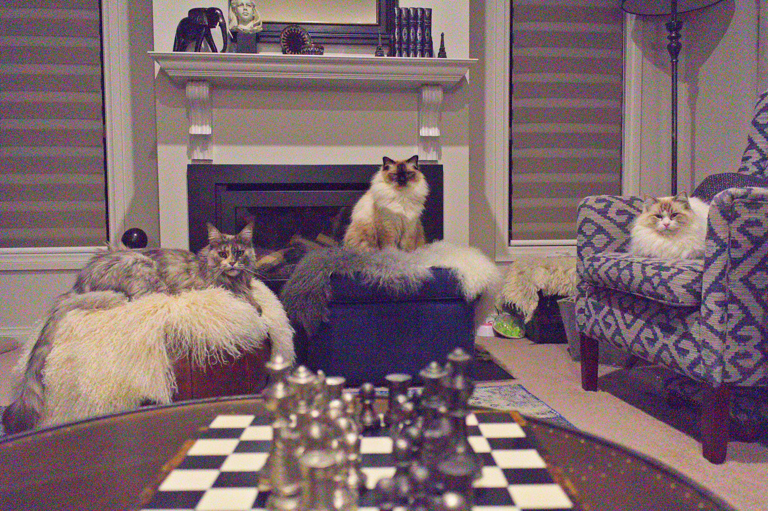
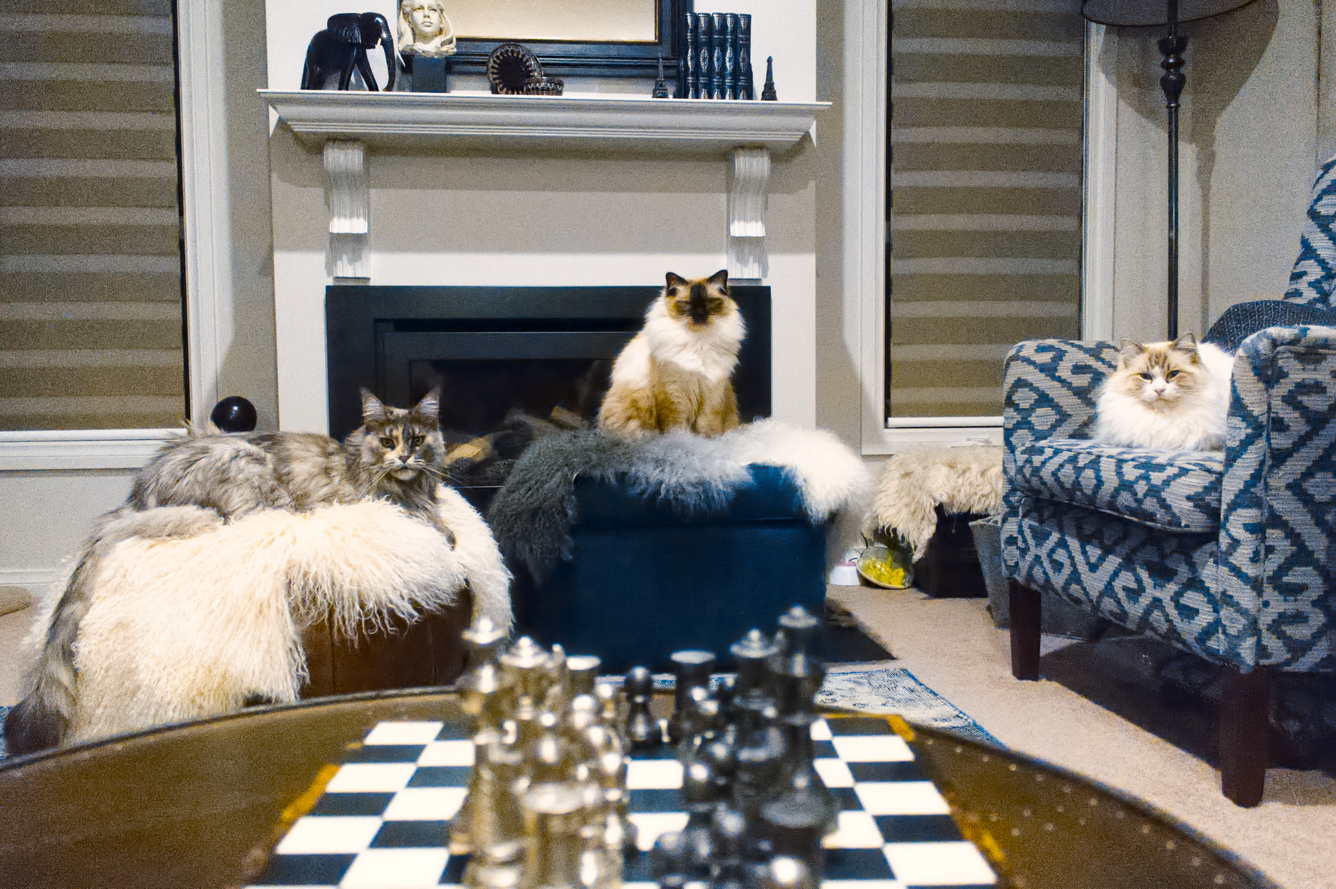
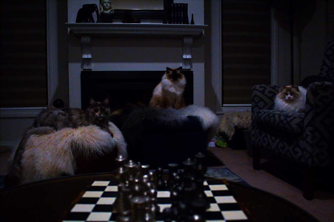
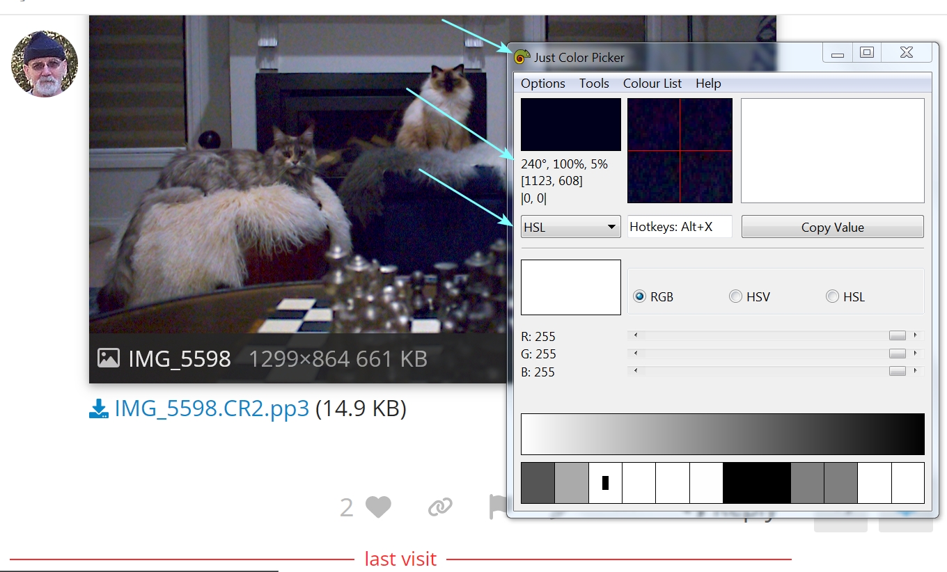
RT 5.11 mainly bringing the white chess squares close to a*,b* = 0.0,0.0, then tarting up the colors in the GIMP. Left the lighting low to match the raw under-exposure.
It sounds like you just jumped in without first watching a tutorial or reading the introduction in the manual. As you may have noticed, darktable is a powerful program with many features, so that’s not a good approach.
I tried very hard to correct it without using much in the Color toolbar, but had to rely on the Balance module after attempting a uniform additive exposure mask, and a color selection (grey) from where the fluted column and the mantle meet.
I used just the color balance tools to try to get the chroma close, and the rgb primaries to adjust after that.
The noise was mostly brought under control with some manual adjustment in the denoise module.
Then some contrast eq, and diffuse and sharpen to fix what I’d done with the contrast eq, and a gd filter to dim the foreground.
In addition to the default enabled modules I used only hot pixel, denoise (profiled), lens correction, and exposure cranked up all the way to max. Color calibration and sigmoid at defaults.
To me it looks already pretty good, though of course I don’t know what the colors were like. I’m a complete novice with darktable (I’ve used other software before), what I’ve noticed is that the defaults and the default presets are actually pretty good and give often a really good starting point. I can second the online manual and the videos others have suggested.
BTW, at least for me sigmoid has been much easier to use than filmic (which was the default), so I recommend changing your the default in preferences: gear icon → processing → auto-apply pixel workflow defaults → scene referred (sigmoid).