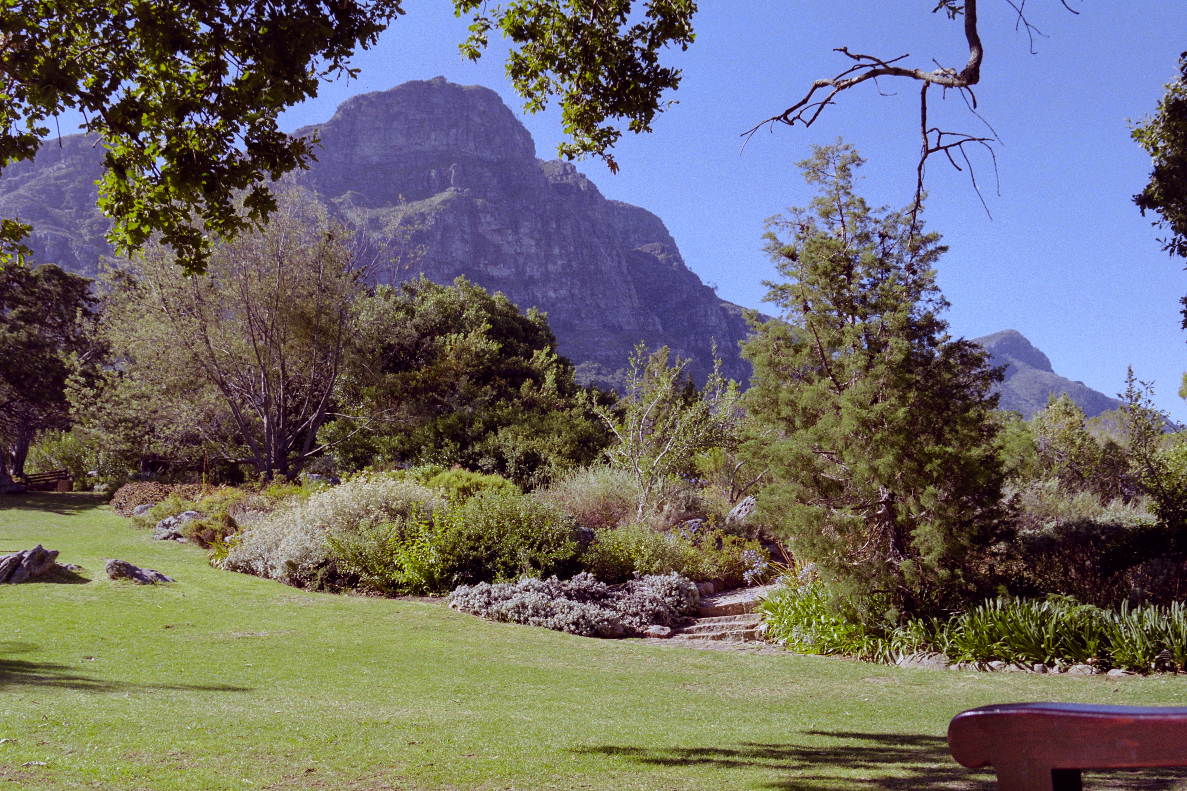
kirstenbosch.neg35.pp3 (14.9 KB) RawTherapee 5.8 Development.
Thanks for sharing this negative. Always nice to have a go at those!
Thanks for sharing this negative. Always nice to have a go at those!
Not at all! I actually realized after posting that I didn’t mean it to be specifically for darktable users. Great job with the colours!
When I DSLR scan my negatives I tend to set a custom spot white balance in the camera before I scan from my light table. After that I don’t usually touch white balance or color calibration in Darktable and things seems to turn out fine.
I also think it’s cool that you have an actual print to compare to. Unfortunately I don’t have prints to compare to, so when I scan color negatives I always wonder if what I produce represents what a print from the drug store would look like back in day or if what I am making is a more “clinical” representation of the image on the negative. Although, I also understand that DSLR scanning isn’t the most ideal, so that may affect the results as well.
I actually do that too, and then make sure it matches in color calibration. Maybe I could just set it to “As shot in camera”? The negadoctor module was developed and implemented before the color calibration module, so I’m not sure if there would be any changes to the workflow since this new module was added.
Yes, I’m lucky that I have prints for most of my negs. But then I’m always deciding between matching the print and coming up with my own interpretation. The labs I used back in the day were rarely high-end ones, so they didn’t always produce the best prints. Sometimes the colours were off and I’ve scanned/processed better versions. I also enjoy the fact that I get a bigger picture, literally, because the prints were often cropped quite a bit from the negative. Overall though, I’d say that the prints are better about 80% of the time. There’s just something special about the film/print medium.
While dealing with negatives, I often find the default settings of “input color profile” not working well. Setting the “input profile” to something like “linear Rec2020 RGB” gives much better results IMO.
Thanks for this nice negative!
This is the first time I used the negative tool in RT, works really nice!
first version // … wasn’t sure about the green
… so i did a 2nd one
@europlatus i did (1) and not (2), three as well …  … guess i just used the calibration sliders first from the negadoctor to eliminate greenish tint. then after, the ones from the color calibration module
I actually like your 2nd one better. The first is probably a bit too nuclear (which you recognized), and the 2nd is a little more true to life. Personally, I’m guilty of edits and scans like your first one because I see too much of it on Instagram, lol.
This was an interesting one to play and I was able to learn a lot. I had to change the input color profile to “standard color matrix” to get something useful out of the data.
Thanks for sharing 
… it’s a fine line between nice colors and  colors 8)
I’ve calmed down the yellows a bit and I feel this is even closer to the original print. The shadows are a bit lifted and it’s less contrasty than the original, but I like it. I also feel the colour rendition is more accurate.
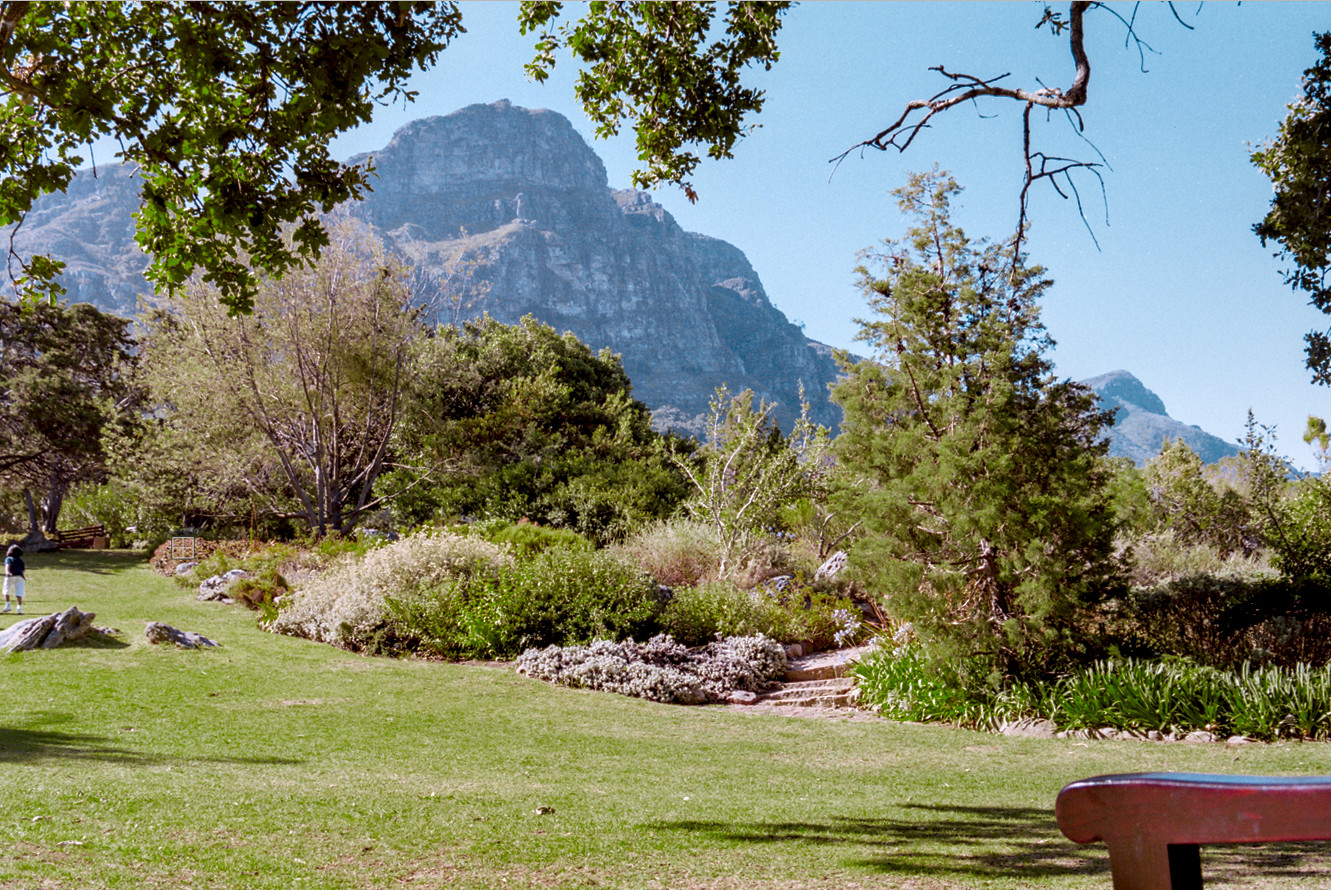
Here’s a scan of the original print for reference:
I think on balance I prefer the processed negative.
I tried to match your result as this looks way more natural than most of the other attempts, and in particular my other attempt. I think I succeeded (it’s not exactly the same but close), but only by massively tweaking the color zones module. How did you achieve this look?
@chris Nice job!
To get my result, I did lots of work in color balance RGB and some tweaking in color zones. I feel I can usually get an excellent result after spending lots of time in these two modules, which is good on the one hand, but on the other I’m trying to reduce the amount of time per image. I feel I should get closer to what I’m looking for after negadoctor, and I usually do with images that have less green in them. For some reason, it’s the green images that cause the most problems or at least images with just one or two dominant colours.
I’m still learning colour balance RGB. I’m getting some great results from it, but sometimes I’m taking a real trial and error approach to it. Nothing wrong with that per se, but I’d prefer to be a bit more targeted with what I’m doing. For example, I want to look at the image, see what’s wrong with it, and know which sliders to turn to. I feel I can already do this with the 4-ways tab, but not as much with the master tab. But I’m slowing getting the difference between chroma and saturation. Brilliance, on the other hand, I’m still working on…
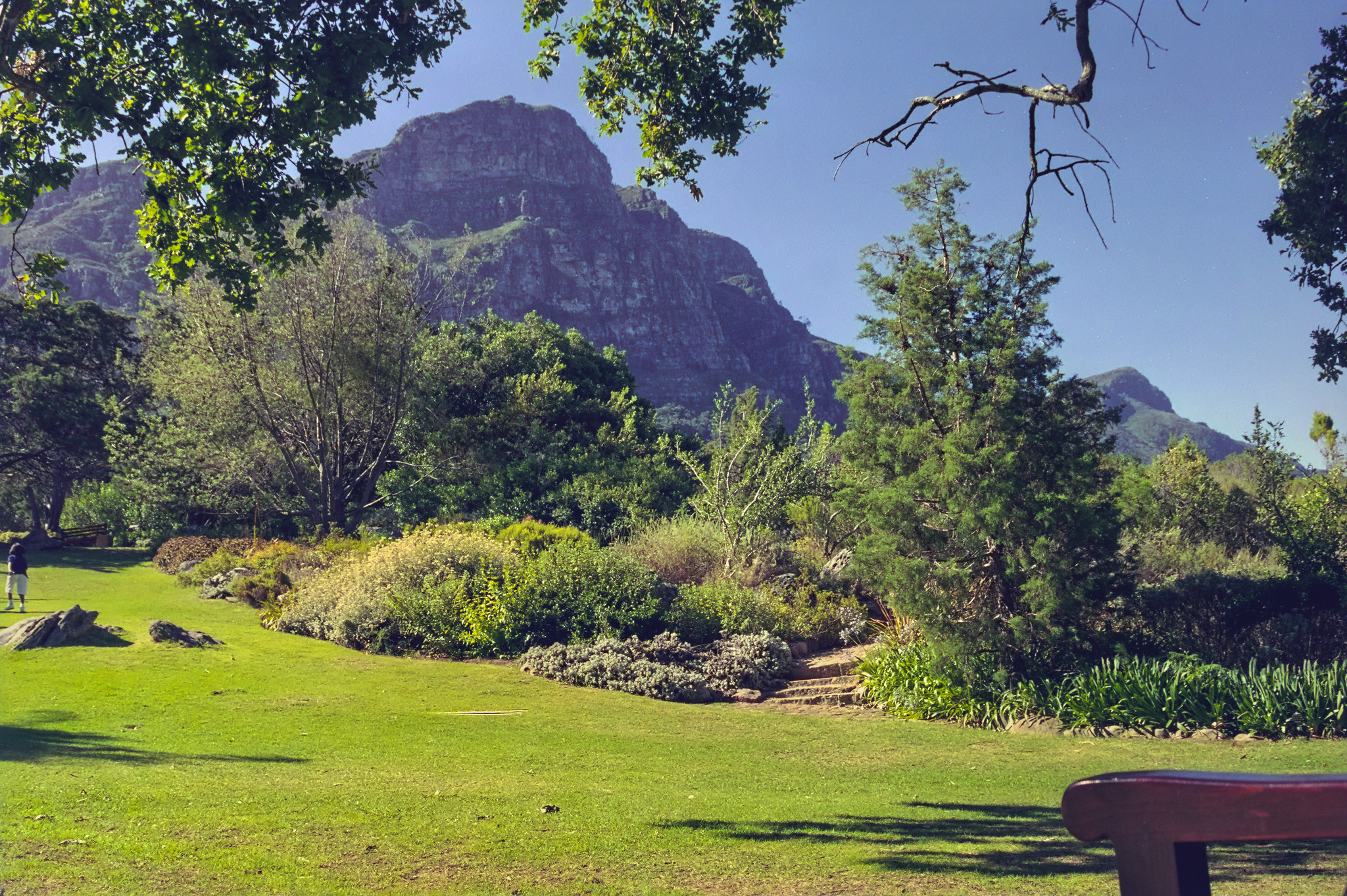
Here’s my latest xmp for this image.
2000_xx_xx S.Africa Roll 2 Neg 35.CR2.xmp (12.0 KB)
I wonder if the approach is correct. Analog photographs are already in a non-linear representation, and the tools made for linear data such as all the *RGB modules may face some issues working with tone-mapped pixel data. Maybe that is the reason why color zones works well.
True, although I’ve found that some negatives do come out looking great just after negadoctor. But there’s usually a little tweaking to be done afterwards and that’s ok. I think my main struggles are with white balance, although it could just be the limitations of my setup. I’m using a phone screen LED and older DSLR to capture the negs. It’s probably not ideal.
Edit: I’m getting better results with WB after creating another instance of color calibration and moving it above negadoctor in the pixelpipe. A warning is displayed that CAT has been applied twice, but this is a special case that requires it. Incidentally, the manual does mention this as a suitable use case.
My attempt to develop in GIMP

Thanks for the negative. It’s the first time I processed one.
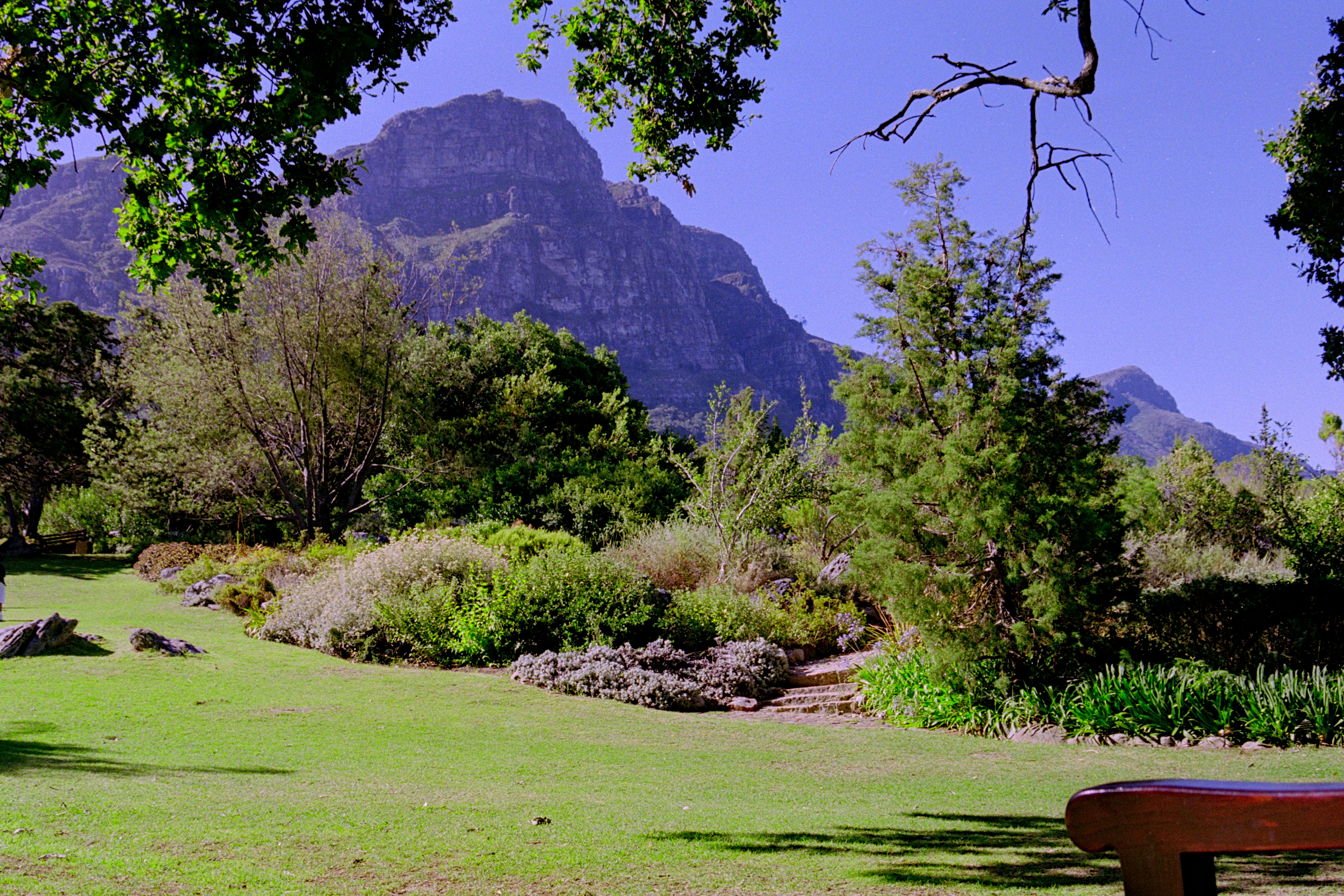
Darktable 3.6
Kirstenbosch Neg 35.CR2.xmp (74.1 KB)