This was the same argument I used against having a dedicated Vignette module and it seems like everyone dislikes it ![]() I agree with you
I agree with you
1 Like
The case of the vignette module is that the control of the mask is very suitable for a vignette and you cannot have the same amount of control with the standard masks. Especially, the ellipse and circle maximum radii are rather limited in comparison and the aspect ratio of the ellipse can only be changed after the fact. Plus, there’s no method to exactly place the mask, e.g., in the center.
The only problem with vignette is that the math for the vignette itself is not suitable.
Sorry for interrupting, though …
2 Likes
I’ve love a vignette module that could be pre-initiated to replicate the vignette of the lens used in the image, so that the image could be corrected, cropped, then uncorrected. With a zoom lens, it would be nice to be able to correct the real vignette over a session shot at different focal lengths (or even lenses), but return a constant vignette to the whole batch for consistency.
Isn’t this what the lens correction module does?
3 Likes
Exactly. Just switch from “correct” mode to “distort” and select only vignetting.
3 Likes
It has a distort mode? I guess I’m so used to using it on automatic that I missed that. Thanks.
2 Likes
I don’t find the Color Zones module complex at all. It’s just a dropdown to switch between the different HSL modes, and the UI remains essentially the same for each mode. I personally think that using masks is more complex, especially for those who are new to Darktable. I think many of us who have been using Darktable for many years forget how daunting the masking panel can be for newer users.
But I respect the decision to leave the Color Equalizer as is. It’s not a big deal for me, even though I’m one of those users that prefers specialized modules and prefers not to use masks unless necessary.
1 Like
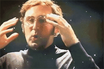
A question about how hues reposition.
In this image, with Harmonizer off, we can see the image has hues aligning with orange and red:
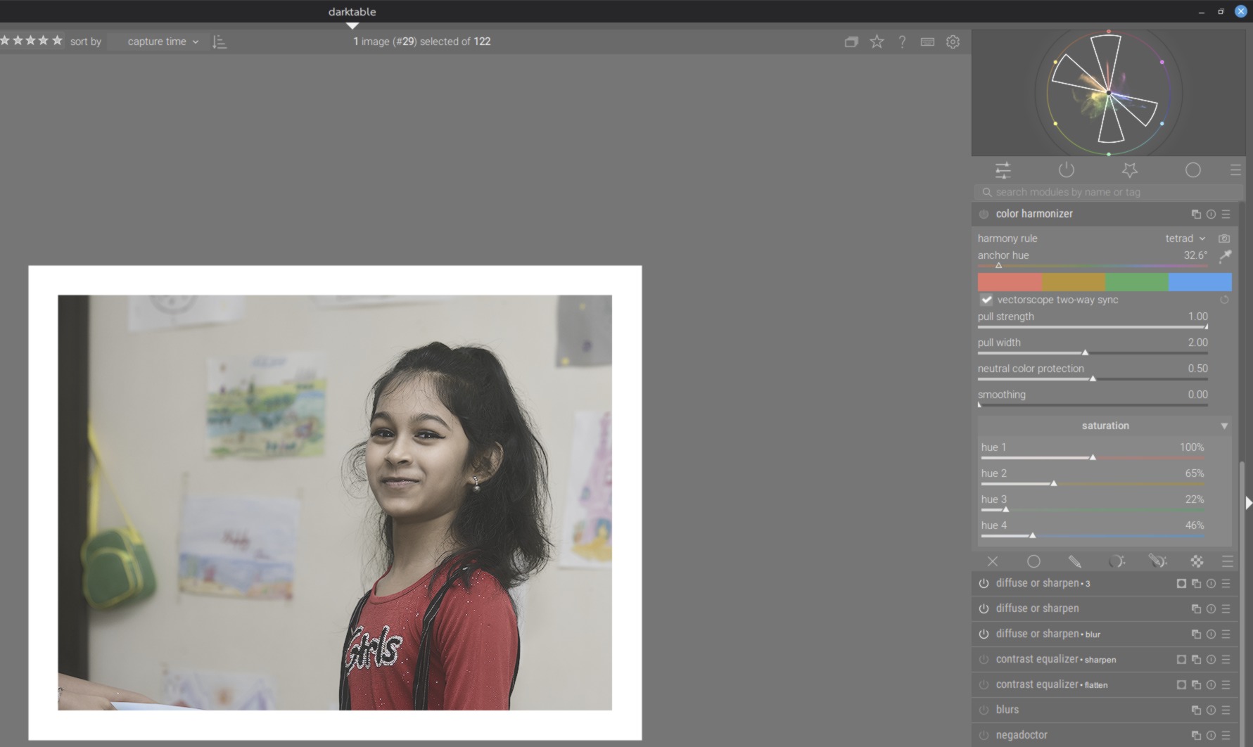
I select ‘tetrad’ harmony, with the goal of keeping the orange (skin tones) and red (shirt) in place, but you can see the orange has shifted towards red, instead of staying where it was within the harmony guides.
My expectation would be that the colours outside the harmony lines get shifted, not those inside. How does the math determine which hues stay the same and which get shifted?
all colours are moved to the target set for the harmony - depending on strength and width. The displayed sections in the scope doesn’t imply a “protected zone”
2 Likes
All hues are pulled towards the anchor and the harmony hues. The closer they are, the stronger the pull. You can fine tune the angles by switching to custom rule and moving the red hue a bit towards orange.
2 Likes
Hm ok. I would probably use color equaliser for custom tuning. Mathematically, is it possible to anchor each hue according to the harmony (eg. Four anchors for ‘tetrad’), then move the other hues towards the nearest anchor? To me this would be more desirable behaviour.
This could be a nice extension for the next iteration. Something like “protect neutral”, but for colors that are close to one of the harmony nodes, e.g., “min pull distance”.
5 Likes
It might function like a pull amount inverter. Currently hues close to the target hue are pulled more afaict, but the inverter would cause hues further from the target hue to be pulled more.
It is a very interesting way of keeping natural variations in the target hues while still unifying the image.
Though for this new inverted pull formula, protect neutrals will become an even more important control and might need an extra “boost” to keep the transition from neutrals to non neutrals from being too harsh, since those values nearest neutrals would be pulled the hardest.
2 Likes