New Sigmoid Scene to Display mapping

Technical follow-up on the subject of color processing!

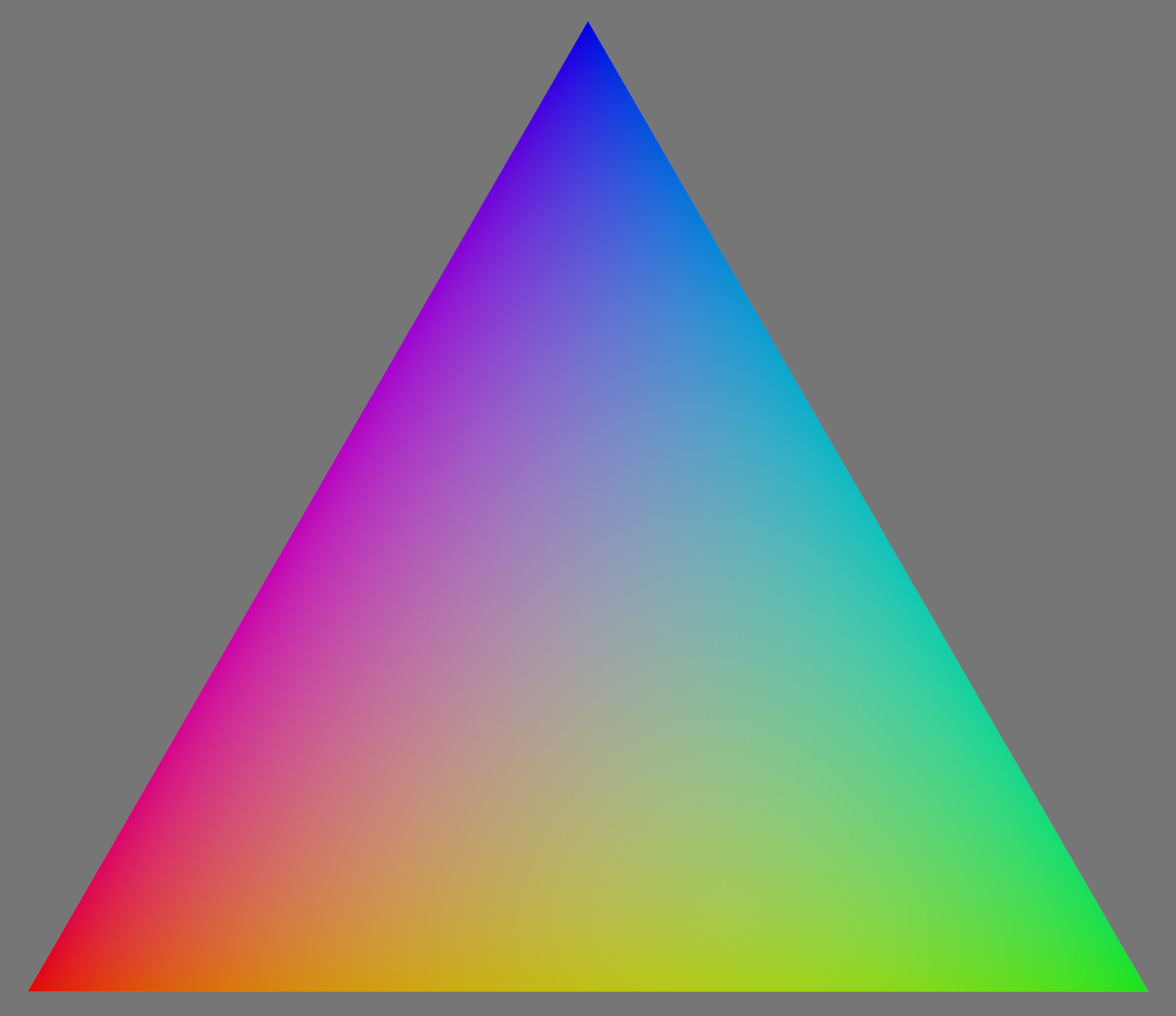
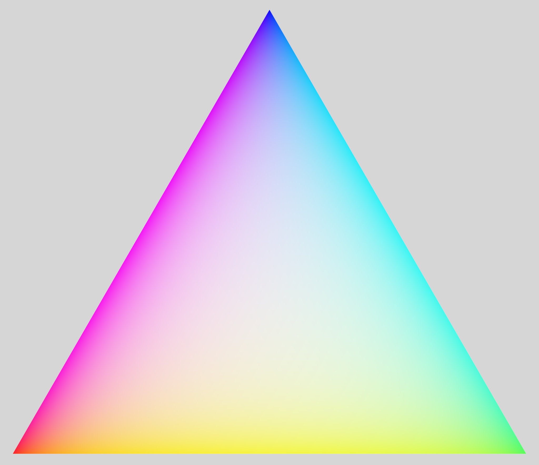
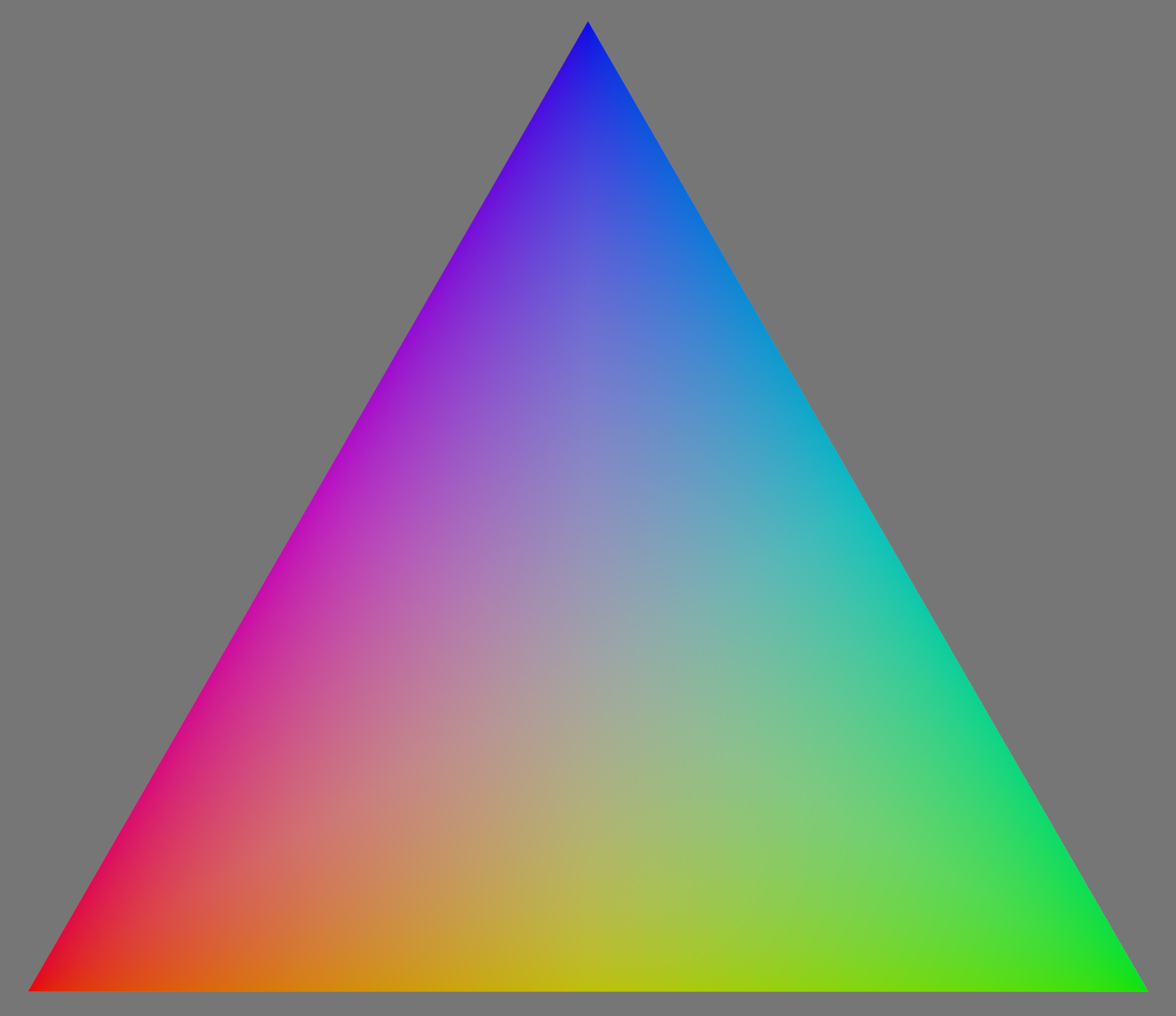
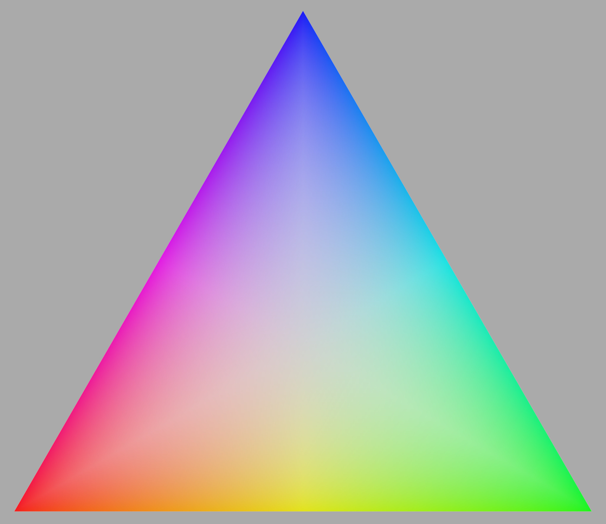
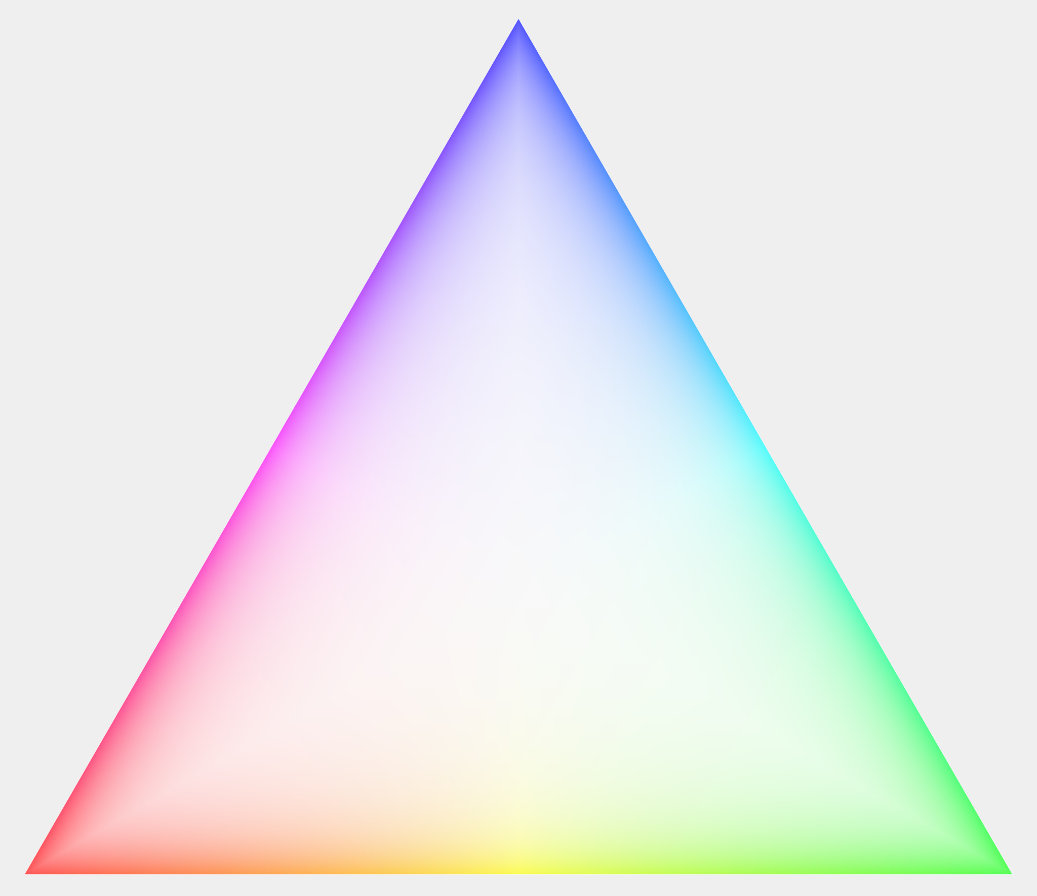
It’s easier to show some behaviors on synthetic charts so I created a simple one where the background is middle grey (0.1845 on all channels) and the color triangle is the linear interpolation between the three different primaries with a constant average of 1.
linear_0

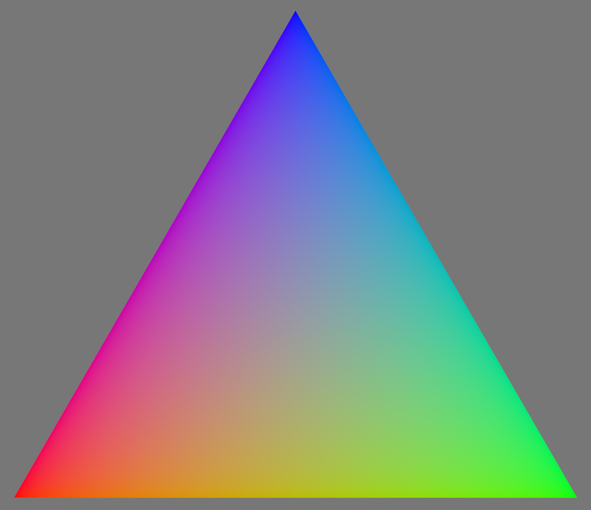
So let us just show what these look like for the three different color modes with the exposure adjusted up by 1, 2, and 3 Ev. All other settings are default i.e. contrast = 1.6, skew = 0

Crosstalk

Base +1 Ev +2 Ev +3 Ev
cross_0 cross_1 cross_2 cross_3

Preserve Hue

Base +1 Ev +2 Ev +3 Ev
hue_0 hue_1 hue_2 hue_3

RGB Ratio

Base +1 Ev +2 Ev +3 Ev
ratio_0 ratio_1 ratio_2 ratio_3

They all look pretty very similar for the base image with this contrast setting and it is actually hard to tell them apart at this level. But even small changes hard to spot here can be visible in faces as shown earlier.

The crosstalk and preserve hue options are still hard to tell apart when doubling the intensity by increasing the exposure by one stop, but something weird happens with the RGB ratio option. A triangle between high saturation purple, yellow, and cyan is formed. The extreme red, green, and blue are desaturating before less saturated colors closer to the neutral center of the triangle.

Doubling the scene intensity again by increasing the exposure with another stop continues the trend of the RGB ratio option where desaturated colors remain saturated in a cross in the middle while colors on higher saturation are desaturated before these. Its also finally possible to see a difference between crosstalk and preserve hue where the former has its purple, yellow, and cyan regions has widened while they stay unchanged for the preserve hue option. There is just one downside to the preserve hue option: star-shaped desaturation spikes going out against the primary locations.

The trend continues for the last picture where rgb ratio has saturated neutrals, crosstalk twists almost all colors, and preserve hue keeps the original hue along the edges.

So what?

I, first of all, want to focus on the problematic desaturation behavior of the rgb ratio option. The shape of the artifact depends on which norm you use but it will pretty much be there in some form. I think it is important that any desaturation of colors in highlights has to begin with low saturation colors and then gradually desaturate more saturated colors. This is what the crosstalk and preserve hue options do as the saturation is part of the dynamics of the tone mapping and not a separate manual step. I find this very problematic, what would you say?

It’s also clear that the preserve hue option actually preserves the hue even for brighter colors while it also becomes clear why any piece of bright sky pretty much always ends up cyan. But also note that there is very little difference at lower intensities between these two options such that the colors will be correctly preserved if the sky exposure first is reduced using either a masked exposure module or the tone equalizer. I.e. dodging and burning in scene-referred space is king and reduces the needed reliance on the tone mapper preserving colors!

Try it yourself!

I finally encourage you to try out the synthetic image yourself on the sigmoid or any darktable module for that matter! It is a really good method for revealing how colors are changed! I like to drag the exposure up and down to see how modules react to changing exposure levels!

Download the openexr-file or the Blender-file that I used to create it with:
average plane at 1.exr (8.0 MB)
color slice.blend (550.9 KB)
I took a very geometrical approach and assigned the colors from the coordinates of the surface, just change the surface if you want to modify what plane to look at or what colors to include.

6 Likes

I like preserve hue more now!

Yes that seems discontinuous. Modifying preserve hue might also be an interesting rabbit hole!

I would argue against that. Maximum saturation/chromaticity colors will be limited by display primary color emission-strength while at the same time you need/try to preserve emission ratios. You can either pin the color at the rim of the gamut and not change its apparent luminance when you increase exposure OR you change its apparent luminance and desaturate (as you cannot do both).
The latter at least tries to keep the dynamic range of whatever scene, the former alters it to maintain saturation. Luminance is maybe more ‘important’ than chrominance, otherwise black-and-white would not work. The sigmoid is quite superb at mapping luminances from scene to display, to me it would be strange to let color-appearance distort those luminances again.

I think this is technically only true for preserve hue. The fact that crosstalk bunches all colors to cyan, purple, yellow makes it almost useless. The above mentioned downside is that when trying to keep saturation, they(preserve hue, crosstalk) remap luminance to do so. And this is even without touching factors like perceived luminances of different colors at different saturation levels.

I’m not saying I like RGBratio…the way the colors wash out seems odd…but I can see why the colors do what they do.

There are several good threads over at acescentral dealing with similar problems and questions. I think there might be one or more solutions on the horizon that go one step further. Gamut mapping options which might look more correct than RGBratio. We’ll see.
Curiously LUTs could be the preferred solution here. They could model whatever desaturation or saturation maintaining behaviour one wants or ‘feels’ is right. Sure this is not as elegant as a analytic approach, but as long as no good analytic solution to chroma mapping exists, carefully handcrafted LUTs might be the way to go.

I keep repeating myself, sorry, but:
I’d personally use preserve hue and RGBratio for now, keeping in mind that both are not perfect.

As always, great work!

1 Like

I think this is a rabbit hole worth spending some time digging out so I will try to prepare some examples of my experience so far with testing this. Would you be able to compile the sigmoid branch yourself and try using it yourself on some images? It really makes it much easier to grasp the dynamics of things!

And some images of mine just to show that it still works! All of them are using crosstalk or preserve hue, rgb-ratio have remained unused so far. Editing process is basically exposure, masked exposure, and color balance rgb in scene-referred space before the sigmoid module. The black and white picture is also using some local contrast in scene-referred space even though it hasn’t been ported to work here yet. (I would really love a local contrast rgb module that works on “exposure level”/brilliance mode and handles infinitely bright pixels!)

IMG_5719_01

IMG_6683

20171001_IMG_9727

IMG_6788

IMG_7193

IMG_7167

IMG_7102

10 Likes

How can we download that branch with sigmoid?. I only know to do it from the master

1 Like

You can checkout the sigmoid branch from GitHub - jandren/darktable at sigmoid_tone_mapping and rebase it to the darktable master branch which works almost without conflicts. Then you can compile that branch and get sigmoid included in the master branch.

@jandren I did some experiments in the last days and it looks really promising to me. I had only some issues in highlight details where filmic did a better job in my opinion.

Just take care it adds entries for sigmoid module in your database data.db and if you remove the module DT is not happy so you have to do some work purging the entries…

As @priort said do take care when trying it out. I would recommend the following to not fuck with the rest of your installation:
clone my fork into its own directory:
git clone https://github.com/jandren/darktable.git

then checkout my branch:
git checkout sigmoid_tone_mapping

Finally build as a separate version using the test build command from the darktable readme
./build.sh --prefix /opt/darktable-test --build-type Release --install --sudo

You could even rename it /opt/darktable-sigmoid to really make it unique.
And probably backup that data.db file just to be sure.

Nice to hear that you tried it out @dirksagwitz and that you liked it! Would you mind sharing some pictures where you think filmic did a better job in the highlights? Would be interesting to both see what result you had like to achieve as well as try it myself. I.e. the raw file + your edit as jpg and its xmp? Would help me greatly in bringing this forward :smiley:

4 Likes

Here is an example where in my opinion Filmic does a better job … even if I like the sigmod saturation a but more but it’s missing e.g. some details in the clouds and I am not quite able to recover them well.
Picture published under CC-BY-NC.
IMG_7253.nef (28.5 MB) IMG_7253_04.nef.xmp (10.6 KB) IMG_7253_01.nef.xmp (10.2 KB) IMG_7253-sigmoid IMG_7253-filmic

4 Likes

@jandren , I noticed this too. I will be back home tomorrow evening and supply some examples. I solved this so far by using the tone equalizer and to tune down the highlights.

Compared to filmicrgb, in my tests sigmoid had less “out of the box” trouble with colour shifts. This was mainly caused by filmicrgbs standard setting for “middle tones saturation”=10%. Set this to 0 and both tonemappers are almost equal in this aspect. A good measuring tool to judge colour this is the new vectorscope, btw.

Using standard settings, sigmoid delivers images with noticable more oomph, due to its contrast setting. filmicrgb needs a little more local and global contrast but catches up if you know which of the 16 sliders hidden in 5 tabs you have to touch :wink:. Put those in a preset and again, both are close.

Where sigmoid imho really shines is in highlighted areas in the transition zone to clipped areas. Simply use highlight reconstruction and you´re done. I will post some examples tomorrow.

Going by @dirksagwitz’s samples only, filmic appears to have normalized brightness and regional (compared to global or local) contrast compared to sigmoid.

I won’t say anything about colour shifts as my system isn’t colour managed and both methods have their own challenges…

Just looking at the whole images sigmoid looks good (if a bit contrasty) and filmic looks strange.

1 Like

funny I would use a bit of tone eq for the sigmoid one esp for the left hillside and then overall I like the sigmoid better in this case if that change was made…I do like a bit of contrast maybe that is it when I look at it…

I would really like to give this a try.
Has anyone built a Windows version? If so, any chance you could share it?
Thanks :slight_smile:

Perfect!

So nice to tackle other pictures than my own and it also gives me the opportunity to introduce a slider in more detail: skew!

Think about skew as a way of prioritizing contrast in your image. Positive skew increases the contrast in the highlights while reducing the contrast in the shadows. Negative skew does the opposite. But let me show it in images instead of words! The following three images are my try at editing your image using a strict scene-referred workflow (more on that later). The only difference is in the setting for skew: 0, 0.39, and 1.

Pay attention to the clouds!

Skew = 0
IMG_7253

IMG_7253_07.nef.xmp (42.2 KB)

Skew = 0.39
IMG_7253_01

IMG_7253_08.nef.xmp (42.9 KB)

Skew = 1
IMG_7253_02

IMG_7253_09.nef.xmp (42.6 KB)

As you can see, adding a bit of positive skew can make those highlights pop a bit more!
It is actually quite pedagogic to take a look at the histograms for these as well. Note how the right white part (the clouds) gets pushed to the right.

Skew = 0 Skew = 0.39 Skew = 1
histogram_skew_0 histogram_skew_039 histogram_skew_1

Some notes on editing

Try to figure out how to put all your modules below the display transform (filmic/sigmoid). This is especially true for dodging and burning highlights and shadows as this operation is a simple multiplication when done in scene-referred space. I personally love to work with masked exposure for this effect and then complementing it with the tone equalizer when there are tricky edges I don’t want haloing around. This is a learning process for the whole community so I will try to help out as much as I can on the topic.

The new color balance rgb module works very well for me and it’s good to see it in use by you as well. One module that is yet to be “ported” to the scene-referred space is local contrast and I see that you correctly put it above the display transform. But, I have found that it actually works ok to use it earlier in the pipeline and I have been especially successful when applying it before adding saturation using color balance rgb. Might be worth a try while waiting for a rewrite of that particular module :wink: One more trick when it comes to local contrast is to use the parametric mask and only apply it on your highlights in scene-referred space.

Highlights are an interesting topic as we still do not have that many specific tools for editing them in scene-referred space, while also being the image feature that differs the most in editing possibilities when in scene-referred compared to display-referred!

4 Likes

I have a dropbox link on the FB page…with some instructions as well…

basically just unzip it where you like. I have a bat file in the directory that will run it from wherever you unzip it and will use an internal config directory in that folder so it won’t interact in any way with your current stuff…

Just take care as your xmp will not be compatible with standard versions as they don’t have that module…

EDIT so make a shortcut to the bat file by right clicking and add that to your desktop

2 Likes

I found the tone eq worked nicely with your module. I like the contrast in general that your module generates but usually the shadows need a bump and the highlights need pulled back so a basic sine wave spline in the tone eq was a nice fix…

Here another example. A shot I took two weeks ago.

Licence is: Creative Commons, By-Attribution, Share-Alike

Stork.cr2 (22.7 MB)

filmicrgb (standard settings + 1 EV, crop)

Stork

Stork.cr2.xmp (8.3 KB)

sigmoid (standard settings + 1 EV, crop)

Stork_01

Stork_01.cr2.xmp (8.7 KB)

First of all: The stork’s neck feathers where almost white, not somehow pinkish as in the filmicrgb example. In this case, setting filmicrgb’s “middle tones saturation”=0% and “preserve chrominance”=no helps. All in all sigmoid’s colours look more realistic for me, expecially the reds, e.g. in the color of the beak.

But if you look at the structure of the white plumage at the neck and head, filmicrgb delivers more detail imho.

2 Likes

@jandren thank you very much for your hints and suggestions. I did some additional image edits with the sigmoid module … and I like it more with each edit I am doing :slight_smile:
Now I will play a bit with the skew parameter, too. I am quite sure that this is a very powerful module and for sure a great alternative to using filmic. In my opinion it should be integrated into Darktable very soon.

2 Likes

I had exactly the same impression, but I suppose playing a bit with local contrast and the skew parameter may produce similar details as filmic does.