New Sigmoid Scene to Display mapping

Here’s a very quick comparison using Filmic vs. Sigmoid and some color balance:
IMG_7294.CR2 (30.2 MB)

Filmic:

Sigmoid:

I don’t want to rush a decision too quickly despite my previous comments. Both modules produce very good results, and it is hard to know which one will over time produce better and faster results until I spend more time with them. I do notice that there is a more yellow hue in Sigmoid vs Filmic in a lot of my images in this set which you can see in the face. No idea what that means.

1 Like

I don’t think this is a fantastic test image for either module, very flat lighting, contracted histogram. Base Curve would probably perform just as well on this photo.

Nice to see some testing, and happy to hear that you like the handling and feel of working with it!

The difference in colors is due to the fact that I only implemented crosstalk as a color processing method so far. It’s the method they use in ACES and was easy to implement. You can achieve the same result in filmic by desaturating your image by 4% and then chose none as color preservation mode. There will most definitely be a discussion on how to handle that in darktable. My plan atm is to implement both, test and learn. That is why I have only posted black and white images so far :wink:

I like the image! Very personal and happy moment :heart_eyes: Maybe a bit hard to draw any conclusion from but I’m also struggling with finding images that are both good and show of the math! I think the main difference apart from the color in the face can be seen in the sky and on her cheeks, the sigmoid mapping is more “careful” there. A bit of positive skew would push those areas to a bit brighter values.

As for comparing to filmic, I had appreciated if everyone could try to focus on what you see and keep feelings kind when comparing the two. This thread has already had its share of heated discussions. :fire:

6 Likes

I have had lots to say about comparisons (among software, and in this case, modules) on the forum. In general, use the tool that suits your workflow. I am glad that some of you already find the sigmoid module useful. We have @jandren to thank for that. :slight_smile:

I get that comparisons are inevitable, but if there is a complaint or suggestion (about filmic or another feature), file it in great detail at the appropriate place. There is always room for improvement. However, be sure to make your comparisons as 1-to-1 as possible to help the devs better understand the nature of the problem, which would take more effort.

As I said above with the tool shed analogy, modules (and software) can be used or disused in parallel. I for one use most of them, but naturally gravitate to some more than others. I suppose not everyone has the time or patience for that. For people with zero patience, commercial software is the way to go… No shame in that, though we tend to poke fun at the commercial scene, because we obviously love FLOSS. :stuck_out_tongue:

3 Likes

Spent quite some time adding some updates to this work in progress module.

  1. Made sure there is good orthogonality between the contrast and skew parameters.
  2. Added an RGB ratio preserving mode, or also known as preserve color in darktable.
  3. Added a preserve hue mode, known as film-like in RawTherapee.

I will write some more about these things and post some good example images soon. Figured I could notify you all in the meantime such that you can try yourself if you want :wink:

9 Likes

Thanks!

As the module does not contain any tooltips at the moment, could you please give a short explanation, especially how the sliders should be used ?

Clipboard01

Yes on its way :slight_smile:

But I can give you the basics now!

ACES like workflow:
Used by a majority of the movie industry, notable examples are probably all Netflix productions, the Marvel movies, The LEGO Movie. Longer list of productions: ACES (Sorted by Popularity Ascending) - IMDb

  • Use the default settings of the sigmoid module.
  • Disable filmic or base curve as you only can have one display transform in your pipeline.
  • Do all your edits in modules before (below) it with tools such as exposure, masked exposure, color balance rgb, tone equalizer, etc.

"Unleash the power" workflow
(Pun intended as the sigmoid is based on power functions :wink:)

  • Always begin with adjusting your exposure after activating the sigmoid module!
  • Find a contrast setting that you find works well for your mid-tones.
  • Massage highlights and shadows using a combination of dodging and burning using masked exposure and tone equalizer.
  • Optionally fine-tune your highlights using the skew option in the sigmoid module.
  • Try the color processing options and decide if your need to preserve hue or not (I will give some examples of the effect later).
  • Adjust your colors using the color balance rgb module.
  • Don’t bother about the crosstalk amount, negative values, target black, and target white in the sigmoid module. They are mostly there for completeness but should in the end probably be left alone.
6 Likes

Great.

People want an explanation regardless, as in What does this button do?!?! :cold_sweat: :stuck_out_tongue:

Alright, lets begin with explaining the three options found under color processing:

  1. Crosstalk
  2. Preserve Hue
  3. RGB Ratio

The crosstalk option is essentially the preserve colors = no option in other areas of darktable but with a tiny bit of desaturation i.e. crosstalk before applying the tone mapping function to each RGB channel individually. This is what traditionally has been used in a lot of editing software and also what is used in the ACES editing standard. Luminance, saturation, and hue are changed using this operation.

The Preserve Hue option is in essence very similar to the crosstalk one but with one difference, its “middle” channel is adjusted to preserve hue. Rephrased, the pixel’s minimum and maximum RGB values are tone mapped while the middle value is changed using a combination of luminance and saturation change for the pixel. The result is that only luminance and saturation are changed while the hue remains unchanged. The advantage is that this provides a natural desaturation towards highlights. Another name is also “film-like” in for example RawTherapee and Adobe DNG, I’m not a fan of saying film this and that as it depends so much on types and how it’s processed. So I opted for naming it after what it does, preserve hue. Thanks Eneen for the pointer! Luminance and saturation are changed using this operation.

The RGB Ratio option is what you all know as “preserve color” in darktable’s filmic module. This option only changes the pixel’s luminance using the tone curve and then applies display space desaturation for blacks and whites. I moved the “norm” options to its separate menu. They should be the same as in filmic v5, so no need for further details on them. Luminance is changed using this operation Saturation is also changed for dark and bright pixels but imagine the operation as saturation preserving is better for your understanding when we look at some examples.

Examples

Each example image is editing using a combination of exposure, color balance rgb, and sigmoid, with identical settings except the color processing setting.

Use the table scroll bar to flip between the different versions. Is there btw any gallery/slide option on discuss?

Circus arena from HDRI heaven

Posted earlier in the thread to show the problem with hue changes in the crosstalk option.
You can easily spot the hue shift in most of the spotlights and on the ring around the arena in the crosstalk image when comparing to the hue preserving option. One advantage of this is the lights actually look a little bit brighter. The RGB ratio has the same hue as the preserve hue image but the desaturation looks weird, especially on the tower in the middle that shines in bright ultra violet white.

Crosstalk Preserve Hue RGB ratio
circus_arena_4k circus_arena_4k_01 circus_arena_4k_02

Music hall from HDRI heaven

Posted earlier in the thread to show the problem with hue changes in the crosstalk option.
The crosstalk image is slightly more yellow compared to the other two, especially around the roof lamp. The RGB ratio image is the least saturated as the other two have their mid-tone saturation increased. It also has a clear blue color in the rectangular lamps as these aren’t as desaturated as in the other two options.

Crosstalk Preserve Hue RGB ratio
music_hall_01_4k music_hall_01_4k_01 music_hall_01_4k_02

Happy Kid

Posted a bit earlier in the thread by person101x
I had liked to begin with saying sorry for not appreciating earlier how good of an example image this is!
Have a look at the nose and top of the checks, the crosstalk image is slightly more yellowish compared to the preserve hue image. I urge you to download and flip between the two to really see the difference clearly. It might not be super obvious at first but it has this weird effect on the face color. This is if I have understood it correctly one of the main arguments for the introduction of the preserve color option in darktable. So why does the rgb ratio option look terrible in this example when it usually looks good in filmic? That is because you have to put the “middle tones saturation” slider under the “look” tab to zero to compare the two. Any non zero value on that slider in filmic is modifying display referred saturation. I think it makes more sense to perform that using f.ex. color zones so I left it out from the sigmoid module.

Crosstalk Preserve Hue RGB ratio
IMG_7294 IMG_7294_01 IMG_7294_02

You might at this point think that the preserve hue option always is the best (that at least what I think of the above three examples). So when would one want to use the crosstalk option?

Fire clouds

Photo by me from a sunset we had recently.
Uses a high contrast value in the sigmoid module to get this punchy contrast and saturation. Take extra note of the bright sun-lit parts of the clouds. The crosstalk image has these areas twisting from red/orange towards yellow as they get brighter. This makes them look brighter and almost self-luminous compared to the preserve hue image which does have a gradient towards a brighter red/orange but looks much duller in its intensity. The rgb ratio image did not far well in this example and looks very dull compared to the other two. The effect is also present in shadow areas where colors twist towards darker mixes, not correct in the sense of what you measure but the effect can sometimes be very good.

Crosstalk Preserve Hue RGB ratio
IMG_6893 IMG_6893_01 IMG_6893_02

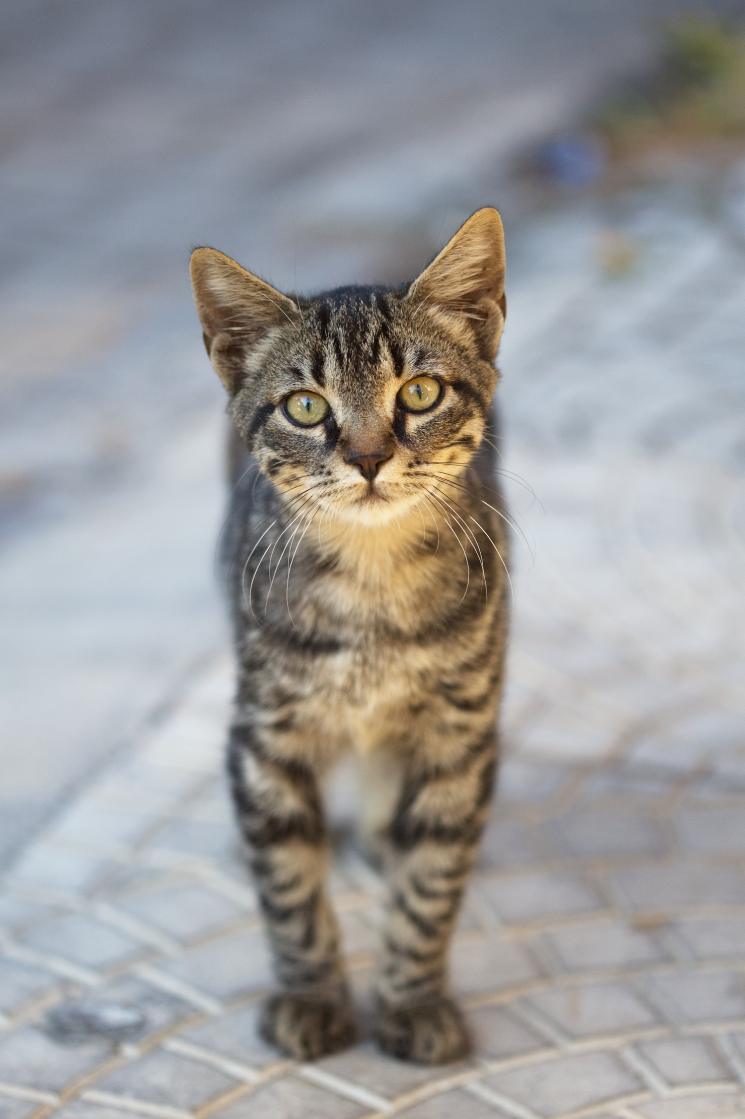
Kitten in Ismir Turkey

Photo by me from a pre-Covid trip. Already used above for black and white examples!
And some pictures you see barely any difference between. There is a slight difference on the kittens check but nothing that makes one or the other picture better than the other. The rgb ratio is again left out as the least nice option if you ask me.

Crosstalk Preserve Hue RGB ratio
20181030_IMG_5417 20181030_IMG_5417_01 20181030_IMG_5417_02

Conclusion

I hope that answers most of your questions regarding that particular option.
My recommendation is to try both crosstalk and preserve hue and see which one suits your images the best. I do not recommend using the RGB ratio option at this point as I still have to find a use-case where it actually looks better than any of the other two options, but let’s see if anyone finds usage for it!

Please ask if anything is unclear regarding the color processing options after this presentation!

12 Likes

Fascinating and exciting! Great work!

Will this be included in the upcoming release of Darktable?

4 Likes

Those preserve hue results are indeed very nice!

2 Likes

Thanks for this detailed explanation @jandren . All the images I edited so far confirm what you described. And now I also know the reason :smile:.

Up to now I tested a few dozen images from pixl.us, especially out of the PlayRaw section and a bunch of my own nasty ones. Your module runs very well and fits nicely into the raw-editing toolbox we call darktable.

I really hope it will find its way into master finally.

Work-around: Most browsers offer the “Open in new tab” option if you right-click on the image. Switching between these tabs you can compare them like a slide show.

2 Likes

The more I read of color appearance models and how to do them ‘right’, the more I think that as long as something is not obviously offensive it is ‘good to go’. I’ll come back to this.

While I don’t like the crosstalk option at all, the orange to yellow hue shifts in the ‘Fire Clouds’ image look very pleasing to my eye. The skin tone hue-shifts for the ‘happy kid’ picture look awful compared to preserve hue, and awful is an understatement.
Crosstalk in the ‘Circus Arena’ image shifts blues to cyan and leaves the hints of purple in those other lights alone, making it easier to see the two different colors with which the stage is illuminated. It’s wrong, but it ‘reads’ better for the lack of a better word.
Preserve Hue appears to be much better in the accuracy department in ‘Circus Arena’. Curiously though, RGBratio at least tries give the blue and purple lights their ‘strength’ back. For my taste it goes way too quick to white at high intensities and floods everything with the same hue of blue, but it tries to render the strength. What RGBratio does nicely is render the colors of the control panel in the front compared to the other two options. In ‘Music Hall’ RGBratio renders a believable carpet color…obviously I haven’t been there and can’t say if this is more correct than the other options. This of course holds true for all the statements above.
What is this personal opinion then good for? Not much, except for ‘PreserveHue’ works for me, except when it doesn’t. I’d use it. Are there applications for RGBratio? Sure! Are there aspects of ‘crosstalk’ that I sometimes would like to have for ‘PreserveHue’? Very few and rarely.

This brings me back to color appearance models (CAMs) and the general question of how to represent the full spectral gamut that humans can see into smaller colorspaces of displays. It’s very likely that you can break any gamut-mapping algorithm at the moment. There are some doing a better job than others. Of course one should opt for the latter ones IF it doesn’t break for a particular image. But, especially the appearance of high chromaticity colors of high brightness, particularily in the blue and red spectral range is something that even the ‘best’ CAMs still struggle with. It is a current research topic. So while true that PreserveHue is not perfect, it might absolutely be good enough or even better in cases where the ‘better’ option breaks.

Great work on that module! Looking forward to it!

5 Likes

I prefer the rgb crosstalk.

Rgb ratio has too much low saturation in the shadows and highlights

Preserve hue totally removes luminance details leaving a solid color blob

Neither rgb ratio and preserve hue really preserve hue because they are based off on the rgb color model (blue is shifted to purple and red is shifted to pink), sometimes they could be accurate but most of the time they just have the opposite hue shift compared to rgb

However it’s great to have many options because the perfect way to handle colors doesn’t exist.

Thanks :muscle:t2:

3 Likes

Thanks for the nice comments!
They also really show how much of a personal taste and image intention plays into this topic as well.

Especially lovely to see your results with trying it out @pass712! Really good results :slight_smile:

I think I will prepare a follow-up post with some synthetic charts that makes it easier to show some aspects of how these three methods differ from each other. Especially on the topic of desaturation in highlights.

It is also a topic that is covariant and intertwined with what you do before this module. Take the control panel in the Circus Arena for example. I would say that the solution for making it more saturated actually is to dodge it a little bit with a masked exposure. It will become more saturated once closer to the mid-tones.

As for a merge to master, well I would recommend you to not hold your breath as the PR still is marked as controversial. It will need to find its proper place, naming, and function before a merge. I hope these last updates have moved it slightly closer.

4 Likes

A post was merged into an existing topic: The darktable magicians have crafted something again - detail mask

Well, time will tell. Regarding the discussion on github it will be interesting to see how the decision is made in the end. I think it is important to discuss it and can follow the arguments against it to a certain degree.

I can only encourage others to test this module thoroughly. If needed I could support the Win 10 fraction with the build I’m using at the moment.

Why not just distributing the module as is for the time being? AFAICS, Darktable’s plugin architecture is flexible enough to load any .so’s that fit the expected interface.

1 Like

Without being represented in the iop order list darktable doesn’t know how to deal with a module.
Of course it’s possible to build a custom darktable version after integrating the pull request.

1 Like

Correct, that’s what I did :wink:.

So if there is any dirty Win10 user out there beeing interested to play with sigmoid just let me know.