Hi everyone.
I don’t know about others, but for me, when working with photos, it is more convenient to work with a white interface scheme, because I do not like to work on reference material (it confuses and blurs the look - imho), and when working with a dark interface I can of course compare by histogram, but add something “my” edits I can no longer do, because I will be wrong. The dark color interface will be confusing.
When processing video, the dark interface is acceptable - I agree. But when working with photos… No! - maybe I’m wrong? Correct me.
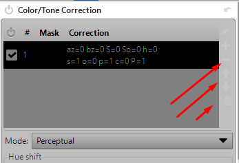
I tried to switch to such a scheme in this program - black text is well visible on white background, but these buttons are almost not visible. Look for them on “chuppah”.
And the second - the background under the photo - it is black. How to change it to gray, or by choice?
Could I have done something wrong with the program?


