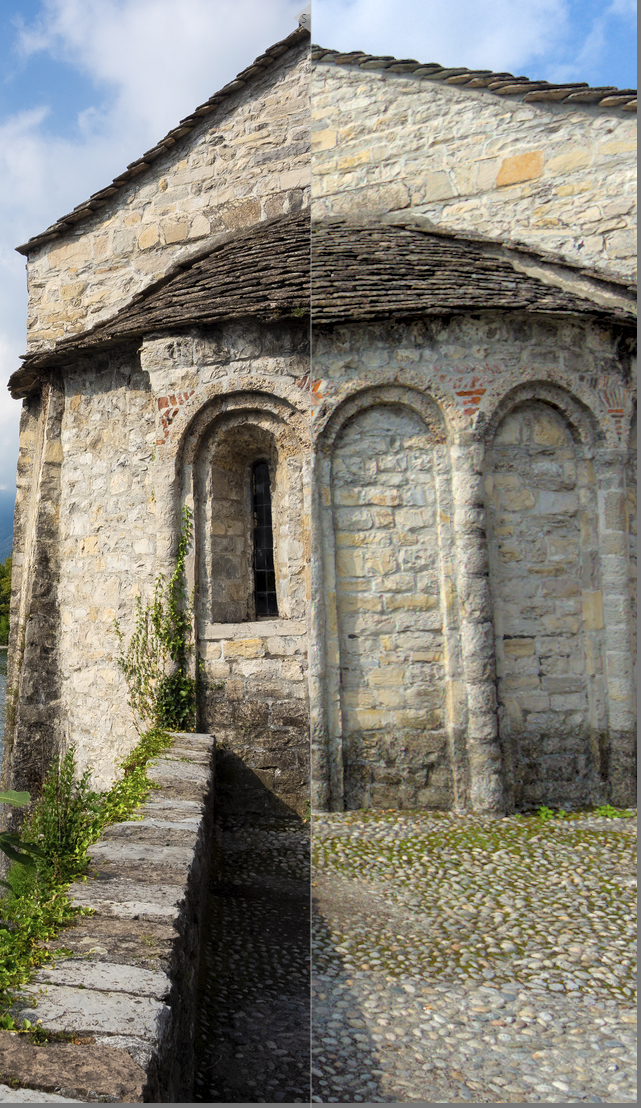
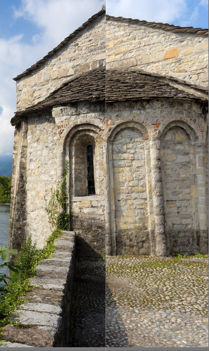
I just used your in-shade profile shot to produce a basic profile using Lumariver. I guess it should be just the same as @priort’s linear profile above, but I wanted to try anyway. EM5MK3Shade no LUT.zip (346 Bytes)
Edit…
After some more playing around, I discovered that at least on this image, this combination produced quite good results, combined with the input profile above:
‘legacy’ WB (i.e. no color calibration, WB module set to ‘as shot’)
Sigmoid with ‘preserve hue’ dialed right down to allow crude hue twisting.
a contrast curve in tone eq
at this point a slight hue adjustment in color balance rgb brings at least most of the colours pretty close to the jpg
I made a style, to be used in combination with the input profile above: Match EM5III.dtstyle (4.3 KB) You also do need the WB module setting to ‘as shot’
@AngryPixel, not at all sure if this helps, but if you’d like to try on a few other images I’d be very interested if it’s good/bad/terrible.
To load the ICC profile you need to create (unless it’s there already) a folder named in inside a folder named color in your darktable config folder. On windows it looks like this C:\Users\USER\AppData\Local\darktable\color\in (swap USER for your username) Copy the .icc file to it, then restart DT and it should be available in the input profile module.
Edit (again)
After a bit of fiddling with images from my EM5II, it seems that the profile I produced from your shot is actually very close to my EM5II profile, and both give substantially better rendering of orangy-reds compared to the standard DT profile which seems to muddy those quite noticeably.
Deep reds do go a bit more magenta than the jpeg, but better than the standard dt profile.
Well you will have lots of options in lumariver… I think focusing on some key colors and getting the profile right for them by setting maybe tighter tolerances on the matrix/lut for those patches might offset or adjust the colors in a more general way. I think with LumaR you can also relax these to the max of something like 100 and the the lut will be essentially equal to the matrix if there is ever a worry that a profile clips… so many options and combinations that you can tweak. As for Olympus it just seemed in a couple of those images the wb is strongly shifted and if you select only the basic primary colors from your chart and look at the vectorscope it has a pattern with cyan a bit weak and shifted over to blue… Magenta a touch towards red. Red and Blue seem pretty true but yellow is shifted a fair amount to orange and green a fair amount towards yellow. So there is the white point tendency and the rotation of the hues… I should look at some test images from a few cameras and see how this pattern compares…
If you’re going to be persnickety about color, you’ll need to be persnickety about your color management. Soup-to-nuts:
Rendering to display through a calibrated display profile. I didn’t see a reference to such in the thread (I just skimmed it, sorry if I missed it), but this is the most important thing to do to make sure you’re looking at renders consistent to what your camera recorded.
A real white reference for white balance. By this, I mean, a shot of a white balance target in the same light as the scene. Doesn’t have to be included in the actual image you’re cherishing, could be taken separately in the few seconds before you shoot the money shot. This is the only reliable white balance reference you can gather; your recall is highly faulted. Now, you may not like that white balance, but it gives you the real white reference from which to depart to your whim.
A calibrated camera color profile. Your first concern should be with the hues of colors, fine gradations of extreme colors are for another thread. What comes with darktable should work just fine, but you can’t really know its not unless you get #1 and #2 above sorted out.
Please share such a shot (once you get the chance to take it) if you are inclined. Its nice to try and work with other images to try and achieve something. I have never tried really to custom tweak a profile I have more or less just used the defaults but I might use yours as a test best to see what sort of tweaks might be improvements…
Yes, definitely options! I found through elimination that most of the more ‘tricky’ options and tweaks like the LUT adjustments and tone curve operators depend on a LUT in the profile which can cause clipping in DT.
One can get around it by either moving the tonemapper (sigmoid) before the input profile module, or by using two exposure instances, one before the profile to lower it until it doesn’t clip, then one after to bring it back up… but one can certainly fiddle with the matrix a lot without worrying about that.
I found it very interesting that in the image the OP shared, just the using the basic profile did look better but the blue sky was still well off from the jpg - but then a tiny global hue adjustment brought both the sky and the colour of the cliffs to much better match.
I tried a couple of the provide profiles, but i get mixed results out of them. They work better for one image but worse for others.
I also tried the whole process in the video, but using my screen’s white balance as input leads to worse results
I think I got better captures this time. But I still didn’t get the color balance module to behave in the way displayed in the video further up above the thread chain.
Based on the documentation of the color checker, I instead tweaked the exposure/black values until I got the 10%black and 90% white values. Before calibration i also set the white balance to spot recommended by the manufacturer.
You can see the results below. The comparisons are always LightRoom JPEG on the left and Darkroom Edit on the right. I capture the results below on windows with a calibrated display.
A Darktable Default
B Color Calibration corrections applied and iluminant set as shot in camera. White balance is on and set to default.
C Color Calibration corrections applied and disabled (passhrough). White balance is set to as shot
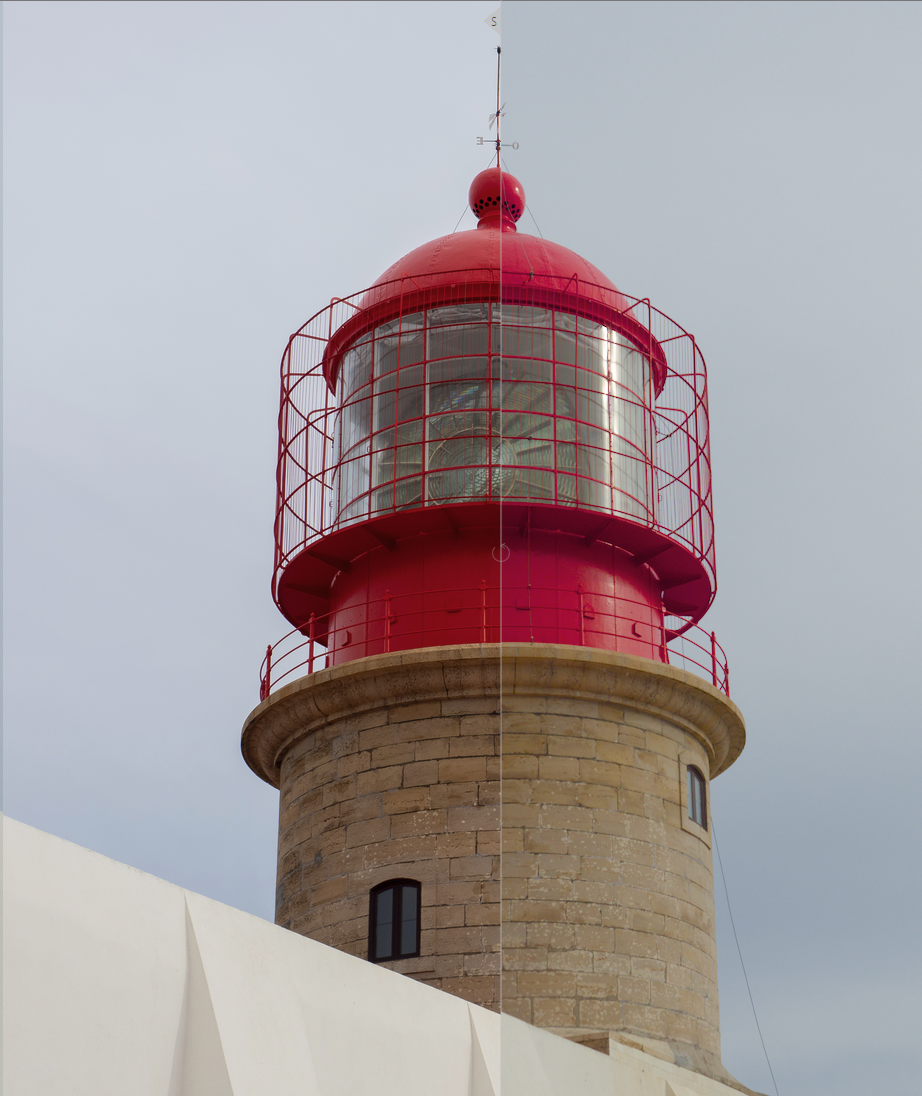
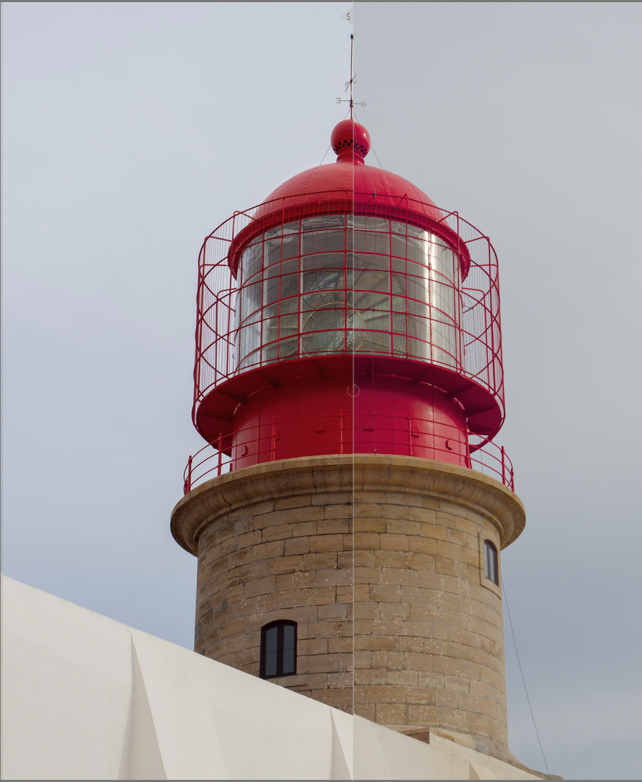
so far C seems to yield the best results. However, the lighthouse red is still not completely accurate. Note that I have tried also the sigmoid module as an alternative to filmic. Sometimes It produces better results.
Maybe I’m doing something wrong, but it seems to me like I’m fated to carry this color checker or a gray card with me wherever I go to have somewhat accurate colors.
I’ll take a look tonight … In your links for sources is the jpg the camera preview or a processed one from LR?? Are you using filmic… If so maybe try v5 set to no… v6 and v7 can push things at times to magenta…but it might be the profile out of the gate…
Just taking a quick look at your first example… I prefer v5 of filmic…it doesn’t have the gamut mapping and if you like your reds well away from magenta I find it to be better and with the ability to play with the saturation I like it… As for WB I made it simple just using only the WB module and the daylight preset from your camera selected in the drop down…leads to something that looks fairly close I think to what you show and so here it is with some very basic modules tagged on ie lens corrections…you could tweak exposure to taste and I didn’t do any color grading at all… Also always check initially without filmic or sigmoid as they can impact color and its nice to see what it does after you assess the naïve image
I think your example might also be a bit brighter and contrasted so you can do a simple perceptual brilliance tweak… that would offer it up more like this…
Well, I think your examples ‘C’ look pretty good. Where the reds are concerned it would be easy to make a preset for either colour zones, masked color balance rgb, or the channel mixer in color calibration, to shift red hues a little.
Just to be clear, when you mention Color Balance here I think we’re talking about Color Calibration?
One more point while I think of it - most camera jpgs have some serious hue twisting going on due to their tone curves - so to replicate jpg colours it can help a lot to set filmic to v.5 no preservation or in sigmoid dial the color preservation slider down to 0.
Hue twisting often only changes bright colours though…
I don’t know if it is just my monitor, but the pictures you posted look very “redish”. Even the clouds have a yellow/red cast. Even though the lighthouse is now red, that’s not an accurate depiction of what I saw
I have also found that correction C starts adding a bit of redish tint to some images that were shot in cloudy/dark skies. I guess this is to be expected since the it was calibrated for sunny days?
Playing with the temperature of the white balance module eventually gets me to a state where it looks good to me. But this all eyeballing at this point.
I know that it is nice to have more option to choose from, but to my eyes it seems that none of the module work correctly or have some downsides to using them.
I personally feel that dark table pre screen referred workflow was much easier to work with
I am struggling with something very similar for my Panasonic GX9. After reading up on the subject, I do not think it is a WB issue, it is RGB sensors picking up light across the whole spectrum to a certain extent so it needs to be corrected. I ended up picking up a test shot from Dpreview’s studio images, and calibrating to the color chart there, now I am tweaking it by hand. You may want to experiment with this approach.
Just by eyeballing, here is my correction, you can go a bit more heavy-handed but it gives back the reds of the lighthouse and the blue of the sky (BTW, having some “pure” colors in there was very useful). Not all channel values sum to 1, which is intentional. These problems are tricky to correct since there is no single “color cast” on the image, it all depends on what color the original object was (eg something green would get a red cast, and vice versa), and neighboring objects modify you visual perception.
I don’t share your preference for pre-scene referred DT; I find it much more powerful as it is now. But I am wondering if there was a bug in the color handling part of the pipeline, how would I know? It is all a big black box to me; I should read up on color theory and will do that at some point but these color casts are the biggest pain point for me at the moment.
And here is an edit “to taste” (or lack of, I was almost tempted to make the sky a complementary green Wes Anderson would have approved of, but resisted):
I must confess that I’m running out of ideas… I’m by no means an expert anyway!
Well, reverting to using just WB and no color calibration doesn’t really affect the scene referred flow - that’s my approach and I think it works well.
One thing I have been wondering about, and which might help here, is how does CC arrive at the initial illuminant temperature? It seems to be based on the camera’s WB reading, but clearly it does something more.
I will post the results of my testing later, but it’s clear that having correct custom WB coefficients makes a significant difference. And as AP said at some point, when it comes to CC CAT, garbage in = garbage out.


