I tried a couple of the provide profiles, but i get mixed results out of them. They work better for one image but worse for others.
I also tried the whole process in the video, but using my screen’s white balance as input leads to worse results
I think I got better captures this time. But I still didn’t get the color balance module to behave in the way displayed in the video further up above the thread chain.
Based on the documentation of the color checker, I instead tweaked the exposure/black values until I got the 10%black and 90% white values. Before calibration i also set the white balance to spot recommended by the manufacturer.
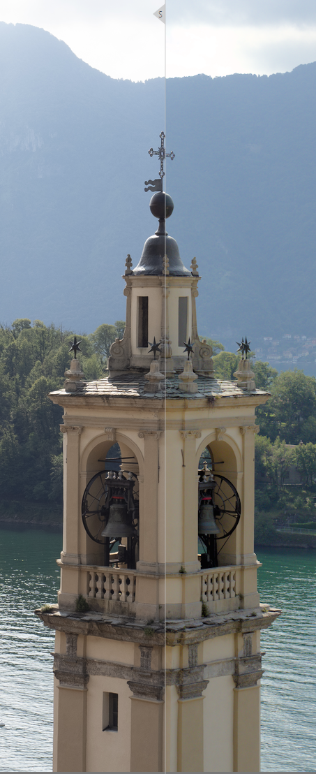
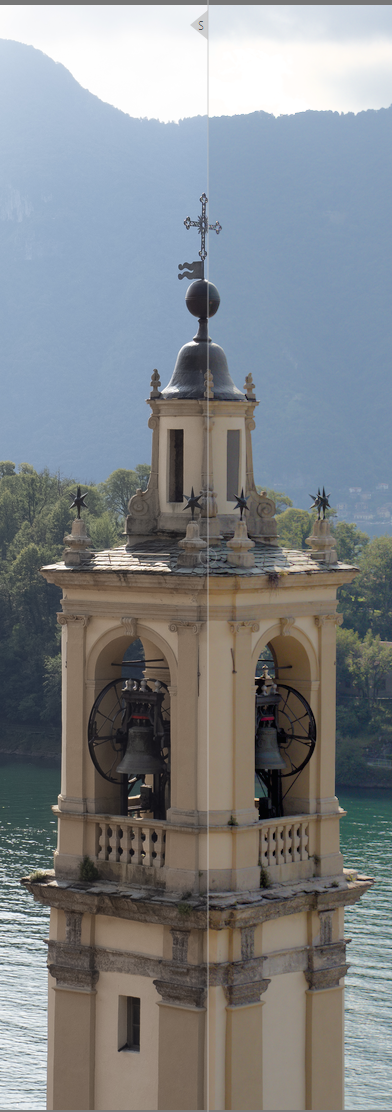
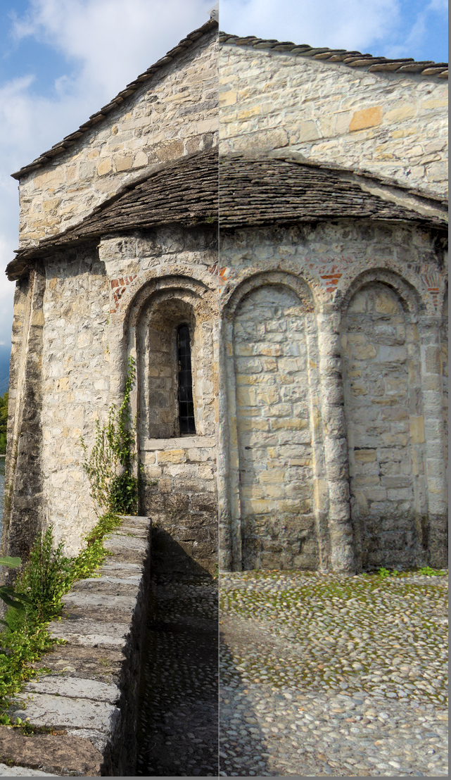
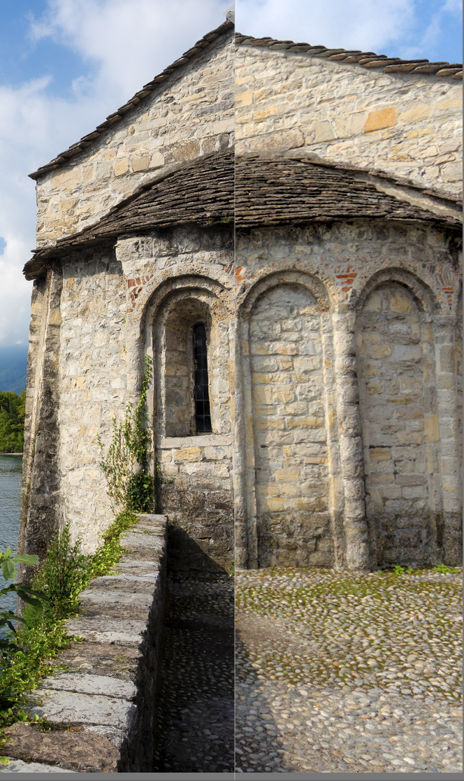
You can see the results below. The comparisons are always LightRoom JPEG on the left and Darkroom Edit on the right. I capture the results below on windows with a calibrated display.
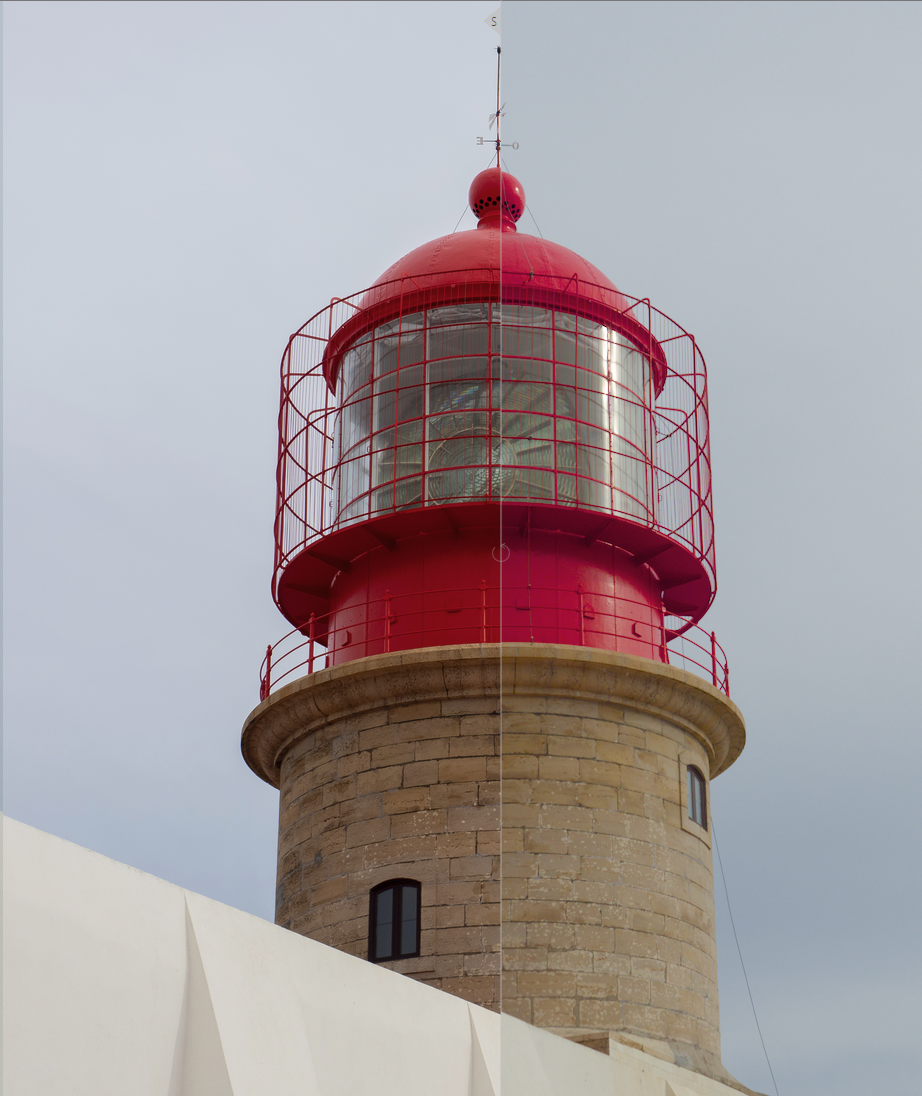
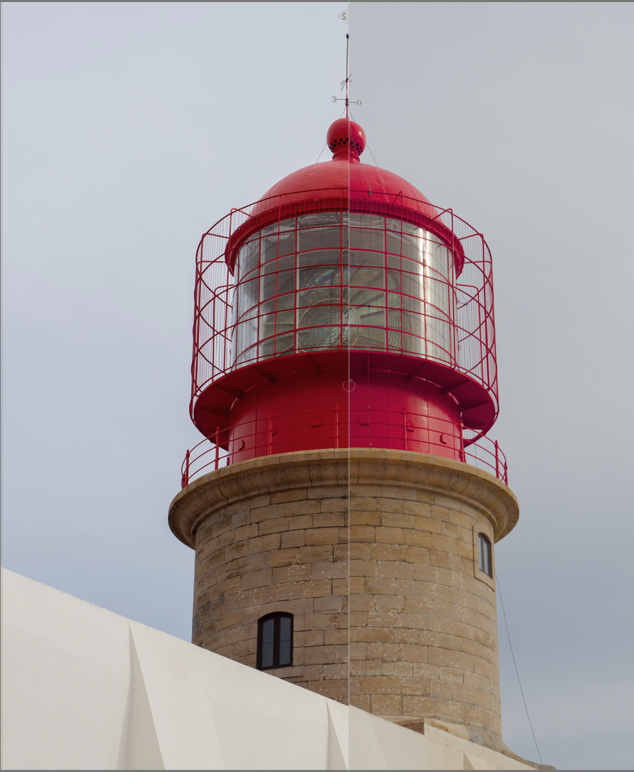
A Darktable Default
B Color Calibration corrections applied and iluminant set as shot in camera. White balance is on and set to default.
C Color Calibration corrections applied and disabled (passhrough). White balance is set to as shot
so far C seems to yield the best results. However, the lighthouse red is still not completely accurate. Note that I have tried also the sigmoid module as an alternative to filmic. Sometimes It produces better results.
Maybe I’m doing something wrong, but it seems to me like I’m fated to carry this color checker or a gray card with me wherever I go to have somewhat accurate colors.
I’ll take a look tonight … In your links for sources is the jpg the camera preview or a processed one from LR?? Are you using filmic… If so maybe try v5 set to no… v6 and v7 can push things at times to magenta…but it might be the profile out of the gate…
Just taking a quick look at your first example… I prefer v5 of filmic…it doesn’t have the gamut mapping and if you like your reds well away from magenta I find it to be better and with the ability to play with the saturation I like it… As for WB I made it simple just using only the WB module and the daylight preset from your camera selected in the drop down…leads to something that looks fairly close I think to what you show and so here it is with some very basic modules tagged on ie lens corrections…you could tweak exposure to taste and I didn’t do any color grading at all… Also always check initially without filmic or sigmoid as they can impact color and its nice to see what it does after you assess the naïve image
I think your example might also be a bit brighter and contrasted so you can do a simple perceptual brilliance tweak… that would offer it up more like this…
Well, I think your examples ‘C’ look pretty good. Where the reds are concerned it would be easy to make a preset for either colour zones, masked color balance rgb, or the channel mixer in color calibration, to shift red hues a little.
Just to be clear, when you mention Color Balance here I think we’re talking about Color Calibration?
One more point while I think of it - most camera jpgs have some serious hue twisting going on due to their tone curves - so to replicate jpg colours it can help a lot to set filmic to v.5 no preservation or in sigmoid dial the color preservation slider down to 0.
Hue twisting often only changes bright colours though…
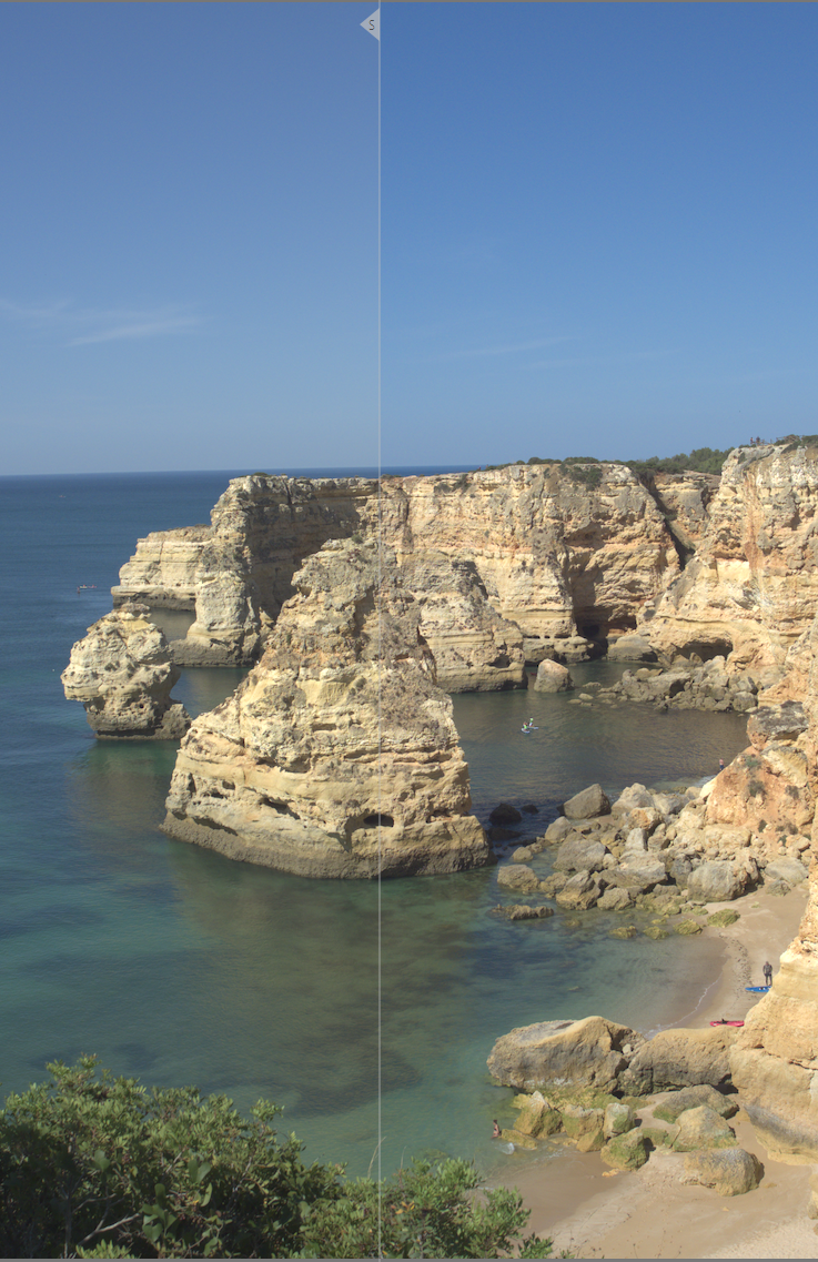
I don’t know if it is just my monitor, but the pictures you posted look very “redish”. Even the clouds have a yellow/red cast. Even though the lighthouse is now red, that’s not an accurate depiction of what I saw
I have also found that correction C starts adding a bit of redish tint to some images that were shot in cloudy/dark skies. I guess this is to be expected since the it was calibrated for sunny days?
Playing with the temperature of the white balance module eventually gets me to a state where it looks good to me. But this all eyeballing at this point.
I know that it is nice to have more option to choose from, but to my eyes it seems that none of the module work correctly or have some downsides to using them.
I personally feel that dark table pre screen referred workflow was much easier to work with
I am struggling with something very similar for my Panasonic GX9. After reading up on the subject, I do not think it is a WB issue, it is RGB sensors picking up light across the whole spectrum to a certain extent so it needs to be corrected. I ended up picking up a test shot from Dpreview’s studio images, and calibrating to the color chart there, now I am tweaking it by hand. You may want to experiment with this approach.
Just by eyeballing, here is my correction, you can go a bit more heavy-handed but it gives back the reds of the lighthouse and the blue of the sky (BTW, having some “pure” colors in there was very useful). Not all channel values sum to 1, which is intentional. These problems are tricky to correct since there is no single “color cast” on the image, it all depends on what color the original object was (eg something green would get a red cast, and vice versa), and neighboring objects modify you visual perception.
I don’t share your preference for pre-scene referred DT; I find it much more powerful as it is now. But I am wondering if there was a bug in the color handling part of the pipeline, how would I know? It is all a big black box to me; I should read up on color theory and will do that at some point but these color casts are the biggest pain point for me at the moment.
And here is an edit “to taste” (or lack of, I was almost tempted to make the sky a complementary green Wes Anderson would have approved of, but resisted):
I must confess that I’m running out of ideas… I’m by no means an expert anyway!
Well, reverting to using just WB and no color calibration doesn’t really affect the scene referred flow - that’s my approach and I think it works well.
One thing I have been wondering about, and which might help here, is how does CC arrive at the initial illuminant temperature? It seems to be based on the camera’s WB reading, but clearly it does something more.
I will post the results of my testing later, but it’s clear that having correct custom WB coefficients makes a significant difference. And as AP said at some point, when it comes to CC CAT, garbage in = garbage out.
I think they are reddish as much of the DT stuff you posted for comparison is more magenta and you were not happy with the red so I went a little more that way… Indeed not being there might take a bit away from what you end up with… I also wasn’t really sure how your LR edits were the main comparison for color. I extracted the previews from the raws to see what the camera had done with the color and these were different… The water scene has strongly modified blues and saturation as do the greens from the in camera jpg and the raw so this was introduced by LR and if DT doesn’t match that then I don’t think it can be used as the reference. I didn’t spend much time on it… for me anyway DT seemed to give a pretty similar starting point to the in camera jpg if you used the camera presets in that module for the camera… Using that wb It was a bit cooler and so seemed to have less of that yellow greenish cast on the stones and walls in the shots that seemed to be the issue you identified in your initial image and the subsequent ones… Maybe I need to go back and make sure I am comparing the right images…
Thanks for the endorsement; that was a fun project and one that I was excited to share.
Yeah, white balance is really about two biases: 1) the color temperature of the light at the scene, and 2) the camera’s non-uniform spectral response. Both require see-sawing the channels so something in the scene that is supposed to be white is R=G=B.
In my fooling around with stuff, I’ve found two ways to shift the channels to a good white reference, one being the three channel multipliers and the other being introduction of the reverse bias in the color transform. To fool around with the latter, I took a target shot in daylight and processed it without white balance correction, then made a camera profile from it. And guess what, that profile when used in the color transform also corrected white balance. I posted a short treatise on it in a somewhat related thread a long time ago:
What do you think of the color in these 3 renditions… its using another software on WIndows… its free but not open source. Its called Picture WIndow Pro. It has some interesting tools and an interesting GUI that of lets you build nodal edits but I was just curious as I knew it could do icc profiles from a color checker and also has a match reference feature. So any image with a colorchecker can be used as an image to try and match your image to. I used the raw not the jpg but you could use a jpg version to match or try to match to camera styles… Anyway I was curious how it might compare to using the internal correction applied by DT so I will have to go and do this using CC and DT chart and see where it lands… I found these to present pleasing colors to my eye but I don’t own that camera so any user will for sure be more familar with the color nuance.
These images are exported after 2 steps… Step one is the automatching transform and step 2 is autolevels of sorts. It does autolevels based on hsv or hsl or rgb and the results vary a little… Image 1 is the hsv , 2 is hsl and 3 is rgb… You can also manually tweak it but I just let it pick based on the default thresholds…I have to run off to make dinner but I will compare these later with DT … Just curious if these results seem any better for color that some of the previous attempts to model it…
I think i have finally reached a good profile. I got this profile by using the color checker shots I posted (daylight versions).
I spent most of yesterday comparing pictures with this profile and there are definitely improvements. The odd thing is that every tutorial/guide always recommends setting the white balance to before proceeding to the correction. Which is what I did with all the previous attempts. For this attempt I left the white balance as shot by the camera and now I actually get better colors.
The lighthouse still has that magenta cast, but at this point I have resigned myself to performing manual corrections in those cases.
I would like to thank everyone again for all their time and feedback.
I think currently it reports the wrong value (from a user’s perspective).
You took a photo with illuminant temparature T.
In camera reference mode, the white balance module applies multipliers as if the shot had been taken under D65 (6504 K).
input color profile maps D65 to the pipeline’s D50, and T to T' (for example, 5500 K to 4200 K).
color calibration then maps T' (the temperature that the D65 → D50 mapping took your original T) to D50. T' is the temperature shown in color calibration, and that is why a daylight shot, taken at something like 5000 - 5500 K, will be reported as 4200 - 4500 K or so.


