Olympus EM5 Mk 3 - Greenish tint (white balance issue)

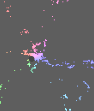
You can try this quick and dirty exercise… I don’t think its your wb. Using the vectorscope its not bad and you can push it around… It might be a tad toward green with as shot and then using your camera mode for shade all using traditional wb it doesn’t deviate much…Shade takes it just slightly to the bluer side of center. If you select only the 6 main colors in your chart you get a nice display to play with. Note how with as shot wb how they come in and then using color zones and doing a very quick hue vs hue curve to rotate them as is done in often in video you can see that your yellow is towards orange and green toward yellow and cyan towards blue… your red and blue seem bang on… after the color zones and you could do a better job than me you can line them up… now save that as a preset and apply to other images to see if you like it better… just as an exercise at least… and finally a daylight shot in the midday sun would offer a more general profile than one in the shade… just some random thoughts…

default exposure and as shot WB

Color zones…

So this

image

vs this

image

So maybe you could find a better starting profile?? I should look at how RT is in the vector scope… I don’t think you can as nicely get this sort of display though

This is your as shot wb

image

Camera shade

image

Set to neutral patch…
image

Manual tweak from the vectorscope to 7709K

image

I think the sensor in the EM5-MK3 Is the same as the em-1 mk2. This review (https://m.dpreview.com/reviews/olympus-om-d-e-m5-iii-review)) at least mentions that.

Thanks for taming the time to try things out. I shot that one in the shade since the video mentioned it didn’t matter much :/.

I have another shot in direct sunlight but somehow the colors that come out are a worse. I can attach that one if it helps?

I’ll definitely try your suggestion !

I am the farthest thing from an expert. If you are taking a color checker shot then for sure it can be in the lighting of your shots and it will then give you the most accurate colors for that set of conditions… I think if your goal is for a more generic profile to use on a fairly wide range of light then daylight is the way to go…ie shoot in that sort of D6500 light… Overall above was my point was at least in that shaded shot… WB hovered around the middle and didn’t seem too bad but that 3 of the main patches did seem rotated … I would be curious if you do the same on a set of images and do that correction and apply it do you then prefer the colors for those image or deem them to be an improvement … if so and if you also notice a pattern then you may be able to create a tweaked profile that introduces a correction to offset this at the start… For software using dcp profiles the Adobe DCP profile editor is awesome for this sort of adjustment and it is very easy to use…

I tried to redo the calibration with the a shot shot during sunlight, but the end results still end up weird. Or maybe it just looks weird to me. While there has definitely been some improvements, there are still colors that look off.

Another issue i’m facing is that whenever I click the recompute profile button nothing changes. The values only update when I change the black levels. And even then they only seem to increase and the average DetlaE keeps going up. In the screenshot below I have applied the exposure suggestions and if I click re-compute it just bumps the values. It never reaches 0.

Example 1

The red of the lighthouse is more of a magenta.
Lightroom JPEG | Draktable Edit

Example 2

The color rendition of the bricks in this structure has yellowish/greenish tint.

Darktable Edit
+++++++++++++
Lightroom JPEG

Example 1 (Default WB and CC values)

Lightroom JPEG | Draktable Edit

Example 2 (Default WB And CC)

Darktable Edit
+++++++++++
Lightroom JPEG

Another thing that I find odd is that, if I run this on windows the color renditions aren’t as bad as they are on Linux.

Are you hitting the check icon after to apply it… You should see a change when you do that …if not something is off… Also if you mean the delta values you will never get zero. Values under 2 are supposed to be considered as not visually different to the human eye. THe solution is a best fit for all colors given the model that you choose to prioritize. Beyond that its hard to compare color to a jpg reference from another software as DT doesn’t work the same. I assume your examples are a file processed in LR so using the LR profile. DT does add the default edits that LR does with its profiles… Also if you are noticing issues between Linux and Windows you will need to confirm your color management and finally where do you view the files to compare them…many viewers are not color managed and so you get the wrong results. All I can say is from my observations above the initial profile in DT can be corrected for the better at least I think so…using CC colorchecker and or simply using color zones and some hue tweaks… What comes after this in terms of filmic sigmoid contrast and color edits that you apply will potentially alter this yet again… Darktable chart will let you do a jpgraw match but it seems for me broken in the latest version I will have to find the time to load an older version and give that a try…

Edit…Style from DT chart… I needed to tweak my export settings…

Jpg/Raw from your provided image… you can try it with or without the tone curve and it also is an older method so it sets the working profile to rec709 you can change that back to rec2020 or whatever you use… Your shot was raised 1.15EV to get the white patch in the right range… You can test over a range of exposure to see how it looks… if any better at all…
om5-jpg.dtstyle (5.0 KB)

I own four different Olympus Cameras, all the same. Greenish (or yellow indeed) tint. I have different color calibration profiles with different success. It’s weird, as above the skycolor often becomes wrong.
I will give Donatzsky’s settings a try.

And, generally I have to complain about CAT. White house on green grass turns the walls into green. That’s wrong, the grass doesn’t illuminate the walls. Be careful with CAT, it can turn ALL colors into wrong.

If one sets “as shot”, it is different from using WB alone without CAT.
Also, try to turn off filmic for testing and see if colors change. Often sigmoid helps.

1 Like

After some more digging around it seems that the color management on Gnome is somewhat broken. I’ve found countless threads on this forum which mentioned it. I tried on XFCE and the colors tend to be closer to what I see on windows. So here is problem number 1.

Number 2 is that I can’t get the color calibration to behave exactly as in the video. I assume there must be something broken in the newest releases.

Finally thanks for sharing your style. It did help a bit with some pictures, but the lighthouse shot still has a lot of issues :frowning: .

It’s clear that I need to use the windows PC for now, but I’m starting to lose a bit of hope of ever getting consistent shots with darktable or raw therapee at this point.

Ah man, that sucks. Sounds like an endless game of whack-a-mole :cry: . At least I know now that it is just not related to me.

I tried your suggestion and it does seem that without color calibration the output is closer to what RawTherapee does, but colors are still a bit off.

The vector scope is a great tool. When messing around with your shade image I could see that the 6 primary color patches had basically the same hue as the JPG even thought they did not look the same due to saturation and contrast. Adding filmic you could see actually desaturated the red for example making it seem less like red but the hue was still around 31 or so. Adding sigmoid adds a fair bit of saturation making the red again look much different. Without checking the hue and using the scope you would think it had changed hue. You can see the vectorscope expand and contract as you toggle them on and off. So the color really isn’t changing even from the jpg. The R and B patches are lined up bang on to the vector scope nodes but green yellow cyan and a little bit for magenta are all shifted quite a bit from the nodes on the scope. If I recall the wb might have been a little towards green and was easily corrected with a small change in tint. So maybe the recipe is a small tint adjustment and an ICC profile that helps shift the y g and cyan a bit closer to where they should be. I don’t think there is anything wrong with the cc module correction It gives a better value for delta E and does change the colors when you apply it but maybe still not in a way that matches expectations. Also maybes to a degree the 6 patches that I played with are not in each case an exact match to their respective nodes on the vectorscope so rotating them blindly with Hue vs hue adjustments might be only a generic correction

I think you can get there. If you have a better starting profile out of the gate you will be better off…

So here are a few “quick” and “dirty” experiments… I only had your shade shot so I used it. I ran it through Dcamprof with basically the default settings… you feed that an un-WB image. I made a linear profile and one with the default or maybe the black ACR tone curve. There are many combinations of settings to alter this I think I am using the neutral look and the skin and sky variant modifier…in any case there is a lot of room to experiment and methods to do some post color corrections…

Standard DT profile
WB only as shot

CC as shot WB camera ref saturation and the blues not the same for this image… legacy on the left n(ie the one shown above)

Modified Dcamprofile same pairing as above… this is the profile with legacy WB as shot

Using CC on the right vs image from above with WB only

Add Filmic default legacy left vs cc right


v5 Filmic legacy wb on the left cc on the right

Finally the same for Sigmoid
Add Sigmoid ACES

So its a shade derived profile used on a sunny day but does pull out some of that cast that you are seeing and a much better profile could be crafted… so really this is just meant to be a demonstration of an approach for you to explore…

Looking at the image used to generate and it and marking a neutral point (note the marker on the grey patch) you can see how it shift white/neutral point more towards the center … maybe a little too much even … and if you look at the primaries it cleans them up a bit too…not fully aligned but rgb are all pretty good and yellow shifts…( not shown)

So here is your standard image with only exposure and standard DT profile …note the white dot on the vector scope …

If you change the profile
Notice now


Now to that add filmic so more color and contrast and this is just more or less default with white and black set if I recall… using rgb color balance you could easily add lots more punch if needed I think still without a cast appearing…

Another profile with the ACR tone curve
Took off the exposure and its fairly neutral so room to be more aggressive…

If you want to play around just to see how it seems to work on your kit here are the pair ie the linear profile and the ACR Tone Curve and both WB and not WB corrected… So for sure not a solution but you can see how you can move the needle…

ACR2 OM-5MkIII.icc (212.4 KB)
ACRNoWB OM-5MkIII.icc (212.4 KB)
Lin OM-5MkIII.icc (212.4 KB)
LinNoWB OM-5MkIII.icc (212.4 KB)

I have a EM5 Mk2, and have never been entirely happy with the colours I get. It doesn’t bother me that much as I can usually tweak on a per-image basis but TBH it’s probably one reason why I don’t use that camera as much as I could, which is a shame.

I recently purchased a colorchecker myself, and also Lumariver profile designer which is the GUI/non-open source version of Dcamprof.
A basic ICC input profile created using the above isn’t much different to the standard DT profile, but Lumariver has the option of adding a LUT within the ICC profile for finer colour adjustments than is possible with a matrix profile. Only problem is that then the profile is not fully compatible with the normal DT workflow as it will clip highlights in the scene-referred workflow.

Anyway, I tried my profiles on your image and it does make a difference… no sure how accurate my Mk2 profile is for the Mk3 though. The profile with LUT certainly changes things a bit.
Here’s a screen capture of me swapping profiles, with the JPEG as reference. BTW this is with just the WB module, no colour calibration and sigmoid.

Anyone who knows more than me, is it possible that Olympus is doing something weird with their RGB primaries? I don’t know what I mean really, it’s just that Oly files seem to be hard to ‘straighten out’ with just a normal profile… maybe their Bayer array uses different colours? (might be a very daft question…)

1 Like

I just used your in-shade profile shot to produce a basic profile using Lumariver. I guess it should be just the same as @priort’s linear profile above, but I wanted to try anyway.
EM5MK3Shade no LUT.zip (346 Bytes)

Edit…
After some more playing around, I discovered that at least on this image, this combination produced quite good results, combined with the input profile above:

  • ‘legacy’ WB (i.e. no color calibration, WB module set to ‘as shot’)
  • Sigmoid with ‘preserve hue’ dialed right down to allow crude hue twisting.
  • a contrast curve in tone eq
  • at this point a slight hue adjustment in color balance rgb brings at least most of the colours pretty close to the jpg

I made a style, to be used in combination with the input profile above:
Match EM5III.dtstyle (4.3 KB) You also do need the WB module setting to ‘as shot’

@AngryPixel, not at all sure if this helps, but if you’d like to try on a few other images I’d be very interested if it’s good/bad/terrible.

To load the ICC profile you need to create (unless it’s there already) a folder named in inside a folder named color in your darktable config folder. On windows it looks like this C:\Users\USER\AppData\Local\darktable\color\in (swap USER for your username) Copy the .icc file to it, then restart DT and it should be available in the input profile module.

Edit (again)
After a bit of fiddling with images from my EM5II, it seems that the profile I produced from your shot is actually very close to my EM5II profile, and both give substantially better rendering of orangy-reds compared to the standard DT profile which seems to muddy those quite noticeably.
Deep reds do go a bit more magenta than the jpeg, but better than the standard dt profile.

1 Like

Well you will have lots of options in lumariver… I think focusing on some key colors and getting the profile right for them by setting maybe tighter tolerances on the matrix/lut for those patches might offset or adjust the colors in a more general way. I think with LumaR you can also relax these to the max of something like 100 and the the lut will be essentially equal to the matrix if there is ever a worry that a profile clips… so many options and combinations that you can tweak. As for Olympus it just seemed in a couple of those images the wb is strongly shifted and if you select only the basic primary colors from your chart and look at the vectorscope it has a pattern with cyan a bit weak and shifted over to blue… Magenta a touch towards red. Red and Blue seem pretty true but yellow is shifted a fair amount to orange and green a fair amount towards yellow. So there is the white point tendency and the rotation of the hues… I should look at some test images from a few cameras and see how this pattern compares…

1 Like

If you’re going to be persnickety about color, you’ll need to be persnickety about your color management. Soup-to-nuts:

  1. Rendering to display through a calibrated display profile. I didn’t see a reference to such in the thread (I just skimmed it, sorry if I missed it), but this is the most important thing to do to make sure you’re looking at renders consistent to what your camera recorded.

  2. A real white reference for white balance. By this, I mean, a shot of a white balance target in the same light as the scene. Doesn’t have to be included in the actual image you’re cherishing, could be taken separately in the few seconds before you shoot the money shot. This is the only reliable white balance reference you can gather; your recall is highly faulted. Now, you may not like that white balance, but it gives you the real white reference from which to depart to your whim.

  3. A calibrated camera color profile. Your first concern should be with the hues of colors, fine gradations of extreme colors are for another thread. What comes with darktable should work just fine, but you can’t really know its not unless you get #1 and #2 above sorted out.

FWIW…

2 Likes

I just wanted to quickly thanks everyone for all their suggestions and feedback :pray: .

I will try them all out over the next days once I have a bit more time and get a sunny day where I can re-take a picture of the color checker :sweat_smile: .

3 Likes

Please share such a shot (once you get the chance to take it) if you are inclined. Its nice to try and work with other images to try and achieve something. I have never tried really to custom tweak a profile I have more or less just used the defaults but I might use yours as a test best to see what sort of tweaks might be improvements… :slight_smile:

Yes, definitely options! I found through elimination that most of the more ‘tricky’ options and tweaks like the LUT adjustments and tone curve operators depend on a LUT in the profile which can cause clipping in DT.

One can get around it by either moving the tonemapper (sigmoid) before the input profile module, or by using two exposure instances, one before the profile to lower it until it doesn’t clip, then one after to bring it back up… but one can certainly fiddle with the matrix a lot without worrying about that.

I found it very interesting that in the image the OP shared, just the using the basic profile did look better but the blue sky was still well off from the jpg - but then a tiny global hue adjustment brought both the sky and the colour of the cliffs to much better match.

1 Like