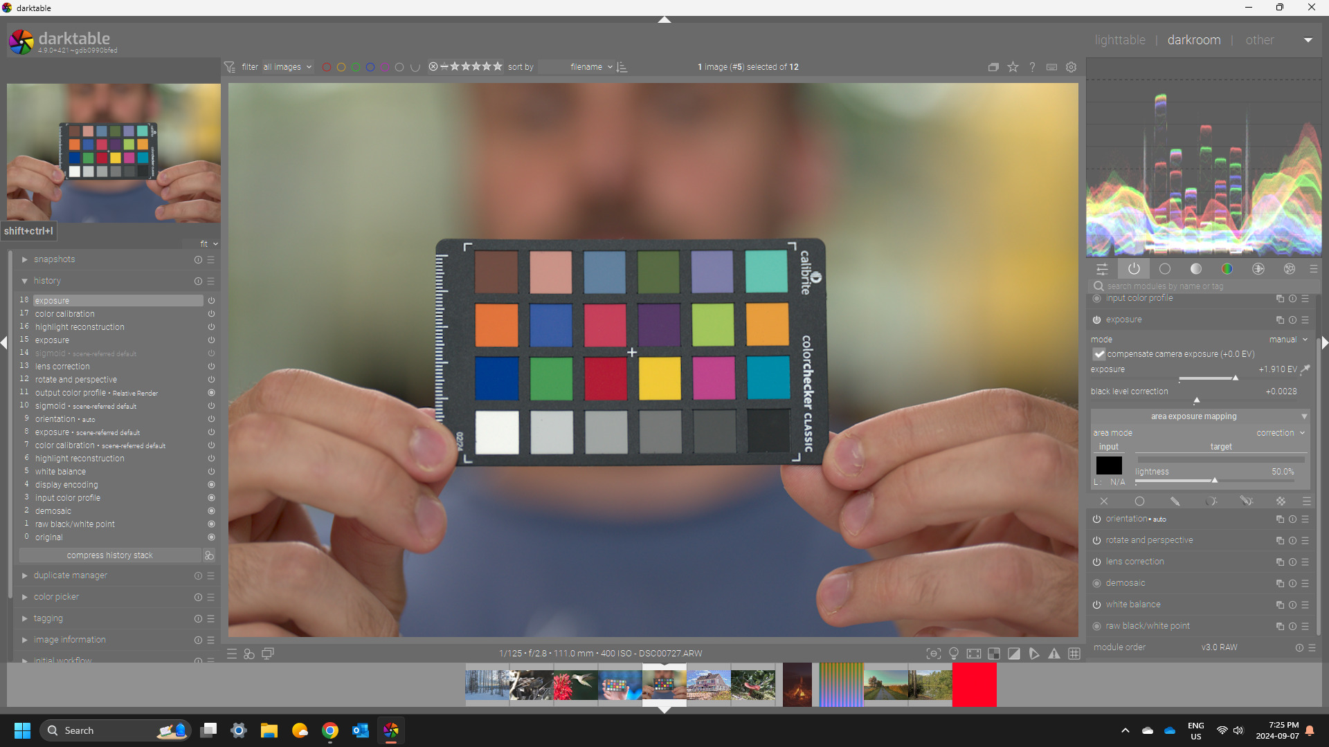
I’m working on some kind of "corporate headshot"project in which I was shooting portraits of the members of the NOC I’m working for. Each of the roughly 70 participants is photographed twice. Once in a well lit entrance hall with nice diffuse daylight and once within the center itself in front of a huge led wall with mixed lightning conditions consisting of both artificial and daylight sources. For consistency reasons I decided to create color calibration profiles with the help of a calibrite colorchecker classic. I am well aware, that applying the resulting profiles not neccessarily works for all images of the particular scence (photos were taken on different days) but at least it gives a starting point that can be adjusted.
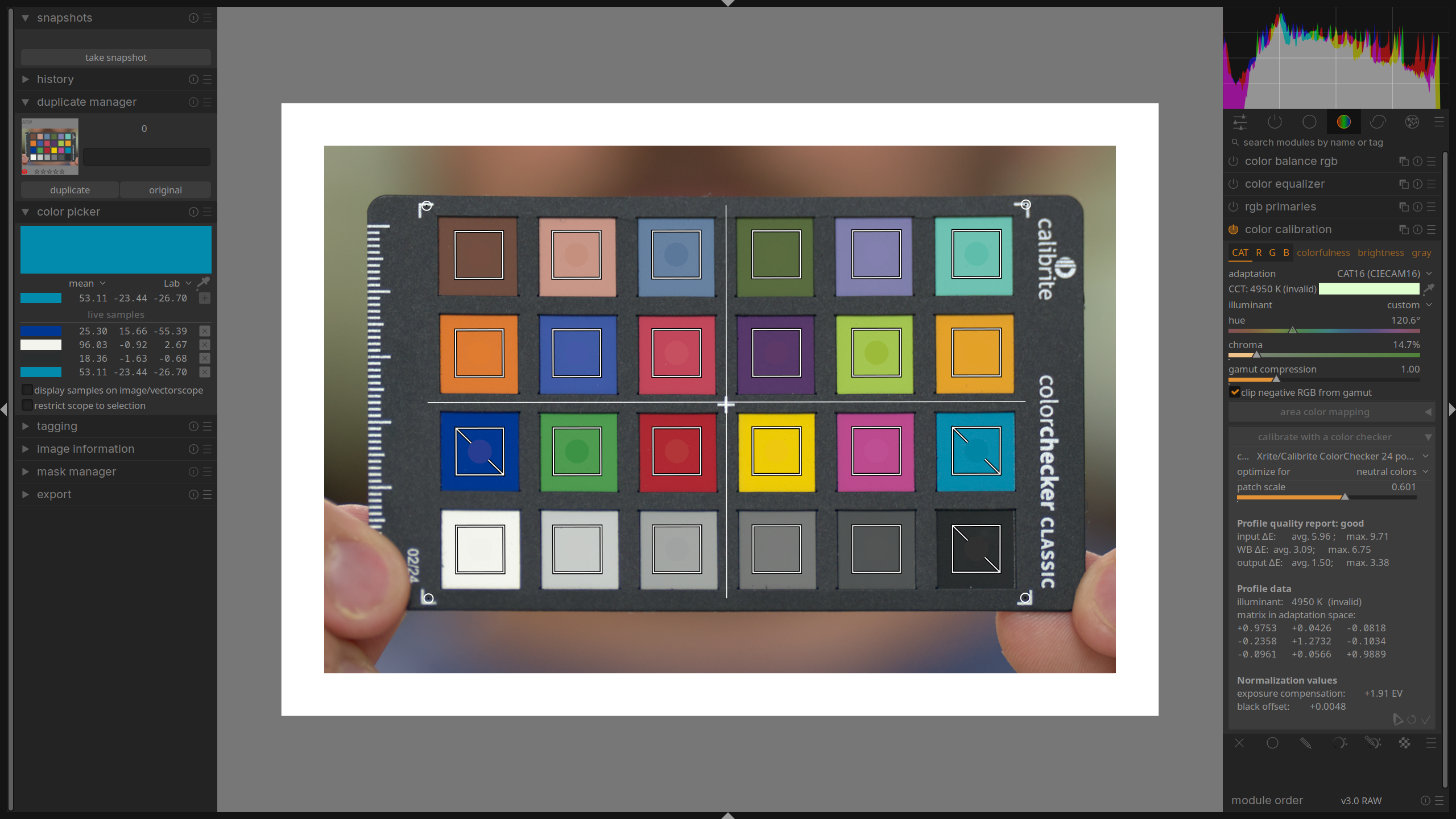
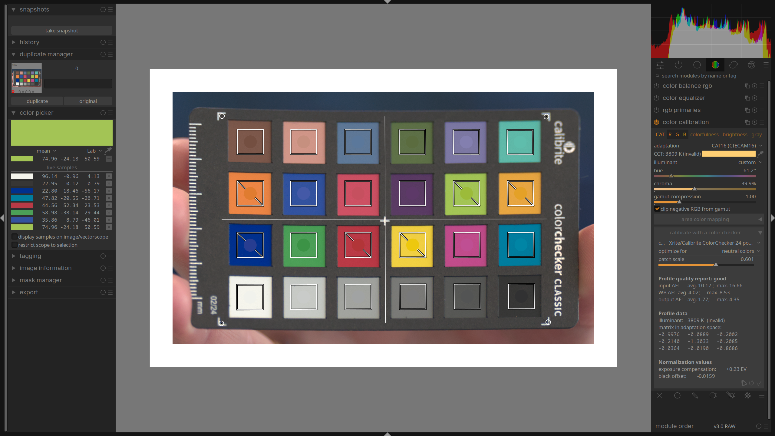
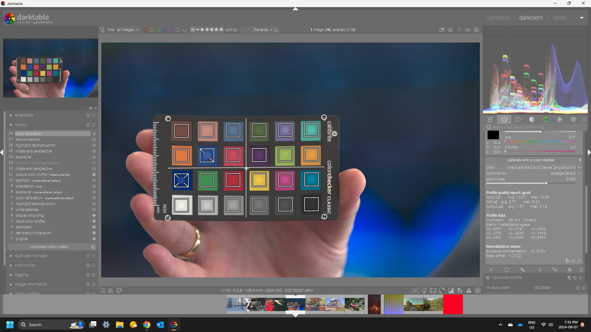
I do however struckle, to get optimal results in terms of max output ΔE, which varies aprox. between 3.8 up to ~ 5 (depending on the optimization setting in cc module) . According to the manual ΔE > 2.3 results in noticeable color differences and indeed as a result I notice a bit too intense and saturated blues, especially in the area of the led wall (the wall shows colored graphs). Skin tones are matched very well though. I tried to adjust exposure compensation and black offset in exposure module but the results are kind of semi optimized. I’m wondering if someone is able to get better results.
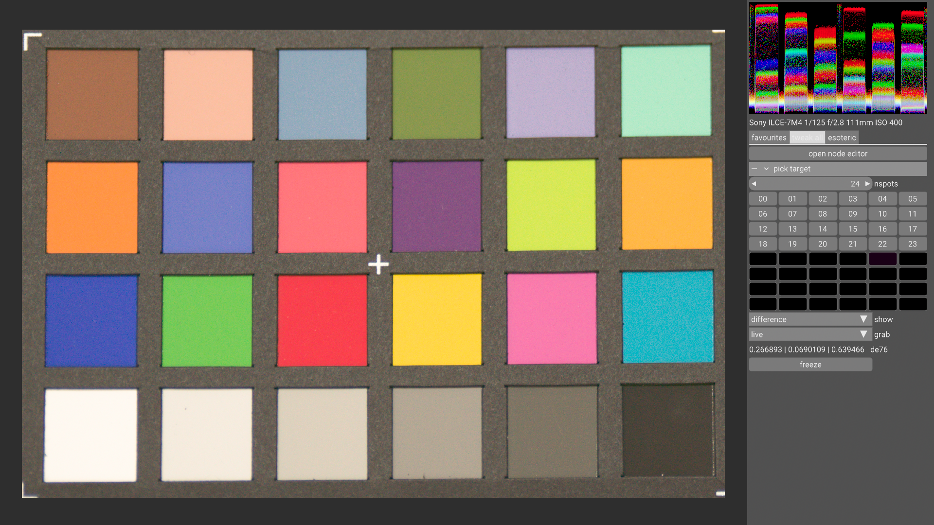
For obvious reasons i cannot provide example images (yet) but at least i can provide the colorchecker shots hoping someone is able to make sense of the numbers.
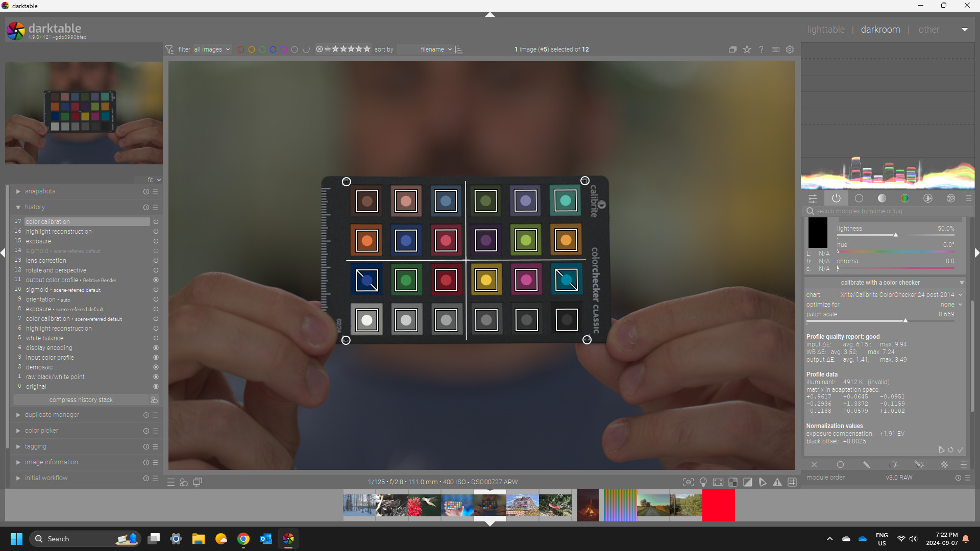
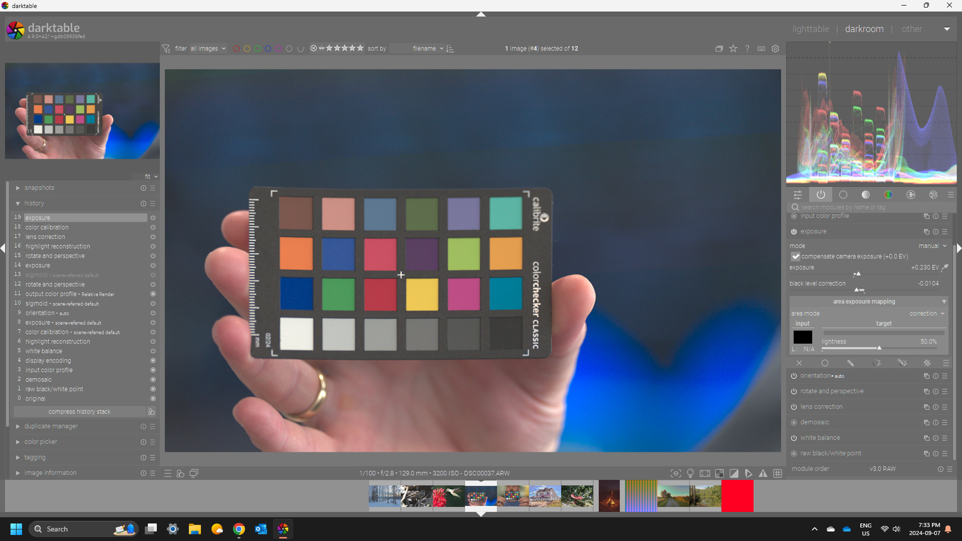
Suggested exposure is ~2 EV… I did the CC with exposure set to zero and sigmoid/filmic off and lens correction on… and highlight reconstruction off… so just basic raw modules …
I don’t think looking at the max numbers is all that useful…it could be one bad patch and changing the parameters might weaken more patches to get a slightly lower average max patch value…so for example to me the best fit for the DSC00037 image is the average model as it only has a bad value for the deep blue and acceptable for one other patch…all others are in the good range…change to any of the other optimizations and you get more wide spread issues on the quality of the correction… remembering also that this is just a matrix correction…to get closer you would need might need a lut but that might then impose other restrictions on the edit
Well I guess but if the skin tones were a priority maybe the preset model for that would be better …I guess you would just have to experiment… In the case of the one image file you shared average gave the best overall result and only the deep blue failed…trying to use one of the other optimizations to save the deep blue made things worse elsewhere…other images may be different… most of the time none or neutral are actually pretty good and then average. I like the use the one that also gives good values for all the patches in the gray ramp…
Nevertheless I think if you are getting an average of 1.3-1.5 ish…that is pretty good in my books… looking at the fingers after correction it also seemed to give a pleasing result…
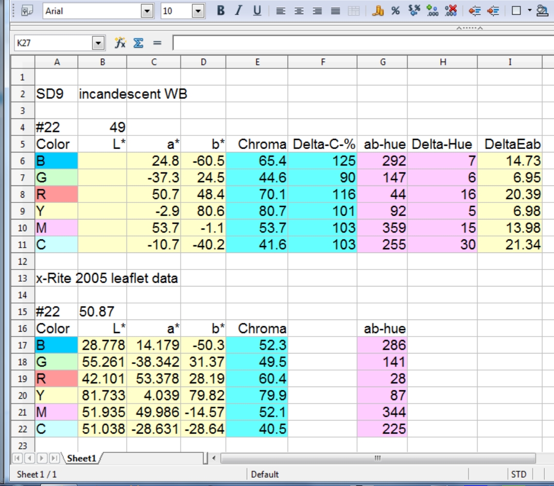
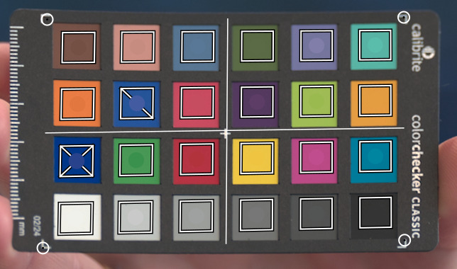
You are looking at a spreadsheet which compares a taken color-checker image with the published color data for that color-checker. The comparison is for the third row, namely Blue, Green, Red, Yellow, Magenta, Cyan. The captured image is color-balanced off mid-gray patch #22 and the image brightness adjusted so that the mid-gray is about 50 lightness. The patch L*a*b* values are measured in RawTherapee. The a* and b* card values are subtracted from the captured image values. The DeltaEab value does not include L*.
I can download one your card shots and do the same thing. Useful if you are interested in the accuracy of Chroma and Hue plus the value of DeltaEab.
Honestly after reading through the manual and the replies in this topic, my interest is more targeted in a (not to) technical explanation, why it is so difficult to correct blues.
As the manual states:
No matter what you do, strategies that favor a low average ΔE will usually have a higher maximum ΔE, and vice versa. Also, blues are always the more challenging color range to get correct, so the calibration usually falls back to protecting blues at the expense of everything else, or everything else at the expense of blues.
How is this issue solved in use cases where color accuracy really matters, like for example product photography?
I’d expect that the spectral composition of the light plays a role as well in this. In any situation where maximum accuracy is required, there are prescriptions for the light source to use.
In this case, if the lighting is LEDs (even “white” LEDs), you probably have more energy in the blue part of the spectrum than expected. So colours that reflect a lot of blue may be tricky to correct at the same time as e.g. reds.
As it’s only some of the blues that cause problems, and from the project description you will be taking protraits, I’d probably ignore the errors in the blues, and concentrate on skin tones. That’s assuming those blues aren’t important parts of e.g. company logos.
So begining from your original question you asked about the CC optimization…
This is a routine run to come up with what is basically a channel mixer matrix that when applied improves color accuracy from what is provided by the original input icc which for DT is a matrix profile, and the CAT white balance. So your final result is from the input icc + CAT + the channel mixer matrix… You could try to see if you made a custom icc for your camera if you could do even better. To do better you often need to use a LUT profile. These can be a bit more color accurate but they can introduce tonal clipping so there can be a trade off and it is often why matrix profiles are used… never the less you could try to introduce a camera profile… The commercial variant of dcamprof, ie lumariver will let you edit individual patches during ICC profile creation so if you want to pay you can explore more elaborate profile creation… Also if you use something like Rawtherapee or ART that supports DCP color profiles then there is a free editor that can tweak colors there as well… this won’t help with DT as it uses an ICC workflow…
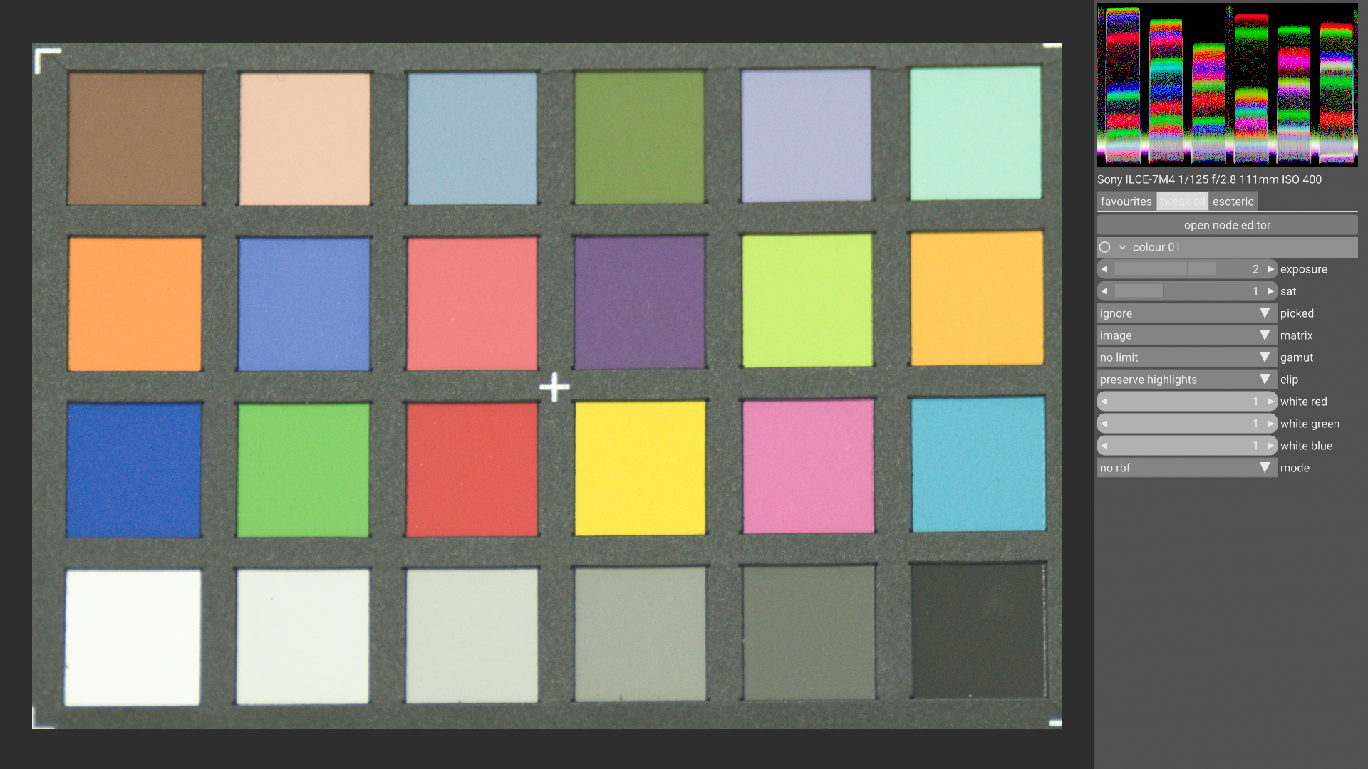
slightly off-topic, but i’ve always been bothered by the use of a matrix transform here. vkdt uses a 3d radial basis function to correct for cc24 patches. this will make all patches match exactly, and try to deviate as little as necessary from a matrix transform (to keep some global consistency). since the mapping is very non-linear, it corrects all sorts of things as by products. in the images from this thread it’s mostly white balancing, but i think there is also some amount of haze… the corrected version looks more contrasty to me.
difference colour picker with rbf corrected image, showing max deltaE 0.63 which is more likely noise and float jitter in the picking process than anything else: