My try using RawTherapee (without sharpening)

For this picture its important to set input color profile to linear rec709.
I also used the colour checker lut module with a parametric mask on the C-Channel to exclude strong saturated colors.
For a good starting point I used my Basic DT Style which I created for my olympus EM10 with the IT8 target by wolf faust.
But I always use linear rec709 also with darktable-chart when creating styles for matching the in camera jpeg processing of the camera. this worked much better then standard colour matrix.
Oly_PM_Natural.dtstyle (3.5 KB)

DSCF1110.RAF.xmp (13.5 KB)
2 Likes
To retain the original color of the jpeg, I often use Fuji’s free raw converter to a tif file, and then finish the final touch with darktable. The color comes really close using this method.
If you care at all about color accuracy you should always use an input profile which matches your camera model.
The problem you’re experiencing is that the artificial light which illuminates the bridge is out of gamut, it’s not handled properly. All you need to do is to use an input profile which compresses the blues in some way. Which way? It’s a matter of taste. Your camera seems to shift the hues towards red, causing purple highlights to appear. A different solution could be to not shift the hues but to instead desaturate and increase the luminance of the deepest blues.
Using a simple matrix the blues go whack, but using the Fujifilm X-T1’s DCP (I don’t have an X-T2 DCP, though there is one in Adobe DNG Converter) resolves the problem:

I really like @Nor_man’s version, not in spite of but due to being creative with the colors. However this thread is more about the difficulty of preserving colors and matching them to what your camera shows without getting out-of-gamut blue artifacts, so that is what the following images achieve.
Using a proper input profile you can get good results (compare it to your out-of-camera JPEG from the first post):
DSCF1110 plain.jpg.out.pp3 (11.3 KB)

And to add some industrial light and magic:
DSCF1110 fattal.jpg.out.pp3 (11.4 KB)

3 Likes
I did that using RawTherapee but I’m sure you can completely reproduce it in darktable. All I did was to use a proper DCP to prevent blue issues (well, not that proper, since it was for an X-T1 not an X-T2), a tone curve to match the image to the embedded JPEG’s tones, and some noise reduction and edge sharpening.
I see two main things in this thread:
- colors are radically different on the bridge (and only on the bridge) between the OOC JPEG and RAW rendering engines, regardless which one (e.g. LR, DT, RT all put the bridge blue unless some extra color mapping is applied)
- up close, there are significant artifacts on the bridge trusses when rendering from RAW (with DT and RT, LR seems to fare better here) when compared with the OOC JPEG.
As I understand it (after reading up on samples clipping), this might be due to out-of-gamut but also possible channel-specific overexposure on the bridge. Indeed, messing with highlights reconstruction does improve the detail on those trusses on the bridge significantly, but it never quite matches the results from Lightroom or the OOC JPEG.
Now, I understand much better the issue of gamut: it’s not something I considered for this at first, and it totally makes sense that the camera would shift pixels one way while rendering engines would shift them another way, especially if there was film emulation enabled on the camera (or, as @houz suggested, “instagram filters” :). I understand this and it makes sense: this is special changes made to the color mapping and we can’t expect rendering engines to reproduce that exactly, especially out of the box. So my immediate surprise at the difference of rendering at the color level is passed now and, well, I accept that the bridge may actually be blue (still an open question, btw - I haven’t found someone who could answer this definitely).
What concerns me more at this point is the difference in detail. There is precious data from the sensor, and it seems we (free software RAW rendering tools) are losing some of it, while our proprietary equivalent fare better. Is there something we’re missing in the algorithms to render this? Why can LR render those trusses without clipping?
Again, to compare, the OOC JPEG:

Darktable, linear Rec709:
Lightroom, out of the box:
And, for completeness, @heckflosse’s try with RawTherapee:
Now of course the colors are completely different in the four images: I understand better why, that makes sense. What I can’t wrap my head around is why the details are so different on the bridge truss. In the OOC JPEG and the LR rendering, I feel I could keep going and zoom another crop and still keep detail. In DT and RT, I feel I’ve already lost and we see a lot of grain on the trusses. I have tried to mess around with highlight reconstruction, but I couldn’t quite get the same result: I mostly end up with a washed out, blurry picture. Nothing as sharp as the original.
Now, I am very grateful for all the answers. The level of technical and artistic knowledge here is impressive and humbling, and I can only thank you again and again for all your efforts. I did feel it would be useful to reframe the question, since we have pretty much cleared the field of the color (blue/magenta) problem, I think.
So if people want to pursue the conversation here little further, I’d be very curious to hear what people think of the detail problem next. ![]()
PS: is this something that should be in “play raw” next time I have a trick question like that?
Well sure, but how do I figure that out? Is that data embedded in the RAW? Could/should DT/RT figure that stuff out automatically?
About the broken blue colors, all those default color matrice are fit to give nice results for typical colors in an image. At the border of the gamut those quickly go bonkers. The only real way around that is using a LUT profile for your camera. You can make one yourself if you have a color target and are careful, otherwise you will introduce other problems into your images. Or you can try to check if the DCP @Morgan_Hardwood linked is using a LUT and then try to convert it to an ICC profile (is that possible?).
About the lack of sharpness, it might be that Lr applies more default sharpening to the images than darktable does. You should also make sure to look at images at 100% zoom. Otherwise you are just comparing the fast display scaling and not the image processing.
This is from ACR (basically LR) using Adobe’s standard matrix profile but with everything turned off as possible. Compare that with RT neutral and dt’s equivalent. Cropped, 100% zoom:

+1 for a calibrated camera profile. Once I made one for my D7000, my input images looked a lot better. The only expenditure needed was for a color chart; most will recommend a IT8, but I got decent results using a 24-patch ColorChecker.
With regard to ‘sharp’, I think the degradation being seen here is also due to the color gamut mismatch; the things that are running together are shades of blue, and they’re being clipped to the max blue of the profile, thus destroying those shades as detail… ??
We have a few Wolf Faust targets for the community to use!
It does look to me as the ooc jpeg is more likely to be wrong colour wise. There’s some quite odd toning from blue to purple going on with those trusses. To make that happen you would need a very complex lighting setup.

It looks more like the highlights (areas that recive a lot of light) are the ones turning purple. Whereas further away , or in shadow from the coloured lights, the trusses are blue. So my guess is that the in camera processing is going out of gamut (or just blue channel clipping) and not coping very well.
I also not so sure about the detail you find lacking. Perhaps an ever more narrow crop to show it? What I can see is that there is more apparent sharpness in the ooc jpeg. This sharpness is as far as I can make out due to more contrast not actual pixel detail. The ooc jpeg also look better because it appears more as smooth planes of colour that meet. This I think has a lot to do with Fuji processing. I’ve looked a fair bit at fuji files and always find they look almost vector based at 200%. This to me suggests some rather heavy processing in camera. The images look great zoomed out a bit so it’s not a criticism of the files but it’s a rather specific look zoomed in.
So what i’m saying is your camera is wrong  Joking aside I’ve also hunted for better in camera approximations of my Pentax files as they really are a great starting point. You do however throw away a fair bit of data with those ooc settings. In my case I loose lots of highlights.
Oh!
The only reason I didn’t order one from coloraid.de was that I hate PayPal. May have to take you up on that…
I’ve had a proper look now and can see more detail/better sharpness at the fines subdetails of the trusses. The ooc jpeg has much more definition.
1 Like
I hadn’t had any luck opening this raw with my tools, but noticed my version of Libraw was one behind the current one, so I downloaded the current one and recompiled, and got success…
I tried first opening it with the dcraw prophoto colorspace, and got the “fuzzy blue bridge”. Tried a few more things, then I just opened it raw/linear with no assigned profile, added 2.2 gamma, set the black and white points, and gave it a little contrast with a curve, let it display with no color profile and ta-da! looks better:

So, I do think you have a camera profile challenge, as it appears only this blue is being crushed, obliterating detail.
I wouldn’t call the above a final solution, just points to the problem…
Can you be a little more specific regarding these artifacts? Maybe mark them in the image? Yet I could not figure out what you are referring to.
Regarding details I can neither see any advantage in the ooc jpeg nor in the lightroom version ![]()

Glad you asked! ![]() I’ll try to be a little clearer… I thought I did pretty good in this comment but obviously, that needs work.
I’ll try to be a little clearer… I thought I did pretty good in this comment but obviously, that needs work. ![]()
First off, regarding details, I must admit I was trying to be more critical than I should have been against Lightroom: the details are great and either comparable or identical to the OOC JPEG, so I’ll just discard Lightroom for now and say that it behaves as well as the OOC JPEG at rendering the RAW, at least that’s what I can see by doing a more systematic test…
The area I base myself on to do comparison are the oblique trusses at the top of the bridge, here (in the OOC JPEG):

This is where I look to “test” the rendering. Obviously, there’s a problem with the input profile: changing it to linear 709 is the first step to fix the “deep blue artifacts” rendering. So we go from this:

to that:

Already pretty good. But if you look at the area in question, there clearly is some “noise” on the truss, specially on the edges. The diagonal lines are not as straight and smooth as they are in the original JPEG and there seems to be some pixelisation on the edge. I am not sure how to best demonstrate this short of zooming in on individual pixels… But here’s another crop, made by exporting as a tiff, opening in GIMP to draw an arrow and crop again, then exporting as PNG:

Scaled up 10 times with gimp, without interpolation shows what I am talking about:
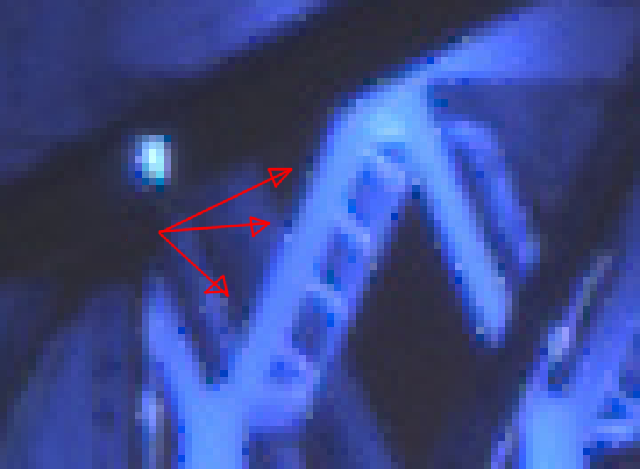
Those are very subtle marks! But I think they degrade the picture enough to be noticed, and that’s the problem I trying to track down.
Here’s the same process applied to the OOC JPEG:


It seems much smoother and I can’t find the same pixels breaking that soft line. Maybe it’s the JPEG rendering engine. Maybe it’s some other limit: we’re getting pretty close to the limits of everything here, from the sensor to the JPEG algorithm itself…
As I mentioned earlier, I think I understand a little better why this is happening. Correct me if I’m wrong here, but this noise would be clipped pixels, possibly introduced during highlight reconstruction, or due to white balance, or parts of the bridge are just over-exposed. So I actually tried to fix this, by focusing on reducing the noise on trusses.
I messed around with all of the above: highlights reconstruction, white balance, and of course fix the input profile. Here’s my take on this:

It’s slightly better. Of course, it’s all hazy compared to the OOC JPEG, probably because I didn’t add any sharpening whatsoever, but that’s not the point: there are still those dark pixels in there.


Sharpening actually outlines them even more of course, and I’ve seen them in pretty much every rendering attempt with free software by others here. I can’t figure out how to get rid of those, and I guess that’s the only remaining open question for me with that image. I have learned an amazing lot, thanks to everyone contributing here (again, y’all rock), but I’m also eager to crack that one final nut here.
Also, of course, messing with the white balance throws the whole image colors back off track, towards a weird green/red tint, because I used a “spot” white balance on the bridge (which seems to be blue of course).

Obviously work needed on the contrast, punching in the blacks and so on, so nothing something else can fix later: this is just to try and fix that darn bridge detail.
Just a thought: maybe that white balance difference is exactly why the camera is succeeding at rendering the trusses better? How does Fuji’s “film emulation” work anyways? Is it possible it actually works earlier on than (say) a “velvia” or other tone mapping in Darktable? Or am I comparing apples and oranges here? ![]()
Thanks again for all your hard work!
So I think this might be just it. As I mentioned earlier in the thread, there’s no “custom matrix” for much of the Fuji series. And again, I’d really like to contribute back to fix this: I have the camera, I have some skills, and some time. ![]() I remember reading about this before, and the camera support page specifically mentions those two blog posts:
I remember reading about this before, and the camera support page specifically mentions those two blog posts:
What, in there, is missing here exactly? I feel the problem is not with the noise profile, but maybe I’m wrong… I did notice that lens correction works for the actual lens, but not the camera body, for example. I guess the more generic question is what, exactly, is missing here… The table only has three columns (WP presets, noise profile and color matrix), and the first two are present for the X-T2, so can I assume those are correct? Or is it possible that, since the camera is fairly recent, they might not exactly be accurate?
I’m curious to hear what I should be doing to fix the remaining issue here, and I’d be really happy to contribute that back to the Darktable (and larger pixls.us of course!) community… For what it’s worth, I did upload the original RAW file for this shot to raw.pixls.us, although it hasn’t shown up in the repository yet… I guess there’s some moderation there or something?
Just for the record, I do agree that the colors are weird OOC. I suspect blue is the right color and agree with your analysis. I must say however, that there is quite a crazy LED setup in there. That bridge was basically turned into a (roughly, iirc) 640x680 pixels display and basically any color can be spawned out of there. There are also some lighting thing on the edgets of the trusss that create more lighting effects. It’s an insane project! The bridge in question is the Jacques-Cartier bridge, well known in Montreal and the lighting project has a website here. Among other things, that site says that the base colors of the bridge change with the season. The picture was taken 5 days ago, at which point the bridge was in transition between… magenta and blue, of course. ![]()
But even if the bridge was magenta, it should just be magenta, not a mix like that. Take that image, for example (not mine, hotlinked):
![]()
Everything is kind of magenta, but only magenta… kind of. There are some spots where the “lines” on the bridge shine on the trusses and create different color effects.
So “complex lighting setup” describes that bridge pretty well right now I’d say. A nightmare to render. ![]()
For the colors, I’d tend to agree. For the sharpness, I’d say I’d love our free software tools to be as wrong to get such magnificent details. ![]()