out of the box RAW rendering not up to JPEGs

Glad you asked! :slight_smile: I’ll try to be a little clearer… I thought I did pretty good in this comment but obviously, that needs work. :slight_smile:

First off, regarding details, I must admit I was trying to be more critical than I should have been against Lightroom: the details are great and either comparable or identical to the OOC JPEG, so I’ll just discard Lightroom for now and say that it behaves as well as the OOC JPEG at rendering the RAW, at least that’s what I can see by doing a more systematic test…

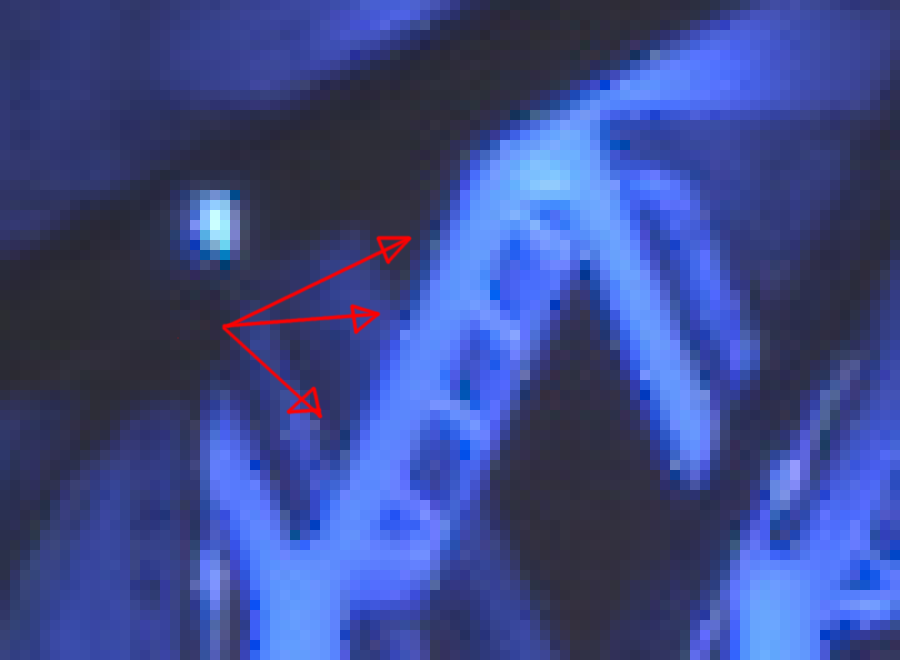
The area I base myself on to do comparison are the oblique trusses at the top of the bridge, here (in the OOC JPEG):

DSCF1110 (OOC JPEG)

This is where I look to “test” the rendering. Obviously, there’s a problem with the input profile: changing it to linear 709 is the first step to fix the “deep blue artifacts” rendering. So we go from this:

to that:

Already pretty good. But if you look at the area in question, there clearly is some “noise” on the truss, specially on the edges. The diagonal lines are not as straight and smooth as they are in the original JPEG and there seems to be some pixelisation on the edge. I am not sure how to best demonstrate this short of zooming in on individual pixels… But here’s another crop, made by exporting as a tiff, opening in GIMP to draw an arrow and crop again, then exporting as PNG:

2cd34503a5fbc7e87379a9a8770dc2404324d4c5-3: extreme crop of the truss

Scaled up 10 times with gimp, without interpolation shows what I am talking about:

Those are very subtle marks! But I think they degrade the picture enough to be noticed, and that’s the problem I trying to track down.

Here’s the same process applied to the OOC JPEG:

extreme crop of the OOC JPEG (DSCF1110-crop)

It seems much smoother and I can’t find the same pixels breaking that soft line. Maybe it’s the JPEG rendering engine. Maybe it’s some other limit: we’re getting pretty close to the limits of everything here, from the sensor to the JPEG algorithm itself…

As I mentioned earlier, I think I understand a little better why this is happening. Correct me if I’m wrong here, but this noise would be clipped pixels, possibly introduced during highlight reconstruction, or due to white balance, or parts of the bridge are just over-exposed. So I actually tried to fix this, by focusing on reducing the noise on trusses.

I messed around with all of the above: highlights reconstruction, white balance, and of course fix the input profile. Here’s my take on this:

highlight reconstruction, white balance and other fixes done in DSCF1110_12

It’s slightly better. Of course, it’s all hazy compared to the OOC JPEG, probably because I didn’t add any sharpening whatsoever, but that’s not the point: there are still those dark pixels in there.

crop of the above DSCF1110_12-crop

Sharpening actually outlines them even more of course, and I’ve seen them in pretty much every rendering attempt with free software by others here. I can’t figure out how to get rid of those, and I guess that’s the only remaining open question for me with that image. I have learned an amazing lot, thanks to everyone contributing here (again, y’all rock), but I’m also eager to crack that one final nut here.

Also, of course, messing with the white balance throws the whole image colors back off track, towards a weird green/red tint, because I used a “spot” white balance on the bridge (which seems to be blue of course).

Obviously work needed on the contrast, punching in the blacks and so on, so nothing something else can fix later: this is just to try and fix that darn bridge detail.

Just a thought: maybe that white balance difference is exactly why the camera is succeeding at rendering the trusses better? How does Fuji’s “film emulation” work anyways? Is it possible it actually works earlier on than (say) a “velvia” or other tone mapping in Darktable? Or am I comparing apples and oranges here? :slight_smile:

Thanks again for all your hard work!

So I think this might be just it. As I mentioned earlier in the thread, there’s no “custom matrix” for much of the Fuji series. And again, I’d really like to contribute back to fix this: I have the camera, I have some skills, and some time. :slight_smile: I remember reading about this before, and the camera support page specifically mentions those two blog posts:

What, in there, is missing here exactly? I feel the problem is not with the noise profile, but maybe I’m wrong… I did notice that lens correction works for the actual lens, but not the camera body, for example. I guess the more generic question is what, exactly, is missing here… The table only has three columns (WP presets, noise profile and color matrix), and the first two are present for the X-T2, so can I assume those are correct? Or is it possible that, since the camera is fairly recent, they might not exactly be accurate?

I’m curious to hear what I should be doing to fix the remaining issue here, and I’d be really happy to contribute that back to the Darktable (and larger pixls.us of course!) community… For what it’s worth, I did upload the original RAW file for this shot to raw.pixls.us, although it hasn’t shown up in the repository yet… I guess there’s some moderation there or something?

Just for the record, I do agree that the colors are weird OOC. I suspect blue is the right color and agree with your analysis. I must say however, that there is quite a crazy LED setup in there. That bridge was basically turned into a (roughly, iirc) 640x680 pixels display and basically any color can be spawned out of there. There are also some lighting thing on the edgets of the trusss that create more lighting effects. It’s an insane project! The bridge in question is the Jacques-Cartier bridge, well known in Montreal and the lighting project has a website here. Among other things, that site says that the base colors of the bridge change with the season. The picture was taken 5 days ago, at which point the bridge was in transition between… magenta and blue, of course. :slight_smile:

But even if the bridge was magenta, it should just be magenta, not a mix like that. Take that image, for example (not mine, hotlinked):

Everything is kind of magenta, but only magenta… kind of. There are some spots where the “lines” on the bridge shine on the trusses and create different color effects.

So “complex lighting setup” describes that bridge pretty well right now I’d say. A nightmare to render. :wink:

For the colors, I’d tend to agree. For the sharpness, I’d say I’d love our free software tools to be as wrong to get such magnificent details. :wink:

@anarcat That’s major pixel peeping! For comparison, this crop is from the ACR output I shared earlier. Remember, this is with as much turned off as possible. ACR/LR should be close to the JPG because Adobe and the camera and lens manufacturers collaborate to get a certain look that is important to the brands. FOSS devs don’t have that kind of relationship.

image

From what I can observe, the darkened artifacts that you show us have been smoothed out or inpainted here.

1 Like

That is, fundamentally, the whole unfairness of this problem and why it is so frustrating to try and keep up with proprietary ecosystems. More praise goes to the good folks at dcraw and Darktable (and everyone else here, really) that make anything at all possible here…

The trick is this is done while retaining a high level of details and sharpness in the picture, of course…

dt minimal processing + gmic median 2. Simple smoothing makes it better.

image

It seems Fuji’s demosaicing algorithm works better than those available in RT and DT for xtrans sensors.

Personally, I’ve created my own custom input/camera profiles for darktable/RawTherapee/Lightroom so that I have the same colour base to start from in the raw converters I use. I use DCamProf to do so. It’s based on Argyll but additionally it offers very nice gamut mapping and tone operator choices. It also has various look options which will help you with out of gamut colours like the ones you’re struggling with.

While the conversation revolves around detail in the LED-lit bridge and LR is held as a high ideal, no one seems bothered by the loss of color detail in the LR and OOC images.

Watch these areas:

OOC, the car light is gone, the roller coaster seems like its evenly lit by a typical orange sodium-vapor lamp:

LR, same:

RT:

The camera has the benefit of having its raw processing engine and settings designed by the same engineers who built the camera, and LR has the benefit of having over 100 full-time employees with the sort of access we can only dream of. Despite this, our open-source projects do perform damn well, and each program (including LR) happens to be better at some things than at others.

5 Likes

In the spirit of my last two samples…

ACR minimal processing:
roller-crop-acr

dt minimal processing + gmic median 2:
roller-crop-dt-med

One additional observation, maybe a hint for the devs. If you move the bridge into focus and then take a look at the region close to the borders there are a bunch of arteficial pixels. If you pan the image, they always stay near the border like a sort of inbound frame. Also, if you move your focus to a darker region of the image, they dissapear completely. Switching on gamut detection highlights them .

dt, 200%, gamut detection off

dt, 200%, gamut detection on

Hope that helps!

Jürgen

1 Like

For what it’s worth, I ended up turning a slight variation of this pic into a play-raw thread, if anyone is curious to play more with a large image.

Thanks again everyone for your contributions here, I learned a lot and it was amazing. Special thanks to @houz and other Darktable developers for their amazing work. It’s great to see you participate in the “user-land” discussions here and I really appreciate the time you take to actually do this.

Wow, so this is an old thread now… but after using darktable for some time and having just recently read darktable 3.0 for dummies: hardcore edition, I was inspired by @anon41087856’s handling of LEDs and decided to revisit this photo using darktable 3.0.


DSCF1110_06.RAF.xmp (11.9 KB)

I didn’t attempt to match colors to Fujifilm’s JPEG rendering, but I did warm up the midtones after first correcting color a bit (based on a building I thought might be approximately “neutral”).

I did also mask the bridge in the color balance module I used for the warming effect, as I also boosted saturation in the same module. I thought the bridge already has a lot of character in the photo, so it didn’t need any more help. :wink:

In addition, I did push local contrast up a bit more than usual, but it’s a city scene and darktable could handle it (and can handle even more than what I went with), thanks to sticking with the modules @anon41087856 worked on and suggests.

2 Likes

You seem to think jpeg should be the starting point. In fact, it is a dead-end :slight_smile: Darktable gives you the opportunity to back up and choose a better path in the first place.

Agreed.

The difference between the JPEG from the original poster at the top (from two years ago!) and all the various permutations on this thread demonstrate how raw files are better than out-of-camera JPEGs.

Also, darktable keeps getting better — 3.0 is leaps and bounds better than 2.x. (And there are other raw conversion tools other than darktable too, naturally, and many of those are quite good as well.)

I just thought it would be interesting to re-visit a notable tricky raw with a revised toolset. :wink:

1 Like

I was actually reacting to the OP’s remark:

I didn’t notice that the thread was so old, otherwise I wouldn’t have bothered commenting on it.

It is my starting point. It’s what I see in my camera when I shoot. It matters.

I agree that Darktable keeps getting better, and I’m incredibly grateful for it. I wonder what the new noise reduction stuff would do with the bridge smudges I detailed here and earlier:

To be fair, this is an extremely hard scene to render. Colors are all out of whack because of the LEDs and there’s a lot going on. But the JPEG from the camera is not a dead end for me - at least in terms of sharpness and noise reduction, I rarely am capable of going back to that level of detail when I start from the raw shots.

And, comparing your rendering to the original JPEG, it still has a lot of fuzziness in that area, so maybe that’s still somewhere the JPEG has an edge. The colors on the Molson tower also seem more realistic in the original…

But thanks for taking a fresh look at this! :slight_smile:

1 Like

We will never be able to beat your manufacturer on its own ground. He knows his sensor, his optics, is ADC,… of course OOC will always be better for less trouble (assuming the firmware did understand what scene it was processing).

That’s one thing I find fascinating with software like Lightroom: their rendering of big brands (Nikon, Canon, specificall) is so close to the OOC version that I suspect there is some IP exchange between the companies to make sure it works that way. In other words, I wouldn’t be surprised if Canon and Nikon would send Adobe some specs (if not some engineers) before they release a new line. In those conditions, of course it’s hard for you folks to compete…

At least they have a lot of developers to reverse engineer stuff. If you profile your sensor as described here: PIXLS.US - Profiling a camera with darktable-chart you‘ll get more ooc like colors. Unfortunately this doesn’t fit to the new recommended linear rgb aproach - the tone curve is required in most cases.