I’m pretty sure @s7habo has at least one video dealing specifically with skin tones. I think this is one:
darktable certainly has modules that overlap in capabilities but as others have mentioned, some of them can be applied in different ways (often more broadly or more specifically).
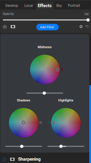
For example a general process might be something like:
Use the exposure module to get the subject exposure
Use sigmoid to get things to a more baseline “correct” state
– Add/remove contrast
– Adjust the primaries (try the default and smooth presets first)
Use color balance RGB for saturation and general contrast refinements
Use color equalizer (maybe multiple instances) to make specific refinements to specific hues as needed
It can be a bit jarring coming from other applications to darktable, but many of the modules in darktable are like the difference between a hand saw and a scalpel. Same general use case, much different levels of precision.
Ah, okay. In that case I’d say the root cause was more likely in how you used filmic, and solving that is a better idea than masking it with grading on top.
You mentioned you are getting better results with sigmoid, which if works for you, great.
I’d still encourage you to experiment with 35-40% latitude in filmic, one thing (main thing?) it does is defines the span of midtones to be protected from desaturation, a big part of what filmic does to preserve hue, which sounds like exactly the issue you are facing.
This is not really the same as older versions and its why the latitude default is now 0…in v6 and 7 the desaturation curve with boundaries described by the latitude is now gone … you can impact the tonal nature of the curve with a larger linear section but it has less impact on color in recent version of filmic…manual has a brief mention…
" Please note that this desaturation strategy has changed compared to previous versions of filmic rgb (which provided a different slider control labelled extreme luminance saturation). You can revert to the previous desaturation behaviour by selecting “v3 (2019)” in the color science setting on the options tab. Since filmicv6 and v7 use accurate gamut mapping to the output color space, the desaturation curve is removed and the extreme luminance desaturation becomes a method to control the bleaching of highlights.
This control is set to 0 by default and it is now recommended that saturation is handled earlier in the pipeline. A preset “add basic colorfulness” has been added to the color balance rgb module for this purpose."
I knew there were changes over time, but I thought they are limited to intro introducing the “highlights saturation mix” slider, providing a way to find the desired balance between preserving saturation and hue… with the hue preservation part being the same as before and depending on latitude.
So apparently I’m wrong? What exactly does this slider do, compared to earlier versions of filmic? Is there no interaction with latitude or other settings affecting the curve?
Are there any more in depth resources on this, say around the level of Aurelin’s videos?
(edit: Just realized there is more on this in the details section of the docs, going through it right now. Still, pointers to other sources are welcome)
whats strange is that the manual literally says: " As a general guideline, you should aim to increase the latitude as much as possible without clipping the extremes of the curve."
Similarly, target blacks is a bit inconsistent, it defaults to slightly above true 0, but the tool tip reads “this should be 0% unless you want a faded look”, meanwhile the manual has a few contradicting statements:
“Reducing it to zero means that some non-zero luminances will be mapped to 0 in the output, potentially losing some detail in the very darkest parts of the shadows.”
perhaps i’m taking the tool-tip a little too literal.
I think raising it significantly can be used to achieve a faded look.
The default being non-zero has always puzzled me, as I think the number there is based on the linear brightness of 8-bit sRGB value 1. I don’t see how compressing to 1-255 preserves more shadow details than compressing to 0-255: if a values like 0.3 and 0.4 are both mapped to 0 in one case and to 1 in the other, we really did not gain anything.
Don’t quote me for the blacks but I think this also helps the autopicker achieve a saner outcome so its for the math at least partially I believe…I don’t think anyone bothers to zero it. If you notice even exposure has a small default offset.
As for the latitude….you can use it to shape the curve together with the settings for hard, soft or safe roll-off…. Going to safe can make things a little softer in the highlights more like sigmoid can be as it fades to white but you can be more aggressive with other parameters including latitude when you use safe so its just about finding the right balance. In the end its about shaping the range of midtones and the resulting degree of compression of the highlight’s and shadows
You will find probably that some photos might benefit from smoother transitions, and some might look better with more contrast and a sharper transition….
If you look at v5 you can see the saturation curve and how it responds to the slider, the width of the latitude and if you choose to shift the whole thing left or right.
That feature then works differently in v6 and v7. When I used filmic, I liked v5 with no color preservation. I liked to control all these elements and not to obey the gamut mapping imposed by the later versions…
I was happier editing under these conditions than the results that often came with the gamut “handcuffs” as some would call them……
Probably related to “pastel”:- a color with about 30% saturation but quite bright. There’s also a term “pasty-faced” meaning not looking very healthy …
after a bit more work with filmic I’m starting to get the hang of it. One thing i’ve found is to set the exposure as best you can on the front end- which is tricky with portraiture because Caucasian skin typically sits about a stop above 18%… but then in filmic i’m using safe curves, without linear sections BUT i’m using the manual middle grey point to dial it in at the end. this has help me get good results for when things are off just a little bit, but you don’t want to start all over juggling between tools. I know this isn’t completely recommended, and I imagine the reason is so that the tools in-between exposure and filmic respond properly, but it seems like as long as you get it close it tends to work out.
You could experiment setting your exposure with the picker and if 50% isn’t right you might find a sweet spot level… When I was using filmic and in most cases I start with the autopicker to set a starting exposure…I don’t trust myself…then I decide if it needs tweaked…my second step based on what I get is to choose a spot not the whole image and then finally I will go to a manual selection if the first two quick auto settings don’t work…
In any case once you hit on it in a key image you could do some exposure mapping and maybe even skin tones on the rest of your series as an approach too…


")