I’m trying to fall in true love with Dark Table after a fairly long career in c1. The absolute control DT offers is amazing, but one thing i’m battling is skin-tones. it seems like often no mater what I do, i end up with somewhat pasty looking skin tones. I can add toning and saturation, but I struggle to get it looking remotely natural to what I get out of the box with the more consumer focused software.
I have a BS degree in photography and worked professionally for over a decade, so i’m not a “newbie”, and have a decent understanding of color management, but not to the extreme scientific terminology that is all over the manual and the deeper menu options.
I feel like i’m using the recommended workflow for the current version- sticking with linear RGB modules, setting exposure for mid-tones, filmic… the only think i think i’m doing thats a bit outside the recommendation is that I typically don’t find the linear slider within filmic to produce good results, and typically keep that close to 0. Part of me thinks that it has at least in part to do with the color calibration and the dual white-balance thing.
Can anyone relate to this? Any tips would be greatly appreciated.
Hi @JP_Richardson and welcome! As already mentioned, some examples and which modules you’re using would be really helpful. Talking about it in the abstract will get frustrating quickly for all involved.
How does sigmoid look by comparison…also try editing without them if you don’t need them to manage the dynamic range after you set exposure. You get some compresson and loss of detail and with filmic some desaturation all of which you have to add back to taste… As noted a couple of examples or a playraw submission here might help… this is where you can upload your raw and edit for comment suggestions and alternate edits…
I am amazed at how quickly people have jumped in on this thread! I apologize for not knowing the ways around this site and the protocols. I was preparing a simplified edit and think I may have found the issues in the process of stripping my edit. I think I was pushing the primaries too far, and also boosting the red brightness in the calibration too high. I’m going to keep fiddling around but I think i’m now moving in the right direction…
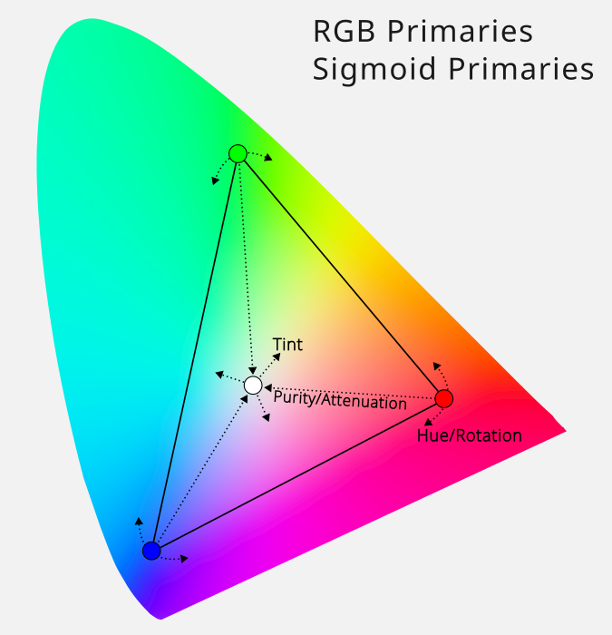
While i’m here, if people would like to chime in, it seems like the primaries tool is a little “cleaner/direct” being fully linear and from what I understand directly channel based (compared to color balance RGB) I’ve been primarily pushing the saturation from there, and then a more slight vibrance boost, as apposed to playing with all the crazy sliders in Color Balance RGB. In order to get things into place I’m pushing the purity well above the default max of 50%… is this nonsense?
If its working for you, that’s good. We try to have a culture here of reading the manual, as it answers a lot of questions.
The answer seems to be: depends on where in the pixelpipe you apply it. Before your tone mapper for nudging colors around, after tone mapping for creative grading.
Check out the PlayRaw category, and maybe post a shot you have trouble with. If you don’t want to share one of your photos, download one from signatureedits.com and share that (their licence allows that, but check for yourself).
Also, check out @s7habo’s videos on YouTube (ignore the 2.6 below, he’s been making them for a long while):
My first suggestion would be to try the sigmoid workflow (or just switch off filmic and turn on sigmoid).
No disrespect to filmic, but I personally find sigmoid much more user friendly and also closer in terms of usage to other more mainstream software.
RGB Primaries and Color Balance RGB are doing very different things. RGB Primaries is essentially a simpler channel mixer, while CB RGB is for more “broad strokes” color grading.
Here’s an illustration of what RGB Primaries does:
It’s great for moving colors around and for some creative white balance, but I wouldn’t use it for general saturation and grading, since it only works on the primaries and white point.
And while keeping linearity is good, I wouldn’t get too hung up on it. The developer behind the scene-referred workflow (and CB RGB) has even said that it’s not really that important when working with colors. It’s mostly tones that benefit, and why they should be manipulated early in the pixelpipe, if possible (but again, don’t be too rigid about it).
The CB RGB sliders are really not that crazy, there are just a lot of them. The manual page has a link to the page that explains what the terms mean.
I second the suggestion to try Sigmoid. Filmic produces dull colors in comparison. Also, I have a Canon R7 and found I needed to raise the chroma for the warm tones to get better skin tones that were as good as the cameras JPG. It wasn’t a simple white balance issue because my neutral tones looked good, but the skin tones needed a little more warmth.
I’m also all with Sigmoid. Former great fan of Basecurve
Unfortunately I have never been able to digest Filmic RGB’s approach to colours, regardless of its iteration, from v1 to v7.
So from my experience (with Fuji X cameras at least), I could advice:
Leave Filmic RGB for Sigmoid.
Boost contrast to 1,7 and play around with the Preserve hue slider in Sigmoid.
While I love using RGB Primaries, I notice that even moderate touch in shifting hue results in overall drop in saturation, and I don’t compensate for it in RGB Primaries itself – in order to do so, I use Colour Balance RGB’s Perceptual saturation grading both in the shadows and mid-tones (usually a value of X in the shadows and half of X in the mids, most often 30% and 15%, respectively).
Thank you so much for all the input! I’m blown away by this community! I’ve been playing around with sigmoid more and it does seem to be easier out of the box. I conceptually like the extreme control of Filmic, but it does seem to be REALLY hard to dial in usable results.
The expectation for Filmic is that you’ll add the colors you want in a different module, like Color Balance RGB, so that Filmic. But this is not as true with Sigmoid, it allows you to pub the color back in there.
with filmic some desaturation all of which you have to add back
My first question would be if op uses enough latitude in filmic if this is the problem.
I was neglecting it for a long time too, to the point that I started using sigmoid as it looked much better. But with a proper amount of latitude, for me at least filmic beats sigmoid big time. With a Fuji X-T4, just for context. YMMV of course.
playing with all the crazy sliders in Color Balance RGB
I think there are only 2 modules that really require digging into in the docs, Youtube, etc.: Color Balance RGB and Filmic RGB.
(Sure, Diffuse or Sharpen too, but that’s incomprehensible alien tech either way, you end up using the presets anyway lol, so it doesn’t actually matter)
But properly learning these two really pays off. It took a very long time for (the 4 ways tab of) Color Balance to click for me, but I can only recommend not giving up playing with it and to keep revisiting info about it until it clicks.
My understanding is that it might be better suited for what you are trying to do than primaries.
Then again, If you have a degree in photography you might already know more about it than I ever will, I hope I didn’t sound patronizing.
Anyway, my understanding of it is a synthesis of these 2 videos. Not too big an investment.
Thanks for your responses, perhaps I shouldn’t have said “crazy” in that way, its just crazy to me to have 9ish sliders for ‘colorfulness’ that work in different ways or what ever word you want to use for distancing from grey all within one tool. I somewhat understand what they do, the difference between chroma and saturation seems subtle though.
I don’t claim to be an expert or brag, I just didn’t want people to think i showed up without an clue as to what was going on hoping for people to hold my hand through things.
I wouldn’t worry about the pasty thing, i’ve since seemed to resolve this issue. in this context I meant that the skintones seems a bit washed out or pale. when i would try to push the saturation it would come through in an unnatural digital looking way.
That’s one of the things I love about dt, the fine control. The manual pages on color has some great diagrams that illustrate the differences between the sliders on the Main tab: darktable user manual - darktable's color dimensions