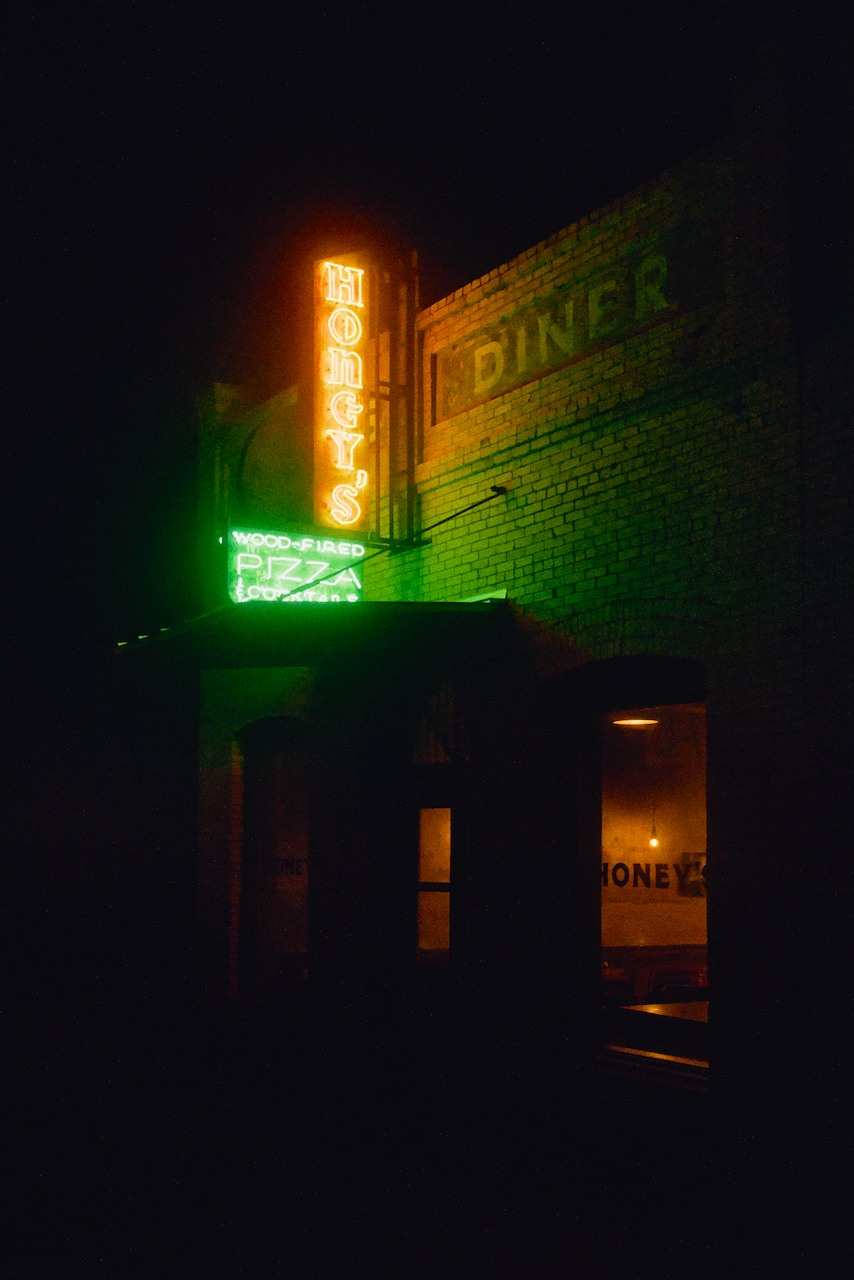
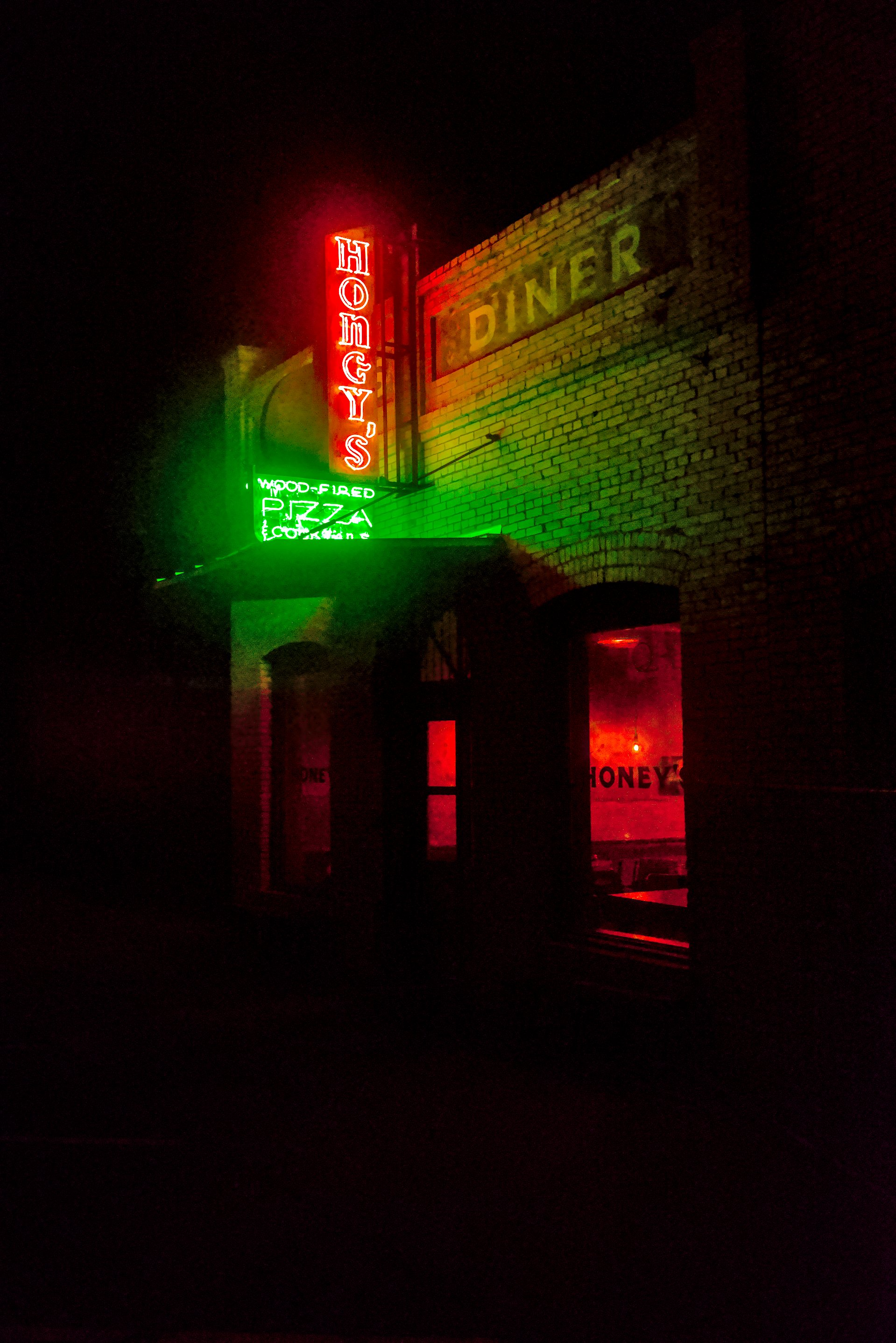
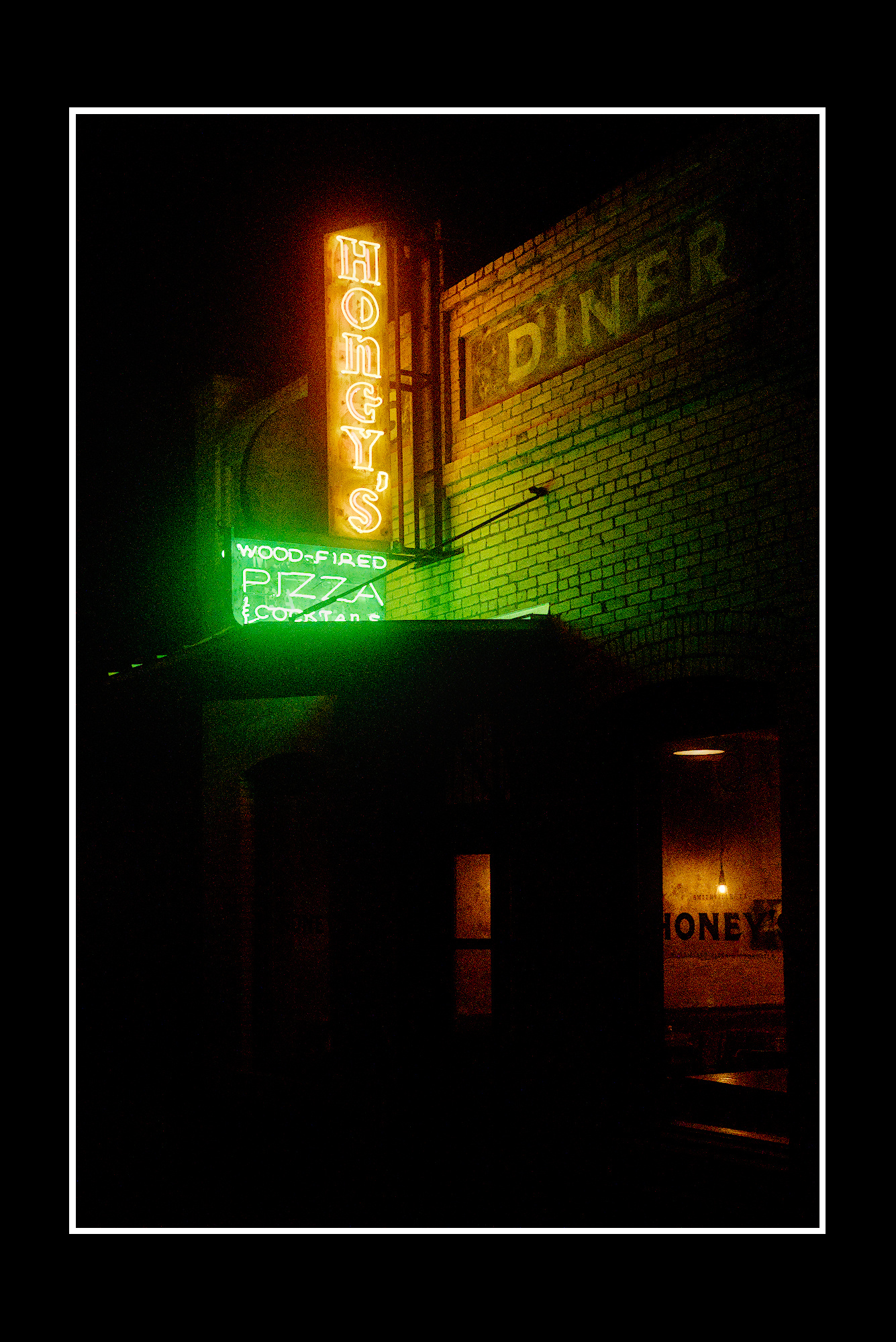
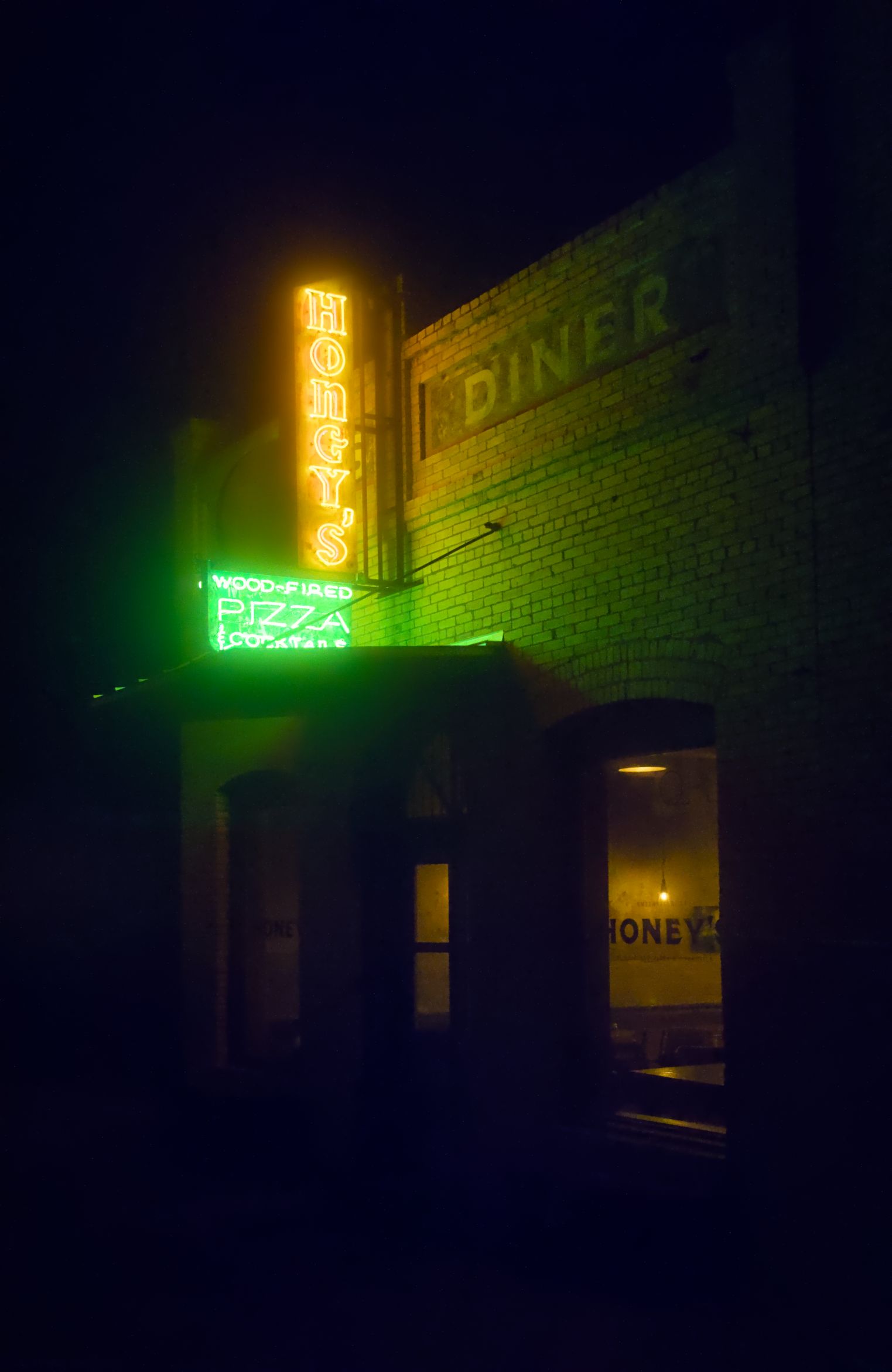
Here is a little shot I took of a cool pizzeria’s signage.
It is a good opportunity to develop your taste for noise, or the lack thereof. Hope you enjoy editing!
neon_light_pizzaria.CR3 (22.4 MB)
This file is licensed Creative Commons, By-Attribution, Share-Alike.
7 Likes
neon_light_pizzaria.CR3.xmp (79.7 KB)
7 Likes
4 Likes
2 Likes
5 Likes
2 Likes
2 Likes
neon_light_pizzaria.CR3.xmp (32,8 KB)
2 Likes
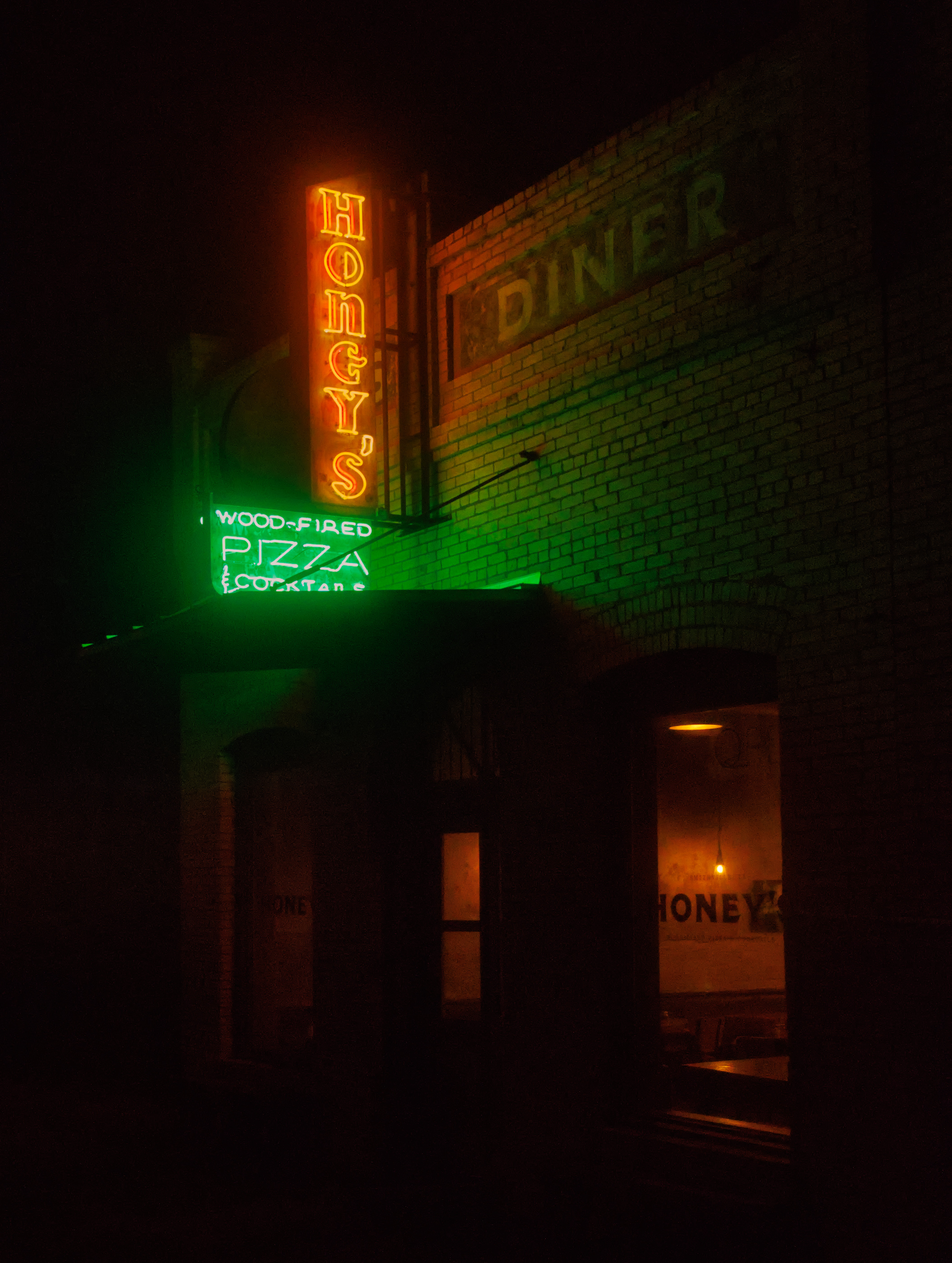
I like the clarity of the text in your edit Tim.
Here is my version and no I am not upset by the noise. For once I feel it has an artistic merit to it.
neon_light_pizzaria.CR3.xmp (22.3 KB)
4 Likes
neon_light_pizzaria.CR3.xmp (16.8 KB)
6 Likes
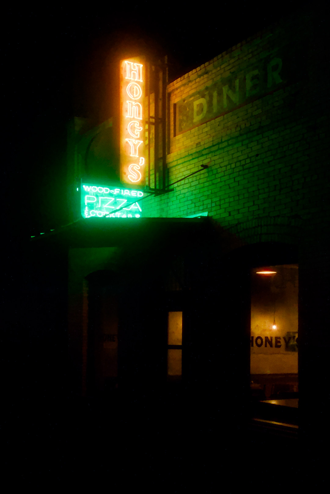
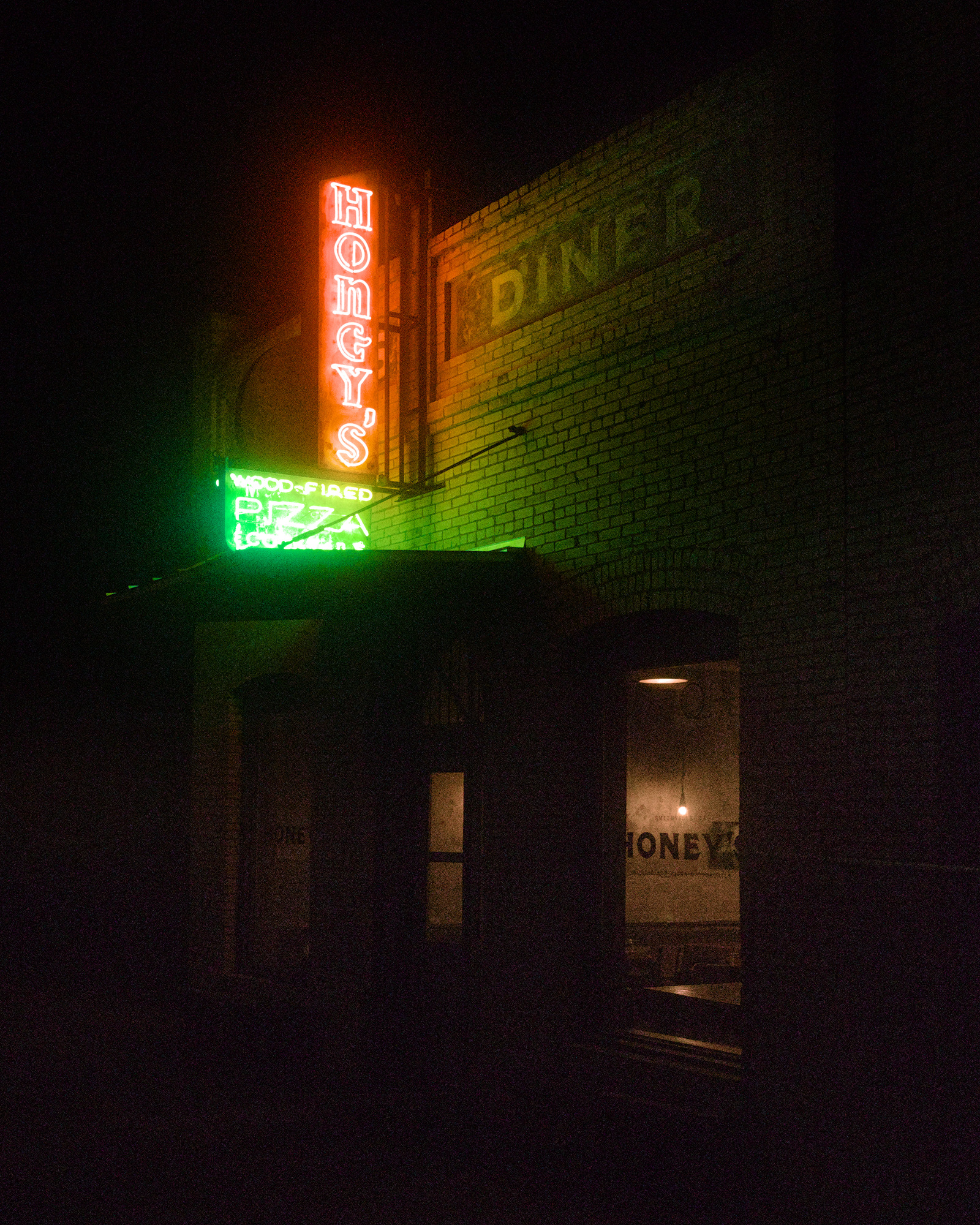
Hi @thumper. Nice shot! This was fun to play with.
I think in common with the others, I looked to preserve the glow as much possible. It was interesting in that simply dragging the white balance around makes such a difference as to whether the greens or the oranges come to the fore on the wall. I tried to keep them in balance and also added a masked tone equalizer on the windows to brighten up the interior a little.
neon_light_pizzaria.CR3.xmp (14.2 KB)
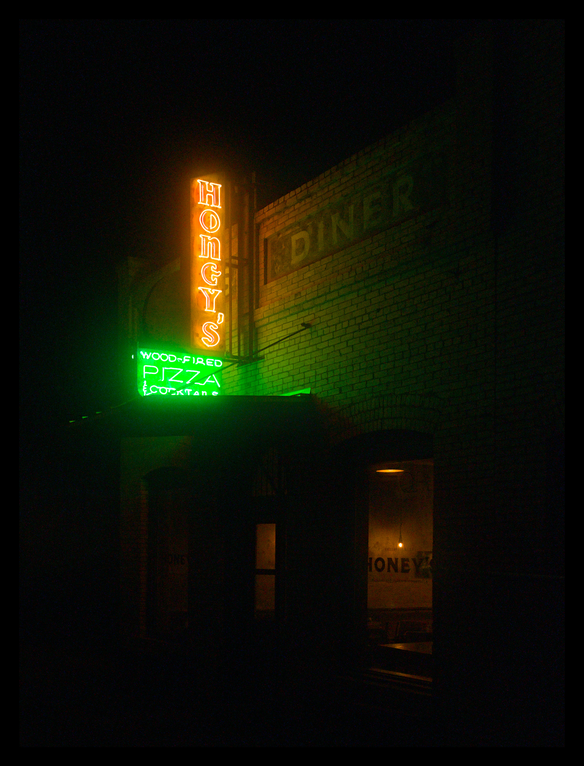
I was fairly aggressive on the denoise, but not so much as to lose too much detail on the bricks and ironwork. Contrast equaliser helps here in that I could lift the overall luminosity around the signs without adding contrast to the noise. Cropped fairly long to keep the nice symmetry and strong diagonals.
(DT 5.4 w/ AgX)
2 Likes
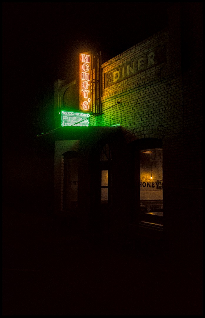
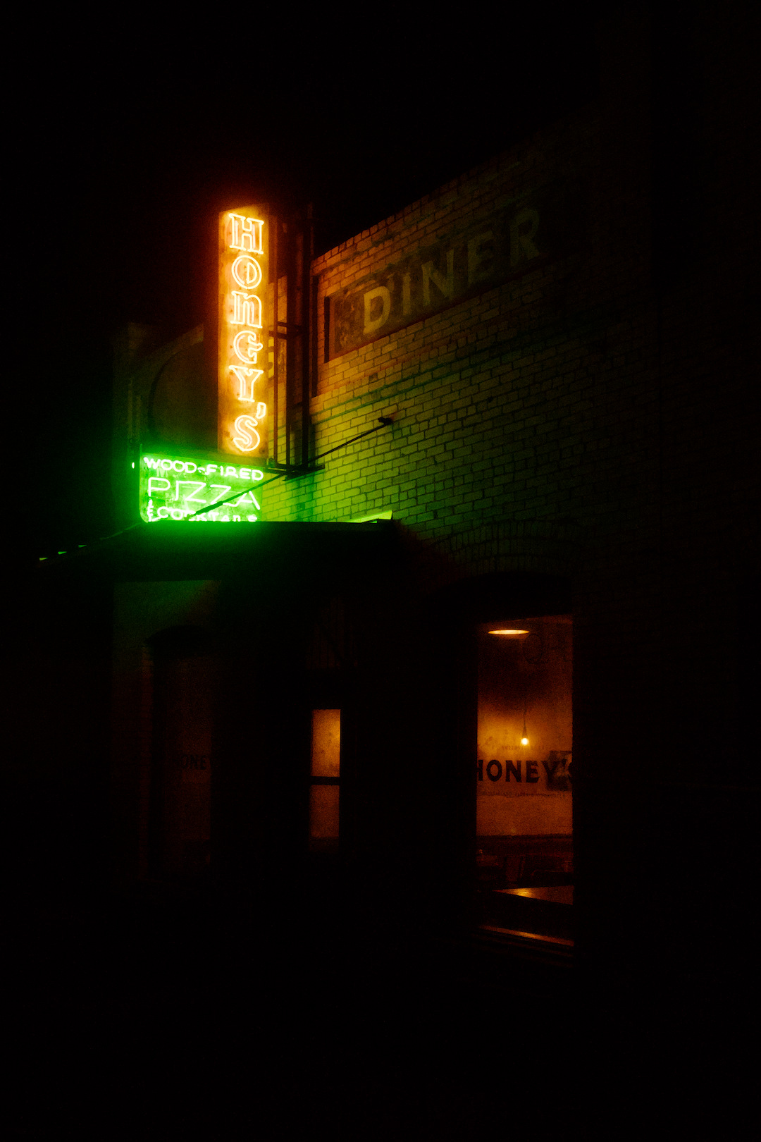
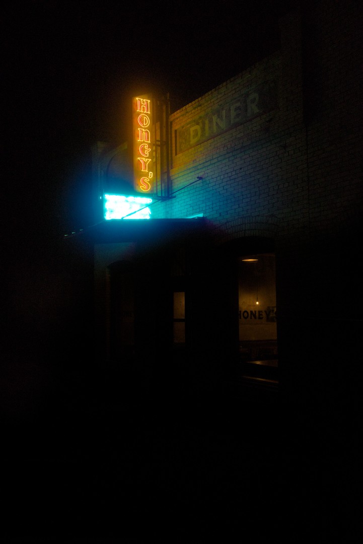
I may have gone overboard with the denoising and colourfulness? It’s an intensive history stack, and I gave the darker areas a blue tint for colour contrast.
neon_light_pizzaria.CR3.xmp (34.2 KB)
2 Likes
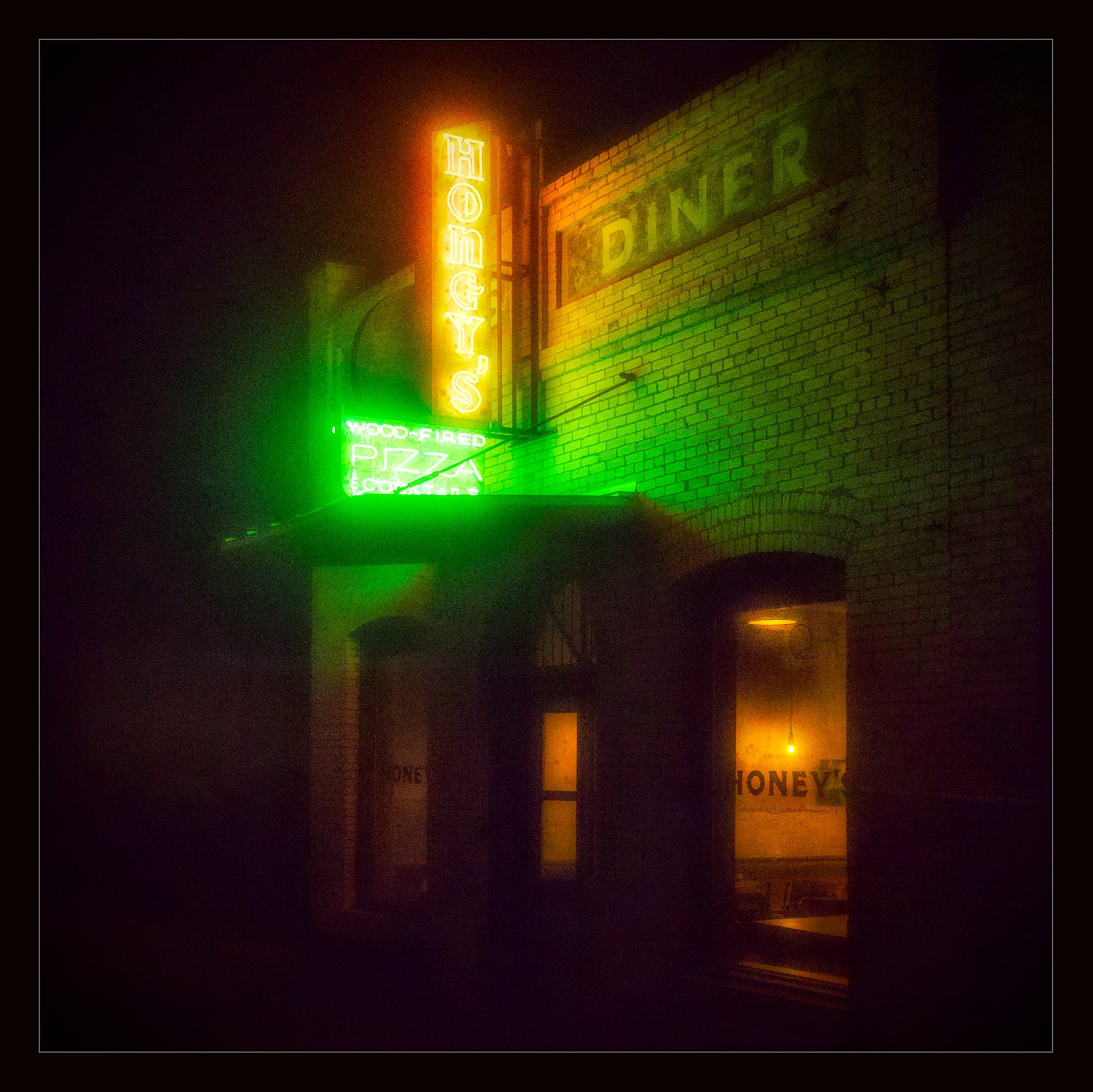
I really like this @Terry_Dooher!
I like the color and window masking work ![]()
1 Like
I love the Glowiness! Feels very Bladerunner-esque.
1 Like
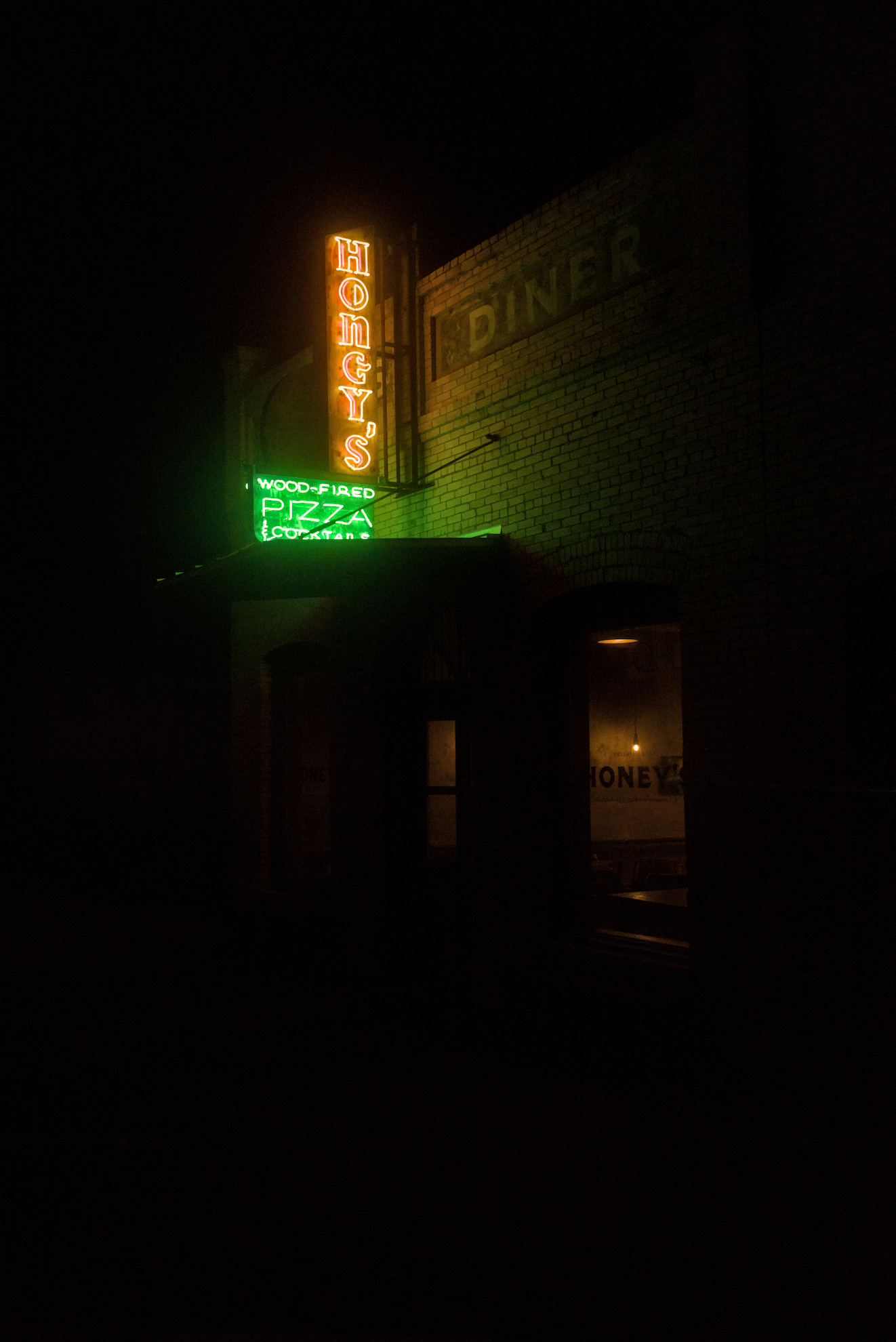
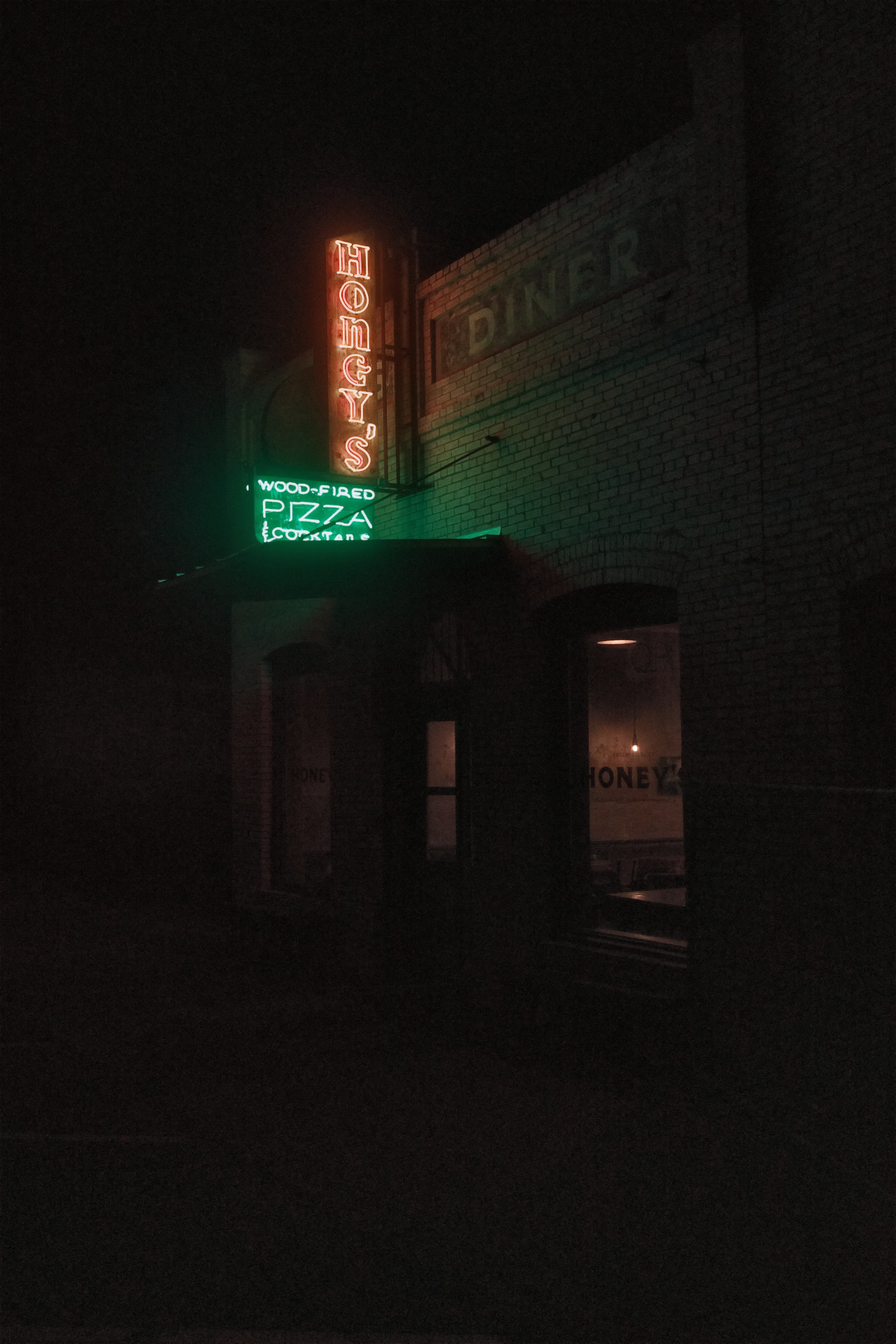
I want to present the anti-edit, out of anger, out of bad experiences forced upon me by uncaring neon-light designers.
What is by now decades ago (plural, I feel old now, but also its more than one, not two, but forgive my cheating, or not), across the street of the bus-station not far of where I lived, a bar would have a neon sign. It was using the purest blue that my eyes could just barely make out without bursting into flames.
Also, in the night, as is well known, the resolution of blue is abysmal. And because they used such a pure blue for this, no support was coming in from the lesser, but also lesser impoverished, cells in the eye for all the other wavelengths of light.
My brain would just scream in pain every time I looked at that sign, as it tried its best to decode what was written on that sign, failing, painfully, for every moment that I did not take away my gaze from that abyss.
So here you have it. Try reading anything.
I’m sorry. But thanks for giving me the opportunity to finally properly complain. (Well, complain, my editing skills are still not up to par.)
DT 5.4.0. Filmic. XMP within the jpeg.
ETA: It was two full decades ago. Argh.
2 Likes
I apologize for your bad experience, but it does make for a funny post ![]()
I still like your edit ![]()
1 Like
@thumper Nice shot. Could have been moodier with a bit of fog, mist or pitter-patter. ![]()
1 Like
Oh yeah!