[Play_Raw] Dynamic Range Management

In my case, the challenge is that I’m working on a whole bunch of possible code changes… Although I’ve realized that I MUST expose a whole pile of parameters that are currently hardcoded in darktable as sliders, otherwise I’ll lose my sanity producing example cases. - I think I have 5-6 example images for my WIP which seems excessive except as its own thread.

Examples are:
Current darktable master (undesirable for various reasons)
Attempting to alter the exposure weighting approach while maintaining linear blending (severe haloing)
Various approaches similar to what you get when exporting +0, +2, and +4EV JPEGs and feeding them to enfuse (with various weights)
Pierre Aurelien’s tone equalizer algorithm (currently handles highlights the best, but results in unnatural-looking colors in the shadows)

Right now, I’m seeing that most approaches to exposure fusion need a better way to roll-off highlights… Most weighting algorithms have such low weights in the highlights that it turns out that the highlights of +2EV and +4EV exposures aren’t weighted low enough (relatively) to keep them from contributing more than they should. So they contributed less to the highlights than the current darktable exposure fusion algorithm, but still way too much, leading to blown highlights.

Since all of the relevant parameters (target brightness, brightness variance) are hardcoded in DT, it’s hard to generate comparison cases without recompiling. Which means I need to venture into the realm of stuff I suck at (UI/UX design) to expose those parameters as additional sliders.

1 Like

Take 2. Add enfuse after the “filter pixels” step from my first attempt. Then tweak subsequent arguments to compensate for this additional step. This outputs a result with more depth and a less blown out outside view. Zoom and enjoy!

7 Likes

Here’s my attempt with Photoflow:

DSZ_0619.pfi (31.4 KB)

I don’t think this image is suited for a global tone mapping approach like filmic - the problem is that the tonal ranges for the interior and exterior parts of the scene end up overlapping. Whenever I try to use a single curve on this image, the view through the windows loses too much contrast and ends up looking misty (or the interior ends up looking too dark).

I used a shadows/highlights layer to bring the shadows range up and drop the highlights a bit. Setting the anchor to 75 (as it is in the relight layer) seemed to give the best results.

The out of camera white balance looked a bit too blue on the chairs, so I adjusted the colour temperature manually.

Once I had done this, the chairs look too flat so I added some local contrast. This messes up the view through the windows, so I moved the local contrast to a second instance of shadows/highlights with a mask calculated from the L channel to restrict local contrast to the darker tones.

Finally, I added a little bit more contrast and a blue/yellow shift using a Colour Adjustment layer.

6 Likes

Thanks for the narrative, very instructive.

I think your rendition comes closest to what I recall of the scene. And yes, I couldn’t shape any single curve such that comes close to your rendition.

Regarding white balance, I think your adjustment keeps enough blue in the interior to convey it’s chromatic relationship to the exterior - after all, it is effectively incident daylight.

Very nice edit!

I doubt that it was that dark inside. Maybe energy-wise but not perceptually. BTW, what is the context of this photo? Where was this taken and why were you there?

This is the main lobby of the Ent Center for the Performing Arts, University of Colorado - Colorado Springs. We were there one recent Saturday morning to hear a rehearsal of a choral group our neighbor conducts. This was a ‘grab-shot’ walking in, headed to the rehearsal hall.

It’s about 1/2mile from our house; I may have to walk down there one morning, see if they’ll let me sit in the lobby for a bit, and take in the morning light…

Edit: Oh, the exterior view is to the west; if one were outside looking the same direction, the sun would be back over your left shoulder…

1 Like

@afre - I’m assuming one of the lua-script approaches or manually exporting then feeding to enfuse?

Not what I’m used to seeing from darktable (although I suspect I know where things are breaking now - the contrast weight in DT’s implementation appears to potentially be WAY off. enfuse default for contrast weight is 0.0!)

I suspect that in the flow darktable uses, contrast weight will simply act to increase the weighting of positive exposures improperly. A “traditional” enfuse workflow (where the highlights of the “bright” images will be clipped severely) that has contrast/saturation weighting turned on will deweight these clipped highlights due to lack of saturation and lack of contrast. In this particular scenario, tracking brightnesses above 1.0 becomes a liability. (However I think that tracking brightnesses above 1.0 eliminates the need for contrast weight in darktable’s exposure fusion use case - they’ll simply get severely penalized in the exposure weight calculation step.)

Need to try when I get home.

Elaboration of my approach.

1 Start with linear no-clip float. (a.tif)
2 Filter pixels, esp. negative values. (a1.tif)
3 Process copy to be in a perceptual range. (a1_.tif)
Step 3 would flatten both the shadows and highlights while adding contrast to the mid-tones.
4 Restore both extremes using enfuse. (a2.tif)

enfuse --exposure-weight=0 --saturation-weight=0 --contrast-weight=1 --entropy-weight=0 --gray-projector=l-star -l auto -o a2.tif a1.tif a1_.tif

Caution Post-processing is required, as enfuse introduces negative values and an alpha channel. Hint Adding grey scale masks to your input images would help you control which pixels contribute to the fusion and by how much.

2 Likes

OK, BOOM - contrast weighting definitely WAS the culprit in many of the issues I’ve been having with highlights and exposure fusion.


Darktable modified exposure fusion with the following changes made:
Perform all operations in gamma=2.4 space instead of linear (despite claims this will cause severe haloing, actually eliminates it)
Disable saturation weight - since all of our images are brightness scaling and we don’t clip, saturation will not change for any pixel
Change exposure optimum to 0.5 and width to 0.2 (enfuse defaults) - these need to be exposed in the darktable UI as sliders, I have no idea why these are hardcoded
Change exposure weighting function from R/G/B peak to R/G/B average (enfuse defaults)
Disable contrast weighting - again, we’re not clipping, and it turns out contrast weighting then becomes just a linear function of exposure shift for a given image
Temporarily disabled all basecurve operations when exposure fusion is active (this is getting undone, proper fix was disabling contrast weighting)
Drop weight for any pixel with exposure >= 1.0 to 0 - TBD, this may not be having much benefit if at all, I’m probably going to nuke it (otherwise it also needs to be a slider - enfuse has an exposure_cutoff option)

After all those code changes, the only settings in the UI are:
Turn on exposure fusion with three exposures
Leave bias to +1.0
Set exposure shift per exposure to +2.0ev

No other changes were made, also I stuck with camera white balance. Once I’ve exposed a bunch of the important control variables in sliders I’ll push the code as a WIP.

Have others done better? Definitely. Once this code is cleaned up, is the work to obtain the image SIGNIFICANTLY less? Yup.

For comparison, here’s Pierre’s tone equalizer, +4.0 EV for the deepest shadows, gradually dropping to 0.0EV for the -2EV highlight band. The highlight region looks much nicer, but the indoor areas look highly unnatural, with that “aggressively tonemapped HDR” look that drove so many people towards enfuse (one of enfuse’s primary claims to fame is that it’s much more natural-looking than most preceding HDR tonemapping approaches)

1 Like

As shown in my command, I gave all of the weighting to contrast-weight because it makes the image sharper. Does it have an adverse affect on take 2? I can’t tell because I didn’t pixel peep.

Where does this gamma come from? How about the working colour space? The latter likely has more of an influence on the colour balance.

How did you do that? If there is clipping in the input images, I usually mask them out. Otherwise, if there is detail, I keep it. I haven’t had any luck with exposure_cutoff.

Yes, looks terrible. (Coming from someone with an ancient low-end colour unmanaged SDR screen. :stuck_out_tongue:)

Hey @ggbutcher, could you have used a polarizer here to help cut some of the glare off the floor and table? (Or did you use a polarizer?)

1 Like

Your rather different order of operations, which appears to have some nonlinear shifts, is likely to behave very differently with contrast weight. At least currently, if there’s just linear multiplication for exposure shift AND no clipping, contrast weight shouldn’t be of benefit - and in fact just becomes a linear function of the exposure shift multiplier.

If you turn on any of the other stuff in basecurve, things could become VERY different. I’m also wondering why a decision was made to disable color preservation when exposure fusion was used - I suspect that operating with this disabled is what makes Pierre hate basecurve so much.

The actual gamma part of sRGB is 2.4 outside of the linear region. The linear region makes it average out to the oft-quoted 2.2. Working color space is the default (apparently rec.2020 linear now?) - changing this could break VERY badly currently. Part of the whole “this is a WIP” thing - the appropriate approach may be to change from working to sRGB after the basecurve is applied, and convert back at the end.

Conditional inside the basecurve_compute_features() OCL kernel (and its equivalent cpu function in basecurve.c) - Since we’re generating the pushed exposures internally, we don’t have to worry about clipping with this flow.

My laptop screen isn’t that much better - but for many years we’re going to have to cater to the lowest common denominator of unmanaged SDR displays. There’s absolutely no decent widely-deployed standard for delivering stills to HDR displays. HEIF/HEIC might do it, but support for that is very limited, especially support with HDR display capability. Right now, if I want to output to an HDR display (such as my Vizio P65-F1), I have to do the following:
Export from darktable as Rec. 2020 linear TIFF
Use ffmpeg with the zscale filter to convert it into Rec. 2020 HLG, 10-bit HEVC codec

Doing this looks AMAZING. But it’s a massive PITA for anyone to view unless encoding a bunch of images to a video slideshow.

Maybe. Last time I used a polarizer I had brown hair, and was a whole lot stupider than I am now… :smile:

Really, I probably need to go back one morning and re-regard the scene. The blueish incident light and the glare look right to my recall, but I can’t remember what I had for lunch yesterday…

The comparison made with Aurélien Pierre 's tone equalizer is unfair IMHO.
Here is what I got with tone equalizer in about 30 seconds (without applying any local contrast boosting after the tone equalizer):

Which is really close to what you have with your exposure fusion for the indoor part :slight_smile: 
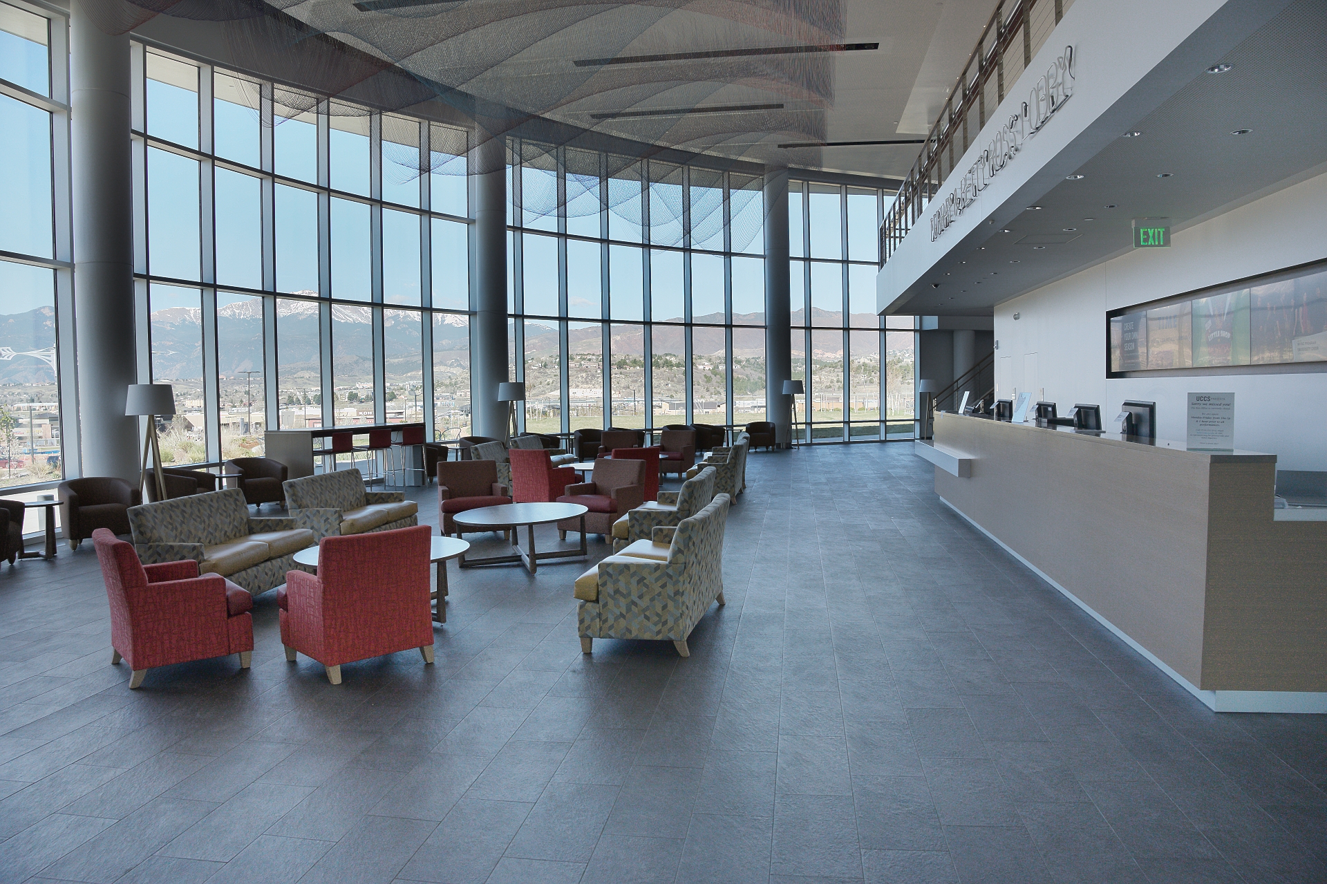
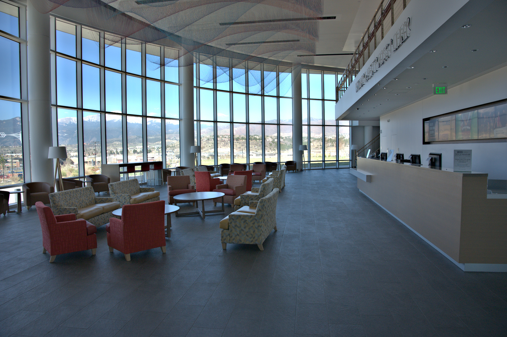
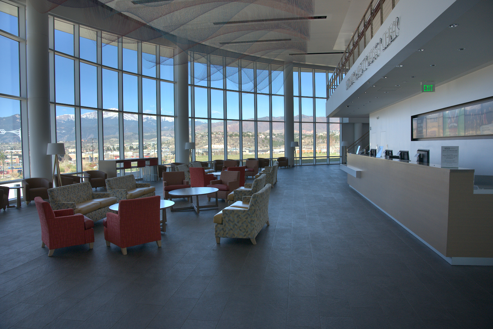
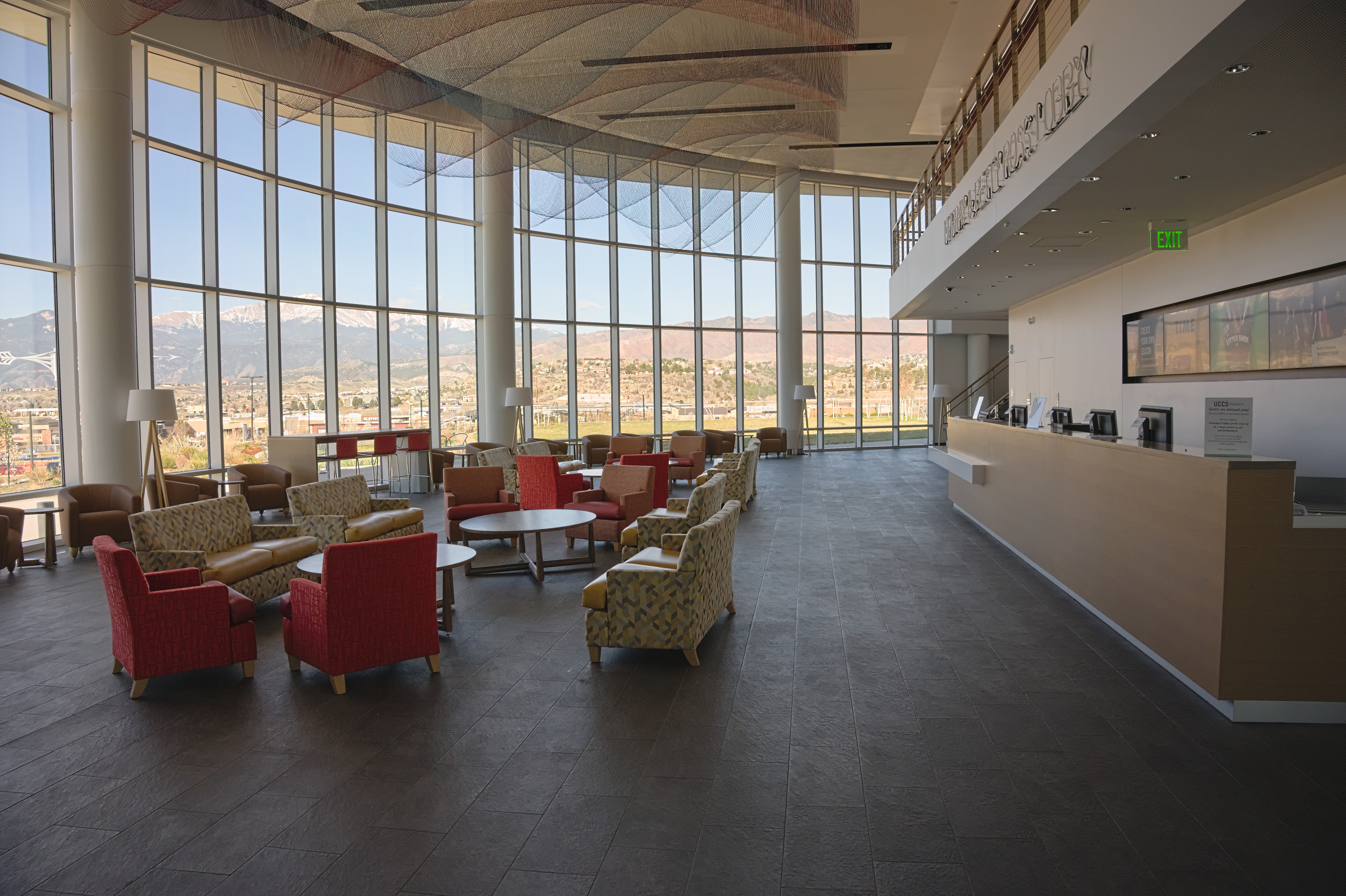
And on the outdoor part, the tone equalizer allows nice control so that the sky remains blue and the mountains highlights remain unclipped :slight_smile:

9 Likes

hi @rawfiner,

nice result. did you used the bascurve or filmic module as starting point?
from the embedded history I only see basecurve, toneequal, rgblevels, …

Interesting, so a combination of a bunch of things.

As I mentioned in my post - can people do better with significant additional work? Yes. I’m not sure if the embedded history for mine showed, but - white balance, demosaic, then basecurve fusion only (the curve itself was effectively disabled by making a linear line) - nothing else.

One of the reasons I’ve liked enfuse so much is that it’s pretty tolerant/adaptive, it’s difficult to get something that looks REALLY bad.

My family currently jokes that my camera has “write only memory” - so getting time spent per image way down so I can clear the backlog that resulted from switching workflows a few years ago (and hence falling WAY behind) is important. (I used to have a pretty quick workflow using ufraw - but it strangely underexposes anything coming from a recent Sony camera by exactly 1 or exactly 2 stops, with the actual value sometimes changing, and with me unable to locate where in the flow ufraw is breaking that dcraw doesn’t. I gave up and started fiddling with darktable.)

I’ve made my life harder by tending to expose for highlight preservation lately which means a lot more work in post - work I shoudn’t be making for myself!

Edit: I just realized that I think I made a mistake in the exposure cutoff function, which would explain why it had far less benefit in the highlights than it should have. While tonight is not supposed to be a coding night (it’s a drinking night! :wink: ), fixing that one issue should only take me less than the ten minutes I have to set aside.

I’m doing the same thing right now. So, my workflow for all imaging - serious and family snapshots - is to make small JPEG proof images with a batch recipe, and for that I just do a linear contrast-stretch that will blow a small bit of highlight in order to get a decent overall spread. I then use those images to select ones for reprocessing. For family work, the proofs are usually sufficient, so that makes things easier.

To preserve highlights, I’m experimenting with the Z6’s highlight-weighted matrix metering mode - it definitely pushes exposure sufficient to meet that goal, but I’m still working through all the implications of that with regard to my proof recipe.

The subject image of this thread was not exposed with this mode, and it accordingly has a wee bit of total saturation in the snow on the mountain, and blue channel saturation in the sky. I’m probably going to venture back over there in a couple of days, to take a weighted mode exposure and to do a proper white balance measurement, at about the same time of day as the original image.

When you say “saturation” I’m guessing in this case you mean “clipping”?

I see the snow as very unsaturated… But channel clipping is exactly what I meant as far as exposure clipping. I reworked the algorithm to use a channel average instead of channel peak for exposure weight (same as enfuse defaults), but calculated exposure cutoff AFTER averaging - which could allow “would-clip” contributors to receive more weight than they should.

Not having to deal with clipped pixels in the pipeline makes things simpler in some regards, but introduces new things you have to consider. (For example, saturation weight in enfuse really is there only to detect when a pixel is clipped in some of the input images, or to handle other camera behaviors that might have altered saturation in an undesirable manner. For exposure fusion in dt - if a pixel has a given saturation value, that value will be preserved when it is scaled during the exposure shift. There could be some artifacts with basecurve when “preserve colors” is turned off, which is why I’m planning as part of my patch to allow it to remain on since it seems like force-disabling it when that feature was added was an oversight based on a conversation with the guy who maintains the preserve-colors function.)

I reserve the term ‘saturation’ for the specific condition of light on the sensor with a higher intensity than the sensor can resolve. Anything in post that drives a value down to display white is ‘clipping’.

Some of the snow pixels behave as ‘saturated’ when they are white-balance corrected, they take on the dreaded magenta cast. But, it’s snow, so it’s a bit dicey to differentiate between a measured white and a saturated white.

The blue channel clipping I observed was manifest in dt’s gamut clipping indicator. Not being familiar with dt, I don’t know where in the pipeline that is determined…

RT 5.6

DSZ_0619.jpg.out.pp3 (11,9 KB)

2 Likes