Nice picture, was fun to work with it

4 Likes
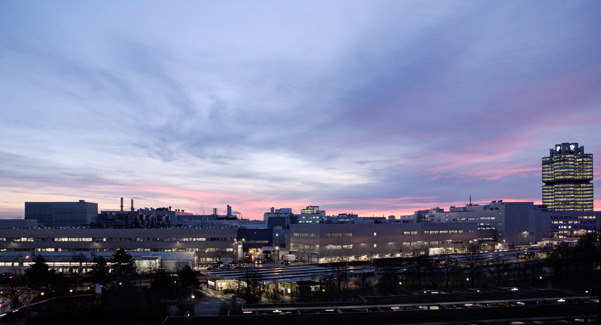
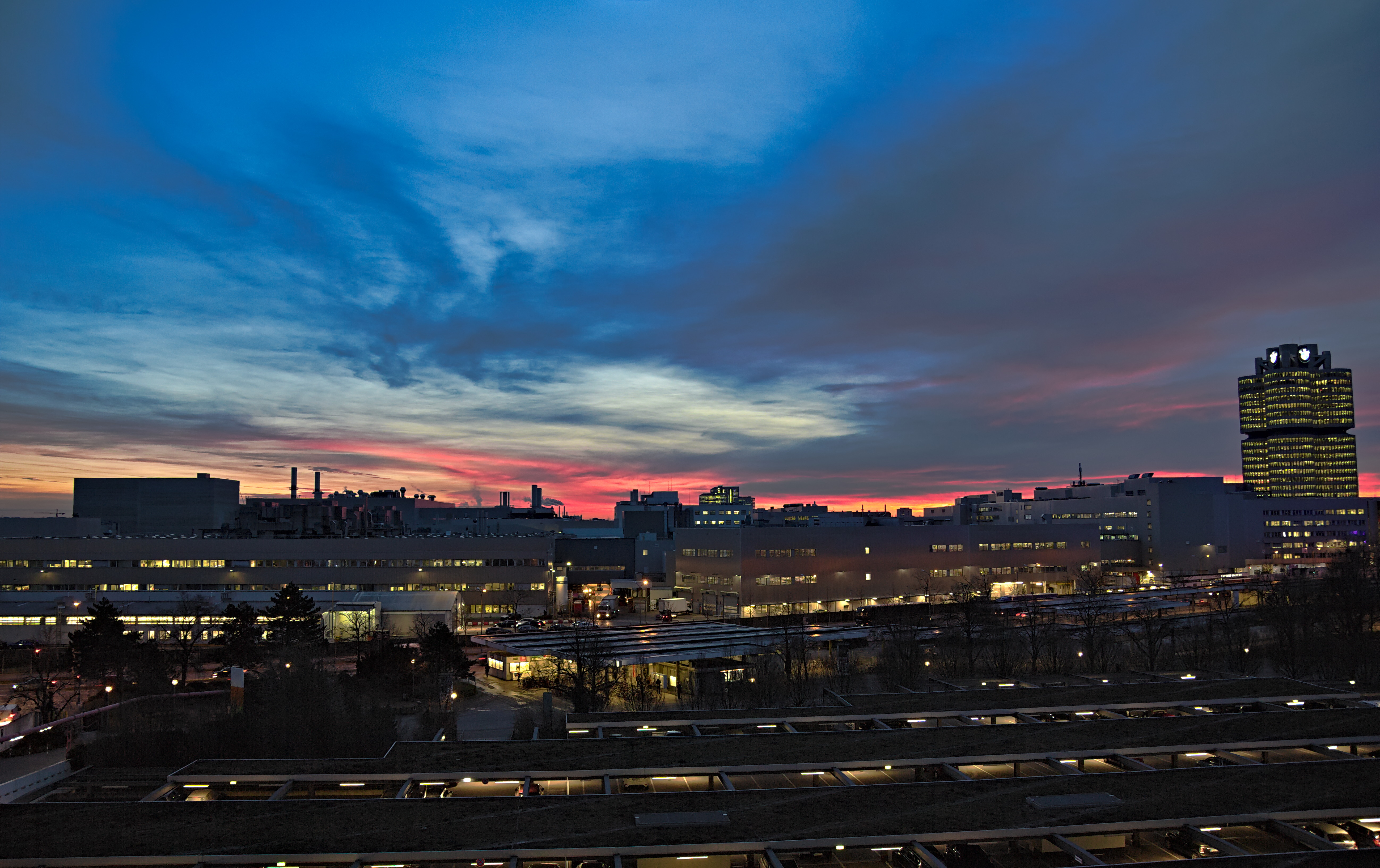
For my taste actually somewhat too saturated. I tried to keep my version more natural.
But it’s called “play raw” and sometimes it’s fun to try something more extreme.
I also think, it’s a good idea that more “beginners” participate in play raws. From my own experience I know it’s okay to make mistakes and you learn a lot.
1 Like
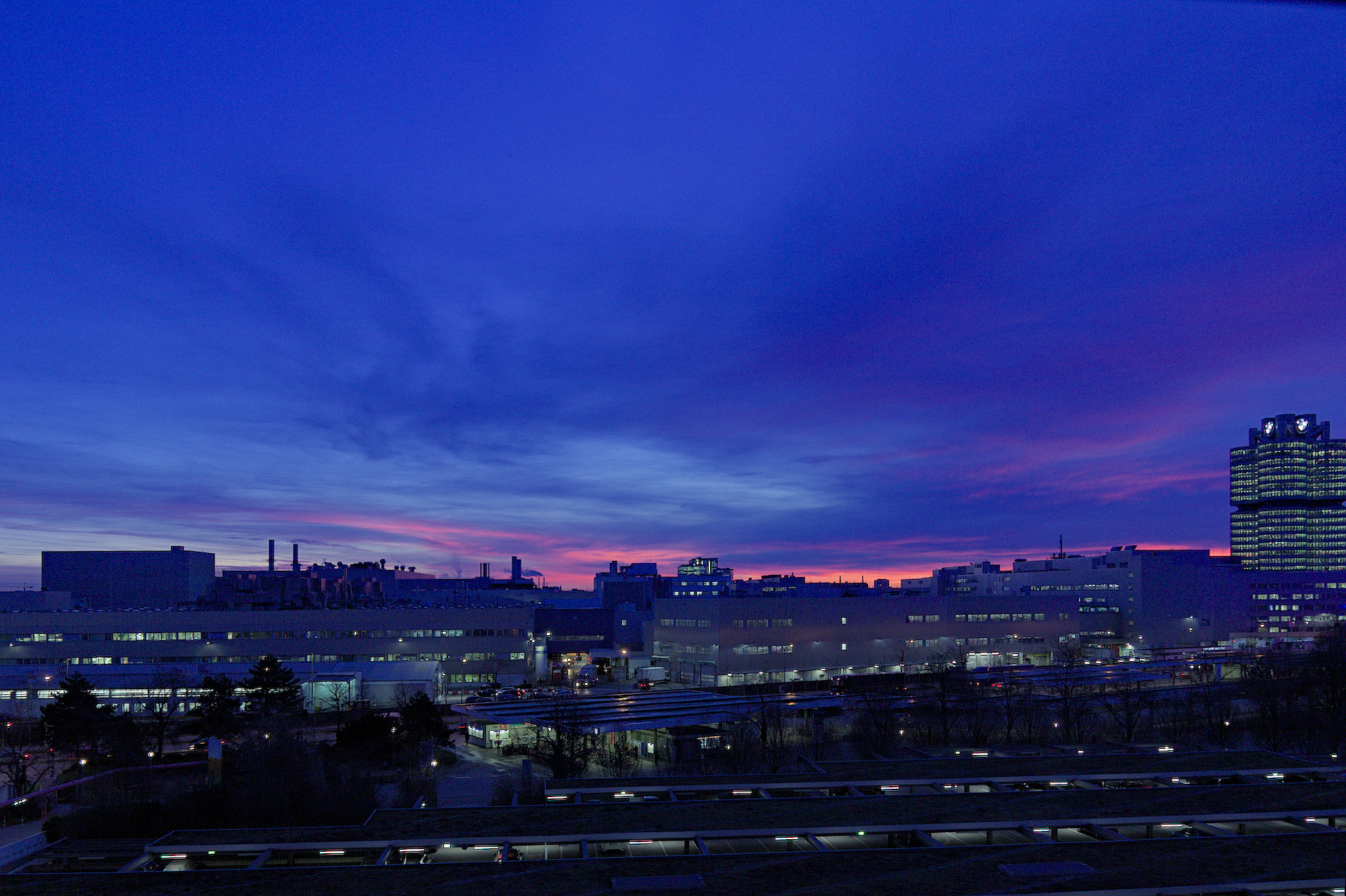
I think I just invented a name for this style: Viennese Neo-Expressionism. Don’t know how much this says to you. Neoexpressionist photography - does that sound good? Maybe I should write a manifesto? The style itself is not my invention though, kind of comes from the Adobe world, at least a Lr user’s invention. One can get used to a lot of color…
Different opinions are always good. Sometimes it’s about real mistakes, but sometimes it’s just a matter of taste or calibration.
1 Like
Sometimes I find the members here are too “polite”. It would be good to point out mistakes and criticize interpretations constructively. But I often don’t dare myself. You don’t want to be rude ![]() .
.
1 Like
I am personally (not from a moderation standpoint) on the fence about criticizing play raws. On one hand, yes it could help improve. On the othet hand, I end up trying things I wouldn’t normally try, and I also try and always post something significantly different from what has already been posted.
From a moderation standpoint, as long as it is constructive and civil, go for it! Also if someone asks not to be, then one should respect that.
2 Likes
+1.
And please do not criticize my contributions (no, just joking).
2 Likes
Flickr, 500px and Instagram are about likes and praise.
I don’t know. As I see my versions next to all other versions they really look much more saturated. But I kind of thought that something should balance the darkness of the foreground, which can only be a lot of color because if the upper two thirds of the picture are much brighter than the lower third there is imbalance. Brightness is always lighter than darkness. On the other hand, there is logic in a brighter sky because there would be real imbalance if the foreground were bright and the sky were dark, I mean if the heavy darkness were on top of the light darkness. That would be extreme imbalance.
I am still not sure. I change my opinion about my own edits all the time.
Edit: maybe we conclude that less saturation is more realistic but less balanced?
Yes, certainly. I like to see different interpretations that’s what play raws are good for. However, yours is a bit too “beautiful” for me personal taste. Nevertheless, I like the blue/yellow contrast a lot.
1 Like
yea, maybe it’s kitschy LOL
How about your skies + CarVac’s buildings?
Hey, I am a beginner, filling these categories ![]() ,
,
and sometimes challenge people ![]() . I make mistakes and have to edit or delete a few posts here and there but I try to be a good and consistent contributor on the forum. If I can do it anyone can.
. I make mistakes and have to edit or delete a few posts here and there but I try to be a good and consistent contributor on the forum. If I can do it anyone can. ![]()
In terms of Play Raws, I tend to be experimental. Won’t garner as many likes and not as dramatic as say @Joan_Rake1 but it is fun: so more people should play and discuss!
1 Like
Unfortunatly i’m unable to manage the noise in the darkest part… Next time i think it will be better to use bracketing.
Anyway here is my try with Raw Therapee 5.7.
_MG_0517.jpg.out.pp3 (12.8 KB)


@ltr21please attach your sidecar files.