See in lighttable mode “load sidecar file” on the right.
One minute edit in Latest Photoflow appimage “PhotoFlow-git-stable-20181108_1224-fbd1fd779dbabe1b3f787e1fb535be86215c0094-x86_64.AppImage”
I failed to mention that I’ve used ur camera profile @Elle; which was slightly different from the one in photoflow, it rendered nicer colours IMO =)
2 Likes
@Elle, I think your original scene-referred rendition has a certain dreamy quality that drew me to try my hand at processing this image in the first place. I think I felt the wind when I saw it!
Unfortunately, I’m more familiar with saturated popping images so I decided to do one of those.

080724-1822-100-1479.cr2.xmp (4.7 KB)
1 Like
@CriticalConundrum - that might be the nicest thing anyone ever said about one of my photographs. Your word “dreamy” wrt to the scene-referred “no pretty-making edits” version has prompted me to re-evaluate what I want to do with the image. At least for me, it’s really easy to start with a reasonably good capture and just mess it up with subsequent edits - sometimes I find the more I work with an image the farther it gets from why I started working with the image in the first place ![]() .
.
I don’t know if it’s acceptable practice to critique various people’s renderings of a given “play raw” file. So my apologies if I’m stepping out of line and keep in mind this is just my response, I don’t wear a hat that gives me a privileged position for making absolute aesthetic judgments:
-
I like your sky a lot, extremely pleasing and delicate handling of the clouds and blue sky. Whatever dreamy quality the sky might have, you managed to preserve it.
-
The processing that made the comparatively darker tonality in the ground has also added a fair amount of saturation which seems somewhat out of balance with the sky saturation and could be reduced using a mask and Luminance blend if darktable has this blend, or using the darktable Lab color tools to lower the Chroma.
Everyone who’s posted renderings, I’ve learned so much - thank you thank you!
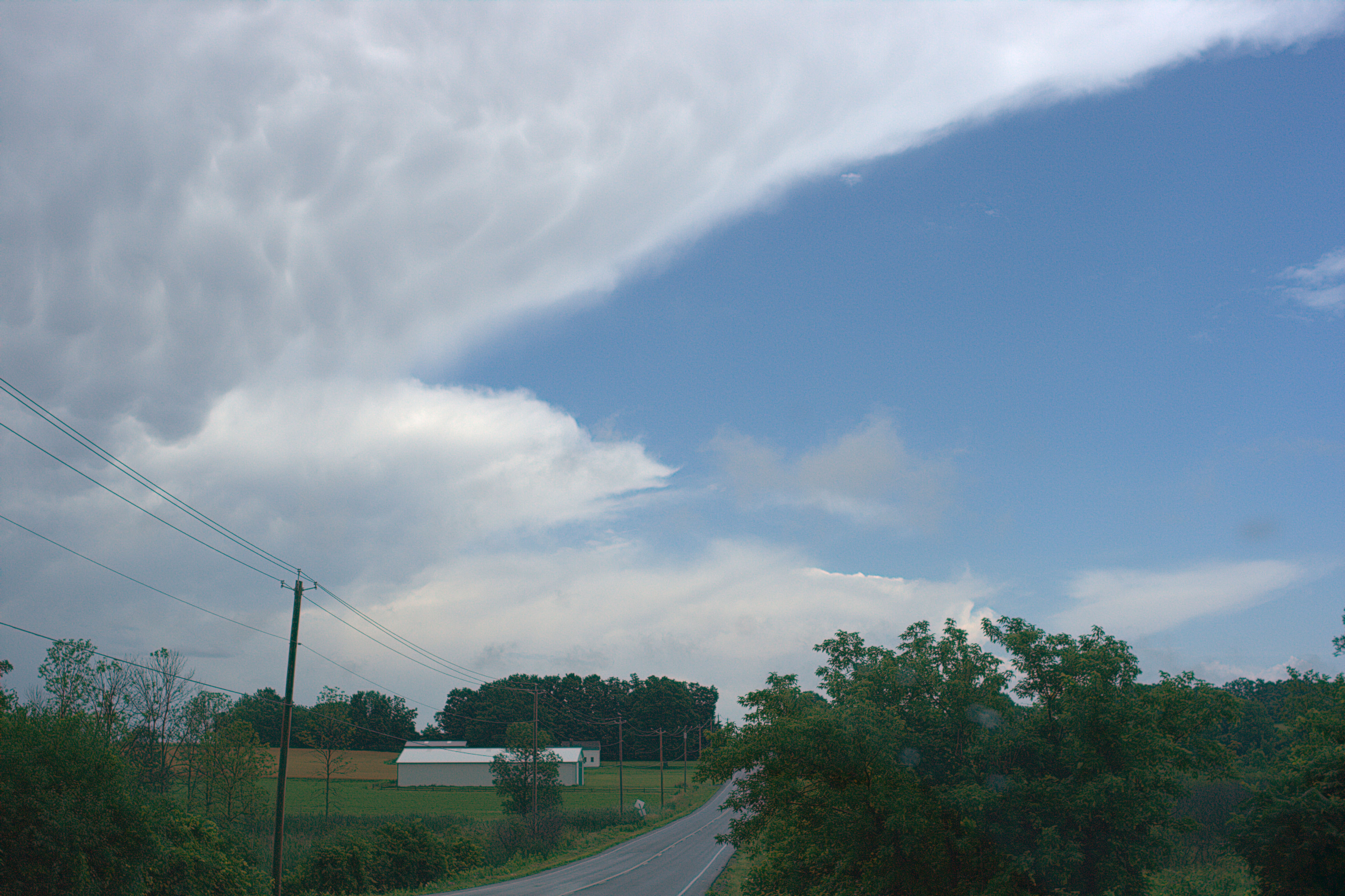
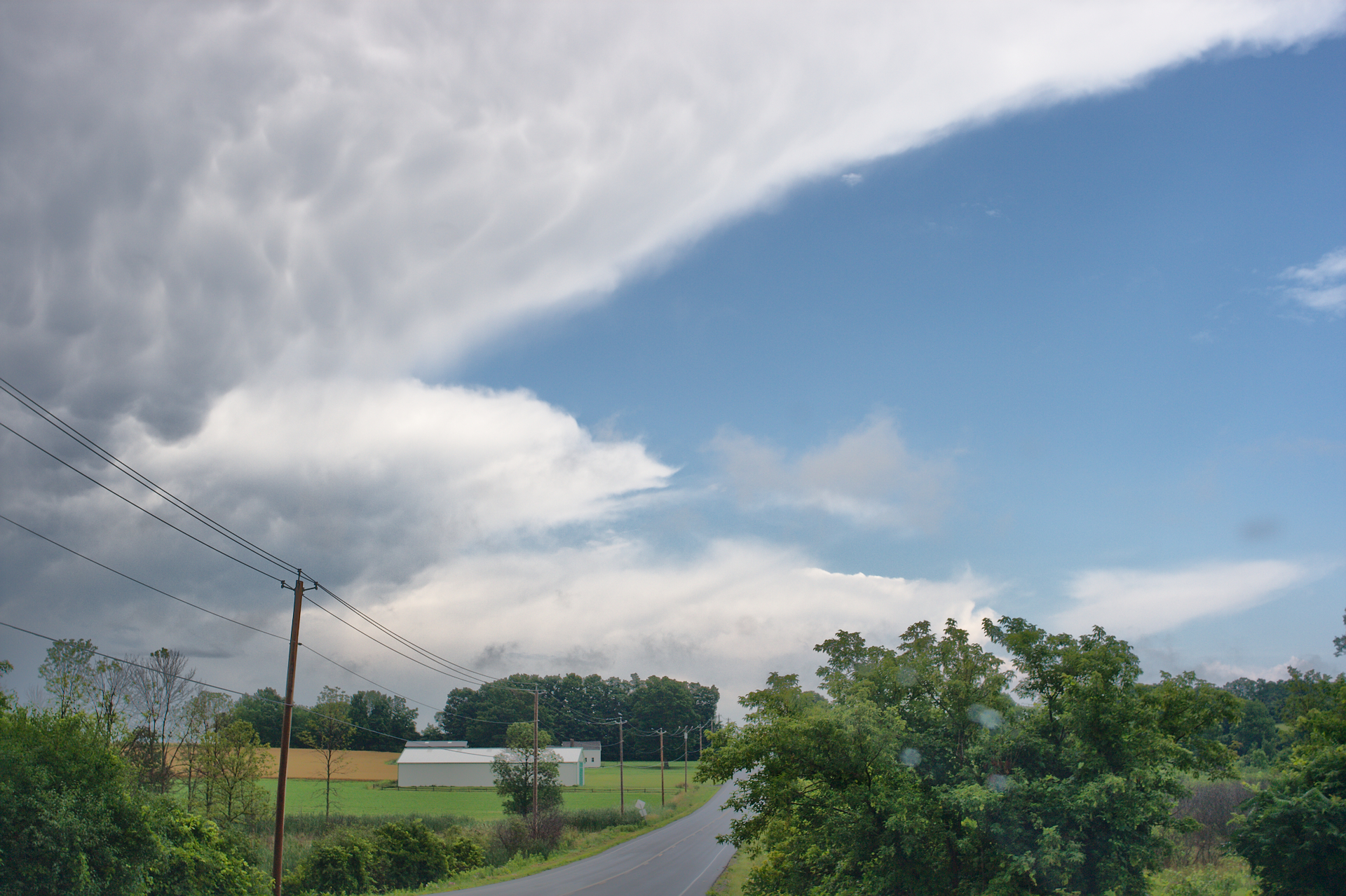
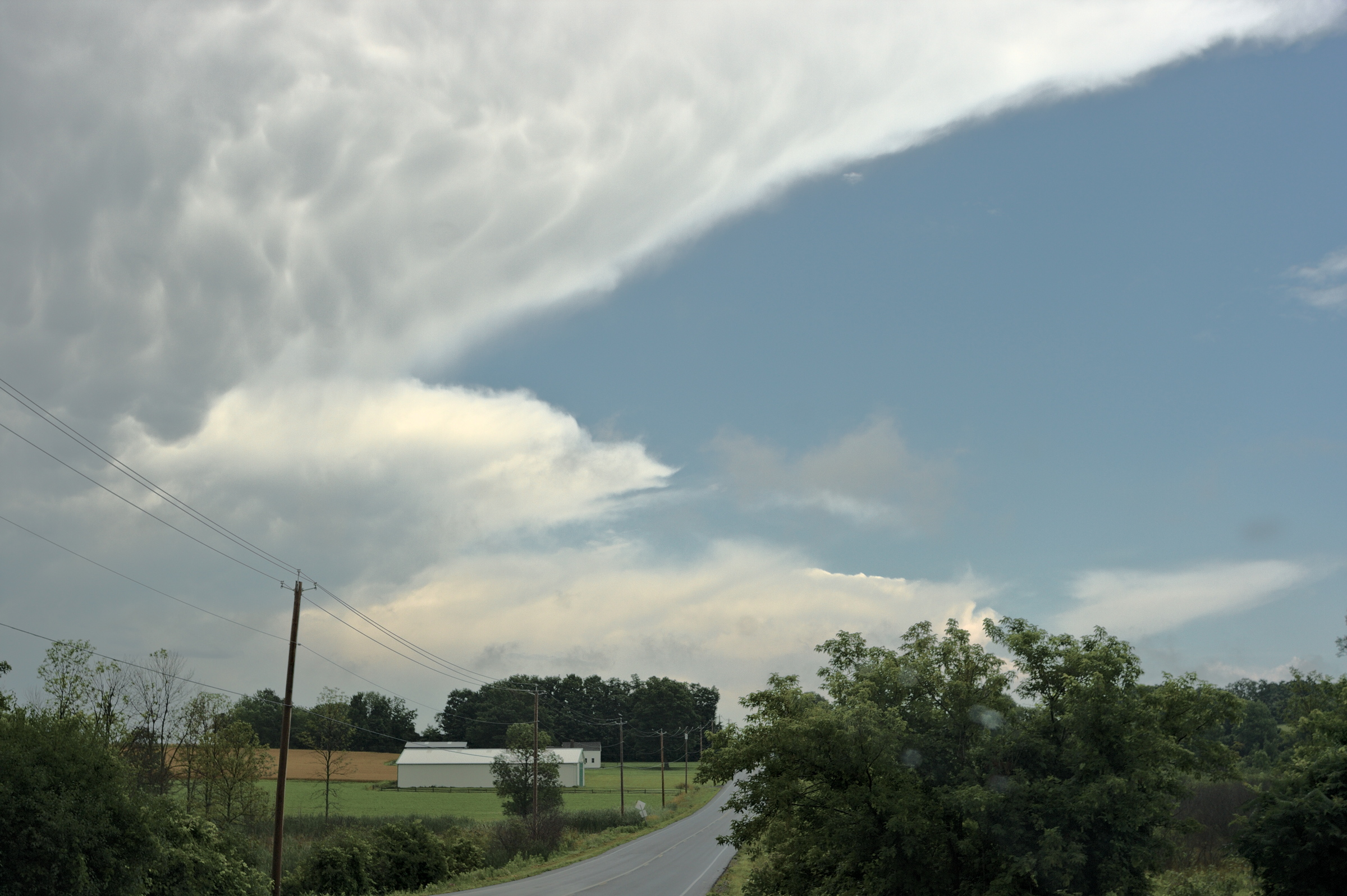
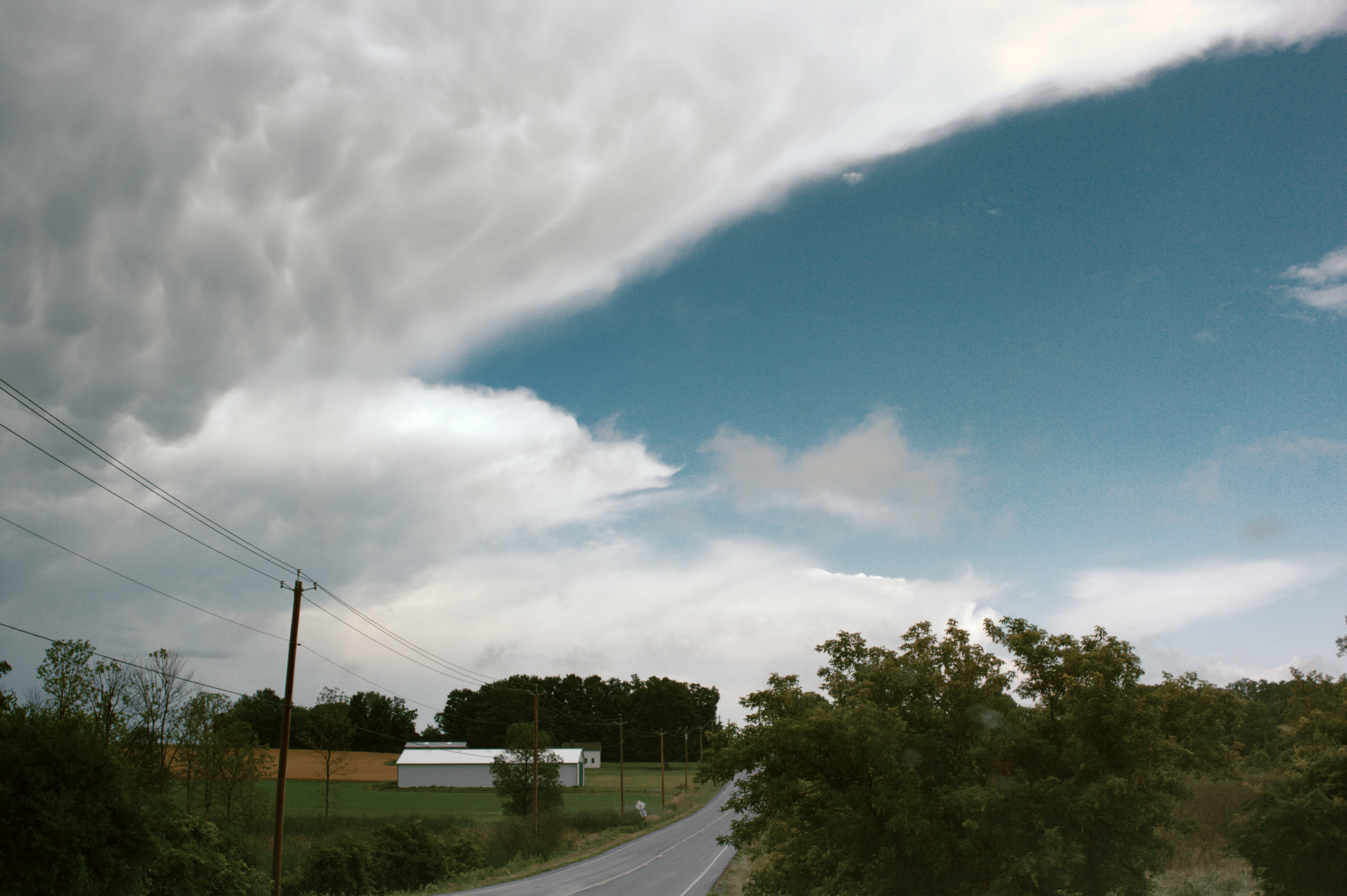
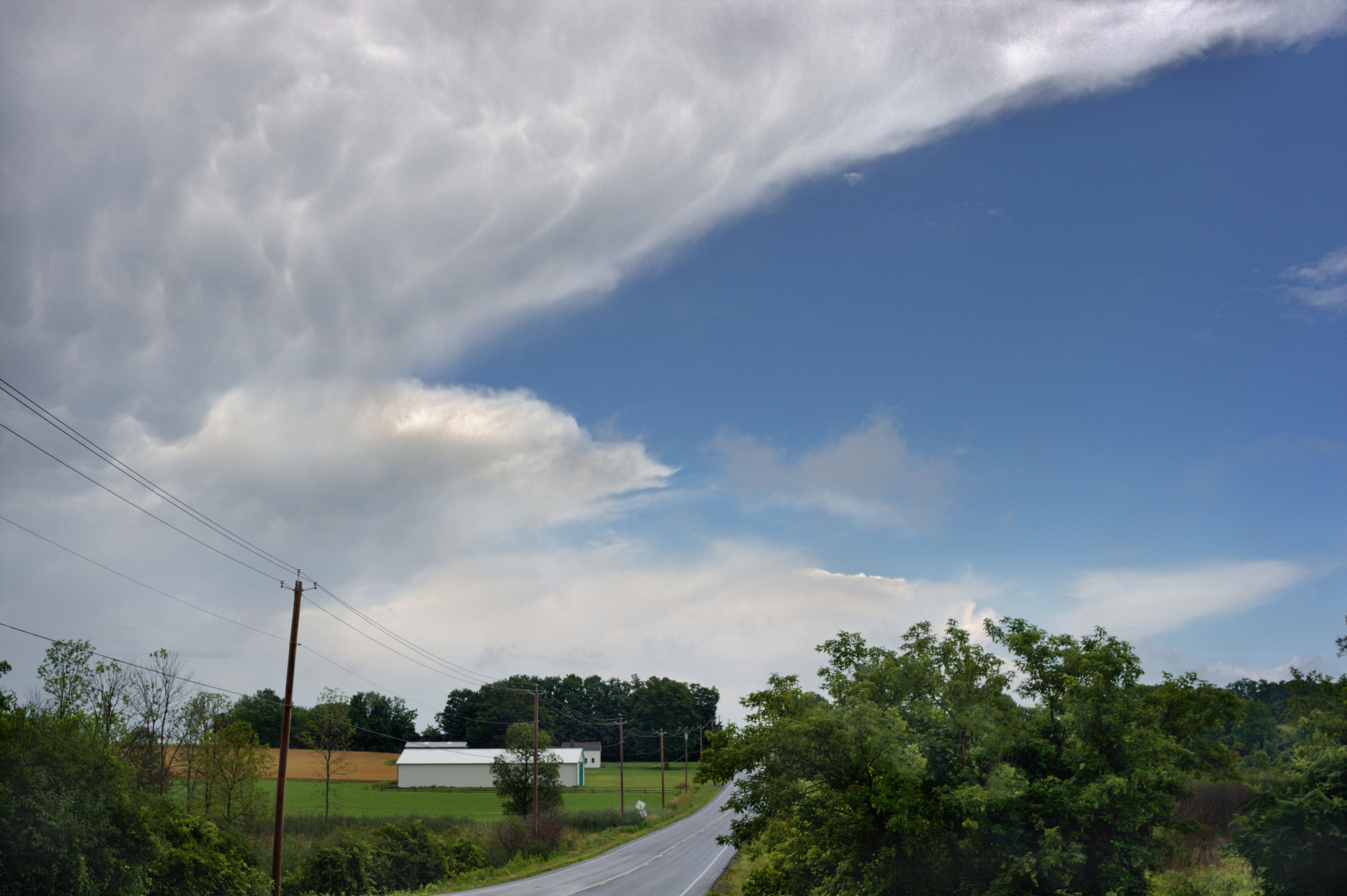
From my own perspective and previous attempts to process the scene, a major problem with this “departing storm” image is balancing the ground with the sky, with “balance” being something that’s best evaluated by filling the screen with the image and stepping away from the monitor to allow all of the image to be viewed at once, as if it were a print on paper seen from eight to ten feet or so away (depending of course on the size of the monitor/image on the wall).
The sky dominates the scene, but the ground provides the context that tells the story. The camera is looking down a long gentle slope, and so there is a great deal of depth to the scene with leading lines from the road and power lines (that I think play nicely with the leading lines in the clouds) and from the near and far trees. This sense of depth should be able to play a nice supporting role for the sky part of the image and also help tie the sky and ground together. But if the ground is kept too dark it seems to me the sense of depth and the leading lines are somewhat or even entirely obscured.
On the other hand, making the whole scene darker and more dramatic absolutely allows to make some very pretty and pleasing renditions that also are very balanced sky with ground.
I think these darker, more dramatic renditions can be extremely lovely in their own right. But I don’t think they capture the idea that the storm is departing, pushed out by the wind, with sunshine rolling in to take its place. I think this alternative vision of “storm leaving, sunshine coming in” probably requires color though my original intention was a black and white rendering - what do you all think?
Regarding “how bright should the ground be”, I had made a couple of “light ground” renditions" with the ground lightened by about a stop to a stop and half. But the resulting images were not balanced - when viewed full screen from across the room my eyes just didn’t find a restful place to contemplate the image as a whole: either the image was totally boring, or else the sky and ground competed with each other, each being too attention-demanding to allow the other room to breath.
Several people including @gadolf, @yteaot, and @shreedhar have given the ground similar amounts of brightening as I tried to do but they managed to not produce the “which part of the image do I look at next” problem.
I have a shot of the same cloud taken just a few minutes earlier, this time looking up a steep slope at farm buildings on the horizon, with the cloud behind the buildings. The capture is similarly flawed as this one (moving car and all), but imho in this other frame there is no problem with balancing the sky with the ground. It’s puzzling how “the same” subject can present such different problems. If anyone is interested in seeing this other image I would be happy to post the raw file.
Oh, several minutes later we arrived at our destination and there was a sunny blue sky and hailstones on the ground, that really was a violent storm that left rapidly!
1 Like
If you’re interested in traditional art, I was actually reminded of the landscape paintings I saw while I was visiting museums in the US. They had this huge exhibition for landscape painters in the MoMA at NYC (or was it the one in DC?). One of the big names I remember is Bierstadt, although the rest were undoubtedly good as well. That’s the kind of “dreamy” color scheme I was thinking about.
And thank you for the kind comments on my processing. I’ll admit I didn’t pay that much attention to the ground, although oversaturated shadows are currently a thing with me.
First RawTherapee: Auto iterate temperature correlation.
Thereafter GIMP 2.10 and G’MIC:
“Pyramid Processing” (a bit customized)
“Mixer [PCA]”
“Normalize Brightness”
Multiple times “Curves” (G’MIC):
3 Likes
Please could you explain?
3 Likes
Thanks! @RawConvert for asking that question - I had the same question and just forgot to ask.
1 Like
So I posted, saw Elle’s comment, and my next port of call was DPReview where I saw this item about storms on the plains in the US. This is a high-res video made from stills, very good. So here you are
https://vimeo.com/298755123
1 Like
I think it is a dev or branch feature. I recall reading about it. I haven’t looked into it myself. I am also interested in this “Auto iterate temperature correlation”.
1 Like
Yes @RawConvert,
Here you can find more information:
Thanks. In fact I had been aware of this - I commented on it back in summer! Then forgot…
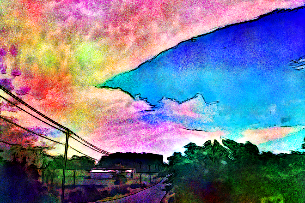
My take plus an alt all in one post. I didn’t consider all that much this time but wanted to have a go anyway since I have been enjoying the conversation. As always, the result may be unflattering in some way because in the background I am actually experimenting with something. Yes, I am hoping to seed a nasty storm in your neighbourhood some day. Muahahaha!
Take 1
1. RawTherapee → WB (dark cloud) → provided ICC → linear Rec2020 → AMaZE+VNG4 (auto:9) → filter pixels
2. gmic → curves galore
3. pnmclahe → enhance contrast
4. gmic → guided (half) → sharpen → resize
Take 2: Glad I wasn’t there.
1. Rawtherapee → ditto
2. gmic → my ludic filter → remove effect → sharpen → resize
@iarga I opened the raw with RT (first time using autowblocal) and got these values. The Student value is much greater than the ones in the tool tip. Is that what you got?
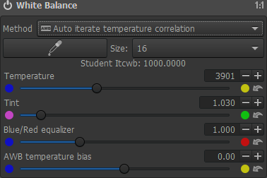
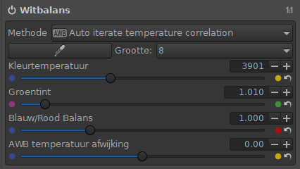
@afre, with RT 5.4-637-gd40ddf5c4 (windows) I got this:
(without the student note)
I only used this as a starting point for GIMP. Maybe I could have used the eyedropper for first white balance (looks better).
With only a neutral processed image from RawTherapee to work with in GIMP, I couldn’t get the yellow for the field behind the building. At first I even doubted it was realy yellow. 

A little frustrating that the clouds are so over exposed and clawing back detail was really difficult. White balance initially done in Rawtherapee and tweeted in GIMP using thresholds.
A fiddle with RGB Curves in Rawtherapee to try and gain back some detail in the white areas of the clouds layered in GIMP.
3 Likes