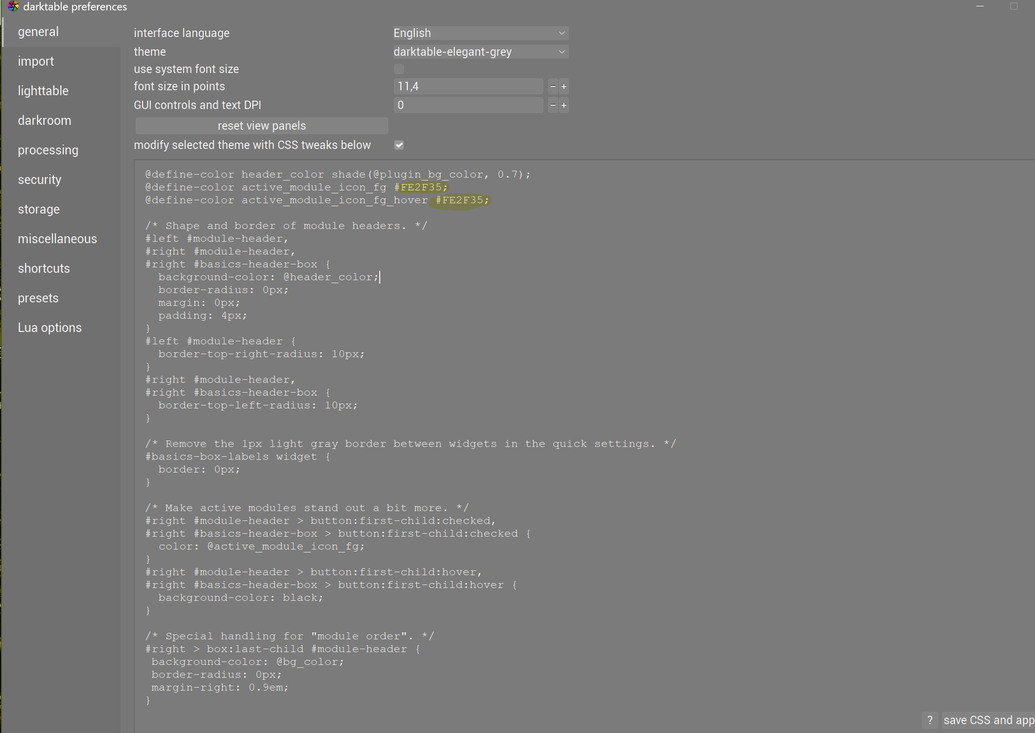
If you want to try the green buttons’s that I use you can just paste this little snippet in the css window in preferences…and then just remove it or experiment with color options that might work for you…
Personally I don’t find the green a distraction and it clearly stops me squinting so much so its worth it… Others will I suppose
I mostly have everything gray but I am experimenting with the new slider option and trying circles…and I like black background for the graphs of the histogram and brighter colors for the waveform and also black bg for the tone eq… Thats all I have tweaked…shown collectively below…
Would like to experiment the graphs background too. Not necessarily black but maybe some other color. Would you tell me where to look in css file. Thanks
For me the pastel green is extremely distracting. I do understand that it might be handy to have a but more contrast to see which module is active and which is not. But personally, I hope this pastel green never because the default.
I have never bothered much about the UI appearance and until now found all this UI tweaking stuff in the forum uninteresting, except that the on-off icon is somewhat hard to discern with my not so young eyes.
Reading this and realizing how simple it is to make amendments, (after first finding out where that css window is situated …), I was amazed once more of dt’s adaptability.
However, that green color of yours is a little more intrusive than what I need, so my question is where I can find out more about those color codes?
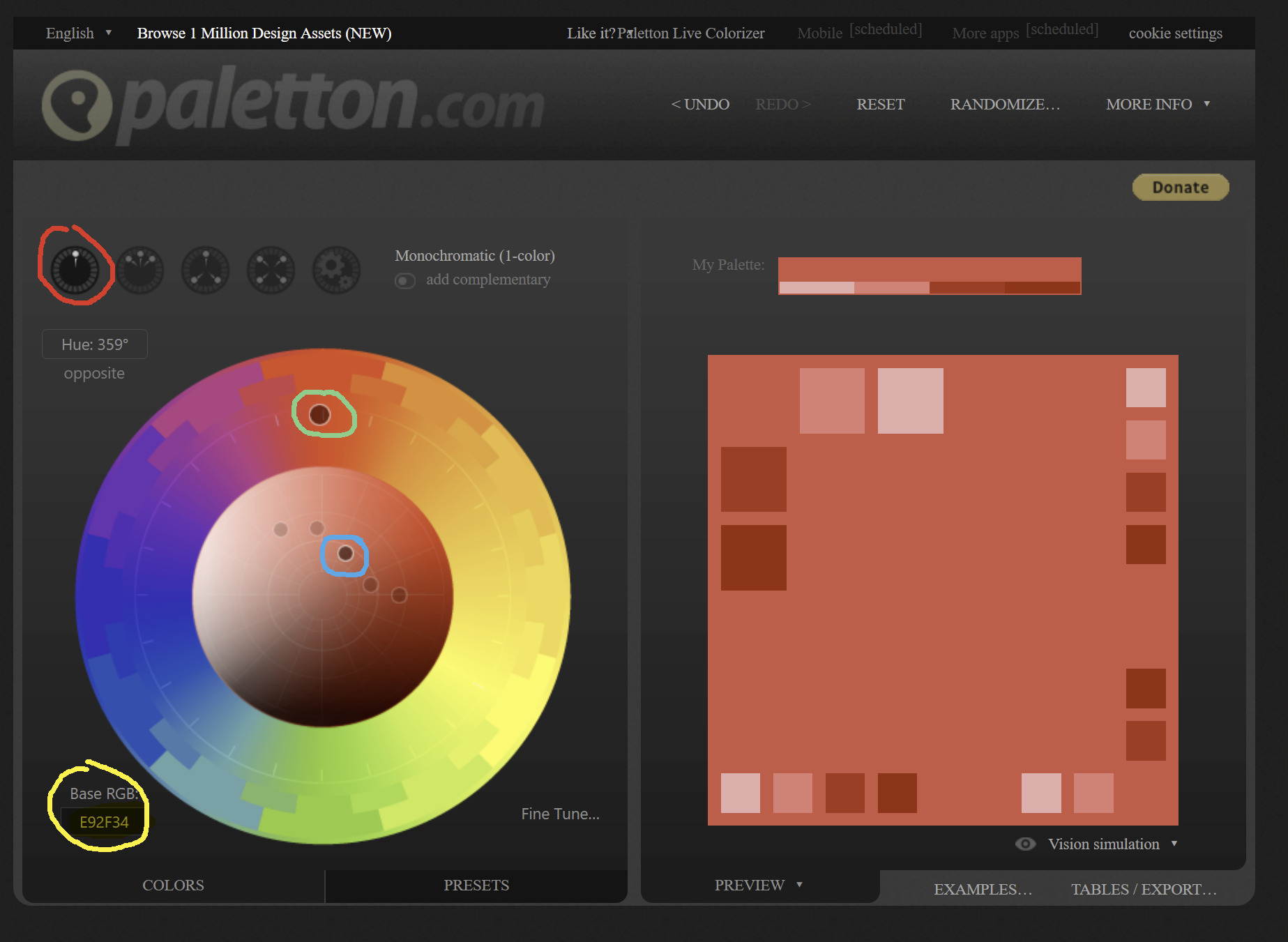
Select the monochromatic (red circle)
Move the point in the outer circle (greenish circle) to select your hue
Move the inner point (blue) to select saturation
Then copy the hex code from Base RGB (yellow)
Then insert/replace in the CSS in the Preferences/General window. I think its the line ‘@define-color active_module_icon_fg #FE2F35;’ after the hash. And click save CSS and apply.
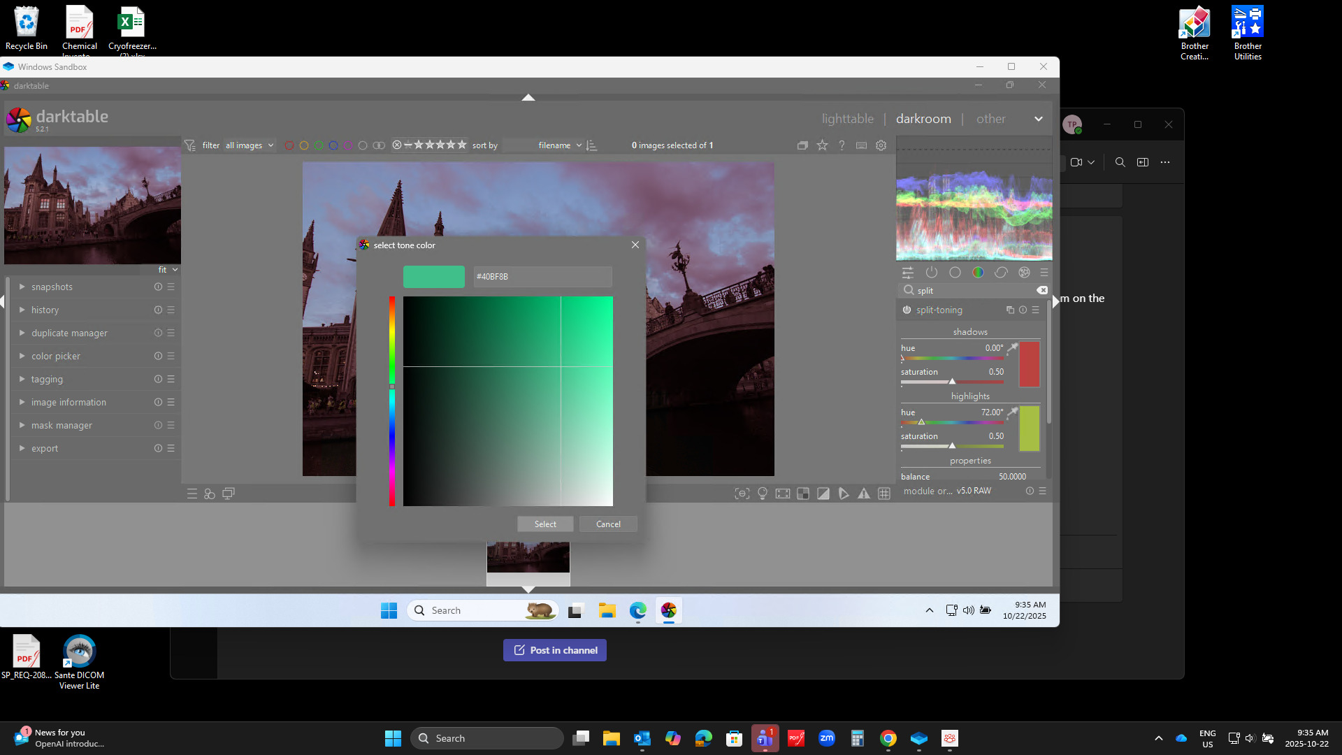
You got some good answers …I’ll have to check out that color…in DT if you pull up the split toning module and double click on one of the color patches then hit the + sign to add a custom color you can experiment and get hex values…
I would welcome changing the default theme to make module separation more clear as well. Especially when using masks it gets quite unwieldy for my eyes. Darkening the module headers helps a whole lot. While I like the rounded top corners I feel like just rounding the top inside corner is visually unpleasing to me. When modules are not expanded the sharp lower corner jus thangs in the air and the outside corners not being rounded feels unfinished.
I would also refrain from making the pastel green the default as I find it a bit too intrusive as well.
Came here after installing Darktable for the first time. For my personal taste I immediately switched to the darktable-elegant-darker theme because it is more comfortable for me to work with it. Everyone in my bubble also use the dark theme (it’s more popular since Blender, Nuke, Houdini, Maya, After Effects, Premiere Pro all have a darker theme by default)
Is this just in my bubble and most people use and prefer a lighter theme?
If not, why not having a darker theme already by default?
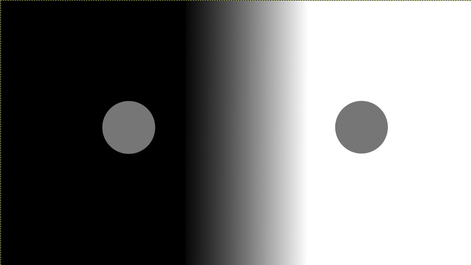
We love dark themes. They look professional, protect the eyes, and do not distract. Lightroom, Capture One, and our own Pro Themes also use almost black backgrounds.
But be careful: The eye can be deceived (simultaneous contrast).
One and the same gray appears brighter on a black background than on a white background.
If you use a very dark theme, you subjectively perceive your photo as brighter and higher-contrast than it actually is.
As soon as you look at the image on a white website (e.g., a news page), it suddenly looks dull and dark.
Please take a look at the following post. If you still have questions, just get in touch again. Best regards
I am clearly outside your bubble. I’ve just checked darker theme’s once more but find both dark and light themes a strain to my eyes. So I’m on darktable-elegant-grey. A boon is that it’s much easier to see subtle interface changes. Like f.i. which picture gets selected.
Whilst developing I do use the ‘b’ key often to judge exposure, color and contrast.
What I did change is the appearance of the module headers and a bit of color to indicate an activated module. More color I will not use.
I came from LR by the way and find that too dark in retrospect.
I appears that users have problems discerning the status of the modules and proposed using a pale color on the status as an indicator. The response was that the overall viewing area should remain neutral and color free. It seems that a compromise may be to change the indicator, for example, use a thin circle with a very dark center for non-active, and a solid light grey circle for active modules. This may allow the status to stand out more significantly and an easy distinction between states as it doesn’t rely on only a slight grey density change and still fulfills the policy that the UI remain color free.
 Others will I suppose
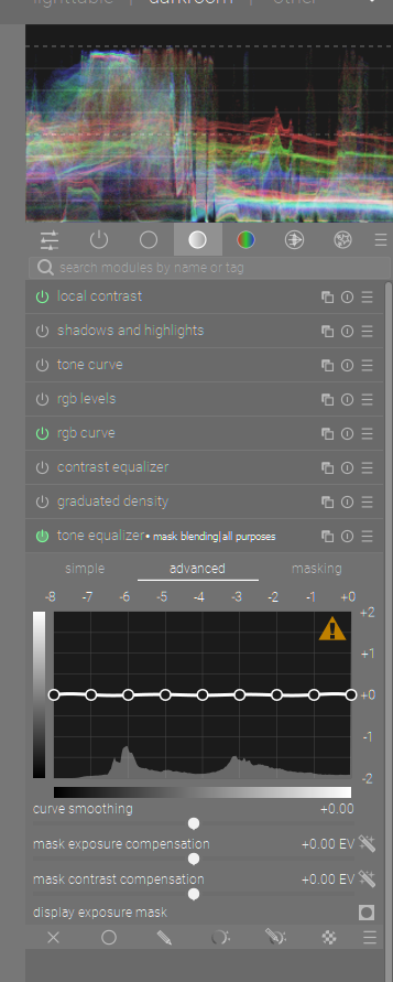