Poll: updating the default grey themes

Hi all,

In Simple users.css hack to improve module separation I put forward a user.css hack to modify the gray themes that seems to have been received very well by the community. It makes the boundary between modules more prominent by darkening a bit the module headers and introducing some rounded corners, without diverging too much from the visually neutral philosophy of the grey themes.

Following @priort’s suggestion [Simple users.css hack to improve module separation - #20 by priort] I then proposed a variant that adds a light green accent to active modules to make them stand out a bit more [Simple users.css hack to improve module separation - #22 by Masterpiga].

For comparison, here are the three options:
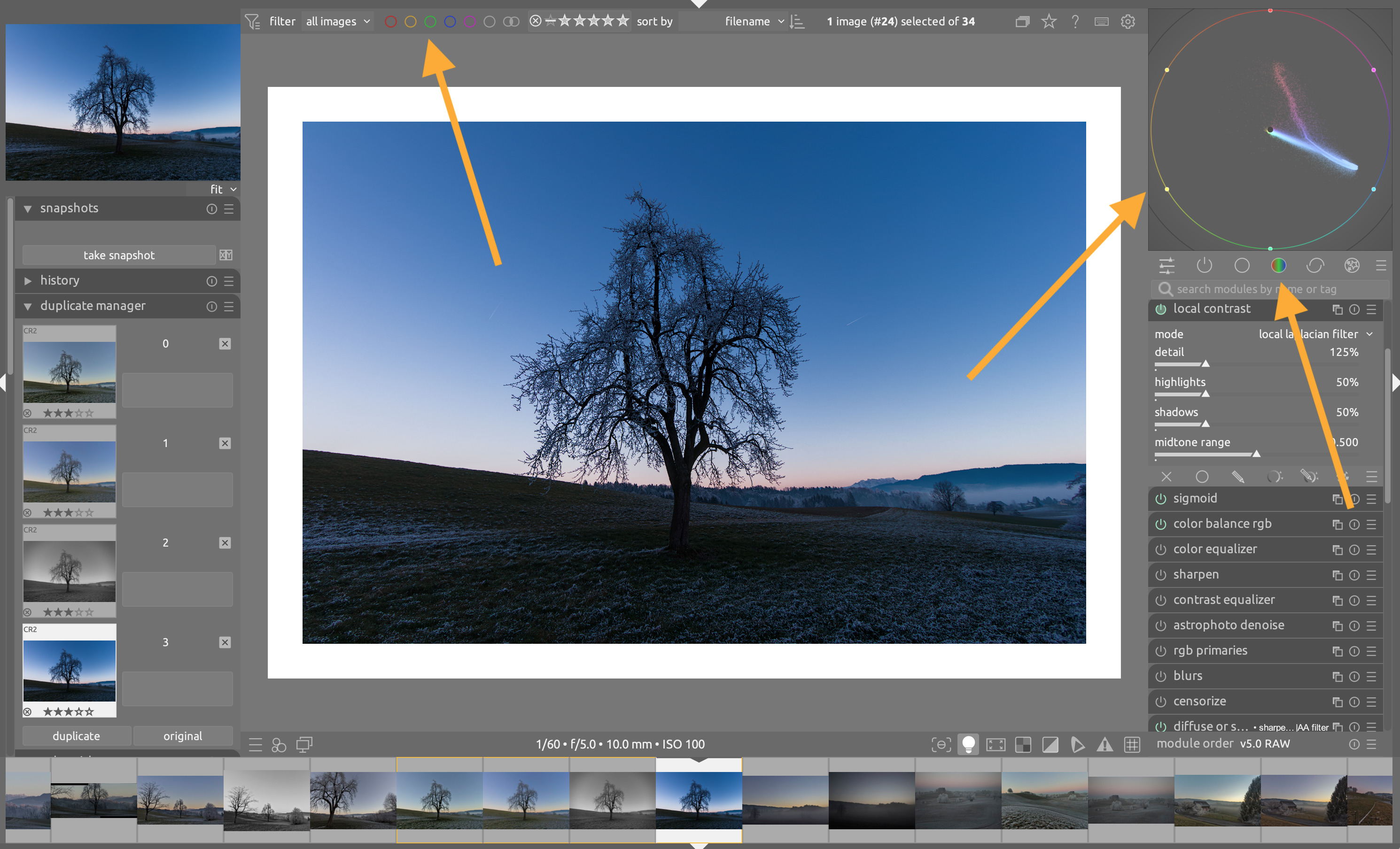
Current grey theme

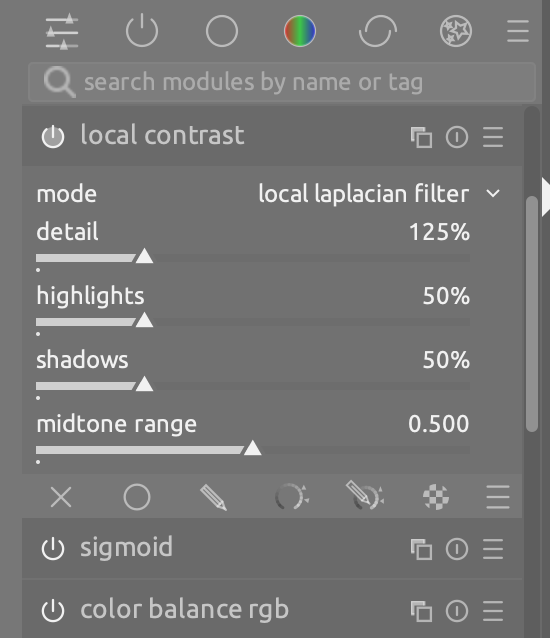
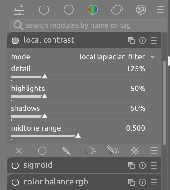
Darker rounded headers, WITHOUT accents

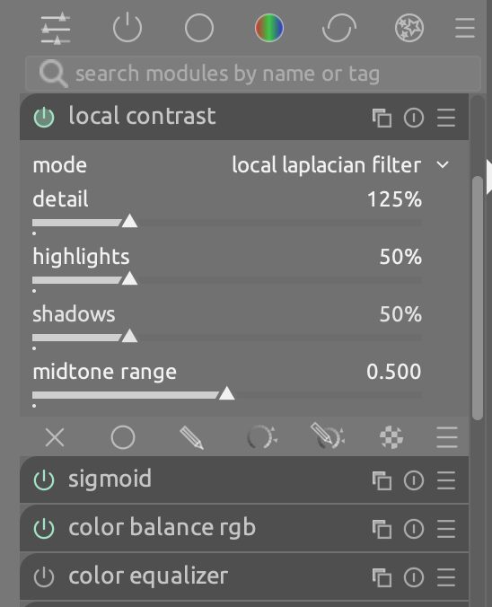
Darker rounded headers, WITH accents

As suggested by @g-man [Simple users.css hack to improve module separation - #8 by g-man] I put forward a PR to add two new themes, elegant-grey-rounded_accents and icons-grey-rounded_accents.

In the PR, @victoryforce suggested that, to avoid theme proliferation, instead of adding two new themes we could consider updating the existing grey themes, provided that the community is not too much against the idea. Hence this poll :slight_smile:

So, the question is the following:

Would you be in favor of updating the default grey themes?

  • No, keep elegant-grey and icons-grey as they are
  • Yes, use darker rounded headers WITHOUT color accents
  • Yes, use darker rounded headers WITH color accents
0 voters

If you voted NO above, would you like these themes to be included in future DT releases?

  • No
  • Yes
0 voters

Please, go ahead and cast your vote. Especially if you are against the idea of updating the default themes you should make your voice heard :slight_smile:

Thanks for your help!

EDIT: Added follow up question to gauge the interest of having the themes added to the release instead of replacing the default grey ones.

Frankly a color accents won’t be merged into a default theme. One rule in dt is that we don’t use color anywhere in the UI to avoid distracting users when evaluating colors.

Also I myself not for changing the default theme at all. I do prefer having more themes (but some others don’t want adding more themes).

I’m not sure what could be done at this stage. One of the best option would be for a group of volunteers to run a Web server registering all themes with screenshot and description and propose a download of the theme. At some point we may even have an option to download and install a theme directly in Darktable given a theme id for example.

7 Likes

I totally understand the philosophy, and indeed the first version of this proposal did not have color accents. That said, do we really think that tiny light-pastel colored indicators are that distracting? The UI already contains a few colored elements with higher saturation than the indicators in the theme:

2 Likes

Yes. I derstand if everyone doesn’t like it, and I don’t think more themes are a problem, but please don’t change the default, I’ve been using it for years and it works for me.

5 Likes

The default theme has a clear purpose and it should probably stick to that purpose.

I personally don’t think darktable has too many themes and it doesn’t seem like new themes are added very often so I don’t see the issue with adding a new one.

For what it’s worth, I also think that we should not change the default, but from the conversation in the PR I had understood that this path would be preferred over adding new ones (and of course, there is also the option of just not doing anything).

Maybe a Lua module that downloads and installs themes from GitHub (like how the current Lua script manager can install and update scripts)? Of course, only one custom theme could be installed at a time, overwriting user.css.

1 Like

Tbh I would prefer to leave the defaul option alone, BUT! I would like to see some of the other options refreshed/replaced as IMHO dt looks rather dated UI now

Understand others will gasp at that though

This is fair enough but I do feel we need some change to make activated and unactivated modules more distinct. I would use the proposed theme if given the choice.

3 Likes

You do have the choice, the custom CSS in the preferences. :heart_eyes:

2 Likes

The biggest revelation from your pull request is that each theme is just a single CSS file. Because of that, we could easily have a whole gallery of custom themes!

I’m no fan of the colored accents, but since it’s just a CSS file, you could easily publish a few variants.

1 Like

Yes, this is what @Pascal_Obry was suggesting above. I think everybody agrees that it’s a nice to have, but it’s not a high priority and therefore nobody is stepping up to do it.

1 Like

Everyone has their own preference. For example, I like a much more compact interface so I reduce the spacing quite a bit.

Rather than have a gallery of themes, how about a page of small tweaks that people can use to build their own in the CSS tweak preference.

3 Likes

Since I suggested the GitHub PR, in my opinion, an update to the default to include some of the rounded corners makes dt more polished and aligns with the new startup screen.

I don’t like the color update to the module on button, so I did not implemented it in my system.

I don’t think we should have hundreds of themes, but we should have at least the default one to look more modern. We can’t please every preference, but I’m sure we can get to a middle ground.

I got totally confused with the poll!

I meant to say, no to changing the default, yes to including the themes, and the coloured switches should be optional.

Then it got worse: I found myself agreeing with everyone!

But Especially this…

1 Like

I started with a Python script yesterday. It reads an SVG file and creates an inline SVG file.
This can then be accessed via JavaScript.
Colors are selected using a color selector.

This is just a rough draft to demonstrate the functionality.

Variables are declared directly via Inkscape.

Otherwise, I also believe in keeping the standard designs and only allowing one user.css file for a plugin (like script download).

1 Like

For me they are a win and not distracting at all. I will copy the user.css in order not to lose it when upgrading.

That’s a good idea; it would significantly lower the barrier for non-technical users and enhance Dartable.
The topic of UI design is always a recurring theme. The technical foundation with user.css is in place and makes sense. A showcase for themes on the Darktable homepage would be a useful addition.

1 Like

Interestingly, I made a similar color and changes to my DT. I used same green (best contrast against grey). The only difference in my theme is that the module darker gray color is not as dark as you suggesting. I think this modification is much easier on my tired eyes and is not as intrusive on the editing sessions. I can share the css file if anyone is interested. However, I agree that these modifications can be done independently from standard DT themes and as suggested maybe a depository by contributing users.

Can we have full screen screen shots of the differences?

The colour and darker grey definitely stand out more in isolation, but may be too distracting for those of us who like the UI to be as close to mid grey as possible.

I do like the rounded corners.