No I get that it’s the masking toggle but there could be a way to control this including as I said an extra control or maybe you right-click the mask icon or some clever way to integrate this sort of fuctionality
2 Likes
Yes I am with you. I often only edit with the right panel open… 95% the left panel is hidden to have more space.
However… If I would only see the dockable pannel that @Masterpiga very quickly threw together… that would be interesting!
I use much programming software. And you often see a kind of vertical tab bar in that software (for the once that have been playing with rapid raw, similar to that). I one such a tab would be dockable that would be awesome…
Or… now I am thinking about it… that would be also a cool place maybe for the mask UI…
Well just idea’s…
2 Likes
For me, a shortcut would be enough to display ‘just’ the mask menu.
Alternatively, right-clicking on the mask icon would also be an option.
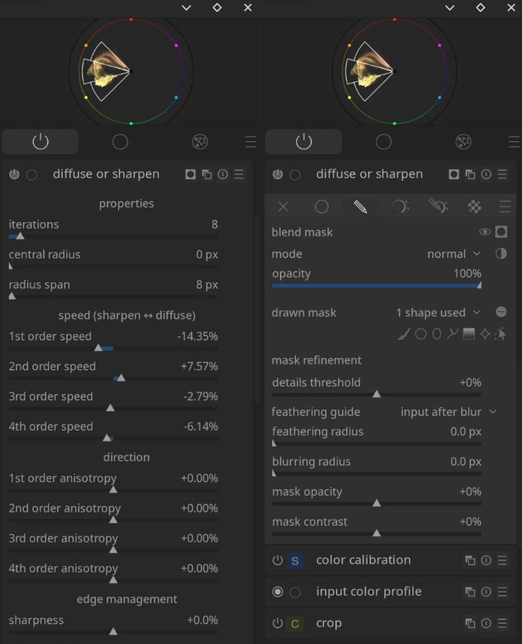
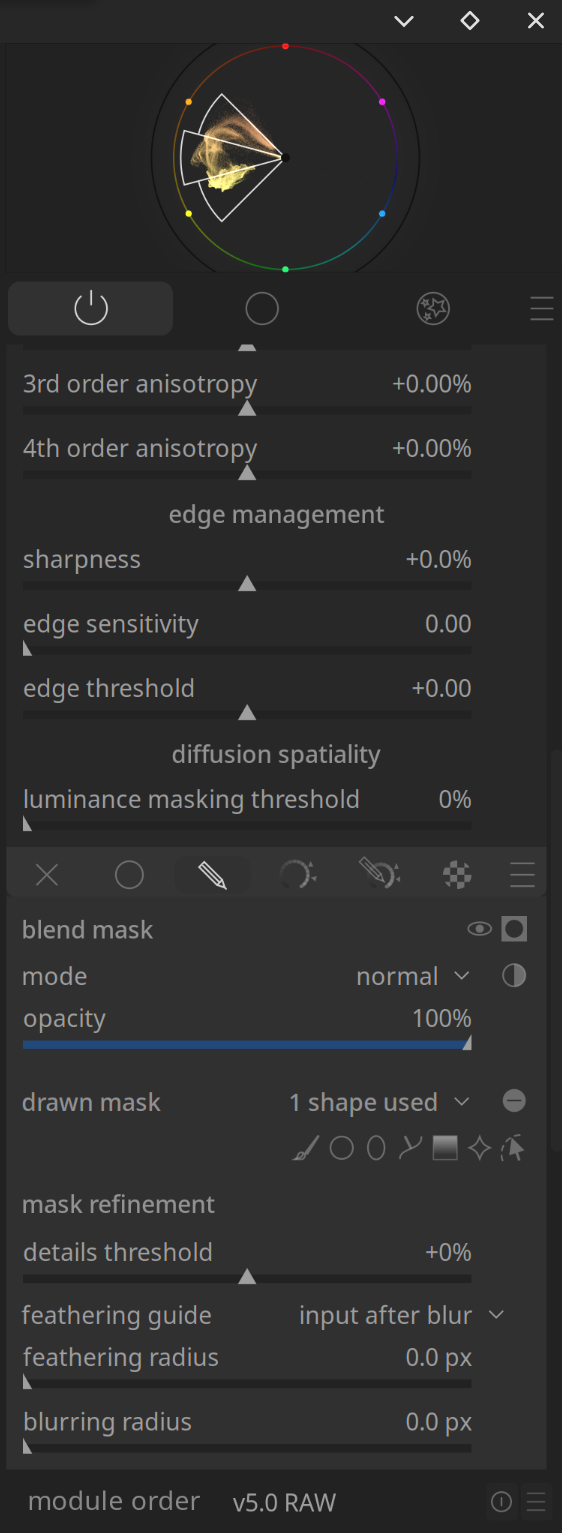
Edit: For some time now, I’ve been using a theme where the mask menu is slightly lighter in colour than the module’s standard menu. This distinction makes it easier for me to navigate very long menus.
3 Likes
Oh, right… Yes.
1 Like
And the mask manager, which is way over the other side of the screen.
See my other comment in the other thread: [RFC] Secondary module panel - #15 by europlatus