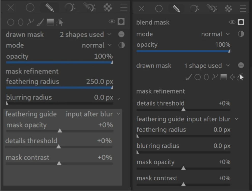
I’ve been thinking about the current layout of the drawn mask section in darktable. While it is very powerful, I feel like the vertical space usage and the discoverability of the drawing tools could be improved, especially for beginners.
I’ve created a mockup (see the left side of the attached image) to compare it with the current implementation (right side).
Better discoverability: The mask drawing tools (brush, circle, ellipse, path, gradient) are moved to the top, right under the mask mode. This makes it immediately clear how to start masking without searching through the “drawn mask”.
Progressive Disclosure: The light gray box in the mockup is collapsible. Since these settings (mask opacity, contrast, details threshold) are often only needed for complex edge cases, hiding them by default saves a lot of vertical space.
Visual Grouping: By using a shaded background for the refinement settings, there is a clearer distinction between the basic mask properties and the expert refinement tools.
Vertical Space: This layout significantly reduces the need for scrolling within a module, which is a common pain point in darktable’s UI.
I’m curious to hear your thoughts:
How often do you actually use the sliders inside the grey box compared to just the basic feathering/blurring radii?
Do you think moving the drawing tools to the top makes the workflow faster?
Would a collapsible expert section like this help you keep your side panels cleaner?
Hi Chris, thanks for taking the time to think about how to improve the masks panel.
I like the idea of hiding some of the controls in a collapsible. For power users there is nothing to lose, as the state of collapsibles persists, so it’s not like they would have to open it all the time.
I am also not fond of the two lines of icons, I find it confusing.
More in general, I think that darktable’s UI is already very dense, and it does not benefit from further densification. On the contrary, some more space and better separation between the controls would probably make it easier to navigate it.
It takes up more vertical space in the UI. We already have problems with not enough vertical space on smaller screens. One instance isn’t going to make a big difference, but if we start doing it everywhere it will be a problem.
My main issue with masking in Darktable is not so much the layout of the main controls, but how to easily manage intersection of masks. The combination of toggling polarities, inverting masks, and choosing between the various union/intersection/exclusion/difference options in the Mask Manager are my biggest pain points.
I feel it should be easier just to use a couple of shapes or a combination of drawn/parametric masks and quickly control how they interact with each other. After using Darktable since version 2, I still get a little lost and end up using trial and error to just intersect a couple of masks!
I don’t necessarily have the solution, but I feel it might come from being given the option to decide the behaviour of the mask at the time of creating it. For example, if I draw a circle, then want to add another circle to subtract from the first one, I should be able to draw the second circle in “subtraction” mode right from the get-go.
In a module like exposure, adding or taking away a hole inch even is not going to make any difference. In Colour Balance RGB it might.
If I’m adjusting the mask in CB-RGB, I have to scroll to turn the module instance on/off. I’d prefer it if I didn’t. But, frankly, I doubt if saving a small amount of height would change that. And putting the last sliders in a collapsible area would make no difference: if I’m not using them they can be scrolled off the bottom anyway.
By having a 1/4 inch less far to look. The first time. After which it doesn’t matter because after that we get used to it.
Unless some UI detail is somehow obscure, or somehow annoying not just the first, but every, time, there is probably no point in changing it. It is just not worth the effort. Even for some degree of better, prettier, more elegant, more efficient, etc.
It is so much better to put the effort of change into making something like DorS intelligible to mere mortals. And even that risks annoying those to whom it already makes perfect sense!
The entire premise of hiding controls like mask contrast and opacity in a “hidden” section seems very counter to stated aim of making masking more intuitive for new people. You are hiding the actual controls needed to make good masks.
For example, in the Mask refinement and Additional Controls section of the manual it explicitly tells people that the use of mask contrast and opacity will help see them to their goals. Under your proposal, they have to find the drop down.
I guess if you expect AI to do all your masking, this cuts down on clutter of modules you wont really touch much?
and if I use a parametric mask or a raster mask, then what happens to the caption?
The mode and opacity slider are independent of the possible path selection. So it’s not a better UX.
The design used for modules with several conditional features has common sliders on top, and then the conditional stuff.
If you change that for one module, the GUI won’t be more ‚intuitive‘ but more confusing because there’s no longer a consistency …
The position of sliders is prone to personal opinions - everybody likes his most used slider be placed befor less used options. That’s nothing about ‚intuitiveness‘ but personal preferences.
My main issue with masking in Darktable is not so much the layout of the main controls, but how to easily manage intersection of masks. The combination of toggling polarities, inverting masks, and choosing between the various union/intersection/exclusion/difference options in the Mask Manager are my biggest pain points.
There a two issues for me with the masking ui under the module.
it is not super clear from the ui what the difference is between ‘opacity’ and ‘mask opacity’
the ui takes - understandable - of space. Especially since I do most of my editing on a laptop. But it would be nice is there is a bit of padding between the masking ui and the next module.
the sliders in the light gray box are edge cases for me so less that 10% of the time.
IMO, faster is the wrong way to look at it. As others have pointed out, the time savings are minimal, but as a newish user, I can still remember how counter-intuitive it was to select the mask property and then having to look for the drawing tools. Of course, now that I know where they are it’s like second nature but it seems more logical to select the mask properties, then jump into the drawing tools strait away. I never select the mask property, then adjust the mode/opacity, then select the appropriate drawing tool(s).
for my use, having the light gray sliders collapsible is a benefit. Other people seem to use these a lot so the option to collapse it is in the user’s hands and shouldn’t detract from those that do use these sliders quite a bit.
For me the issue is the workflow of the masking section. I have never understood why there is a distinction between uniform, drawn, parameteric, drawn & parametric, etc. as if they are inherently exclusive.
In my opinion, It would make sense to open the “masking” section:
At the top: a global mask opacity slider.
Below that:
Masking tools to choose from: gradient, circle, elipsis, path, parametric, etc.
When you select one, you can then add and tweak a new mask component with that tool.
Pick the gradient tool and add a gradient mask, click the pencil tool and draw a mask over an object, select the parametric mask tool and immediately be able to select an area of the image to mask(default to luminance or whatever), etc.
Each mask you add would be tracked just like the drawn and parameteric masking section. There would be a list of all the currently added masks with a toggle beside each to toggle the polarity of that mask.
Then the various masks would be combined via darktable’s internal logic and modified globally with the opacity slider at the top of the masking panel.
Of course, you would still have all the mask refinement options, and maybe they could be specific to each mask component (drawn shape, gradient, parametric etc.)
I think this would be a more flexible and easy to use setup, personally.
On the topic of maks… What I also would appreciate is that the mask manager itself would get a bit of ui update. Down below are just personal preferences but I am interested is I am only in this.
When I create a mask for module A and reuse this mask for module B there are still a new (?) mask created for module B. I can see this is convenient from data / pipeline point of view, but I find it strange.
When I group a selection of masks, and only use the group in a module then the individual mask are also in the list of the mask manager.
And those effects are combined. So sometimes you end up with a whole list of maks. While in practise you are only using one.
I did query a while ago why we had separate drawn, parametric and drawn+parametric options. I thought it would be more streamlined to just have drawn+parametric, and you simply choose the tools you need within that one group.
I can’t remember now what the answer was, but I think there was a good reason why they were separated. Maybe someone else can chime in and explain why.
But I definitely think the whole workflow could be more streamlined in an ideal world.
For me, the Mask Manager should only be used in some “extreme” cases when you need to juggle multiple masks over multiple modules and take advantage of the grouping function. But if you just want to use several masks within one module, I don’t think you should need to go to the Mask Manager. This would mean including the various mask combination options (union, intersection, difference, exclusion) into the masking section of each module.
I would be very interested in a new workflow that adds these options at the time of making a mask, e.g. add circle 1, add circle 2 in union mode, add paintbrush 1 in intersection mode, add parametric mask 1 in exclusion mode, etc.
There already is a “combine masks” dropdown in the parametric options, but they aren’t in the drawn mask options, and I find them confusing in combination with the Mask Manager options.
And I still get confused with the “Add existing shape” and “Use same shape as” options after all these years!
Maybe I just don’t use masks enough to remember…
Sorry, I prefer the current layout to the mock-up. I am not a fan of all these drop downs that are coming in, they just amount to extra clicks, and I like the ordering of the rows better on current layout.
It would look cleaner, which is attractive, but I would prefer to keep it open since I use these sliders, and need to consider using them even when I decide not to.
I could live with a change like this, but I’m now accustomed to the existing layout, so my personal preference is to leave it as-is. But I am willing to adapt if it benefits the greater community. That goes for other changes being proposed.