I’ve this photo I tok a while back with my Canon 70D. I’m trying to edit it using darktable, rawtherapee but also lightroom for comparison. I Just imported them, and no processing.
Righ off the bat, the image is displayed completey differently. I want to specifically understand how the halo around the light (for the red box) is handled.
Lightroom seems to smooth a lot the centre of the light to a smooth gradientto the red
RAWTherapee has a small ring separating the whites and the reds, but quite smooth
Darktable (using the scene referred workflow) has defined rings.
Here are screenshot, and my questions below:
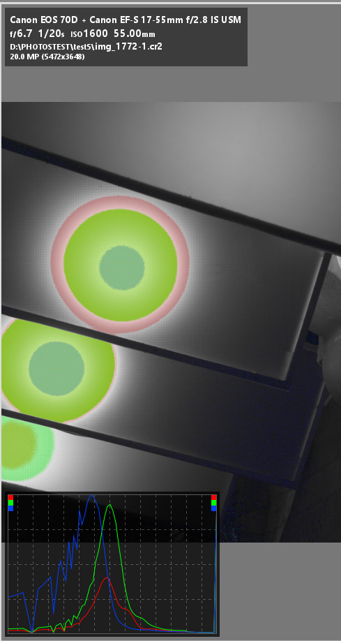
Darktable, at the “original” step of history
Darkatble, at the last step of the scene-referred workflow
RAWTherapee, just imported
Lightroom Classic
Question 1 : Seeing te 3 different render, does the ring really exists in the CR2 file and the “smooting” we see in RAWTherapee and lightroom are processed ?
Question 2 : In Darktable,what would be th process to smooth the rings to get something similar to RAWTherapee or Lightroom ?
Question 3 : Does RAWTherapee has some processing that is not shown in the history so that their is some smoothing ?
Thanks. I’m trying to better understand all these processing and learn
To be sure, looking at the pp3 is the safer. Apply neutral to be sure that no processing is applied.
In RT the history shows what you did in the session. It doesn’t show the processing done by the existing pp3 or by the default raw profile that are loaded when opening photo.
Yes, I forgot the main attraction of the post ! Ha. Here are the link of the image and files. The CR2 is 25MB.
Also, As I’m fairly new to this, I’m using RT and darktable defaults. With darktable, I usually delete the .config/darktable config files.
I like the edit you did. Thanks for sharing. I will check how you achieve that, I’m now curious.
I understand your point of view However this is not how it looks, but you could’nt know the context. Here are 2 more contextual photos. It was during a night Instagram meetup, we were walking by all lighting location in the city
Thi is one side of the “corridor”, you see the lights
When a “white” spot lightsource illuminates a colored surface, you will see a spot in the surface color. When the lightsource gets stronger, the spot becomes brighter. With a very strong lightsource the human vision will perceive a white spot. So the look of such an object strongly depends of how bright the light was.
The camera works different. It will “see” a spot of the surface color until one channel gets saturated. Then color artefacts appear and have to be repaired by “guessing” the right color. Because the channel saturation appears when the light was rather bright, a highlight reconstruction with less color saturation is often prefered.
So, @s7habo s edit would reflect a situation with a less bright lightsource, while you perceived a (relatively) bright light in that situation.
Thanks for you explanation. Indeed, I see a spot light behind a semi transluscent glass than a dimmed light. This is all the problematic between, do I want to have an image that looks like what I saw, or look like different.
I’m still amazed by the reconstruction !
Clipped pixels means that the sensor site was saturated and no meaningful information was recorded. See my post above where I show the clipped areas.
In this case you have necessarily to apply some highlight reconstruction/recovery processing in RT/ART, as well as in all raw processing SW.
In RT/ART, there is no default processing applied behind the hood.
The user chooses himself in the preferences/image processing tab the profile to be applied when opening first time the raw. It can be a neutral profile (no processing), a bundled profile or a custom profile or a dynamic profile.
see http://rawpedia.rawtherapee.com/Preferences#Image_Processing_Tab
That’s the dilemma. If you are an artist like @s7habo yo will prefer the second option.
Being hesitant I chose something in between (showing a circle, but not white inside)
In deed, the context was not clear and I was guided on the one hand by magenta colored matte illumination that was not overexposed and on the other hand, that reminded me of Japanese Shōji screen:
I find this kind of illumination very pleasant and that’s why I processed it that way. This is also the reason why I deliberately overdid it with highlight reconstruction. The nice thing about it is that, as you can see, with the darktable you can go a step further from the pure “reconstruction” of reality and allow yourself your own interpretation.
But, to stay with your original questions, here is another version, similar to the one the @age has done excellently, which perhaps corresponds better to “reality”:
I thought of that kind of japanese paper light when I saw you first edit Your second edit is more true to what I saw. Mostly because the light is very strong (it’s a bulb lamp) and you can’t have a uniform lighting across the 2m wide glass.
Thank you for your feedback
I do not think that we can ever truly duplicate the original scene in our images. Our images can often evoke a memory that encourages us to think “that is exactly what it looked like” but we are really fooling ourselves.
But … I do not think that that matters; we are first and foremost creators.
Agree with you. As photographer we always build an interpretation of the reality, starting with the composition. Then we have a creative part. And everybody sees and edit a photo differently. Just looking at photo edit from the community shows it