RawPedia feedback

Note: none of the screenshots going to be shown are implemented in the live website. Those are just suggestions that will be implemented if they are accepted and doesn’t create havoc in other places of the website (a.k.a. I have to check the modifications in a lot of screen sizes, browsers and platforms, and I have to check several test pages to be sure everything is o.k.)


@afre: does it look better this way?

I think your display is smaller, but the text is now left-aligned, so I don’t expect weird alignments there

The Rawpedia logo can’t be aligned with the byRawTherapee logo in all screen resolutions. Sorry. The website is meant to be primarily responsive, that is, good looking on smart devices. Some drawbacks have to be expected.

I saw the screenshot, but I didn’t knew what you were talking about. So much better a written explanation. Thanks! :smiley:

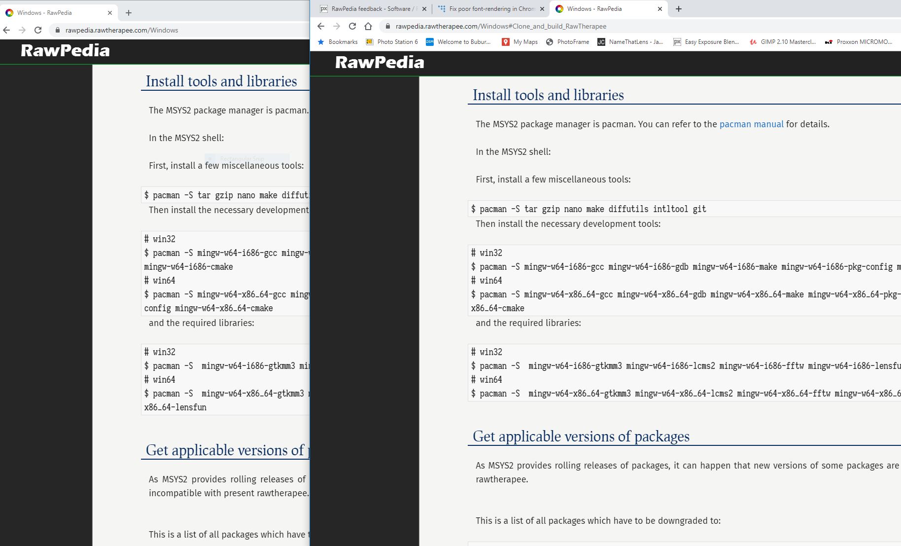
I think you’re talking about this?:

win10vswin81

Upper part of the image is your W10 render. Lower part is my rendering in W81. Your computer renders the text slightly wider, so also a bit rough. The difference is really slight, but easily visible for sharp eyes :wink: . Sadly I have no idea what’s happening here, nor how to solve it. Any Windows expert around here?

Sorry, but not bigger:

It seems to me that it is an optical illusion caused by a bolder typeface. Anyway, I’ve tweaked a bit the code snippet style, and changed the typeface, too.

Does it look better this way?:

code

If it’s annoying and I don’t break anything trying to fix it, then it should be fixed. I will look into it. However I can’t promise anything, as mediawiki is «a bit special» when you try to tweak a skin (the look of the website).

Can you see the difference of 1 point? :open_mouth:
Well, the bigger font was intended, as some pages are really large (to be honest, huge), and a slightly bigger font makes it easier to read long sentences in full (a problem that doesn’t happen too often in pixls.us). I will try locally with a font 1 point smaller, to see how it looks.

FullHD = 1920*1080 (same as mine)

It looks this way here:

Not even 1/2 of the screen. Anyway, I’ve scaled the screenshot, and now it looks this way:

Better? The greeting text is already bigger than the main text font, but it can be a bit larger if needed.

I don’t think that’s possible (to me). I’m not a php programmer, I just tweak css stylesheets, and a change like the one you suggest would mean editing the php template. Beyond my knowledge. Sorry.

That means tweaking the php template. Same as previous point. Sorry.

I will look if I can move it to the bottom of the sidebar, but I think mediawiki won’t allow me with pure css. If it’s feasible, I will show a screenshot here so you can tell me if it’s worth it.


Thank you all for your feedback. :slight_smile: . Already expecting more… :laughing:

4 Likes

True enough. The rework of the site presents an opportunity to make it more visible, though. It seems to me that people new to RT need to be directed to that page quite frequently.

3 Likes

Hi. There is a clear visual improvement, and also the fonts allow a better, more attractive reading.

2 Likes

Not really :slight_smile:
I made the screenshot on purpose showing how the pixls site looks like and how rawpedia looks like. Most of the other sites have the look the pixls site has, the fonts look well rendered (even if I enlarge them until they match the size of rawpedia).
The fonts on rawpedia are just not rendered nice enough by Chrome on Windows. It might be that the my computer does not have the fonts used and some other are used instead them? I only have the standard Windows fonts and some Roboto fonts installed to test the elegant theme of darktable.

Here’s what inspector shows me on Firefox on Linux:
image
Have a look at your Chrome equivalent of Web Developer > Inspector and see whether you have Open Sans.

2 Likes

Hmm … looks like this:
inspector

But your hint was good, the chrome inspector also shows what the problem might be:
error

The link is https://rawpedia.rawtherapee.com/skins/pivot/assets/fonts/fontawesome-webfont.woff2?v=4.7.0

Fonts are fun, eh? :exploding_head:

2 Likes

Not all browsers support all kinds of fonts… For the web there are at least three major formats. Also font awesome is just the icon font, it isn’t used for the body or headline text.

1 Like

Oh, so I was just to happy to find an error :slight_smile:

I was expecting the combination of Windows and Chrome to support most of the things, it should be on top in the ‘internet usage’ :smiley:

Just for comparison I made a screenshot with how rawpedia is rendered by Firefox and by Chrome on Windows 10:

I guess Firefox wins this one, especially for the ‘code snippets’ section.

A lot of sites use Open Sans as a main font, that’s true (not every site) because it’s nice, and readable… and wide

opensansvsfirasans

Above is Open Sans, as shown in Google fonts. Below is Fira Sans as shown same place. As I said, Open Sans is nice and slightly wider, but I can’t see Fira Sans bad, or rough, or not readable too.

The font was chosen precisely because even being nice and readable, is narrower. If you take into account pages as the Spanish wavelet documentation, the Color Management addon, or the current French documentation of the Local Lab tool, and try to read them on a smartphone, you will suddenly know what I’m talking about. Documentation needs to be more compact, but readable.

Well, at least that was the idea.

Not likely, as all the fonts are loaded as you load a Rawpedia page. You won’t have them installed locally, but your browser will have them and will make use of them (until you close the browser).

True. And among that, the browser tries to load those icons from 4 different formats, and choose the one that likes the most. It happens that there’s one of the font awesome versions which is not liked by Chrome.

Not strange I guess, as Fira Sans was developed specifically for Firefox OS, from a font used by Mozilla. That doesn’t mean that is a font only well rendered by Firefox. May it mean it’s not well rendered by Chrome on purpose? :smiling_imp::smiling_imp::smiling_imp:

Could you make a test on your computer, please? You will have to use Chromium (the alma mater of Chrome), but without all the «advantages» added by Google.

Download the appropriate version in PORTABLE version (click the Archive link, and after download finishes, extract the contents to a folder you choose)

It’s not the latest version, but you may test if it renders the fonts correctly. If it does, then you’re advised to change your default browser (Chromium is THE SAME browser as Chrome).


Any opinions on the suggested changes I showed in my previous post?

And if that ungoogled Chromium doesn’t solve the Windows-Chrome problem, try this fix

I see no difference between them:

ClearType is enabled. I’ll check if disabling 2D acceleration in Chrome fixes something, but again, the rest of the sites I usually read look just fine. Only rawpedia looks ‘not as good’

Ok. Thanks for trying it out.

I’m looking at the problem from another point of view (although in my systems I see no problem, so I rely in your testing).

According to this post in Stack Overflow, it seems that there’s a problem with the Fira Sans font downloaded from Google fonts, and I have downloaded it from the suggested original source. There are obvious differences between them, but I don’t know if that will solve the problem.

The new Fira Sans version is already online, so can you check how does it look now?

If that doesn’t work either, I will check if Open Sans doesn’t break the skin, and if it doesn’t I will make a definitive change.

And as it seems that it doesn’t break anything and it still looks good, I’m going to:

  • update the code snippets styling
  • decrease the font size 1px and increase the line height for larger resolutions (there will be no change for small screens)

Stay tuned, and keep sending feedback! :smiley:

1 Like

It looks fine now. The font rendering is more or less the same as for the other sites (i.e. pixls).

1 Like

Sorry for the sharper than intended poke. Hard month and a no-sleep week can do that. The tone was supposed to be positive:

It was constructive but lacked in specifics. Ran out of time to do that but the others have done so splendidly and I concur with most of it. Keep up the good work!

1 Like

:smiley: Well, that’s a relief! Thanks for your help! :+1::+1:

1 Like

I think most of the suggestions should be working now in the live website.

The code typeface has been switched by a (hopefully) better one.

We haven’t yet an Eek link, and I’m afraid we won’t have a table of contents on-screen all the time. But as @afre said, I keep working on polishing the skin. :wink:

@sguyader: as I thought, the Tools group on the sidebar can’t be moved to the footer area, nor can be positioned on the bottom part of the sidebar without editing php files. What can be done is placing it below the other groups, if that helps:

sidebar

If there are any other suggestions, or even if those changes recently made are not good enough, you’re welcome to point them out here. :slight_smile:

Hi, positioning the Tools group below the others is actually what I meant. That’s good now.