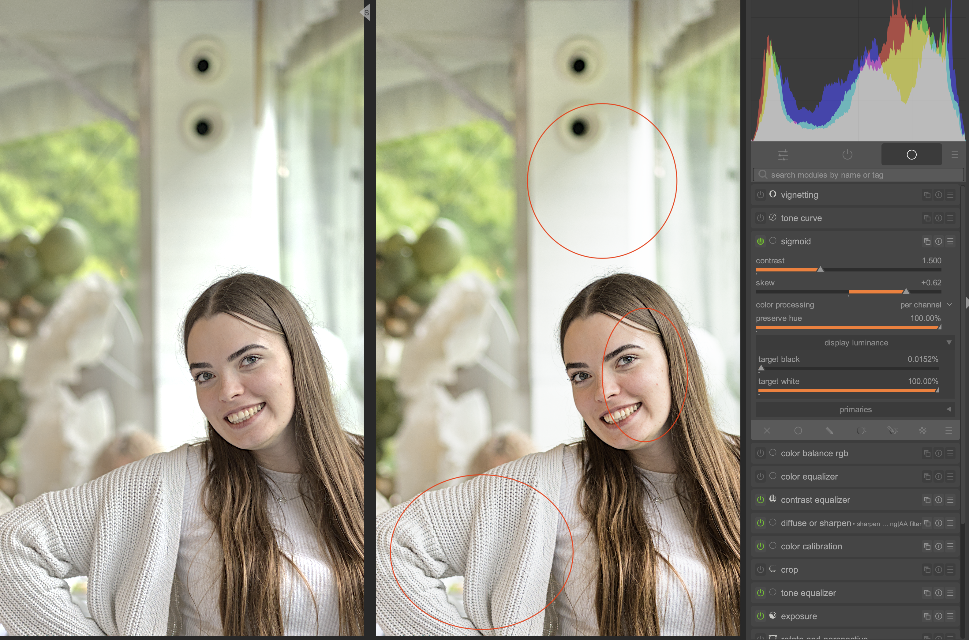
Let’s get straight to the point. On the left is edit with Sigmoid disabled. On the right, the Sigmoid is enabled.
I prefer the picture on the left, but I keep reading that using a tone mapper is required. I’m trying hard to get good results with Sigmoid, but it just isn’t working for me.
So, the picture on the right has the following issues I can’t resolve:
Too much contrast on the skin of the face
Too little contrast on her white sweater
There’s not enough contrast on the pole in the background - the kind of blown-out highlights shown in the image on the left are actually what we want here
Could you explain to me how I can achieve the results I need? However, please stick to the Sigmoid, I’m not ready to learn another Tone Mapper yet.
Without diving into you specific situation here I can tell you that I often switch of the tone mapper or only apply it partly (changing the opacity slider of the mask).
In other situations - mostly having more contrast - I may change the settings though to achieve for me optimal results. For instance trying to have more contrast in a light sky with subtle clouds.
I use AgX for a while already and am no expert on this. But nothing wrong with switching of a tone mapper when you better like the image without it.
What I notice when opening your picture is that you a) applied a +2.275EV exposure shift and b) applied positive shift in ‘tone equalizer’ in the highlights.
You only have to convert something when conversion is needed.
This is when the scene referred tones are a) going outside gamut of your screen (or printer as you like) and b) you want them within that range.
So when there is not a big contrast in a picture there might be nothing wrong with switching it of or halving it’s work. It is up to you to do as you like.
IMO, the highlight on the top just looks horrible without a tone mapper, like early digital video which had like 5 stops of dynamic range, so everything is constantly clipped to pure white without any falloff or smoothing. (Battlestar Galactica comes to mind)
If you look at any film photo you will see it always looks more like the right example than the left. Of course it’s all up to personal taste at the end of the day.
For the face part you can use the skew slider, or use filmic which will provide you with more controls over those contrasty areas.
In case of this picture I would: a) reset all modules (use history module for that), b) expose for the face of the woman, c) use tone equalizer to get the highlights and shadows where I want them. I would trie to achieve this with sigmoid switched of - simply because I like the colors and contrast better then. It looks ‘fresher’ to me (but that is only my hunch with this picture).
But… I would try to make a duplicate image as well with sigmoid turned on from the start and find out how this image develops.
I also would start a new duplicate each time I feel I’m at a dead end, retaining the ‘dead end’ image for further evaluation and learning.
One more thing I noticed - you changed the ‘skew’ in ‘sigmoid’ considerably to the contrasty side. So you pushed the picture three times in the direction of ‘out of control’ (exposure, tone equalizer and sigmoid)
I concentrate just on your question, so I took your posted edit, added a bit of local contrast for the highlights, leaving out skintones (parametric mask).
I changed a bit the sigmoid setting to soften the contrast in the midtones a little bit, even though I don’t think there is too much contrast on the face of your edit. That’s it.
By the way, if you are happy with the edit without tone mapper, don’t use a tone mapper. Why do something just because you read about it. If somebody writes the best thing you can do is jump from the Eiffel Tower, would you do that?
And the comparison to jumping off the Eiffel Tower is spot on If you tell that to a two-year-old who’s just starting to learn about the world and how physics works, chances are they’ll actually jump.
It’s the same for me - I’m just getting to know this new software, and since I don’t have much experience, I have to rely on whatever information is available to me. And I keep seeing (strong) recommendations to use Tone Mappers everywhere.
But now I’ve learned something new and I have a much better understanding of the process. Thanks guys for your help.
Tonemappers often make sense!
But it’s your edit and your taste. So you decide.
The dynamic range on this edit isn’t that high that you can’t cope it without a tone mapper. But there will be pictures, where you are completely lost without.
If you are interested how others would edit your picture you can post it in the category Play Raw. There are often quite great and unexpected edits, and because you get the sidecars, you can lern a lot.
In a couple of weeks DT 5.4 will be released with AgX toner mapper. This may solve your problems. Here is a straight edit with AgX and I feel the contrast and detail are more to the image that your prefer. Contrast can easily be increased or decreased as well as saturation. It is a great tone mapper.