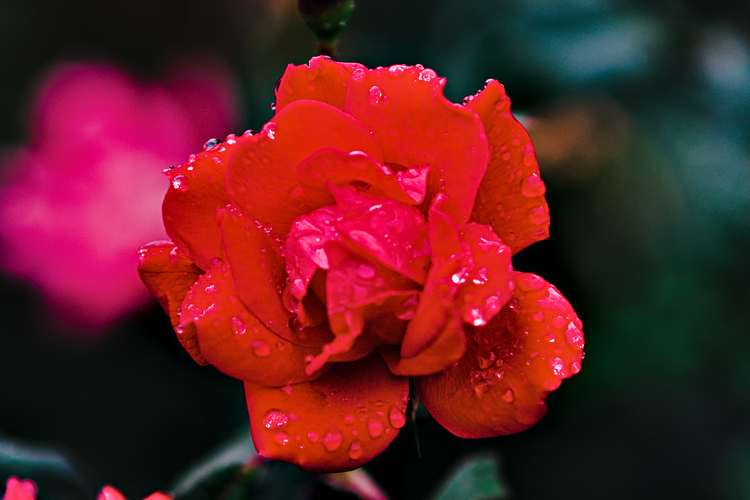
My camera, a Fuji X-T20 always seems to struggle with the reds on my rosebush. They always seem to blow out into a muddled mess.
For those into vintage lenses, this picture was taken when I was testing out my newly acquired (but definitely not new) Konica UC Zoom-Hexanon AR 80-200 mm / F4
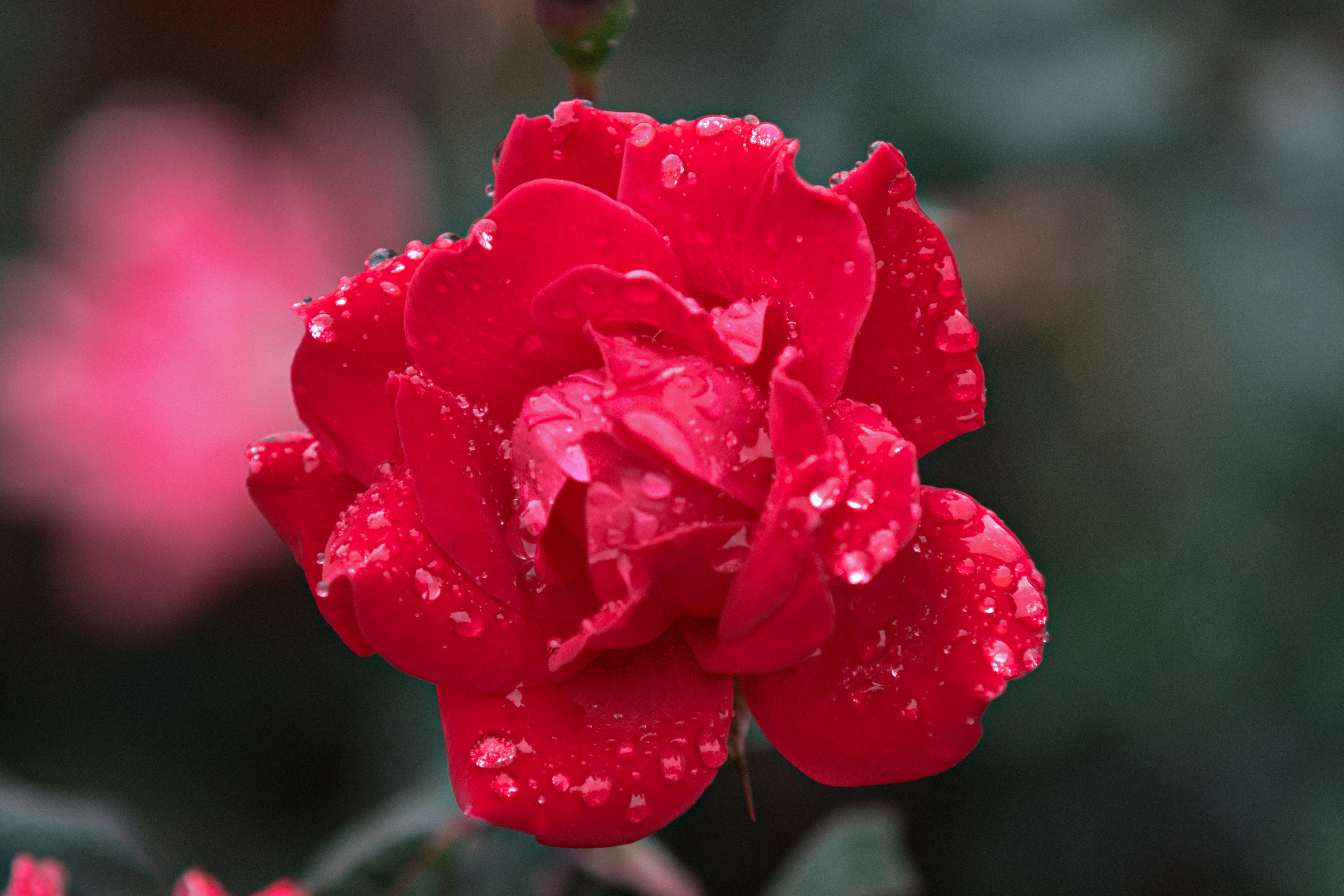
Here is the SOOC and my take using RawTherapee dev and a Provia film sim.
I am interested to see what others can accomplish, particularly with RT.
As a reference point I just snapped a cell phone pic - this is straight out of my Pixel 6 using the native camera app. Same bush, different flower and different time of day.
I do not think that you should blame the lens
I have a couple of Hexanons, and they all behave nicely.
To my eyes, it looks like a typical Fuji-high intensity-flower-image.
I played around with a few solutions half a year ago — I’ll see
if I can find them.
Perhaps you think that I have oompfed it too
much, but I thought it would be nice to see all
those cute water drops, to show that your Fuji
and Hexanon is a fine combination :-)))
I know you’re interested in RT, but I did a rendition in rawproc with a X-T30 SSF LUT profile I had, and it improved the color gradation in the center slightly:
My standard editing with DT. BTW, I remember from the days of film that red flowers can be very difficult to capture as the human eye perceives the color. There are colors in flowers that the human eye can not detect, but film and probably digital cameras can detect. DSCF0259.RAF.xmp (9.2 KB)
No DT but you can use the curves and do hue vs hue or play with saturation at the specific hue and likely tweak the rose to whatever you want from yellow orange red to pink…
EDIT : I even feel like there is an example of dealing with a rose in the rawpedia literature… I will try to dig it up…
EDIT2…
Local adjustments… tweak away… wasnt a rose but red flower none the less
EDIT3
Are you trying the different tone curve options…you will get quite a different starting point…this is something to check out… saturation and weighted for example not the same as the default
I was hoping that somebody who is more skilled than I
would have brought up a discussion about out-of-gamut, color profile, and other nasty things.
What would be the best way to check/measure/tell whether
a certain image falls within the boundaries of a certain profile,
like sRGB? And what to do if it does not?


 .
.