Scene-referred produces washed out final image (vs display-referred)

I think the others have probably answered your questions :slightly_smiling_face:
But yes, when I was talking about ‘swapping around’ I meant the order of how I adjust things, which doesn’t affect the order of operations in darktable internally.

BTW, it’s rare that I need to move modules in the pipeline - it can be useful, but to use your example about adjusting colours in conjunction with filmic, one can usually happily leave the color balance module in it’s normal position. So it feeds its adjustments on to filmic, which in the normal way is meant to be at the end (or near the end) of the pipeline. Because it does the transform from the scene-referred space into the display space… anyway, the default module order is quite carefully thought out fo best performance, so one only needs to move them if one has a specific point in mind, in terms of some operation that needs to be done before/after something else.
But all this is not affected at all by the order that you adjust sliders - you can jump around to your hearts content!

For the exposure thing the demonstration with the tone ramp in Boris’s latest video really demonstrates it well … ie the part where he draws the face over where middle gray needs to be and then just adds exposure to get that shift…much of the ramp is then overexposed until remapped with filmic or sigmoid… I think this sometimes gets missed when people move to doing scene referred edits and I think they can be conservative as often you could be adding 2 or even more EV. This would seem strange in other software that has opened the image with a profile that has a tone curve and or other adjustments out of the gate…

1 Like

If you notice when Boris does this he has made targeted corrections to the image and has it where he wants it Then for the next step he is sometimes trying to impact the color from that exact point that he has developed so he moves the module so that the effect will be added from that point instead of the default position where it might impact the work that he has done. He knows very well what he is doing and of course we can all learn from those techniques he presents but for the basic workflow and based on single instances there is the prescribed module order as people have mentioned already… There can also be the nuance as it applies to masking and what gets used as the input along the pipeline… Inserting extra instance in the default position which is earlier than some of the corrections you have already made could impact parametric masks that you created in those modules…

2 Likes

I see you have already received very good answers to your questions.

I’ll briefly clarify why I changed the order of the modules in Episode 50 when converting to black and white, which is causing the confusion.

First, let’s clarify how the conversion to black and white works in the color calibration module.

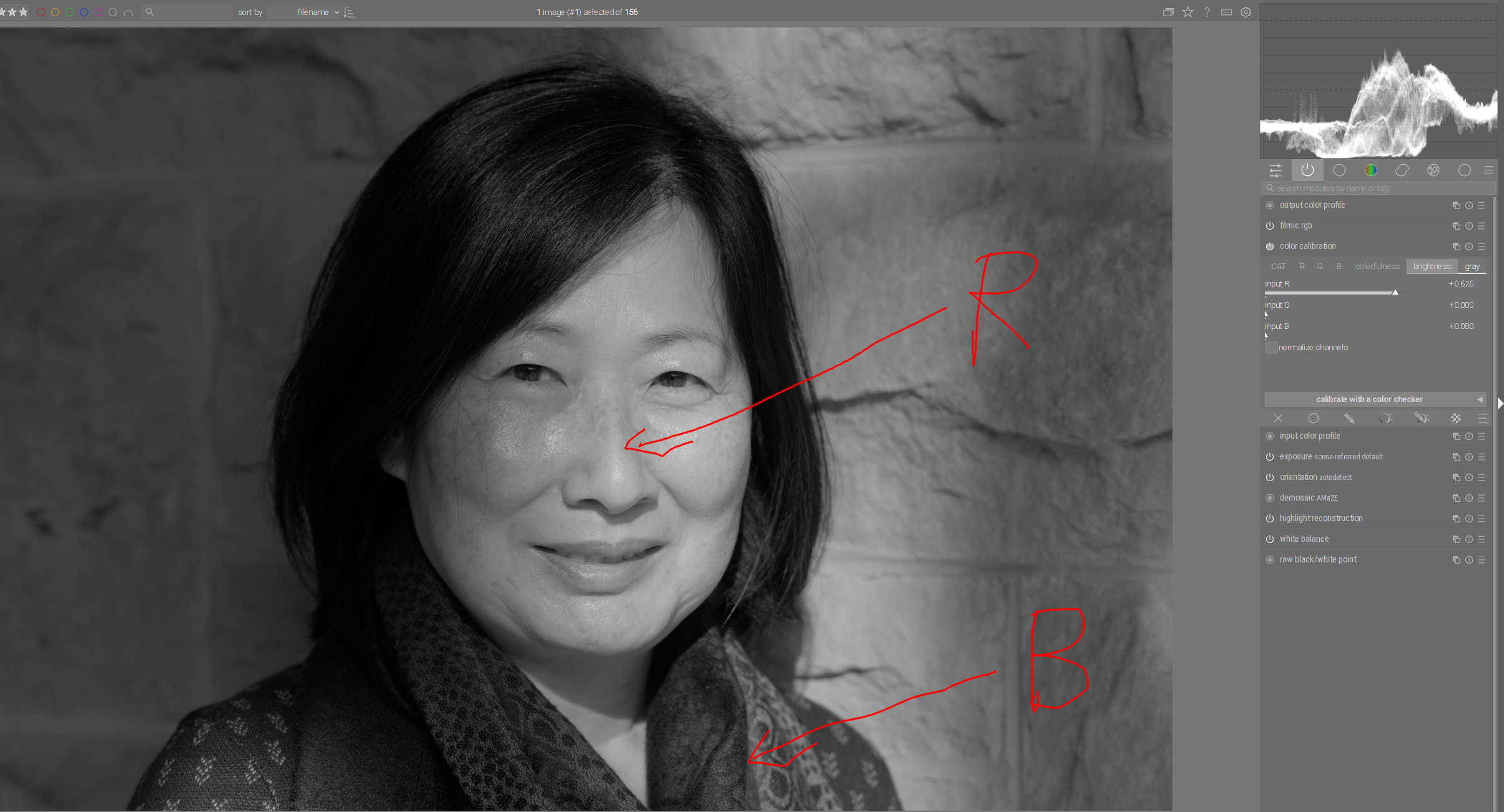
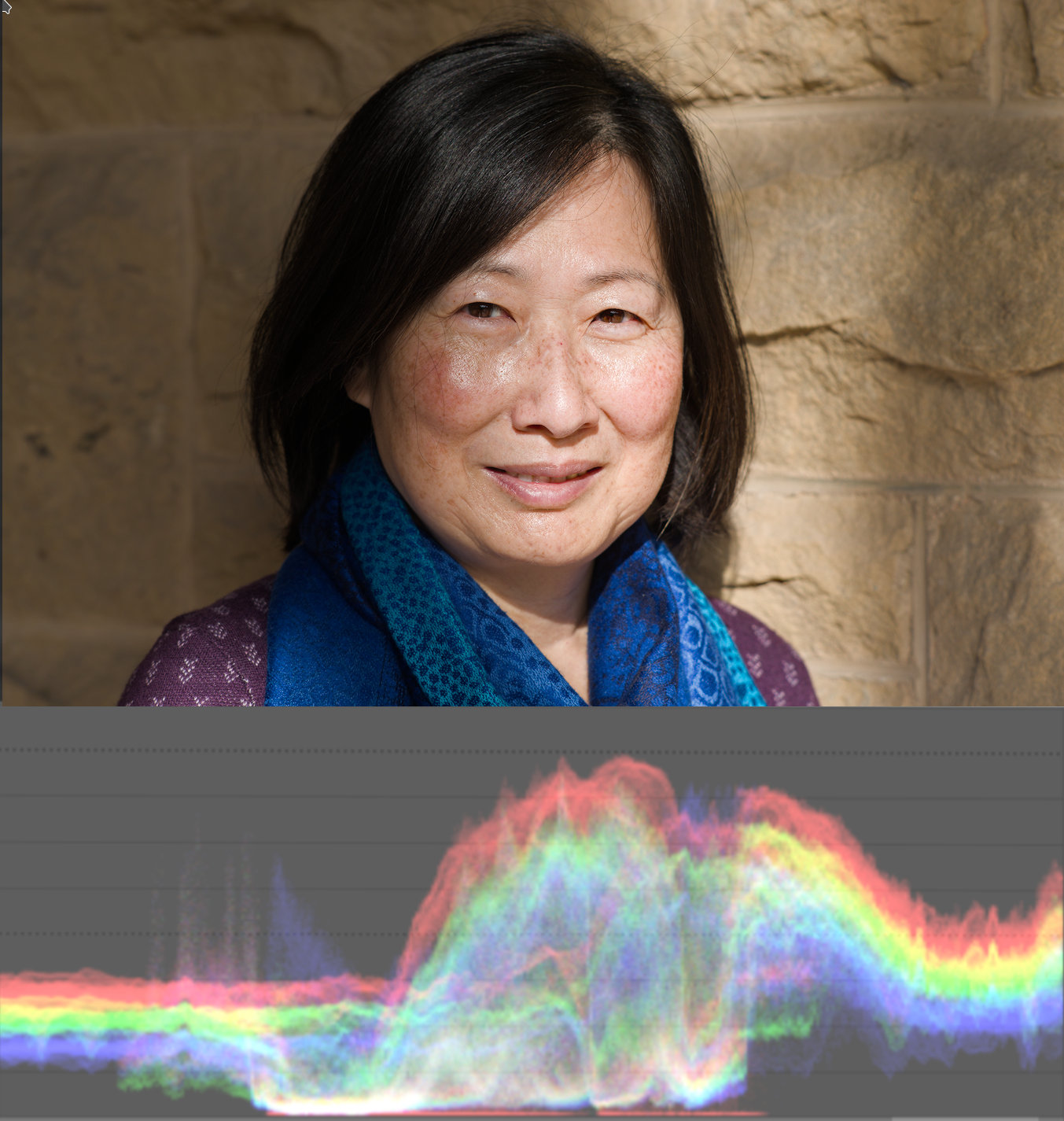
First we notice that in the face the red color channel dominates and in the scarf the blue one:

When I move the slider in the “gray” tab of the color calibration module, the corresponding color channel becomes brighter. For example, if I increase the red color channel, the face becomes lighter because red color dominates there and the scarf not so much:

But the problem is, the face looks very flat, loses the details.

If I now instead of red, take the blue color channel, scarf becomes brighter and the face not so much:

Also the skin details in the face are amplified, because there the blue color channel is lowest and they remain even darker than the face.

Now that I know that, I can decide how I want to do the transformation.

For example, I want to have the face lighter but in such a way that I don’t lose the skin details too much. So, I combine both color channels according to my taste.

This way I find a good balance according to my taste:

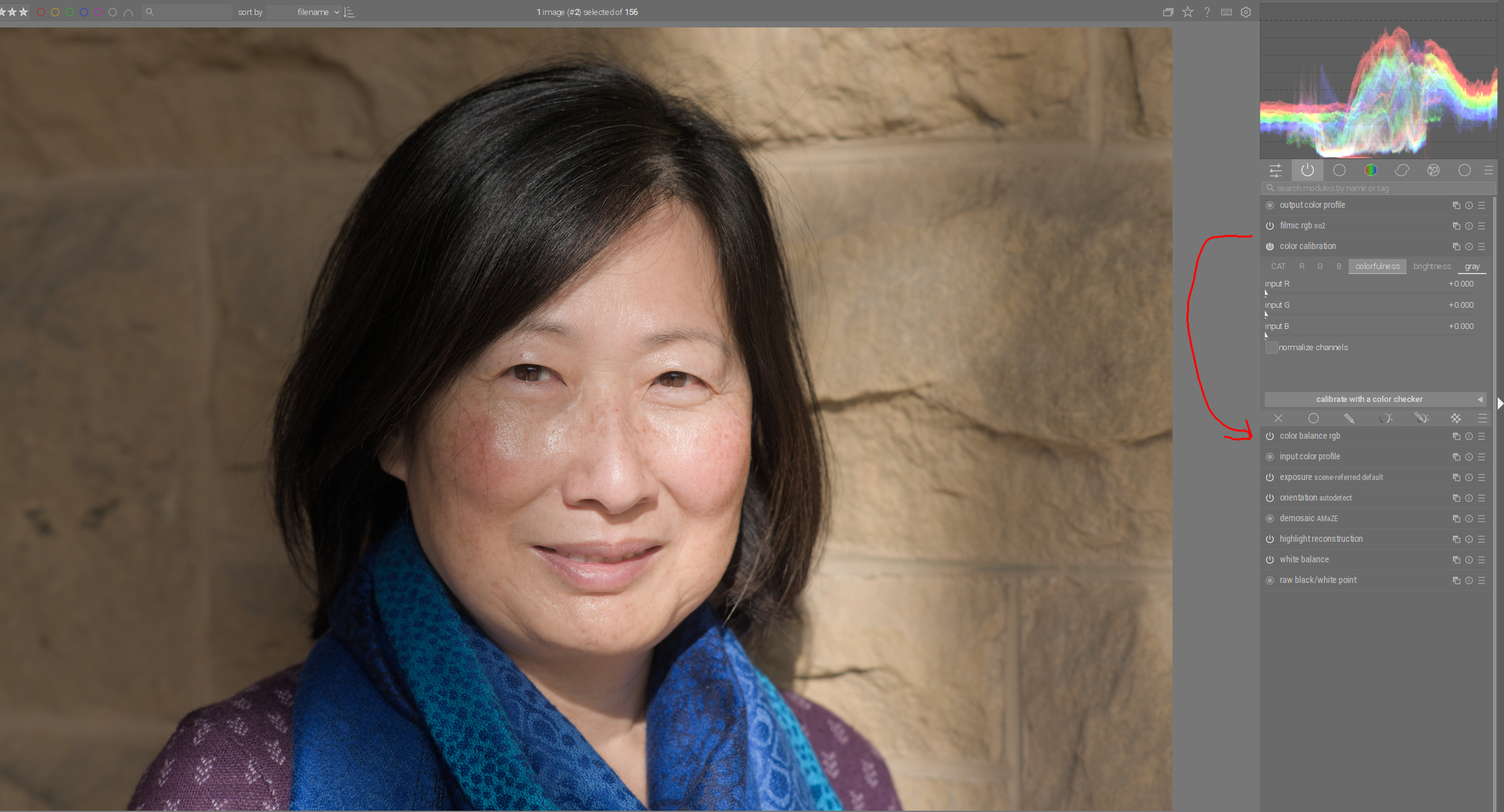
And as a last step, I want to increase the contrasts a little bit in the photo as a whole. I can do that with color balance rgb module, which is located in the order above color calibration module. That means I increase the contrasts after conversion to black and white.

For this I will use only shadows and highlights slider in “perceptual brilliance grading” function in color balance rgb module:

And now I have a good black and white version of the photo with good contrasts.

Now, let’s say I want to have a version just like this one, but with a slightly more darker scarf, so that I get a better “framing” of the face.

Since in the conversion example above I used the combination of mainly blue color channel with a little red color channel to get optimal face brightness and details in the face, scarf would be darker if it was red instead of blue.

That means now, before I make the conversion to black and white, I have to make the scarf red to get the desired effect - darker scarf later in the black and white version.

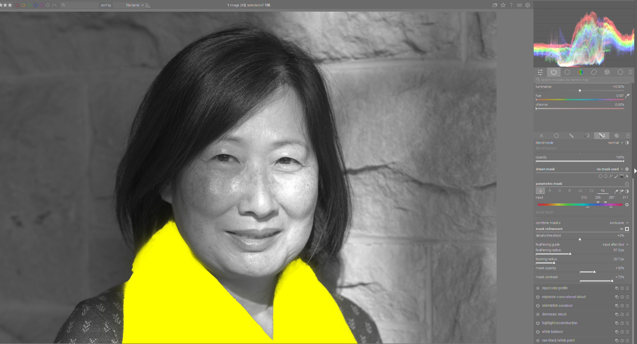
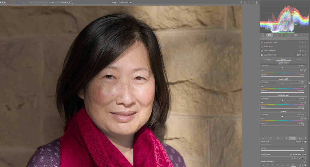
It also means that I need an instance of the color balance rgb module before the color calibration module (before the conversion) to be able to make the color shift of the scarf from blue to red. So, I move the color balance module under the color calibration module:

In the color balance rgb module I mask the scarf…

…and change its color in the “4 ways” tab:

I also change his name to “Color of the scarf”.

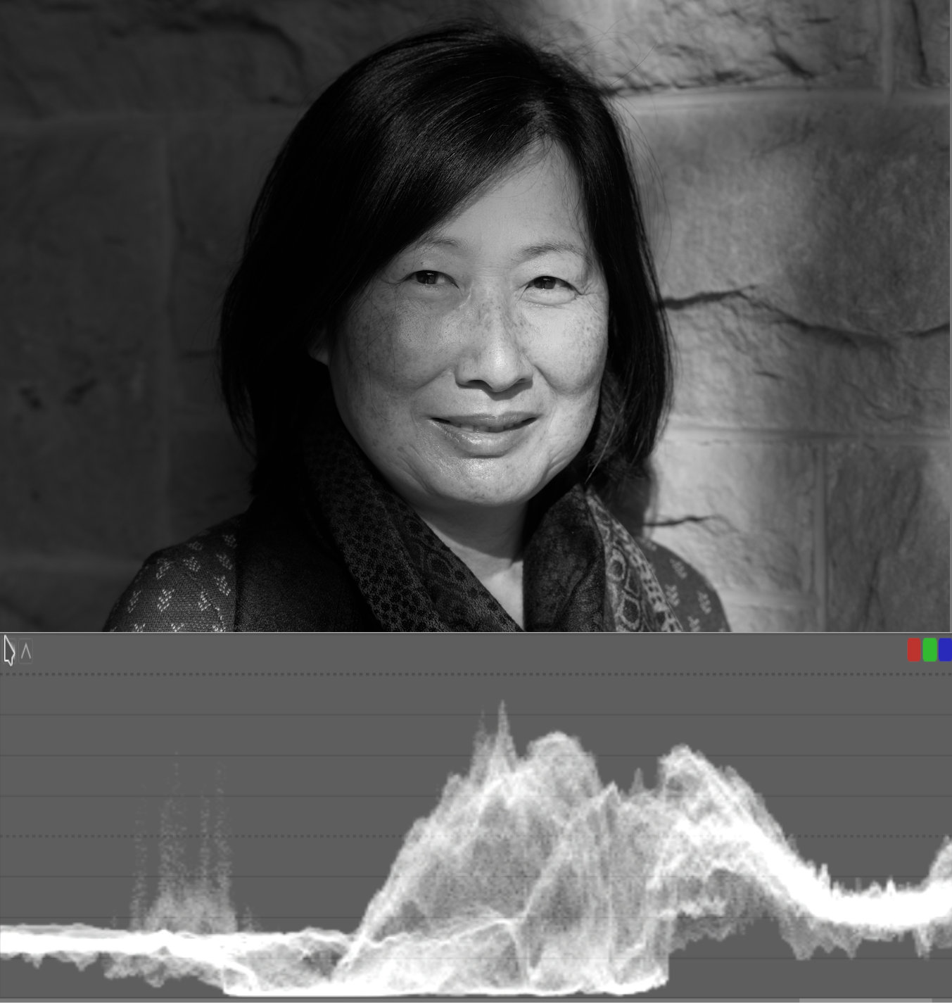
Now I use the color calibration module as in the example above to make black and white conversion:

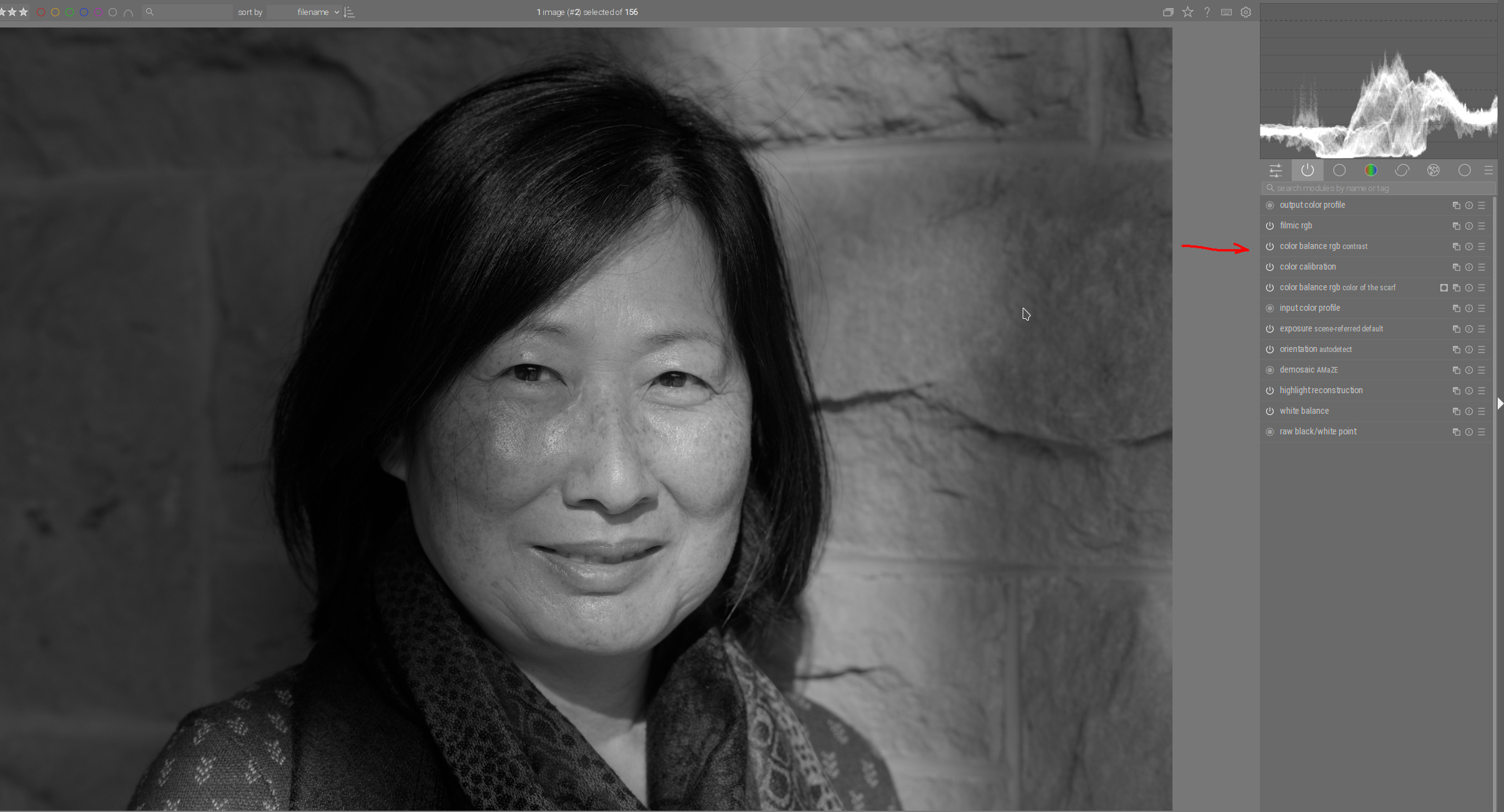
At the end, I need another instance of the color balance module to increase the contrasts in the photo after the conversion.

I create new instance, rename it as “contrast” and move it over color calibration module with which I did the conversion:

Now I can increase the contrasts just like in the first example above:

And as you can see, now I have similar results as with the first conversion, but with a much darker scarf.

20 Likes

Boris, Todd, Steven, Miguel and others who commented/responded to my Qs:

My gratitude and appreciation for your help, time.
I believe I now understand darktable, filmic, the pixel pipe and flow, what to do and when and why…far better than by reading the manual, playing with the app, etc. That your comments were pertained to and were readily applicable to an image I had taken made them even more striking and edifying.

I believe I have enough to put to work what I’ve learned (at least until I hit the next road block which I hope is some time off into the future!) I’ve already updated to 4.2, have sigmoid and keen to use it after review of Boris’s new tone ramp video

Thank you very much!

5 Likes

Now you know why I said Boris moves things around because he knows what he is doing :slight_smile: His videos on white balancing with the channel mixer and the ones he does on bw conversions are really insightful even just from the point of looking at the photo, analysing it and then deciding where to go from there…

5 Likes

Hi Boris,

this is a very illustrative and compact lecture on B&W conversion in Darktable. Thank you!

1 Like

I have a question, just to confirm:

You say you used “4 ways” of “color balance rgb” module to change the color of the scarf from blue to red (see the concerning photo). I understand that you keep the hue at the starting position that is red and you move the chroma sliders of “shadow lift”, “highlights gain” and “power” to 100%.

Boris, now that I’ve had time (and some footing in DT mechanics) to better understand and absorb what you detailed in your example above I have a few Qs and would appreciate your clarification on them.

I noticed you use the waveform scope. Following Todd’s suggestion I started using it too and find it more useful than a histogram (which was a giant step forward to not having anything, which was the norm before digital SLRs!)

You say: “red channel predominates (in the face)”…“increasing the red channel in color calibration the face becomes lighter because red color dominates there…”, “blue brightens the scarf, not the face…” and finally “find a good balance (combining both channels) according to taste”.

I’m curious how you used, if you did, or would use the waveform (in one of its three incarnations) in making those choices and decisions. i.e., beside the eye alone, what in the waveform can we use to guide our choices and decisions?

In your video Episode 50 (Conversion to B&W) (Darktable Episode 50: black and white conversion part 3 - YouTube) you first prep/fix the color image and get it ready to convert to B&W. I find this a very valuable step. The waveform is in color too, perhaps suggesting how it can be used to answer what I’m trying to get at.

In your example (in this thread) you had already converted the image to gray scale and then explain how R or/and B help.

In either or both cases I’m curious how the waveform–whether in combo or RGB Parade–can be used to guide in the conversion and production of a stellar B&W image.

Red is the dominant color in skin tones this can be confirmed in the waveform but often the vectorscope us used. Many apps have a skin tone line… The scarf is pretty obviously blue. If you set the color picker to restrict to selection it will show you waveforms, parades or points on a vectorscope that represent the selection so its not too hard…you can also always mess with the channels to see where the bright areas are or in the channel mixer show each color channel… a flat tone curve blended in lightness should also give you a hue map of the image…

image

Yes. You can additionally desaturate original colors of the masked area with “linear chroma grading” sliders in master tab.

Waveform does not play such a big role. I only used it to see where overexposure might occur. The nice thing about the waveform is that it shows both the brightness and the color distribution spatially:

In which area dominates which color channel, you can see by the color scheme how the three color channels are combined:

rgb-farbmodell

For example, orange-yellow hues of the skin are a mixture of red and green channel, where green color channel is a little lower than red. Blue channel is the lowest there.

Here I quickly reduced the value of the green channel:

rgb-farbmodell_lover_green

So, red channel dominates in the skin colors. You don’t necessarily need the waveform for that. It is much better to know this scheme of color channel combination.

Boris, I was aware of the color channel. Your response clarified for me how you used it in exercising judgment on the Color Calibration sliders in converting to B&W. I appreciate your clarification. Thank you.

1 Like

Very quick edit scene reffered