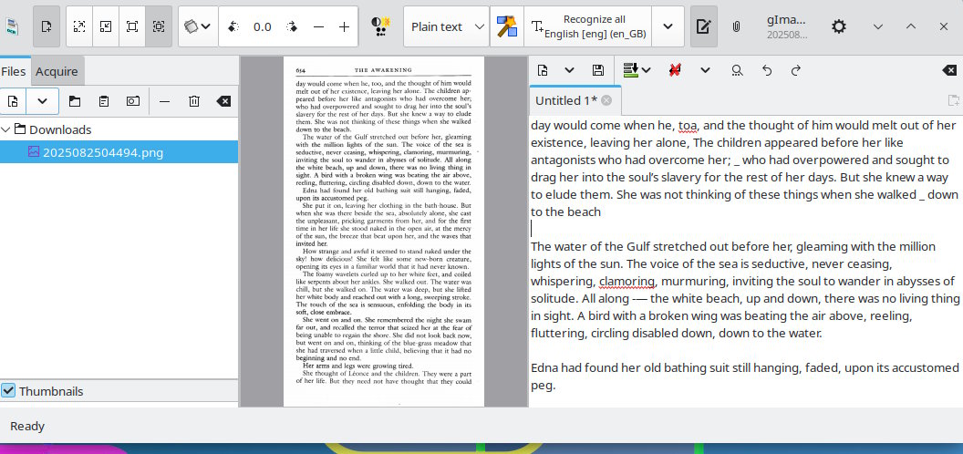
I have some scans of book spreads and/or single pages on which I’m trying to improve the color and consistency of the text (see attached picture, it’s a page from The Awakening by Kate Chopin):
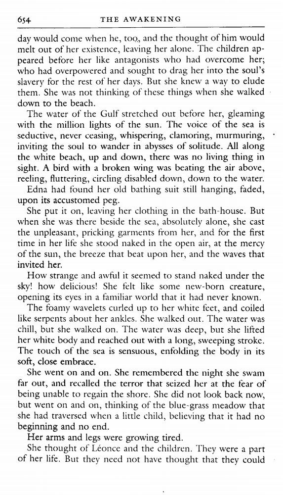
You will note that the text is not uniformly dark throughout the page (for example, about three-quarters of the way down the page where it says “Her arms and legs were growing tired,” the text there is slightly darker than in other places; there are also other places throughout the page where this is also the case). This is quite possibly due to the fact that I didn’t do the best scanning job in the first place, or else that the text, when it was printed by the publisher, came out a bit light.
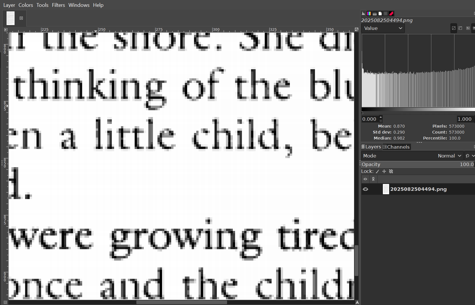
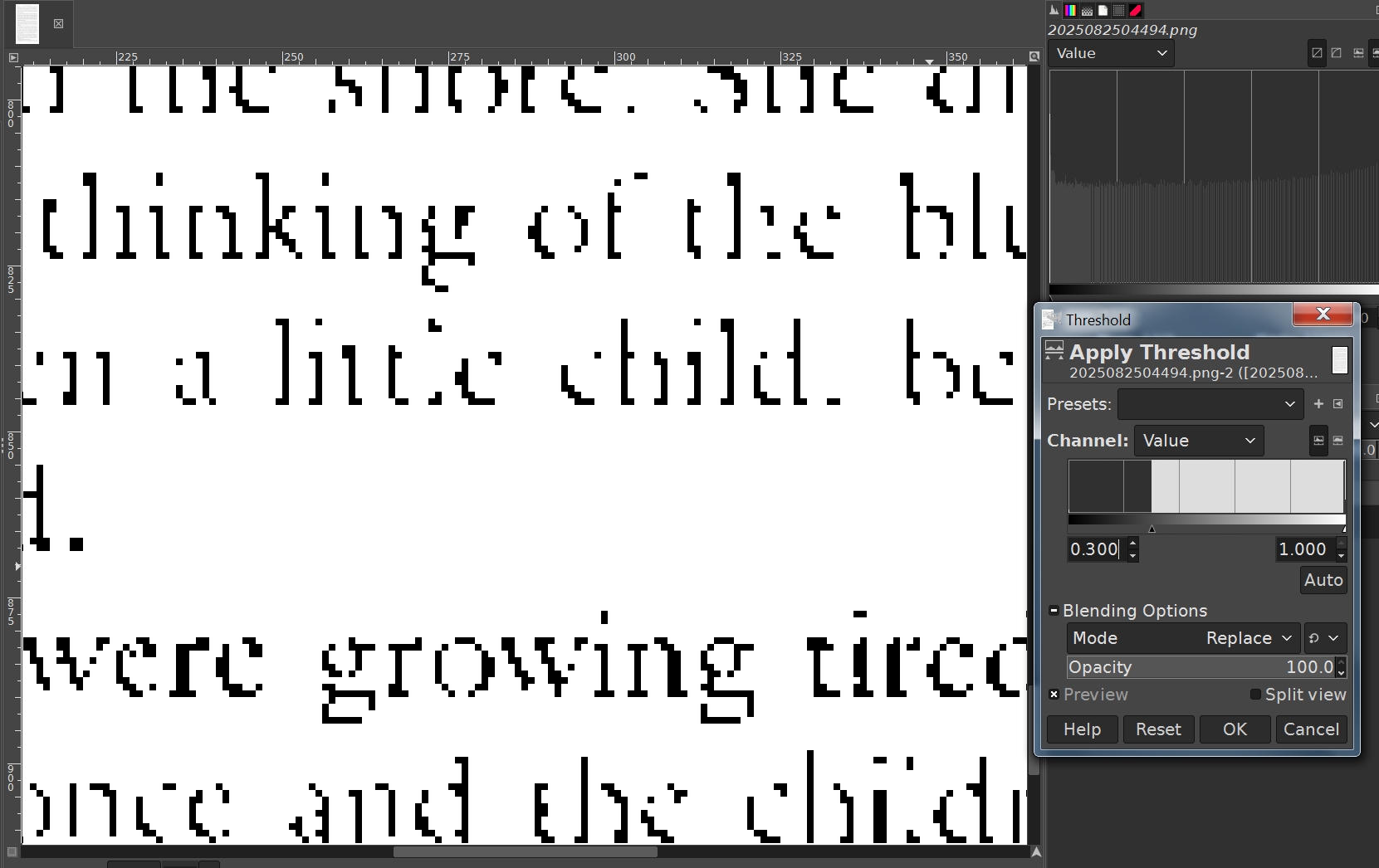
I can go page by page and manually select and erode the text that is too light, but this would be quite labor intensive and time consuming, and I’m wondering if there is a way to have GIMP (or any other software) go through page by page of a book and do what I might call a “selective erode” if I set some sort of baseline to equalize the color of the text. Am I asking the impossible or is there some way to do this?
Potentially cleaner versions of morphology filters are geodesic versions of the filters. I have rudimentary G’MIC commands if you want to try them: afre_dilateg, afre_erodeg, afre_closeg and afre_openg; sorry, no GUI version (use custom command filters to try them).
Geodesic or not, the steps would be to create a new layer for closing, which would help you detect the thin parts. Use that layer to do a reverse selection for you to erode only the parts you want. Maybe I got it backwards since I am tired from a long day, but that is the gist. Experiment!
Also remember that fonts are tricky. Font-unaware filtering can reduce readability.
IMHO you are looking at the problem the wrong way. The general text is not dark enough, but at places the characters are bit wide (ink bleed?). For instance if you look at the ll in recalled the terror, their stem is 3 pixels wide (while it is 2px is most other l in the document) but there is also a line of pixels under the baseline that you don’t see in l elsewhre). So the correct fix would be to darken the document (by adding contrast) and thinning some characters.
Assuming that each line of text contains pixels that should all be adjusted in the same way, a possible approach is:
Split the image into lines of text.
Adjust each line by applying a LUT (look-up table) that is specific to that line.
Re-assemble the lines of text.
For step 2, the CLUT should be such that when it is applied, the histogram of the result matches some standard histogram. This is called “matching histograms”. When making the histograms, don’t count the pixels that are nearly white.
The “standard histogram” could be of the lightest line, or the darkest line, or whatever you want.
Thanks to @afre, @Ofnuts, & everyone else for taking the time to respond.
Uh, well it would seem that I’m more than a little out of my depth here; my GIMP skills are very rudimentary, not to mention the fact that I’m only on 2.10.36 (a little while ago, I upgraded, but this seemed to cause some problems, and GIMP ran very slow on Linux Mint 22.1, though I’m not sure why, and I think there were some other issues as well though I can’t remember what they were at the moment. I’ve since downgraded ).
To start at the beginning then, (duh) what’s G’MIC, and how do I run the commands you mentioned? And, uh, geodesic filters? Font-aware filtering? Looks like I’ve got some studying to do . What I’m really hoping for is some sort of filter/plugin/process that will go through a document, page by page, and equalize the weight/darkness/crispness of the text without my having to do it manually. Possibly something called ABBYY Finereader can do this? Unfortunately Windows only, I think.
Batcher enables you batch file conversion using GEGL filters.
GEGL filters, like Level or some tone mapper (see [Colors] > [Tone Mapping] in GIMP menu) may be usable for your purpose.
OK, what do we have: Linux Mint (version???) and Gimp 2.10.36 (so from memory comes from 'buntu 24.04)
Not a bad idea going back to Gimp 2.10 for something like this, although that version does not come with Python, which rules out a lot of old plugins.
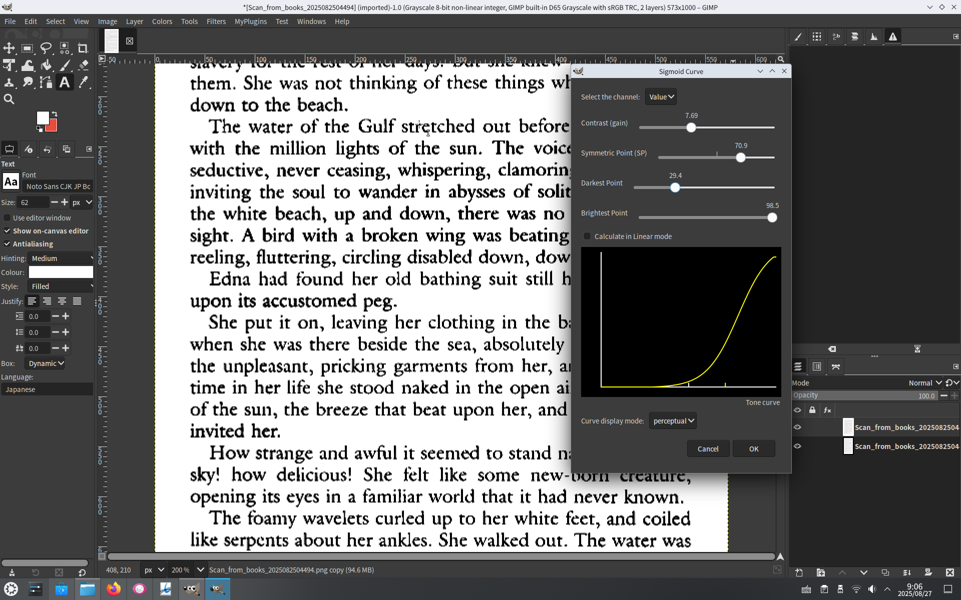
The gmic Gimp plugin will work. www.gmic.eu and get the version for Ubuntu Jammy. A possibility is making the lighter text darker. This using the Might Details filter. https://i.imgur.com/sPE23Ic.mp4 Might be suitable, I duplicated the example page for a before/after.
For batch processing there is BIMP. A linux version here: BIMP version 2.6
…and a clue on use at the end of that little video.
ABBYY is a good OCR for Windows, For linux I use gImageReader but IMHO that example page is way too small for OCR.
EDIT: Well, I have go back on that opinion. Not too bad, although lots of manual formatting often needed with gImageReader