I’ve finally got around to properly edit some of my 2020 solar eclipse images:

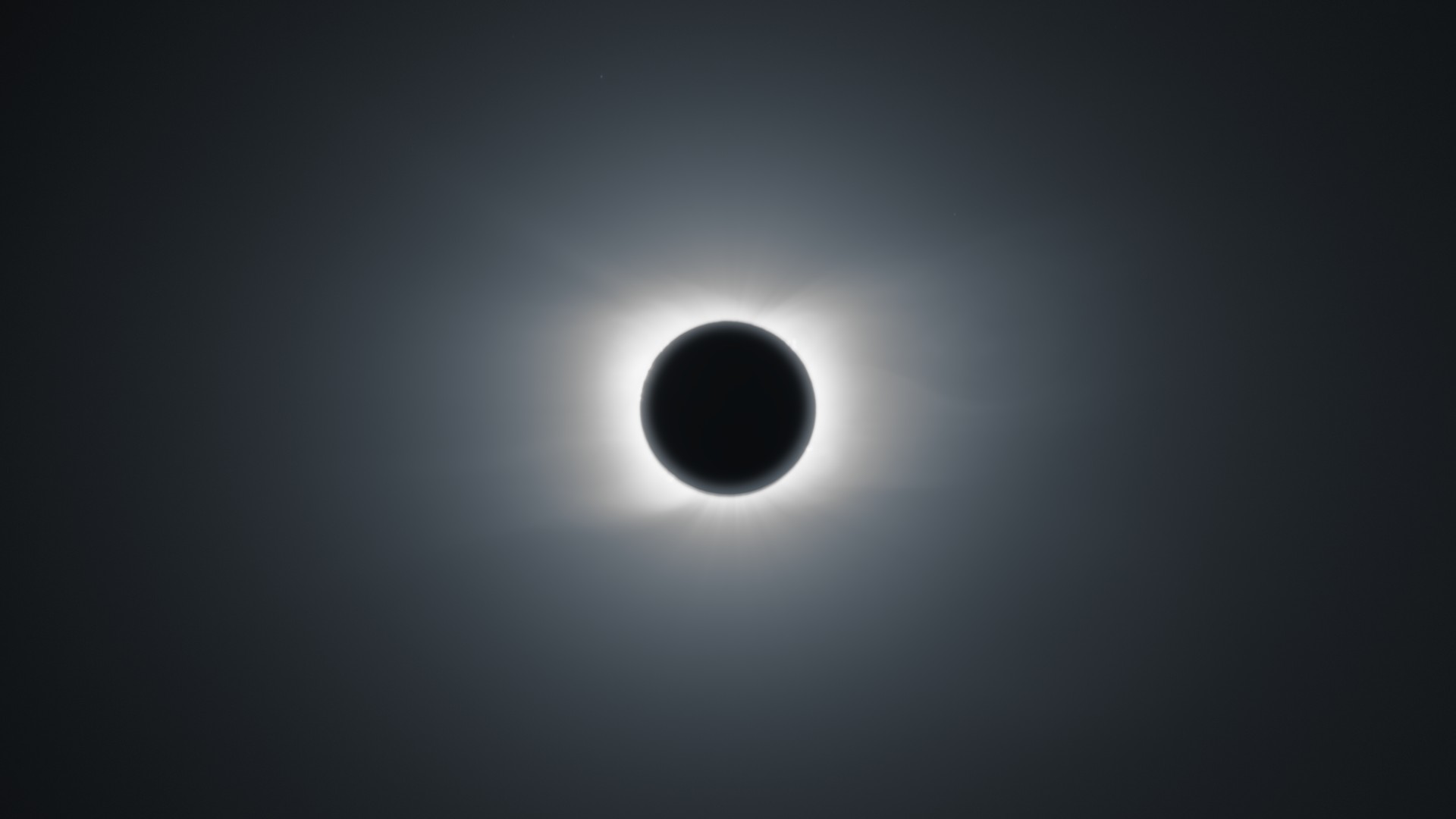
I’m quite happy about the ‘technical’ result: this is an exposure stack across 8EV (LuminanceHDR), each exposure level itself being an average of 4 images with dark and bias frames subtracted (Siril).
However, I’m still not convinced on the ‘artistic’ part of the edit. I’m running around in circles in darktable regarding the level of detail, contrast and exposure. The image above has both highpass and local contrast applied.
Maybe a bit less of detail (local contrast disabled)? It looks more calm, not so punchy:

Maybe bit more global contrast (increased black relative exposure in filmic rgb)? It goes the other way, it looks more dramatic:

For reference, this is the image before highpass (that module is doing magic  ):
):
What’s your opinion? Feel free to critique or make suggestions on any aspect of the image.

