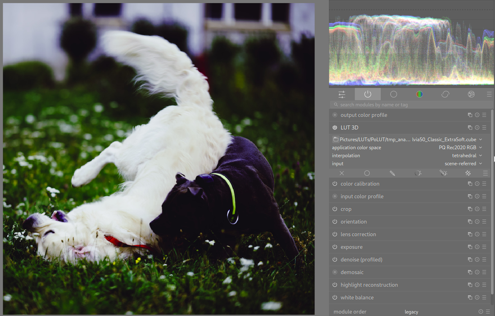
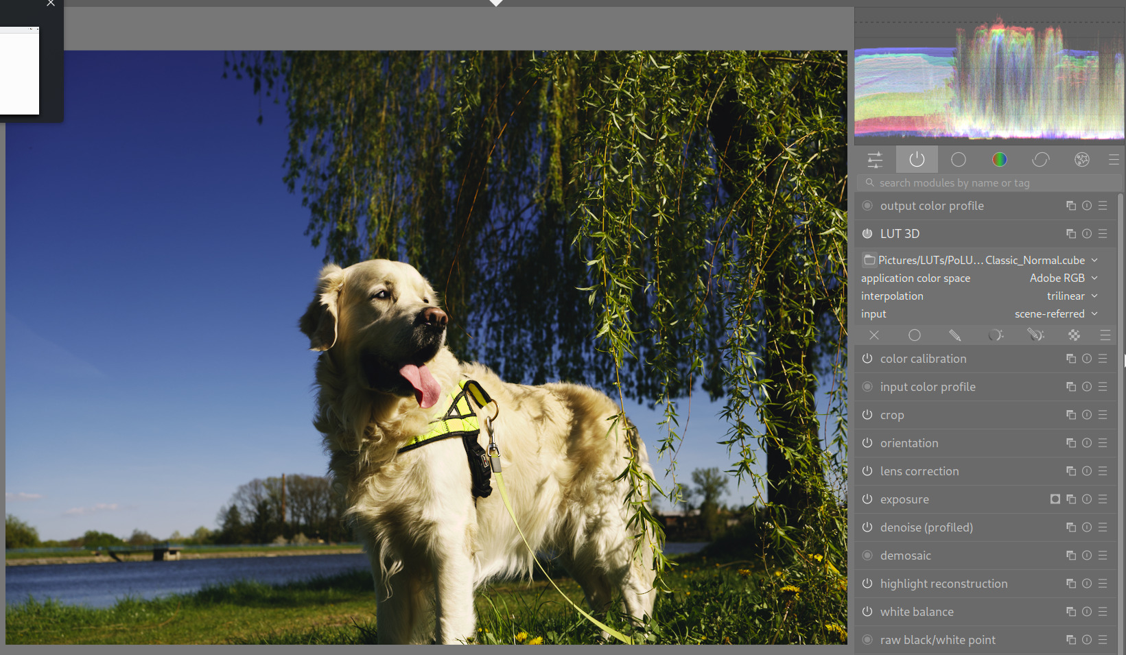
I did a thing. Well, claude did, even though I am a software dev I don’t know much about this domain or this style of code. Anyway…
I grabbed some Kodak data on film stock, photographic paper and color filters and created some LUTs that represent combinations of these. Only planned a set of Tri-X LUTs, ended up adding Velvia too,
Two versions of each: A classic and a modern one, the difference being that the modern LUTs add the Helmholtz-Kohlrausch correction while the classic ones attempt to replicate the original look as faithfully as possible.
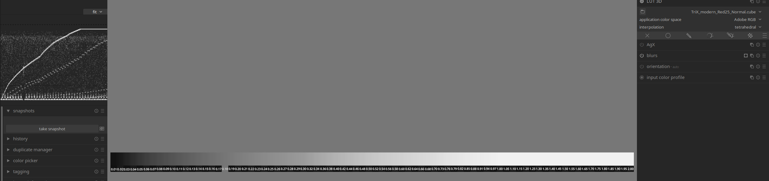
These are supposed to be used with scene referred data, so switch off your AgX/filmic/sigmoid. It also means that in other software you will probably not get out of these what was intended.
Also note the LUTs expect the application color space in the LUT module to be set to Adobe.
So, play around with it, give me some feedback. I would also appretiate if @kofa and other contributors that can actually judge this critically would tell me what they think. Whether there is any point doing this, if they have any suggestions… or idk.
(Oh, yeah, @kofa if I might. Claude really wanted to target PQ REC.2020, we settled on adobe as the next best thing. Do you think it is worth pursuing this being added to the LUT module? I mean, I can’t do much, other than creating an issue on github, but it would be great to make it happen somehow. Also not gonna pretend I understand more than 5% of why it’s a good thing)
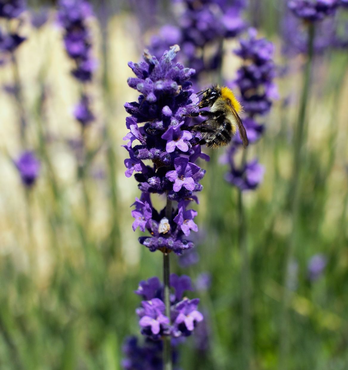
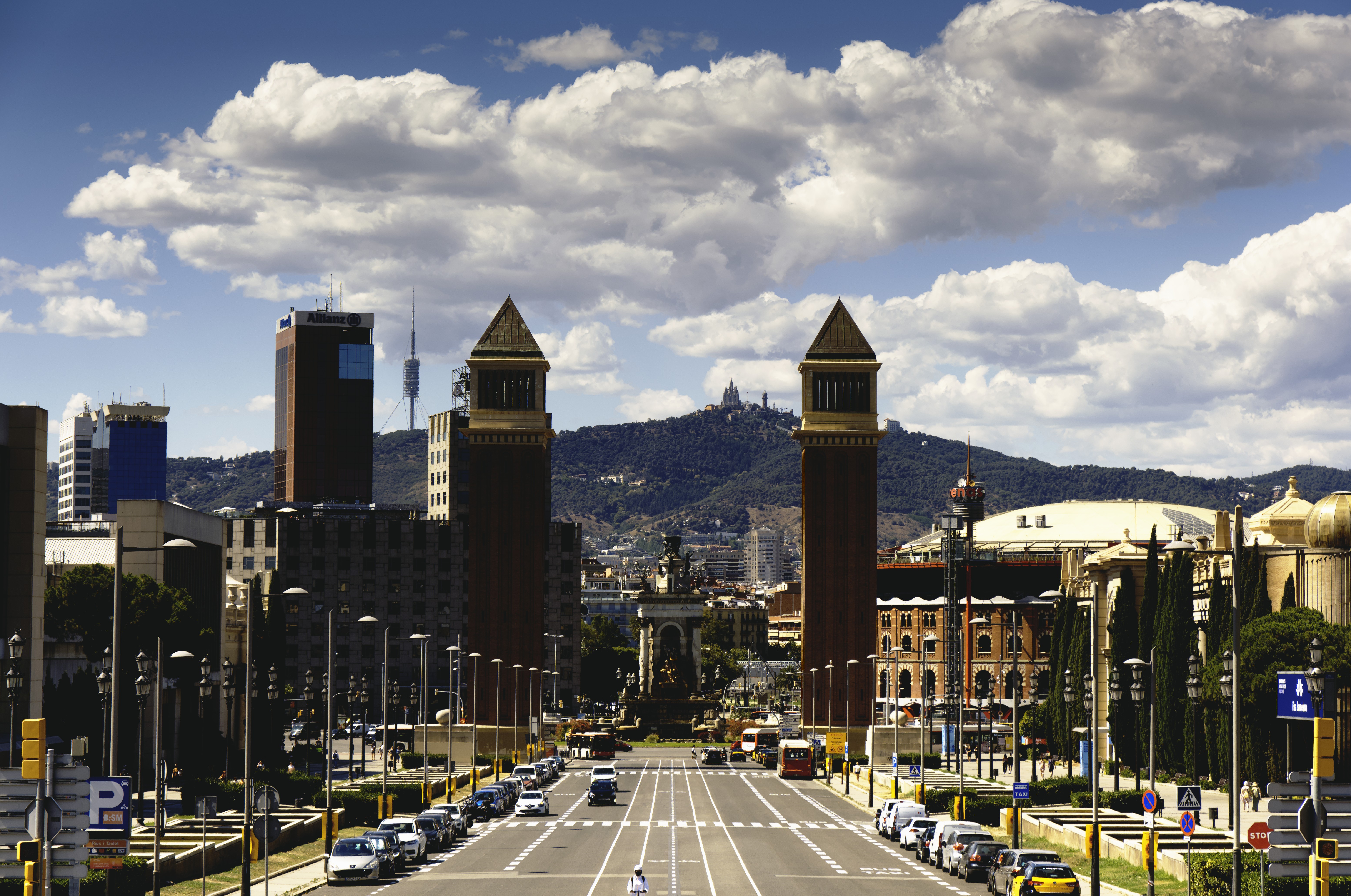
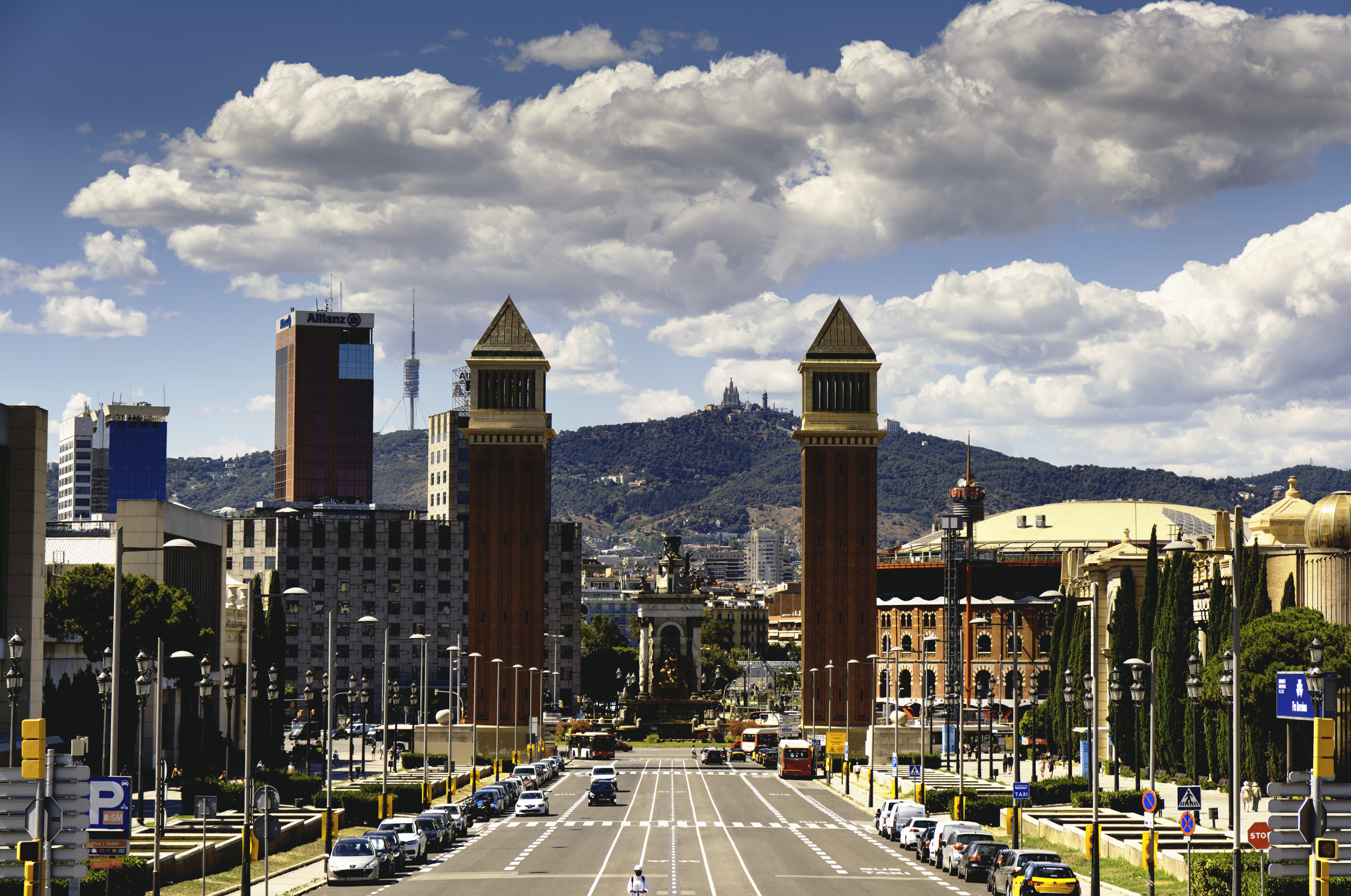
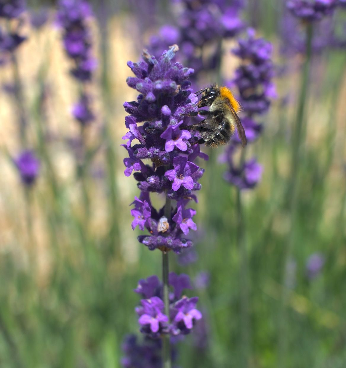
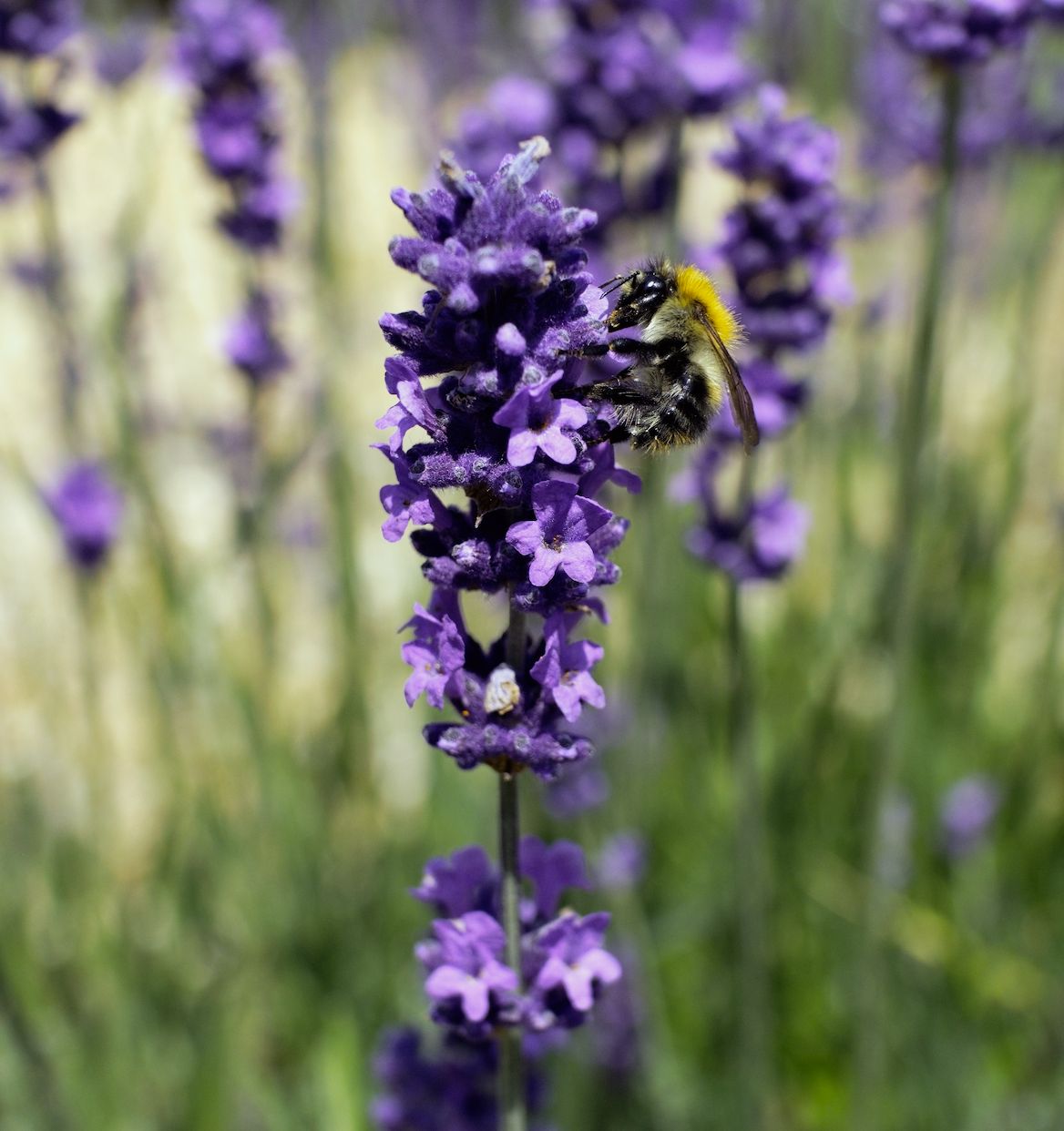
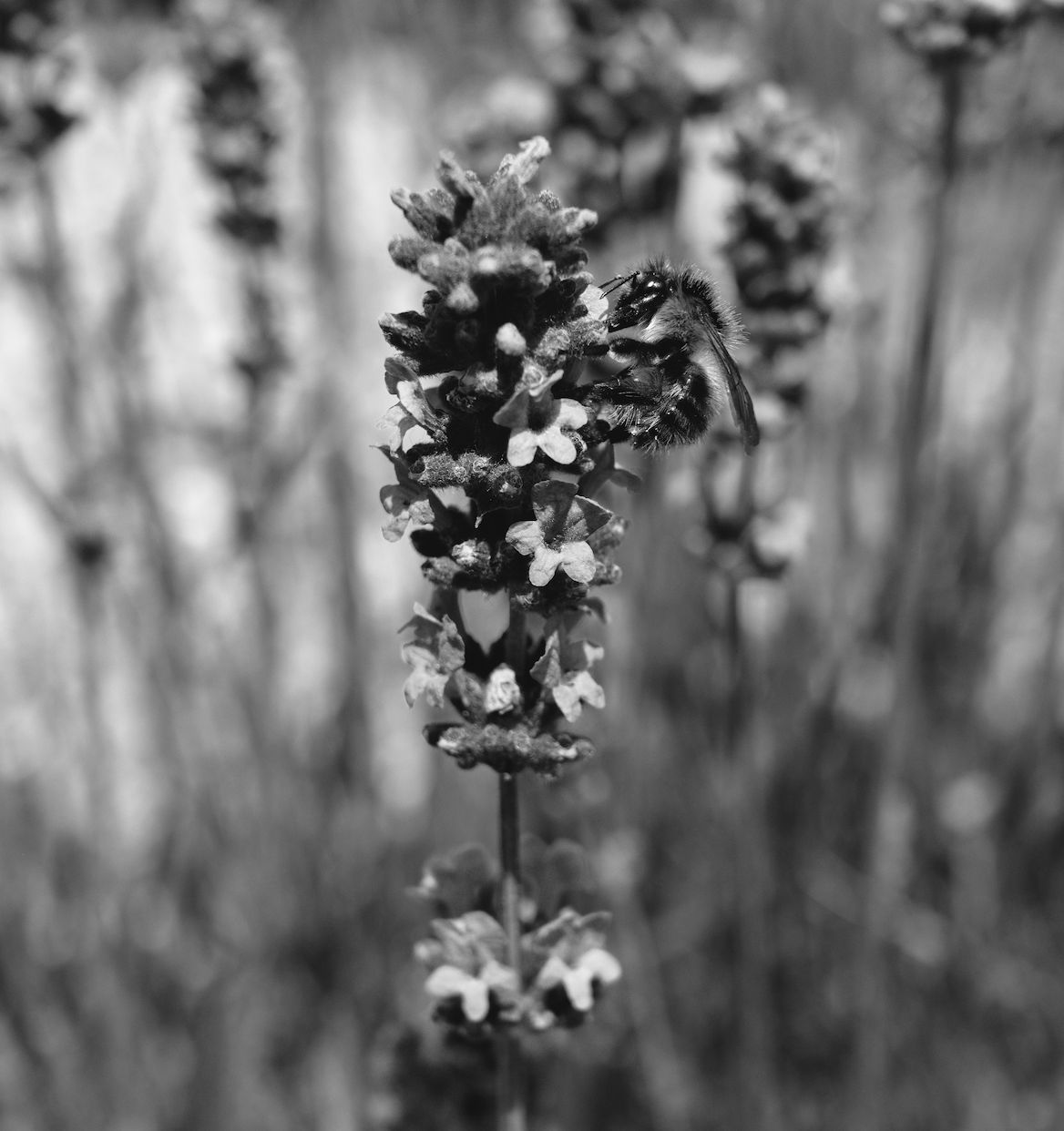
Tried a few on my ‘bee and lavender’ pic.
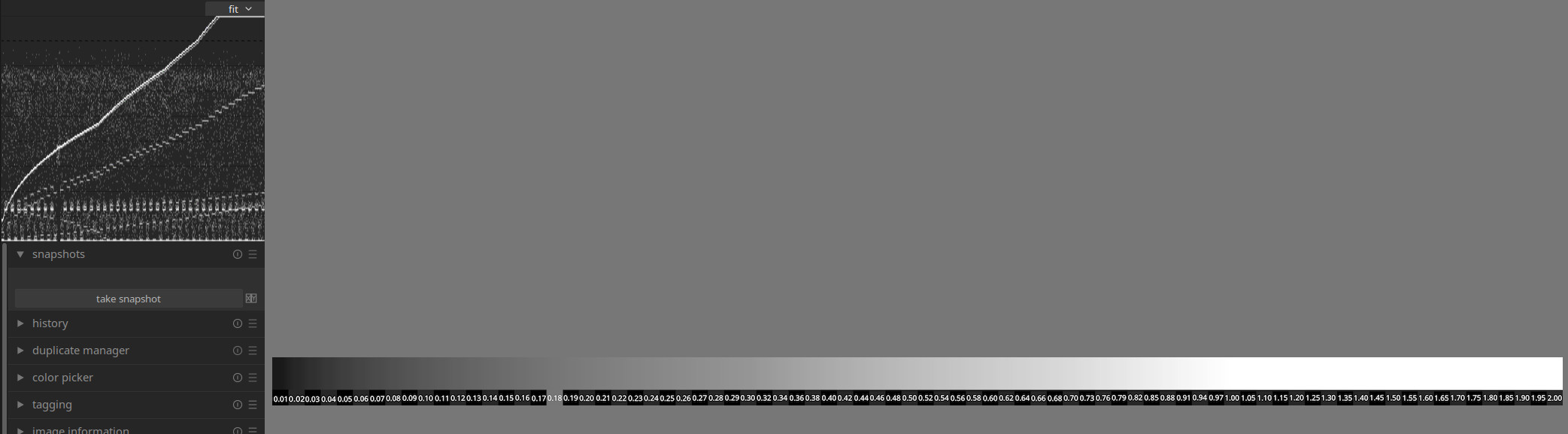
First no LUT (or tonemapper, some blues are clipped)
Second Velvia classic normal
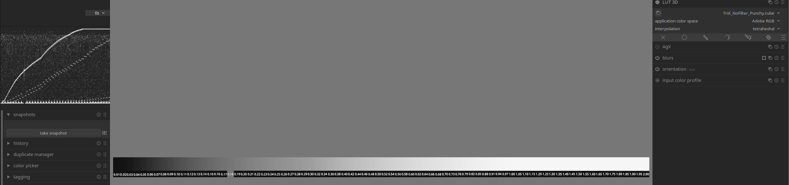
Third TriX classic punchy
Seems the TriX maxes at 96.3% display white, similar amount for Velvia, but the punchy Velvia was hitting around 100% values in the waveform.
I’ve done a few more tests. I can’t examine these files much more than that, but they don’t seem to like values above display 100%.
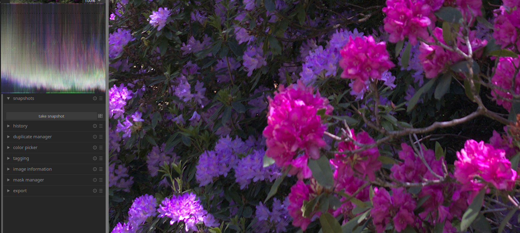
Here are some rhododendrons that are above 100% with no tonemapping, and then with TriX classic Red Normal:
Well, a LUT is a table of values with interpolation and maybe(?) extrapolation, but that depends on the algorithm you use to apply the LUT. I’m quite sceptical about extrapolation outside the range of values listed in the table.
hey, thanks for taking an interest in this. In the past 1-2 hours I pushed a couple of fixes, at least one critical and one of high impact, maybe you would be interested in retrying with the current version. I sure would like to see your results.
I also added a real paper option to velvia, Ektachrome radiance III. Not gonna lie, a bit unusual for the eye trained on digital photography, and red can clip like crazy unless you underexpose, but I’m looking forward to testing it more
Also I would love to compare the velvia lavender with the current version of the LUT
Oh yes, noticeable difference in the Velvia, it’s not making the sky purple anymore (tested on another pic). The bee is slightly less yellow as well.
The updated TriX modern red normal is still giving me those artefacts on the rhodies. (Classic ones haven’t been updated) Still seems to clip in the same place on the test too.
Modern and Classic have the same names so I need to rename them to put them in the LUTs folder together.
So, some velvia classic with ektachrome radiance paper. Not gonna lie, when I started working with this pic, I kinda thought it’s just broken. Behaves very differently from what I’m used to.
Then I added a graduated filter and everything started to make sense. Apart from that, this is basically an unmolested edit. Maybe it could use some dodge and burn.
Still… never in my life have I produced anything as filmic as this thing here coming from a digital file. (or dare I say, seen, though there are some good open source projects I didn’t try).
Stay tuned everyone! Tried to solve the issue with velvia being so difficult to work with, and Claude just spit out this
What was actually more forgiving historically wasn’t a gentler reversal paper — it was sidestepping reversal printing entirely: shoot a duplicating internegative from the slide, then print that internegative on ordinary color negative paper. That’s the same well-behaved γ≈1.0–1.3 regime your Portra/Gold/Ektar exploration just landed in, because it converts the problem into a negative+paper system instead of a positive+paper one.
and we found some data on EASTMAN Color Internegative II Film 5272/7272, so if I can programmatically extract it from the chart, I’m gonna make this happen tomorrow.
allright, I’ve done the whole internegative process. The update LUTs are on Github. More often then not, the additions to modern version will help, but even then, you might find yourself wanting to use the compress DR preset in the tone equalizer.
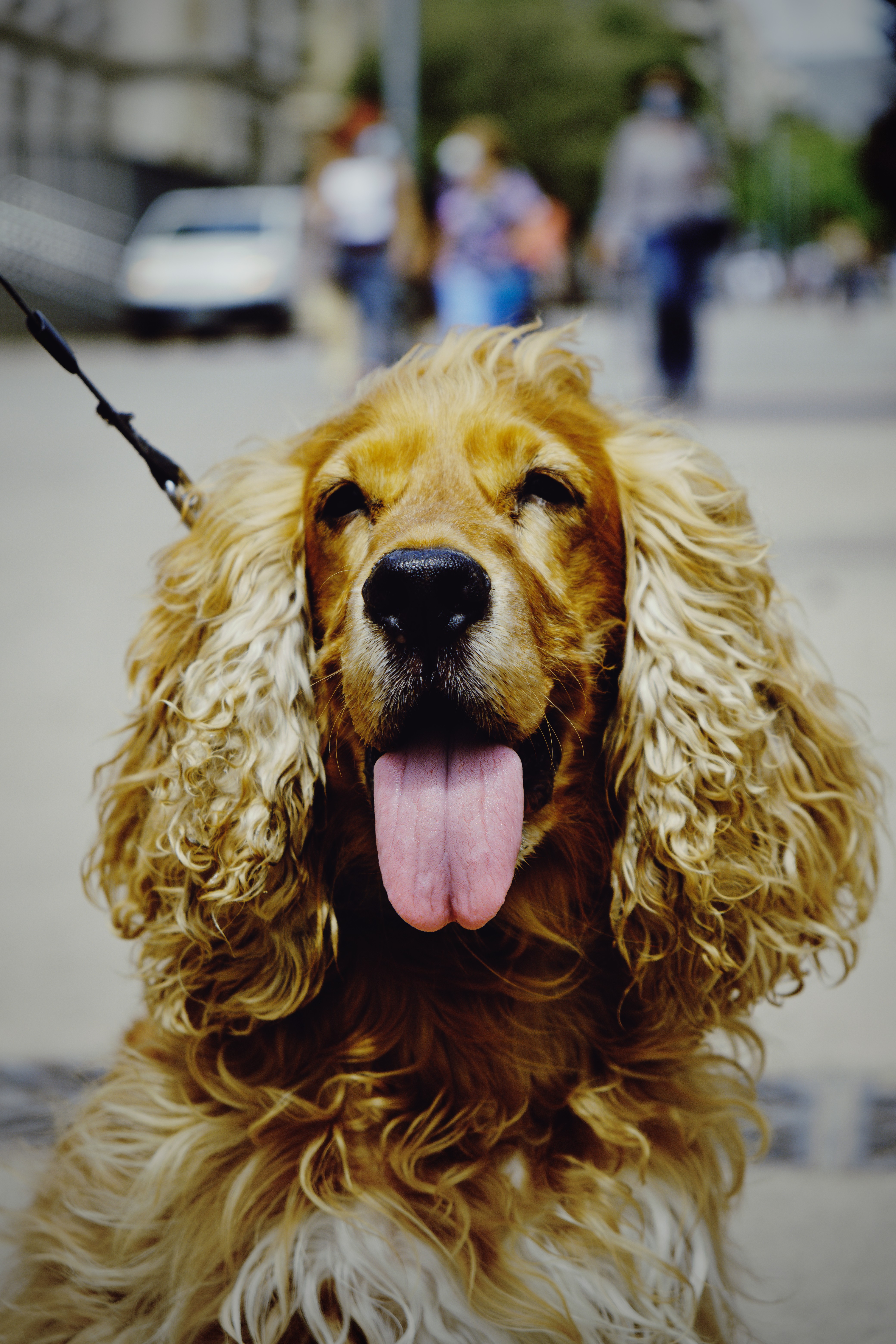
The results? Tell me this guy couldn’t go to the frontpage of Woof weekly as the dog of the year
Okay, you probably also wanna do a bit of desaturation and color and general color balance rgb work. This is the final version with that, and some vignette
The LUT basically does the tone mapping, so the default ordering is what you want. That way, whatever would have ended up before your tone mapper ends up before the LUT, and vice versa
keep in mind that the 3DLut module is in display referred mode - so the tone mapping is done by clipping everything outside the 0-1 range.
a tonemapper maps the max. of the range to 1.
well, I guess either you die as a darktable user or you live long enough to fork it and mess with the code. doesnt really make a difference though. My understanding is that slide film in its purest form is just really this crazy. (pardon my white balance)

 Nice work, though!