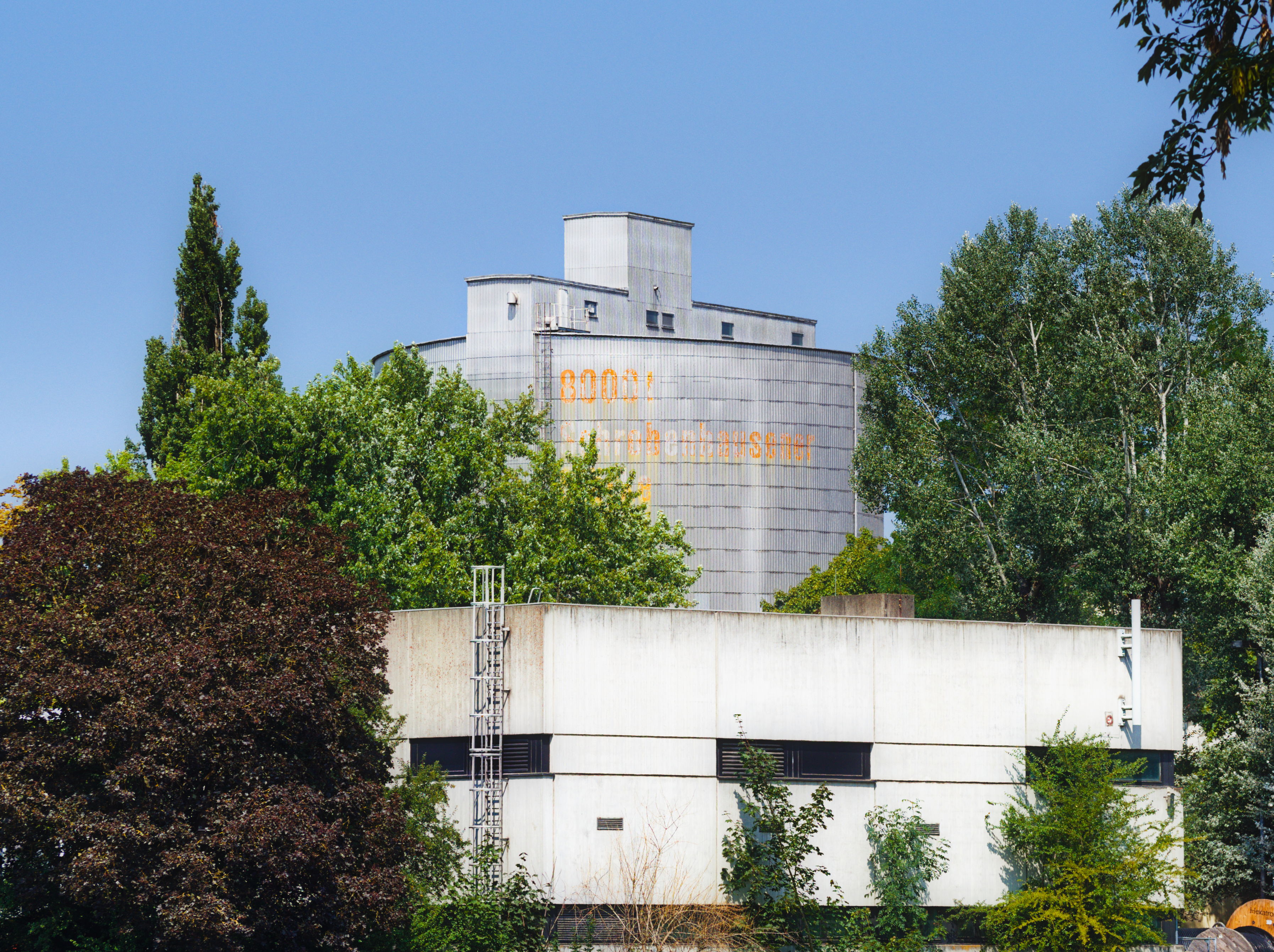
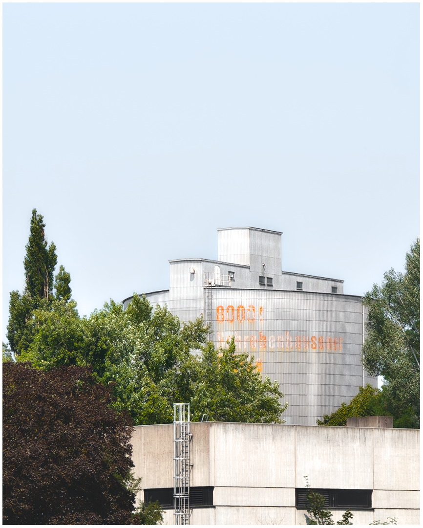
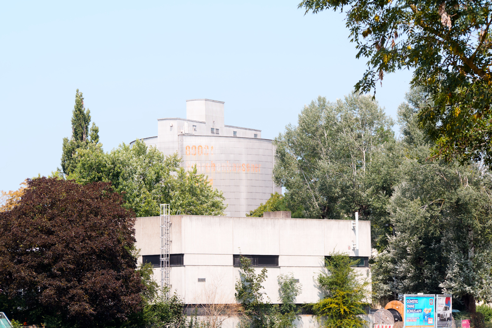
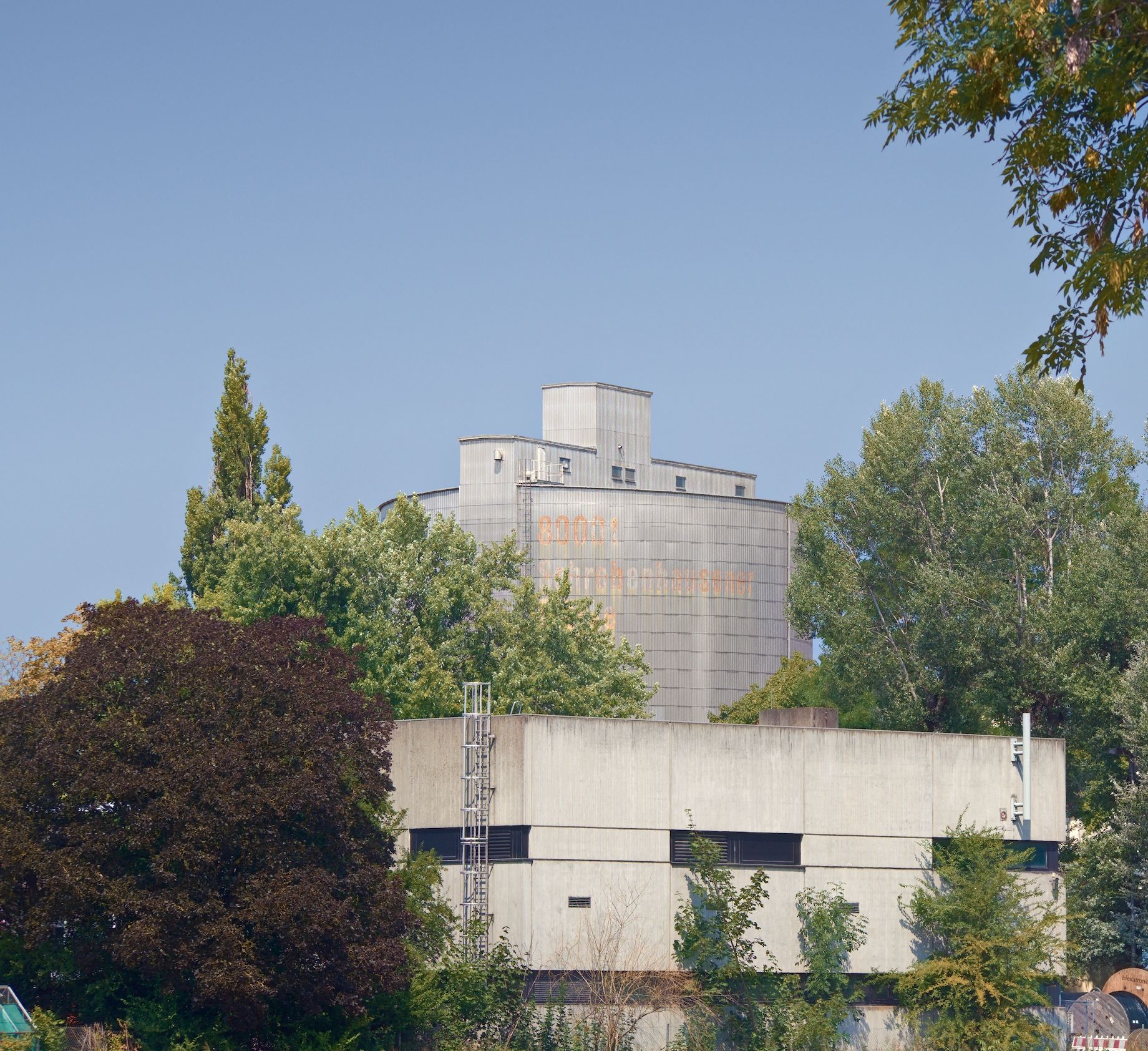
I took this picture of a (starch) silo and wanted to give it a softer, summer look. Recently, I watched quite a few videos of James Popsys and wanted to go a bit into his style of editing, but I was lost on this picture. Curious to see your interpretations.
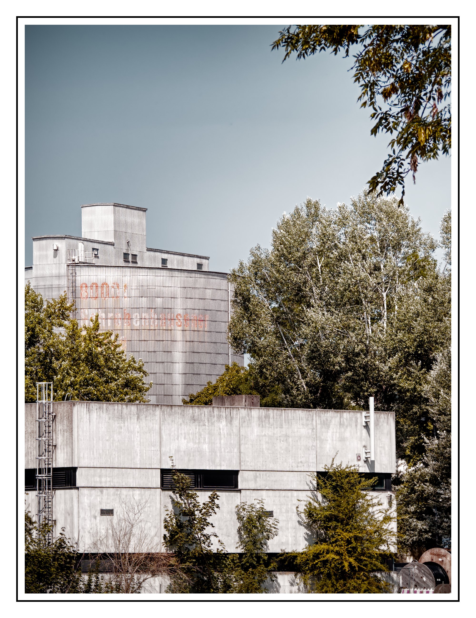
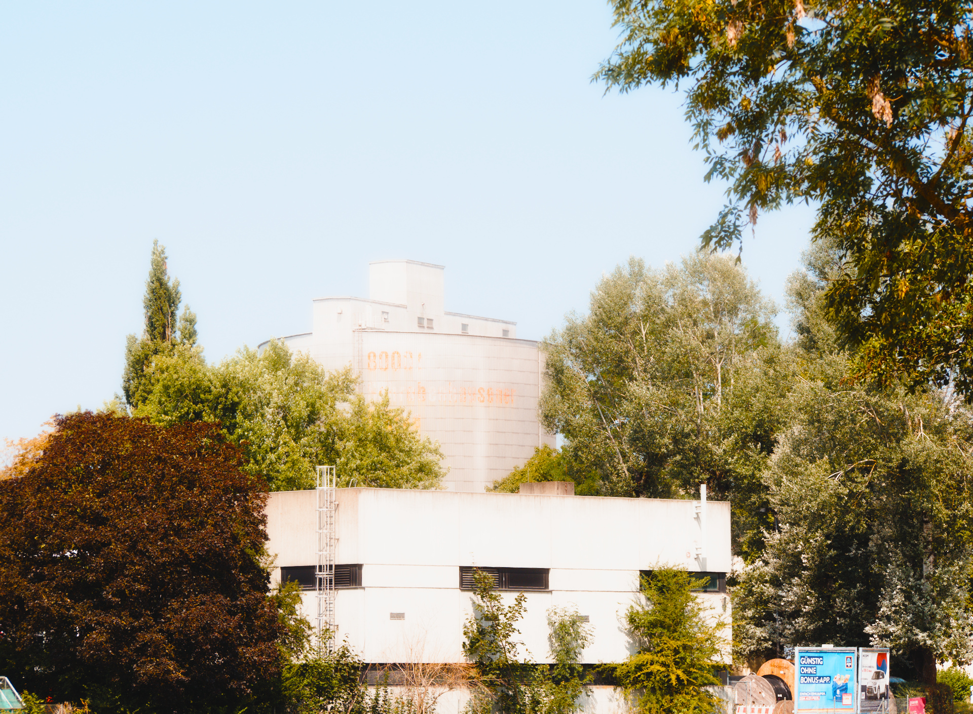
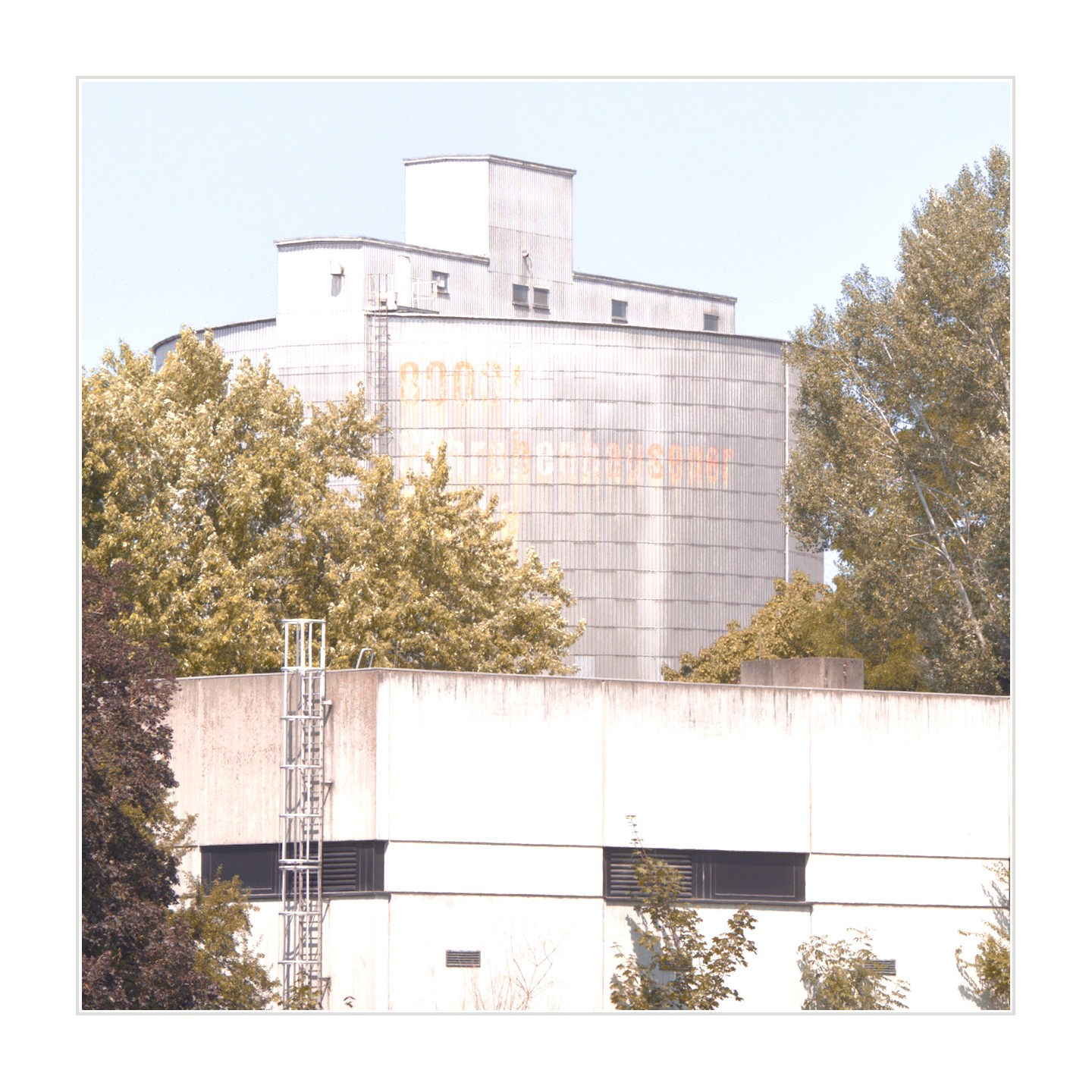
Here is my take in DT 5.6. Instead of sharpening the image I softened it a little with a preset for softer skin that I have made for DoS module. In the AgX module I lifted the shadows a little to move the blacks to a shade of grey. Not something that I personally like but I was trying to consider your intention. I did a square crop to get rid of distractions and maximise the building.
To get the look you want, you might want first to look at the way JP frames and composes his photos. Often there is good isolation of the subject, and he tends to use nearly-blown skies as a “negative space.”
It should be possible to brighten the sky in your image, but that’s only part of the style.
I think he did a video once where he shows how he edits.
Before my render a few thoughts, Maybe they sound a bit harsh, but they are meant positive.
Wouldn’t Mr. Popsys be a poor photographer when his style would by just some special editing on his RAWs? Don’t you think that there is more?
Like waiting for a special light when taking the photo and playing with this (look on his pictures, where the light comes from, when he is taking his shots). Don’t you think his photos work like they do, because he is choosing his subjects including the colour palette accordingly?
This brings me to further questions:
Why do I try to copy someone’s style (when I usually choose completely different subjects in different light)? Wouldn’t it be better to create my own style which is fitting to my photography? If you are able to paint like van Gogh, wouldn’t it be a waste of talent if you just copy his pictures instead of creating your own with your own style?
As You can see, I’m not a big fan of copycatting.
This said, it makes of course any time sense to analyse pictures of others. What makes them special? Why do they work? Is there something I can learn from?
But have in mínd that there is much more than just editing. Taking the photo, on the right time and choosing the light you need for the thoughtful chosen subject. Deciding for a proper composition…
So here comes somehow a touch of Popsys without any chance to carry real magic as it isn’t a coastal shot with its typical light taken in the late afternoon.:
I think the editing style can be replicated but it needs at least a stronger backround foreground separation where the background should be hazy and dreamy and the foreground should have much more contrast. Though I totally agree with what Doug and Uli wrote.
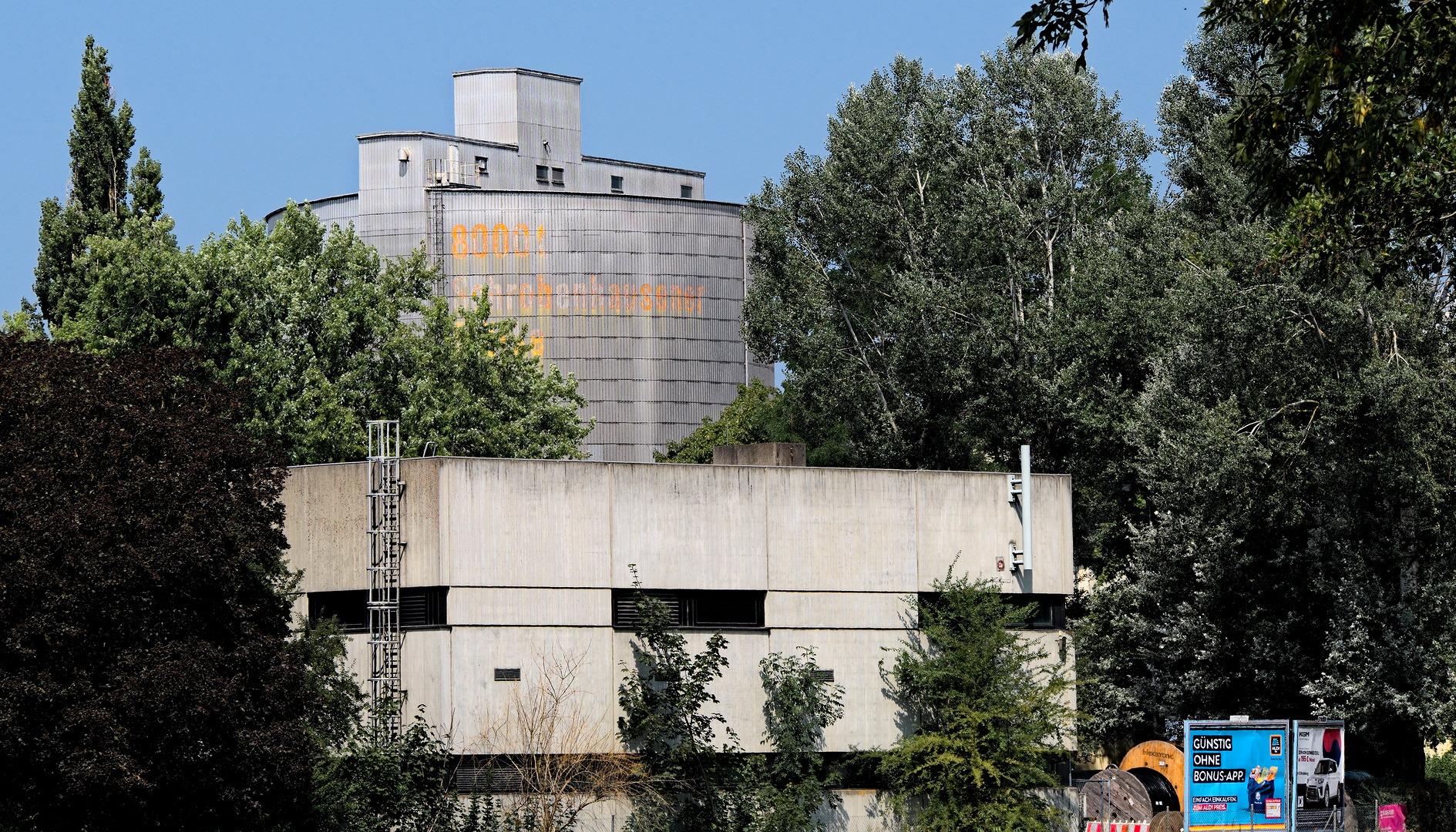
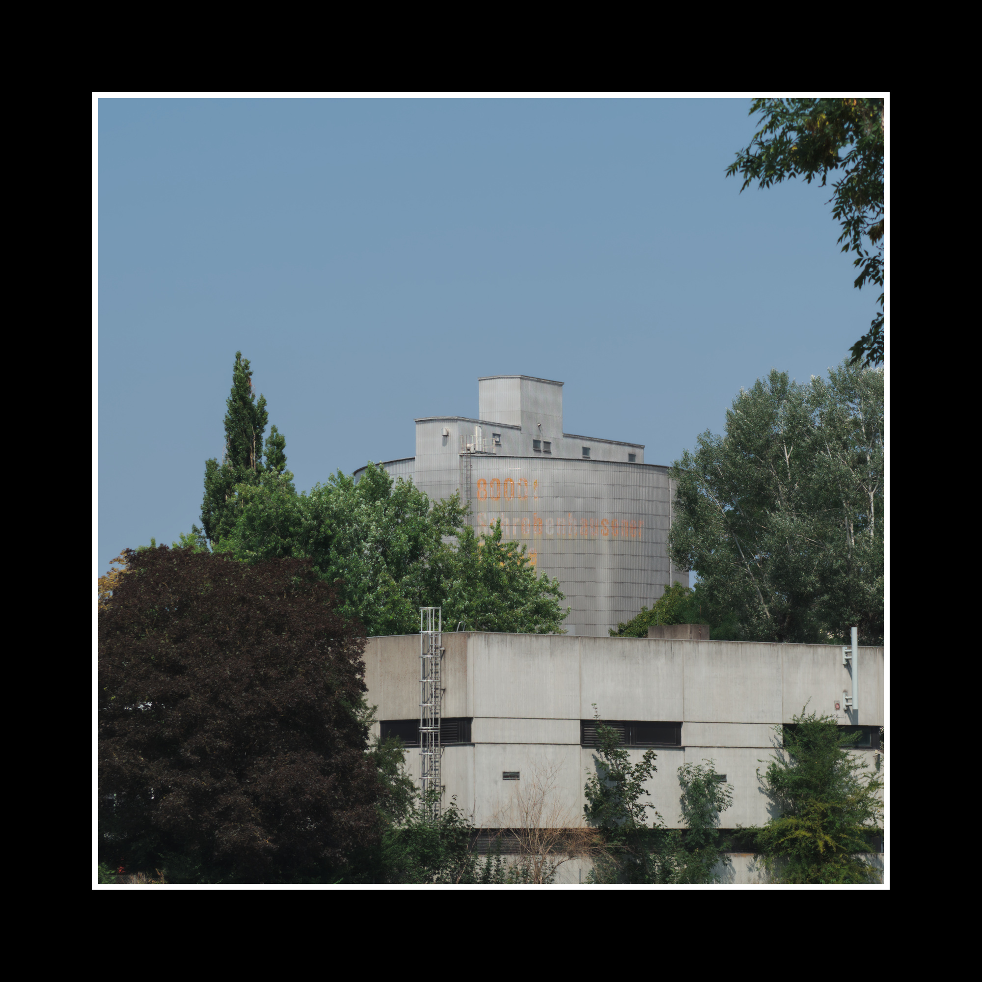
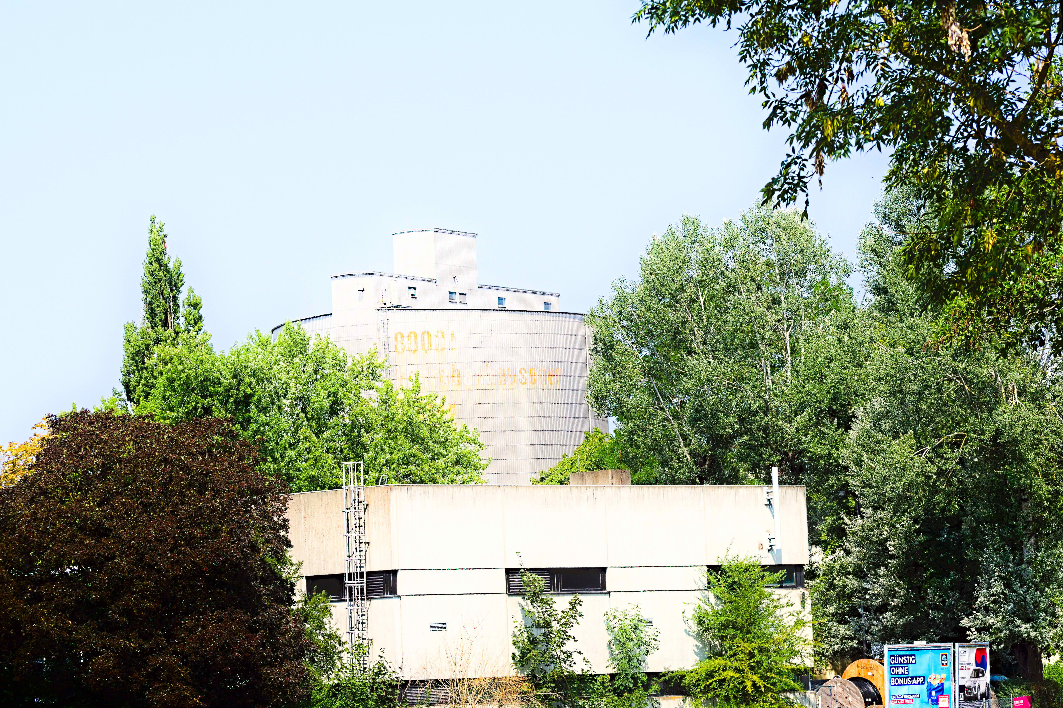
If I had to imitate his style it would be something like this for this photograph, but as others have mentioned it’s the frame that matters, not the edit.
Overall he has a strong global contrast to the point where he sacrifices the sky in order to broaden the dynamic range on the subject. I’ve set tone equalizer to “contrast curve - soft” for the global contrast. His midtone contrast is also quite sharp, so I’ve set my exposure to middle grey and I’ve set AgX contrast to 4.0. Colours wise I haven’t studied his work that much, but they’re quite punchy, so in color balance rgb +20% vibrance, +20% saturation, +40% highlight saturation. Also in my opinion his palette is compressed in a way that I’ve expressed with the rgb primaries: green +5, blue -5, and a slight olive tint around 75 degrees +1%.
I’ve set my white balance to be quite neutral here (daylight 4400K in color calibration) but I think his work comes across as warmer than this, though I think he had times when he was editing much colder than he does now
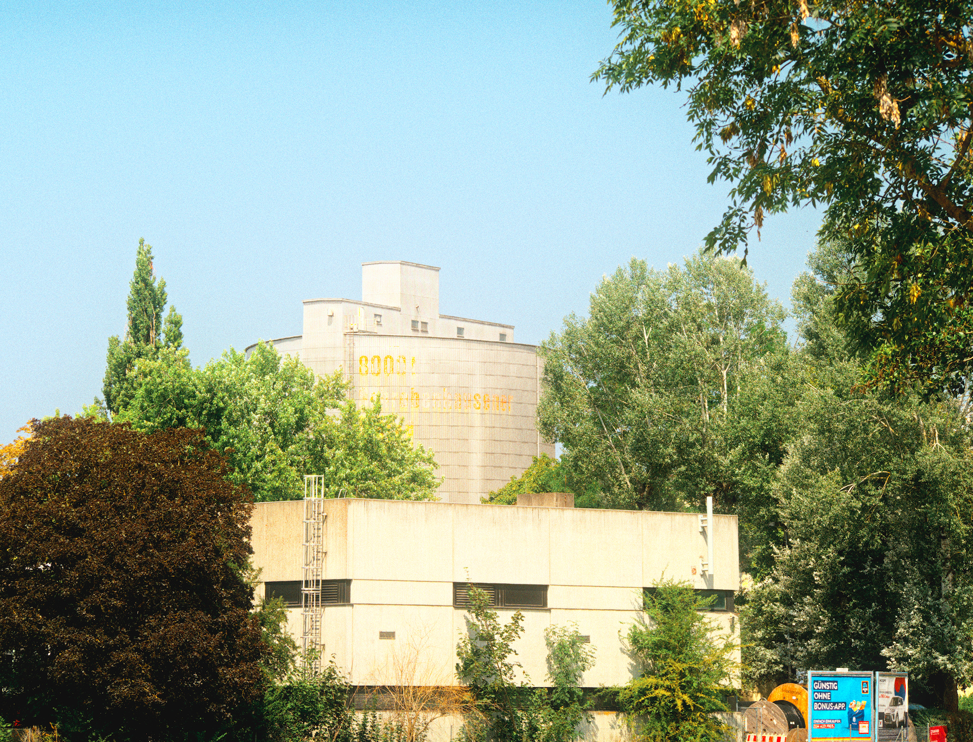
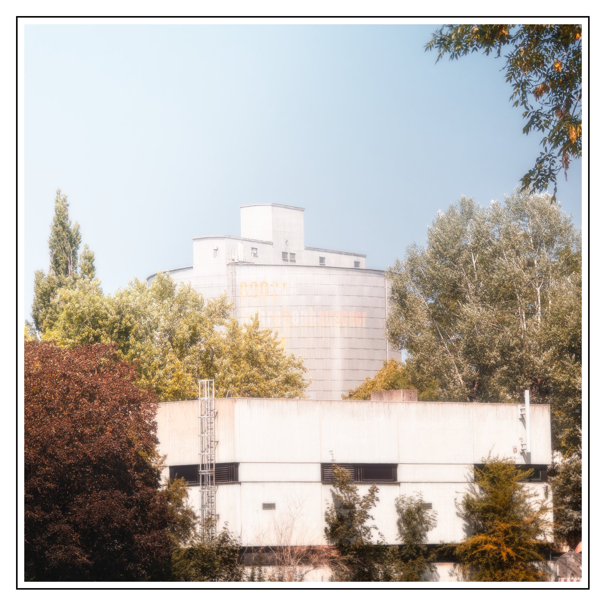
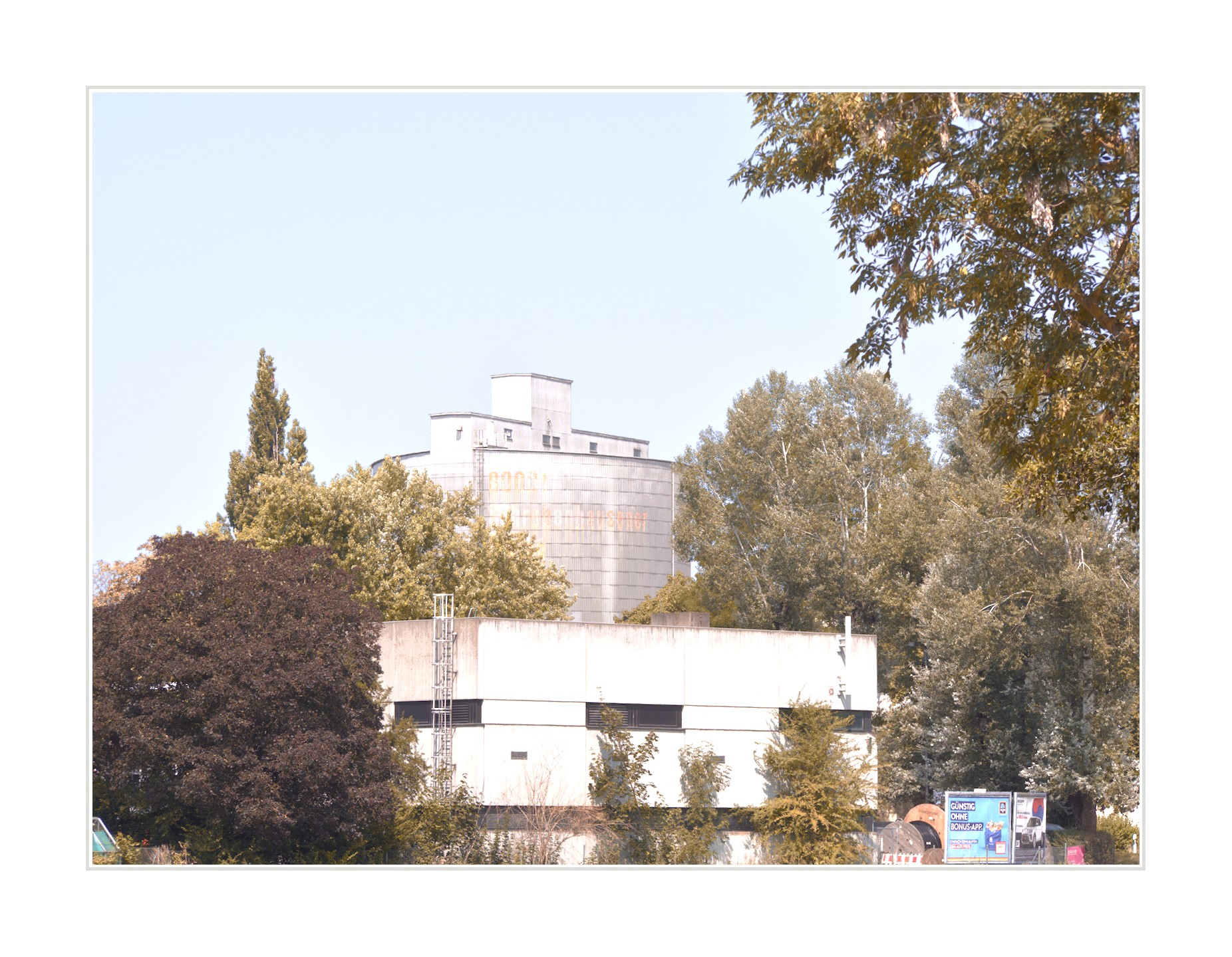
Not emulating Popsys, just trying to say ‘summer’ with this. However, I couldn’t even decide whether to give it a blue or yellow tint… I’m choosing the yellow one here.
I gave it lots of saturation, then removed a lot of it with colour zones.
I am the last one to make any artistic assertion but would this be a good photo for that sort of processing…When I look at his page, his photos have a subject or foreground element with color and/or a composition that isolates some element of the photo with some color…here the subject is likely this building and its already a sort of washed out structure…
So I am sure there are creative people out there that can do magic with any image but it wouldn’t be my first choice for an image to apply that sort of artistic style to…
Its hard because he likes more ‘empty’ space and the sun is usually in front of the camera (not behind/over the shoulder). Or, at least, that is what I remember. Its been a while though, so maybe I am way off base with those ‘observations’ lol
I read your answers and you are right. Maybe I was also a bit too lazy too express myself in another way. My wish was more about understanding how to get a soft and creamy look in the pictures, rather than copying the complete style of photography of somebody else which is also much more dependent on taking a good picture in the first place.
So I’ve read/seen that raising the blacks, lowering the whites, reducing contrast and that lowering the saturation while increasing the luminance can be used, but I am never really happy with my results.
I see a lot of your pictures and xmp which I am going to check out and learn
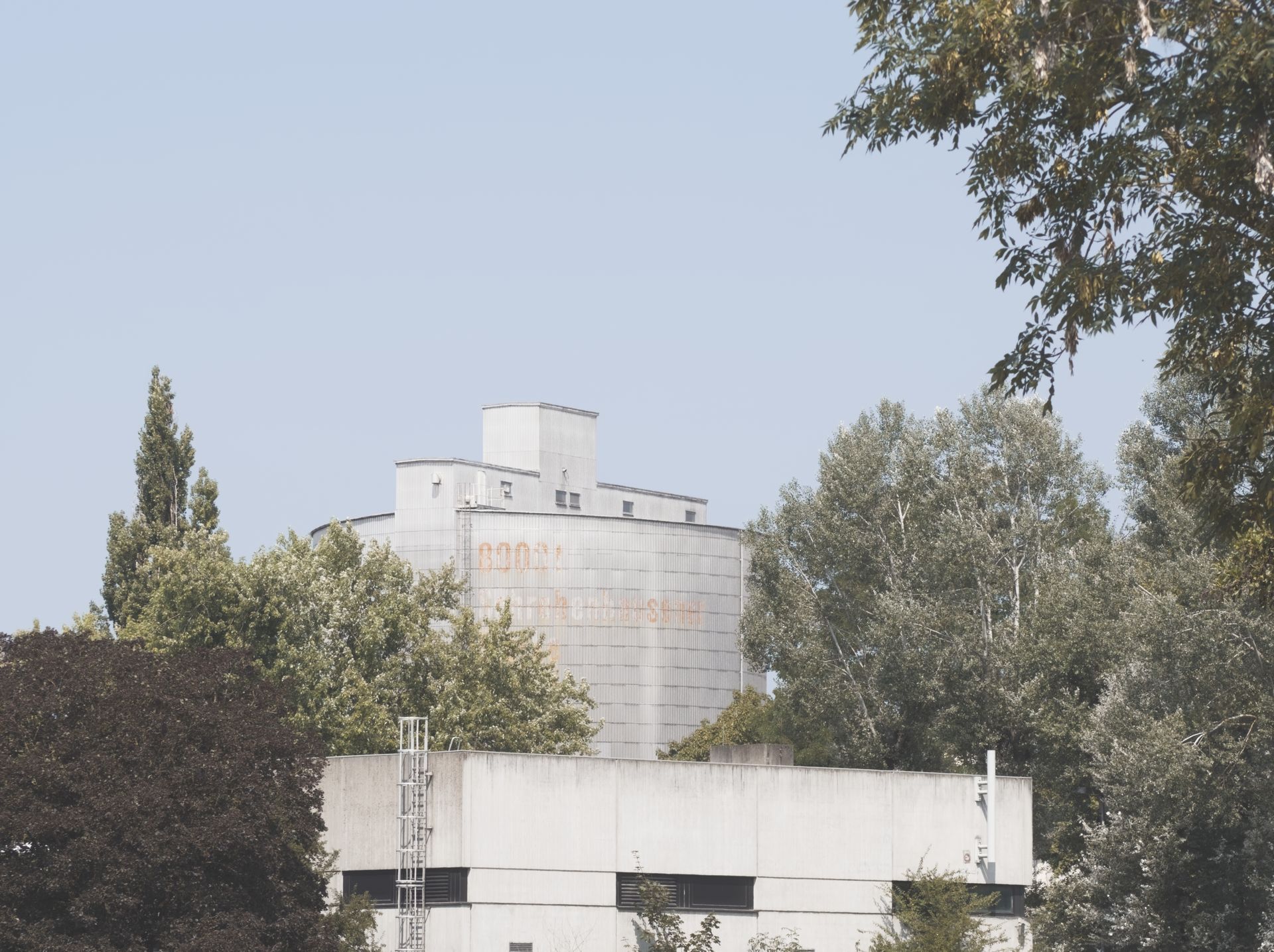
 )
)