I’m using the scene-referred workflow in Darktable. The color calibration module does a good job at white-balancing images even under challenging lighting conditions (say LED light).
However, the result has perfect neutral white balance, but for atmospheric pictures (say winter evening indoor shots), I’d like to keep some degree of warm lighting.
With more simplistic raw developers, I would simply adjust the white balance color temperature. But this approach does not work well with modern Darktable: if in color calibration I switch the illuminant to black body (to get the temperature slider), a slight color cast appears. I do like the result of darktable’s white balancing with its “custom illuminant”. All I would like, in a second step, is to map white (and correspondingly every other color) to a warmer variant.
I imagine this to be a common thing people might want to do, so I expected that it would be easy. But so far I could not find a satisfactory way (I searched this forum, the web, and studied the documentation). The best I’ve been able to come up with is adding a second “color calibration” module, switching it to “black body”, and setting some very high color temperature (like 7000 K or more). But this displays a warning, and I do not think that the result is very good.
I imagine that it would be useful if there was a way to simulate the following:
Correctly white-balance the image (this works)
“Print” the image on white paper
Illuminate the “printed” image with an red-yellowish light
This should be equivalent to remapping the RGB values and I see that this is possible in the color calibration module. But how to find out the correct values (relative to each other), for a realistic light source (say a 2700 K black body)?
Normally you can just let it do as shot and then toggle to custom…there is no change its a bit neutral often as you say…so you just slowly drop the chroma slider and this will bring some of the light back in… you can of course tweak the hue as well . You can also introduce color with rgb color balance… There you can just pick the hue and add some or using the pickers…by default they will select the opponent color but if you add 180 degrees you can add the color…this can be used to enhance the lighting… or simply skip CC module and use normal wb and warm it… lots of ways to mess with the lighting…
I think one of the ‘recommended’ approaches to this is to keep the neutral white balance, then in color balance rgb, under the 4 ways tab, use either the offset or power groups of sliders to add a warm tone back in. I can’t remember offhand which group or sliders is actually equivalant to white balance, but I often have nice results using the ‘power’ set.
The other option which is often mentioned is to simply lower the ‘chroma’ slider in the custom illuminant interface to reduce the degree of correction. I sometimes find this doesn’t look right though without wiggling the hue slider as well.
Gosh… 2 posts popped up while I was writing this. I’m redundant…
Personally, I find the 4 ways tab confusing. I would love to see a video which focuses strictly on this feature and is explained clearly without too much techno jargon.
Hello,
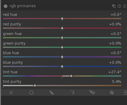
Personally, I prefer to set the light admosphere with the Primaries RGB module, with which we can set the colors and the white point separately.
I take this opportunity to wish you a happy new year 2024,
Christian
What is confusing?? You are adding color/luma in the tonal regions…mask is set in the next tab… The pickers are designed to cancel out a color cast… so if your shadows are bluish you will see some yellowish hue and some chroma to cancel it… if you want to enhance the blue then type +180 on that hue the picker determined and you can boost that color in the given area… Other wise you are just picking your own color or brightness to add for effect… Perhaps I am missing something… I actually think at one time Boris did a video where he did edits on a series of photos and he only used rgb colorbalance…multiple instances of course…
I would probably take the simplistic approach and disable the color calibration module and just use the WB module like any standard programs workflow. Another way to add warmth would be to use the RGB curves module to add yellow by lowering the blue curve and add red by raising the red curve to achieve the desired warmth. I often use the RGB curves module to do final tweaks of color. You also have got good suggestions from others here so do what works best and easiest for you.
I used to find it off putting actually. I’m not quite sure why, but I just couldn’t get the hang of “when to do what”.
But after some time of experimenting and seeing how others used it - it just clicked so as to speak.
As Todd says it pretty simple really, but I do feel there’s a surprising amount of flexibility in what you actually use it for.
One should never assume and I am very often guilty of just that … I often have to go back to read the manual just to be sure… I often use the global luminance in the 4-way tab to drop the waveform down ie like a black point compensation… and I always set the masks with the pickers before using the module. I use the initial workflow script to set that auto exposure and to set the tone eq mask so its ready to go…essentially its like cycling through the modules and hitting all the autopickers… but it can help to target the adjustments and though I don’t often move the mask in rgb CB other than the auto settings you can actually really impact the image by doing so…
I rarely use the standard histogram any more and I find this really helped my editing. You can really just see what is going on by using the waveforms and then swapping to the vectorscope when messing with color… They are great tools for when you are experimenting as well… I find that you really don’t capture the nuance when you use the traditional histogram…
Its the older version of the module but in video’s 23 and 32 Boris @s7habo expertly demonstrates it very well… in 23 his edit is done with I think 6 instances only that module…