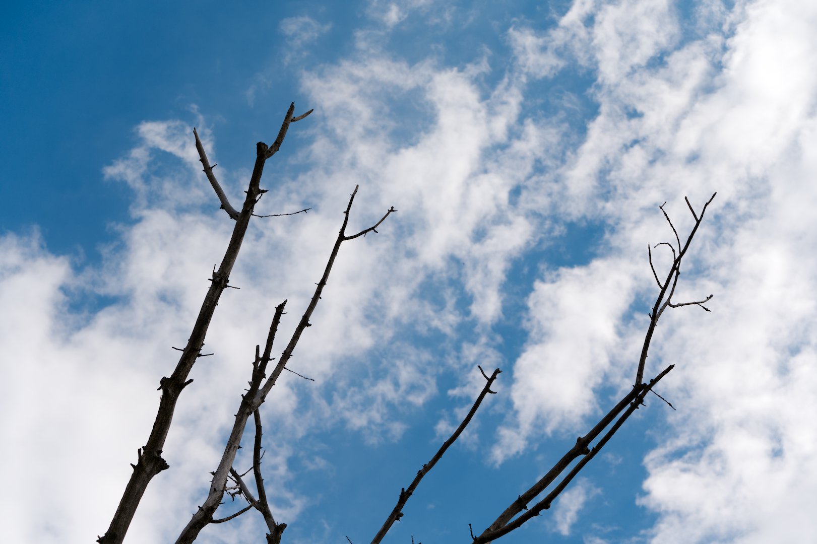
I’m not good at writing fancy text, so I’ll get straight to the point… Last month I went for a photography walk and besides some bird photos I got a few random shots and one of them was this seemingly dry tree.
I thought it looked cool, but in Darktable it was rather boring no matter what I did to the image. So I thought… let’s spice it up in a Vente-kind-of way. Besides a “normal” edit …
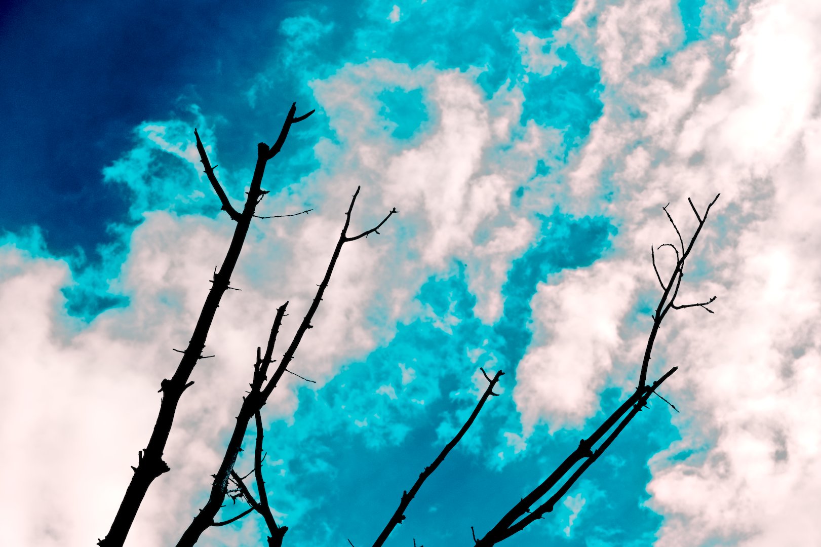
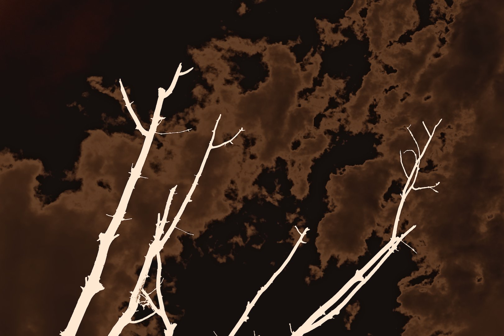
… I’ve done four more, all with the help of some crazy settings in Color Look Up Table module (and a color negative LUT for two of them). Some ended up looking quite abstract which I like a lot.
I wonder… which one do you like the most? Mine is _04, probably because it looks like coffee and there is something satisfying about the tones of the photo.
02 is my preferred version but it just beats out 03.
If the grey and aqua/cyan portions of 03 were slightly smoothed/ made streaks it would take on the appearance of blue flames (like a gas stove) which would be somewhat fitting for the scorching so many people got last month.
I have already tried to blend the blue a bit with D&S module (with chromaticity blending), but it didn’t help too much sadly. I could tweak the CLUT module some more perhaps…