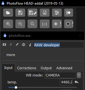
Unfortunately, the deep blue won’t sit well with our no distraction grey friends. 
Most wanted feature are:
- Wavelet sharp and denoise.
- Object removing.
Not instantly but very useful features.
Nice. At first look the look reminded me of RT…
For me it was just important that there is more space for the image but this UI looks good, but the more minute slider etc of the old UI, I prefer.
@afre I guess the blue can changed.
The small sliders definitely look better!!
Is the floating thing optional or fixed in this UI?
It’s optional as usual, but I still have to check how it looks like with tool controls below the layers list…
This last UI looks nice!
IMHO, It looks better than the official UI.
To confirm my feeling it should be tested on various platforms (e.g. Windows 10) since, from your screenshots, it looks like it is currently tested mostly on the Mac OS, right now 
I downloaded the latest. Several issues.
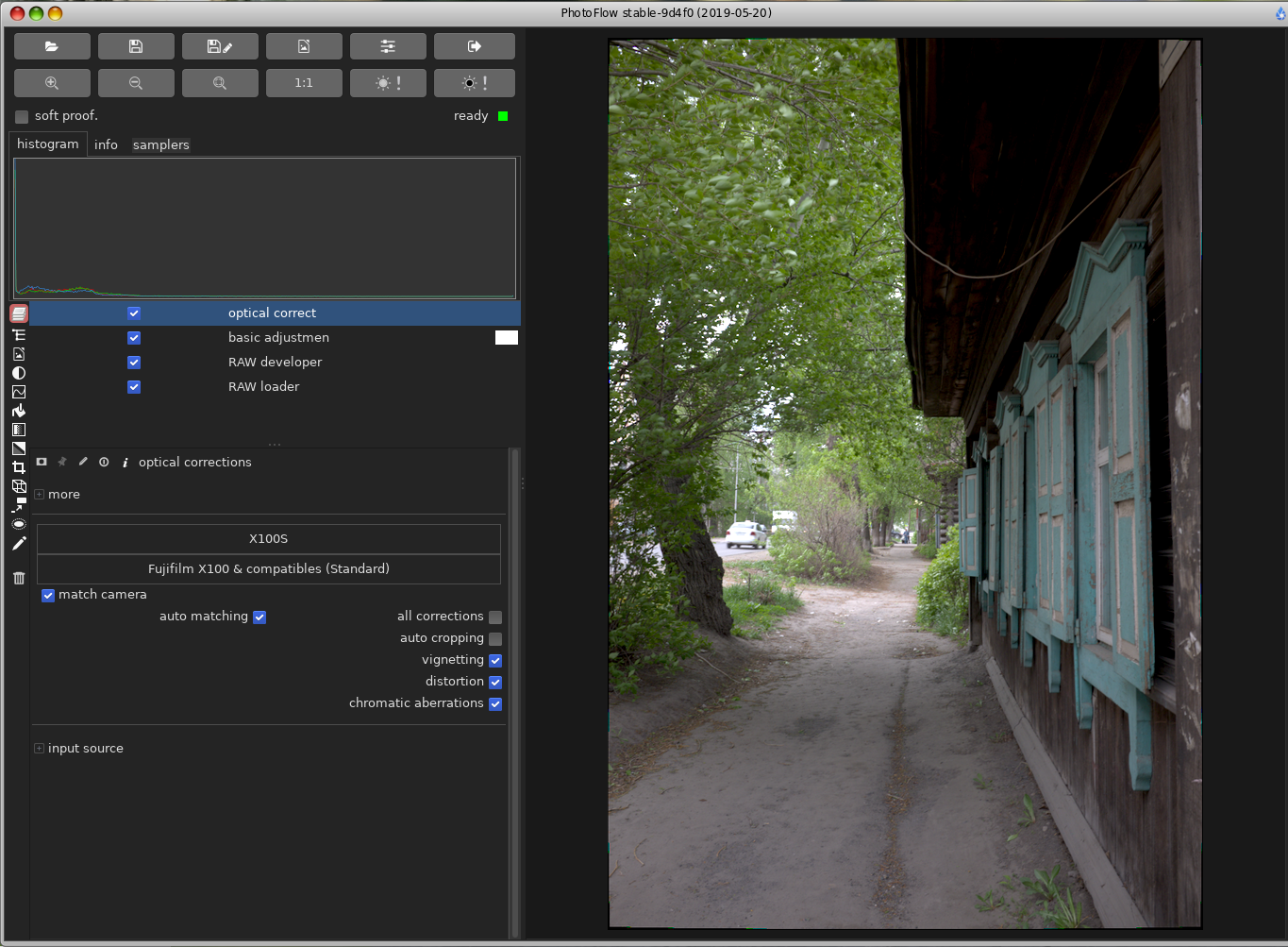
1 The side panel takes up about a 1/3 of the screen.
2 Tool tips font colour is barely legible.
3 Large gap underneath mask, pin and info.
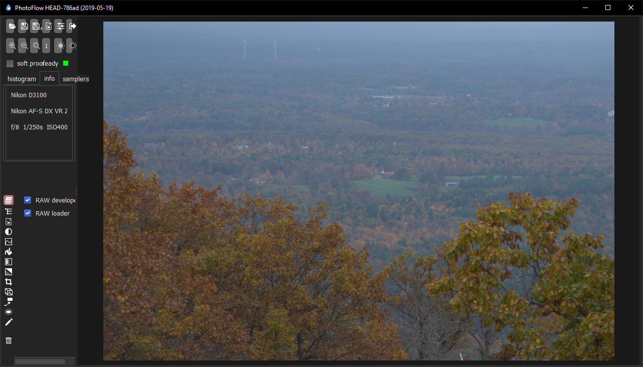
4 Missing filename!
5 Floating samplers doesn’t have a close button.
6 Closing samplers window places samplers after Info tab.
See window bar, title and icon for size comparison.
Edit: vs floating window width and layout.
- the width of the left panel should be adjustable. Is that the minimum size you can get? Did you try to reduce the width? The value of the width is stored in the configuration and loaded the next time the program is started.
- I will check where this is defined in the GTK2 configuration
- that’s where the opacity and layer blend mode controls go for layers that support it. The RAW developer does not support blend modes, that’s why the space is empty. I have so far not found a better way to handle this
- I know, my idea is to put the file name in the window title when only one file is opened and there are no tabs
- I will add a close button
- I might just put them after the info tab by default…
Hi, author! Thanks for new GUI, sliders looks and works very good.
Now - what is needed for photographs.
- Gradient have not intuitive interface. For photo purposes we need masks with controlled length, width, direction.
- Very needed selective colors! We need (in Linux) to work with human defined colors (not RGB but all rainbow colors) and need for example to minimize yellow in all maroon spots.
1 Unfortunately, it is minimum width already, at least on my machine! I can decrease the width now. The rightmost icons are trimmed slightly.
PS
What are the default black levels? I see 128,128,129,129…

@afre meanwhile I have modified the code so that the left panel can be squeezed smaller than its natural size, if needed.
The default black levels are those reported by the RAW decoding library. They should not be modified unless one knows exactly what he is doing, and has good reasons to suspect that the default values are wrong…
Thanks for checking!
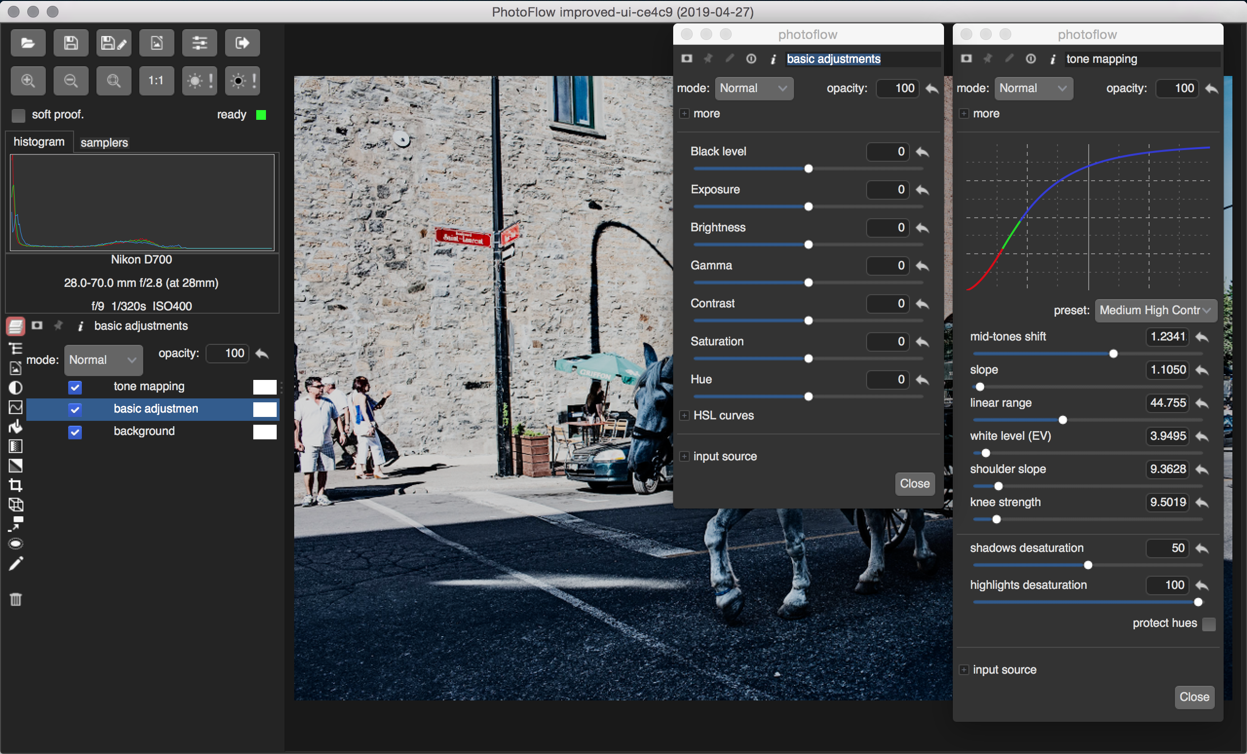
Before, I could resize it only half the time. Now, it is much better. Unfortunately, everything scrunches up. I suggest that we have a scroll bar for the entire panel. Right now, it is only for the layer list. Lastly, the samplers tab is in its own little world. 
1 Like
– Looks like samplers still doesn’t have a close button.
– Button order (and labels?) inconsistent. E.g.,
Save image as… → Cancel Save
Export image → OK Cancel
Open image → Cancel Open
Settings → OK Cancel
Exit dialogue → Yes No
1 Like
You are right. I have opted for having the “Cancel” button always first, as this is the default layout for the GTK file dialogs. I have also added a “Close” button for the samplers dialog.
Do you think it would be more logical to have a Cancel/Save button pair also for the export and settings dialogs?
Cancel Confirm would be my goto set.
You could also elaborate on Confirm by replacing it with Export, etc. I recommend:
Export: Cancel Export
Settings: Cancel Confirm (or Cancel Save)
Exit: Cancel Confirm (or Cancel Yes)
1 Like
I think that slider have too wide range of adjustment. In a most cases ist’s enough to move slider ± 1 - 5 units, but all sliders have range 0 - 50 (for example).
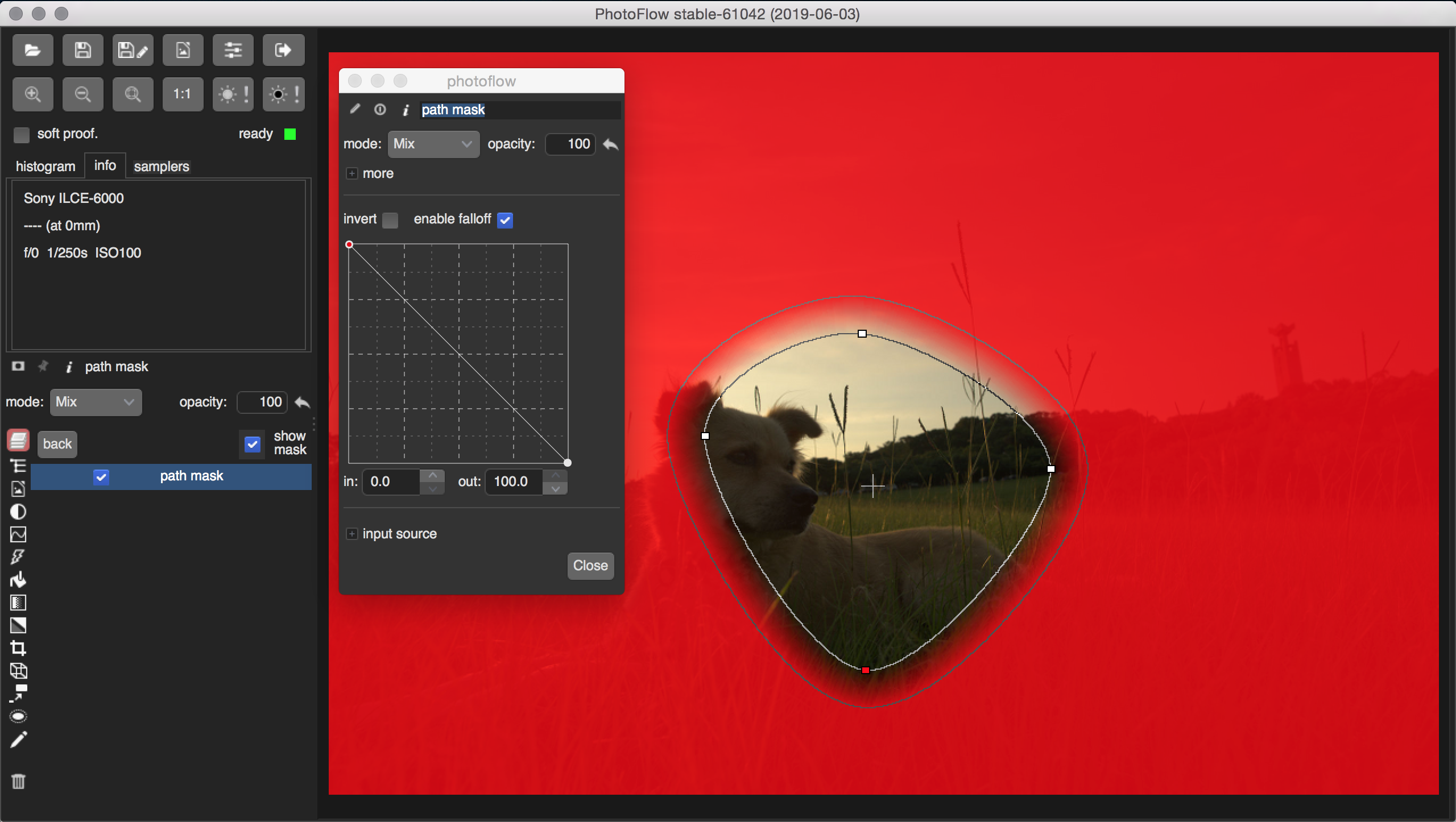
And about “mask” layers – mask must be on transparent layer, I have to see what I cover by this mask.
Do you have an example? Range depends on the image and what the user wants. Re-framing your question, maybe what you want is finer or coarser increments. Does that sound about right?
By that, do you mean an overlay? If so, I agree that that would help. Personally, I don’t use masks in pf because they aren’t intuitive and crash if I do it wrong or step on a bug.