Getting towards the end of the year, so happy new year to you all.
I thought I’d share some musings on darktable workflows from a personal perspective and seek some insight from all you experts out there…
Ever since darktable shifted its stance towards scene-referred processing and introduced more modern workflow modules such as the various tone mappers, I’ve made various attempts at adjusting my workflow, but in the end I have settled on a simplified and non-standard approach that works much better for me than what appears to now be the recommended methods. I was wondering why that is.
Let me start by describing my 2025 era personal workflow:
I have the workflow options disabled in the settings (that is, pixel workflow defaults = none). This results in my initial imports being dark and murky.
I address this by first applying the local contrast module using the clarity preset. I assume this is intended to add a bit of crunch to the image, but to my eye what it seems to do is some tone mapping: generally it seems to lift shadows and midtones a bit and smooth out the tonal range. Not sure what is really happening under the hood, but that is what it appears to do for many images.
Then I use the Colour balance RGB module sliders (the perceptual brilliance grading panel) as basically my substitute for Lightroom’s global exposure/brightness/contrast/lights/darks/highlights/shadows sliders.
Finally, I fine tune mid tone brightness with a simple curve with a single anchor at the midpoint.
If any local editing is required, I use extra curve instances with masking to simulate photoshop adjustment layers in local areas of the image
Finally I fine-tune the edges and corners using the graduated filter and vignette tools
I use the contrast equaliser and the diffuse and sharpen modules only as sharpening tools (using presets only)
Sometimes I also the haze removal module as a kind of shadows/darks enhancer contrast tool.
Entirely missing from this are the three tone mapper tools that are supposed to be central to the scene-referred approach.
I have tried adding them to my workflow, but they just mess up my normal approach and I can’t really find a way to make use of them that makes sense.
In the end, I have found that the only time I switch on a tone mapper module is to when I have a tricky shot with rather hot highlights I need to tame or weirdly blown out colours at the edges of, say, a sunset. Aside from these edge cases, I can’t seem to find a use for them in normal shots, nor do I really grasp what problems all those complicated sliders are supposed to solve.
Can someone explain how my personal workflow actually works and what if anything I am missing out on by not routinely using one or more of the tone mappers?
Can’t find an edit button, so here’s a p.s. to my post.
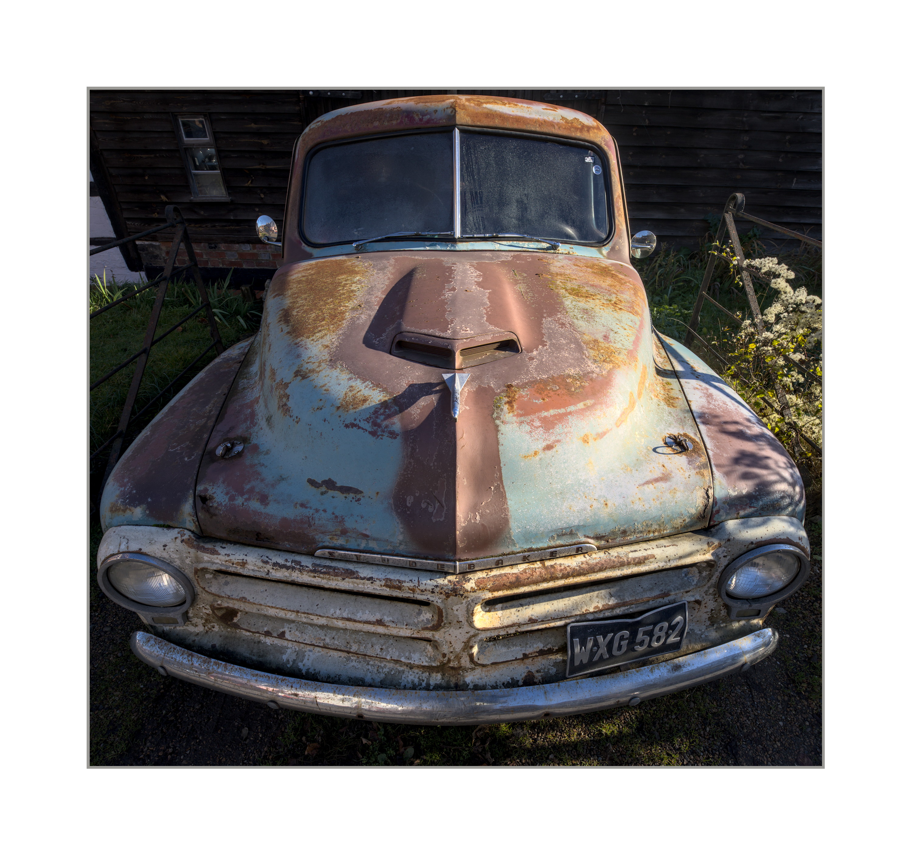
A picture is sometimes worth a thousand words. This is a shot processed with my personal workflow. How would this be improved by employing tone mapper techniques (say the new AGX module)?
If I wanted to do further tonal refinement with this image, my approach would be to create multiple instances of the curves tool used with individual masks to raise or lower the brightness of selective parts of the image. Dodging and burning, basically.
Would the tone mapper obviate the need to do this?
The best way to find out if the approach can be optimized is via PlayRaw. You submit one of your photos (raw files) with your editing and see how other people achieve a similar result.
I find the new AgX tone mapper is magic. The auto tune levels seem to sort out the bulk of the issue with the blacks and whites with a single click of the mouse. I then use the pivot target output to fine tune the final brightness of the image.
I personally don’t get hung up on scene referred verses display referred processing as long as the final look is what I want.
That car would make a nice playraw and let you judge for yourself what others do.
Thanks for the replies so far, although I’m still not really grasping what the tonemappers are for and how they would enhance editing.
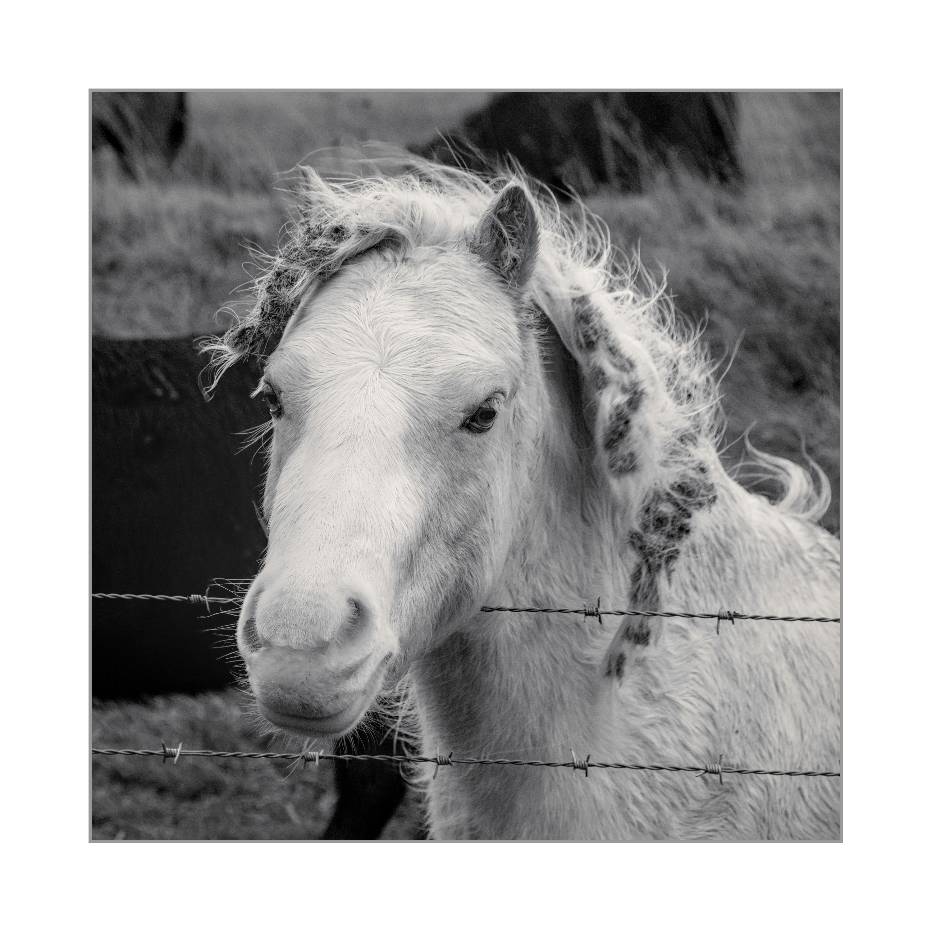
Here’s another image. This one uses 3Dlut Acros film solution plus a bit of split toning for the B&W treatment. Tones are editing simply using curves, Colour RGB and local contrast and haze removal; no tone mapper module used.
It looks ok to me, but am I missing out on something by not using AGX? If so, in what way would AGX have improved things?
At the end of the day, you need to map the vast dynamic range of the raw file to the rendered JPEG on your screen, while retaining a realistic rendition of contrast. How you do that is essentially up to you.
In your case, you seem to be using the tone curve to do this. Perhaps a more robust tool would be the base curve or the RGB tone curve. Both are better behaved “below zero” and “above one”. But if you have other tools to address these ranges, that’s fine too.
I’m not sure what you mean by the tone curve. I use RGB Curves and colour RGB, with some help from Local contrast, haze removal, Vignetting and grad density modules.
I remember base curve, it’s the old simple tone mapper that provides a default look to different camera brands (I assume there is a separate camera colour profile hidden away somewhere as well that mimics brands’ out of camera jpeg default colours) . I’ve made the assumption that the 3 tone mapper options are replacements for base curve and that when I set my default workflow to “None” in settings base curve is also disabled.
The implication from all the documentation, YT videos and debates is that a tone mapper like AGX isn’t just an automated way of giving you the curves and masks techniques I do manually, but is some kind of sophisticated mathematical method of doing something extra, something I’m missing out on using my old-school dodging and burning methods. But I don’t understand what that extra magic is.
In fact, I struggle to imagine what it could be - what is there other than raising or lowering the brightness of narrow ranges of tones like I do with curves and masks? What other parameters are there to mess with that AGX is manipulating, and what do you use them for?
I have occasionally used Filmic. I don’t know what it is for either, but I found that if I moved the white and black relative exposure sliders with some images where I was finding it difficult to manage blown highlights, it could sometimes help. I didn’t use it for anything else because I don’t understand the terminology it uses, or its user interface; and randomly pushing and pulling controls seems to be of little use.
It would be quite useful to me if someone could explain what these tone mapping tools do to the tones that can’t be done simply by adjusting a curve. I know it is difficult to put yourself in the mind of a confused person and put them straight, but if I understood what they do, I might be able to figure out something I could do with them
Here’s another recent image edited with base curve, filmic, sigmoid and AGX disabled. If I switched on AGX, what could I do with it to improve the image?
The tone mappers are all about maintaining midtone contrast, and regulating the look of overexposed highlights (as with your filmic example). If you have no problem with those, you don’t need them.
Ah, so they don’t give any kind of special look to perfectly average, unchallenging images, they are there as a way of fixing tricky exposures and high contrast/saturation?
For regular images, I can switch them off and carry on with my old fashioned dodging and burning. That way I have them in reserve for those images where I’ve exposed hot or got colours going weird and not have to try and force them into my workflow for every image…
The tone mappers allow for a sort of midtone centric approach. You can expose or adjust exposure to give you really nice midtones/subject. This is generally desirable and will preserve the most detail. In doing so you then might have bumped highlights and or shadows to a place that needs correcting… Here the tone mappers are used to manage the mapping of that dynamic range for display. Usually your image is going to have a lot more DNR than your display device and this allows you to make the most of it
Tone mappers deal primarily with the dynamic range of the image, mapping it to the destination (screen). In addition to that, they deal with colours: in case of filmic, making sure hue is unchanged, in case of AgX, trying to imitate how hue shifts in highlights. They also try to manage saturation: filmic tries to make sure saturation is preserved (you can change this), and also that the output fits inside the output space (there are no oversaturated colours). AgX provides a ‘path to white’, in general desaturating brighter tones.
So far, these tone mappers are basically per-pixel operations, except the highlight reconstruction of filmic, where pixels influence nearby pixels.
Dodge and burn are locally applied (masked) operations, they don’t affect all pixels.
The good news is that almost any workflow you want you can create. The good/bad news is there isn’t an “opinionated” workflow to “guide/restrict” you.
The issue is that image dynamic range is greater that display dynamic range and how to fit one inside the other.
display referred maps the image range to the display range at the start of processing and then expects all processing to take place within the display dynamic range.
scene referred let’s all processing take place in image range (unrestricted) and then maps that to display range at the end with a tone mapper.
none let’s you decide. You edit the photo and manage the dynamic range while you do it.
You will need to share a raw file and your sidecar to get a decent answer and or example. Then you will be able to compare your wf to that of others using the tone mapper. In the meantime as a course and extreme example take an image and put the exposure picker on your subject and set the exposure. This doesn’t work for all images but it will often give you a sense the tone mapping WF. It may be much more exposure than you would normally add. Maybe do this with the tone mapper off and then enable it. Now work with the tone mapper. If it’s AGX for now just set the auto picker for b and white and set the second picker in the next pair on the point in the image where you want the most contrast to be. Then teak the output pivot and contrast sliders to your liking. Finally you can add a little saturation or tweak the blacks in the look. Now move to local contrast and any other modules you might need… Compare your edit to your traditional one… You may or may not see new end results and you may or may not like it…
Going back to film days, there you were often mapping a wide subject brightness range to a lesser film dynamic range, curtailed and mapped by the film’s toe and shoulder response, which was then mapped to a lower paper reflectance range. All transformations involved exploiting the non-linear regions of the materials at the toe and shoulder.
How does this work with digital where we are working with largely linear responses.